Covid-19 cases in England
This analysis looks at the figures for Covid-19 cases in England. It’s a little dig into what this data can - and can’t - tell us. The source code is available on Github.
If you want to just skip to a general picture of Covid-19 cases across the UK, click here. If you want to look at a particular area, search in the page for the area name; if you can’t find it, that’s probably because cases aren’t that high there right now.
The data is from https://coronavirus.data.gov.uk/downloads/csv/coronavirus-cases_latest.csv and reports “lab-confirmed positive COVID-19 PCR test on or up to the specimen date”. The specimen date is the date that someone had the test taken, and it can take a number of days to process the test and to report the result. That has some implications about the numbers from more recent days, which we’ll come back to later. The official site has more details about the meaning of case numbers.
The most recent data shown here is from 2020-10-30. This data is quite big: it contains 113352 rows and 7 columns. That’s why we’re processing it in R rather than a Google Spreadsheet or Excel.
Let’s take a look at the first five lines.
| AreaName | AreaCode | AreaType | Date | DailyCases | CumulativeCases | CumulativeRate |
|---|---|---|---|---|---|---|
| Adur | E07000223 | ltla | 2020-10-30 | 0 | 378 | 587.9 |
| Adur | E07000223 | ltla | 2020-10-29 | 0 | 378 | 587.9 |
| Adur | E07000223 | ltla | 2020-10-28 | 6 | 378 | 587.9 |
| Adur | E07000223 | ltla | 2020-10-27 | 10 | 372 | 578.5 |
| Adur | E07000223 | ltla | 2020-10-26 | 6 | 362 | 563.0 |
Sometimes this data seems to contain no information for the most recent date. This manifests itself in the data when the number of daily cases given for England is zero (which you wouldn’t expect unless we had really reached zero cases across the country, which is unlikely to happen any time soon). In these cases, we’re going to remove the data from the most recent date (all of which are zeros) because it is inaccurate and throws off the rest of the calculations.
As you can see, the data contains information about various different types of areas. Let’s get a list of the different types:
- ltla
- nation
- region
- utla
We’re going to do analysis at the most granular of these levels: on Lower tier local authorities (ltla), so we’ll filter the data down to rows that relate to that geography. We’ll also group by local authority, order with the most recent date first, select only the columns that actually have useful data in them, and have another look at the table.
| AreaName | AreaCode | Date | DailyCases | CumulativeCases | CumulativeRate |
|---|---|---|---|---|---|
| Adur | E07000223 | 2020-10-30 | 0 | 378 | 587.9 |
| Allerdale | E07000026 | 2020-10-30 | 0 | 863 | 882.8 |
| Amber Valley | E07000032 | 2020-10-30 | 1 | 1660 | 1295.4 |
| Arun | E07000224 | 2020-10-30 | 0 | 792 | 492.7 |
| Ashfield | E07000170 | 2020-10-30 | 0 | 2073 | 1620.6 |
Some of the data that we will look at is only available for regions, not at the local authority level. So we’ll use a lookup file from ONS to map the local authorities we have to regions.
| RegionName | RegionCode | AreaName | AreaCode | Date | DailyCases | CumulativeCases | CumulativeRate |
|---|---|---|---|---|---|---|---|
| South East | E12000008 | Adur | E07000223 | 2020-10-30 | 0 | 378 | 587.9 |
| North West | E12000002 | Allerdale | E07000026 | 2020-10-30 | 0 | 863 | 882.8 |
| East Midlands | E12000004 | Amber Valley | E07000032 | 2020-10-30 | 1 | 1660 | 1295.4 |
| South East | E12000008 | Arun | E07000224 | 2020-10-30 | 0 | 792 | 492.7 |
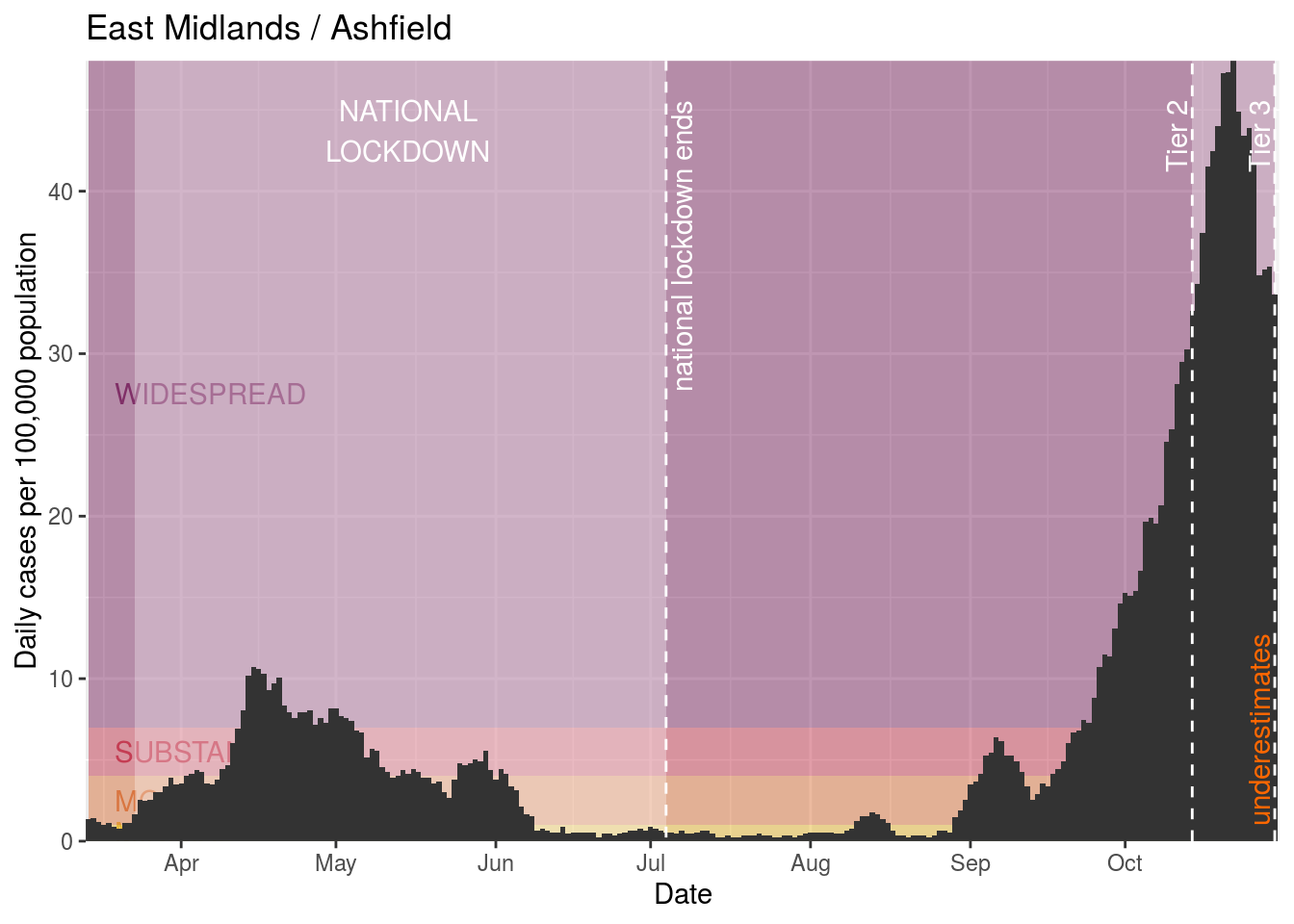
| East Midlands | E12000004 | Ashfield | E07000170 | 2020-10-30 | 0 | 2073 | 1620.6 |
Examining cases in an area
Let’s pick an area and see whether we can plot the cumulative lab-confirmed cases for that area.
We’ll pick on Manchester. We can look at Manchester’s data in a table:
| RegionName | RegionCode | AreaName | AreaCode | Date | DailyCases | CumulativeCases | CumulativeRate |
|---|---|---|---|---|---|---|---|
| North West | E12000002 | Manchester | E08000003 | 2020-10-30 | 43 | 20412 | 3692.1 |
| North West | E12000002 | Manchester | E08000003 | 2020-10-29 | 290 | 20369 | 3684.3 |
| North West | E12000002 | Manchester | E08000003 | 2020-10-28 | 371 | 20079 | 3631.9 |
| North West | E12000002 | Manchester | E08000003 | 2020-10-27 | 431 | 19708 | 3564.7 |
| North West | E12000002 | Manchester | E08000003 | 2020-10-26 | 467 | 19277 | 3486.8 |
Now let’s plot out the cumulative cases.
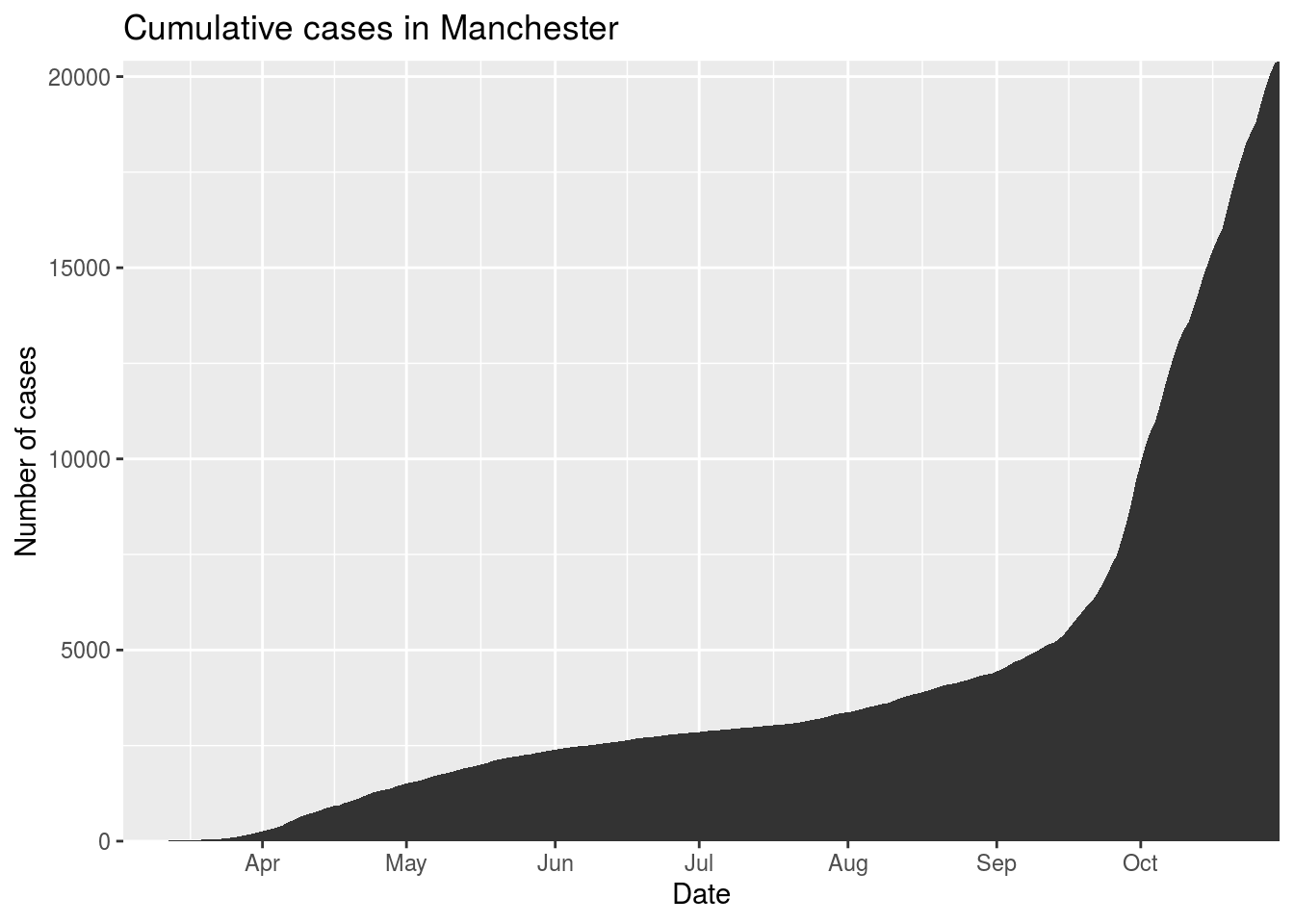
Cumulative cases don’t really help with understanding whether the number of cases are going up or down. To do that, we need to look at the daily lab-confirmed cases instead. This is what that shows:
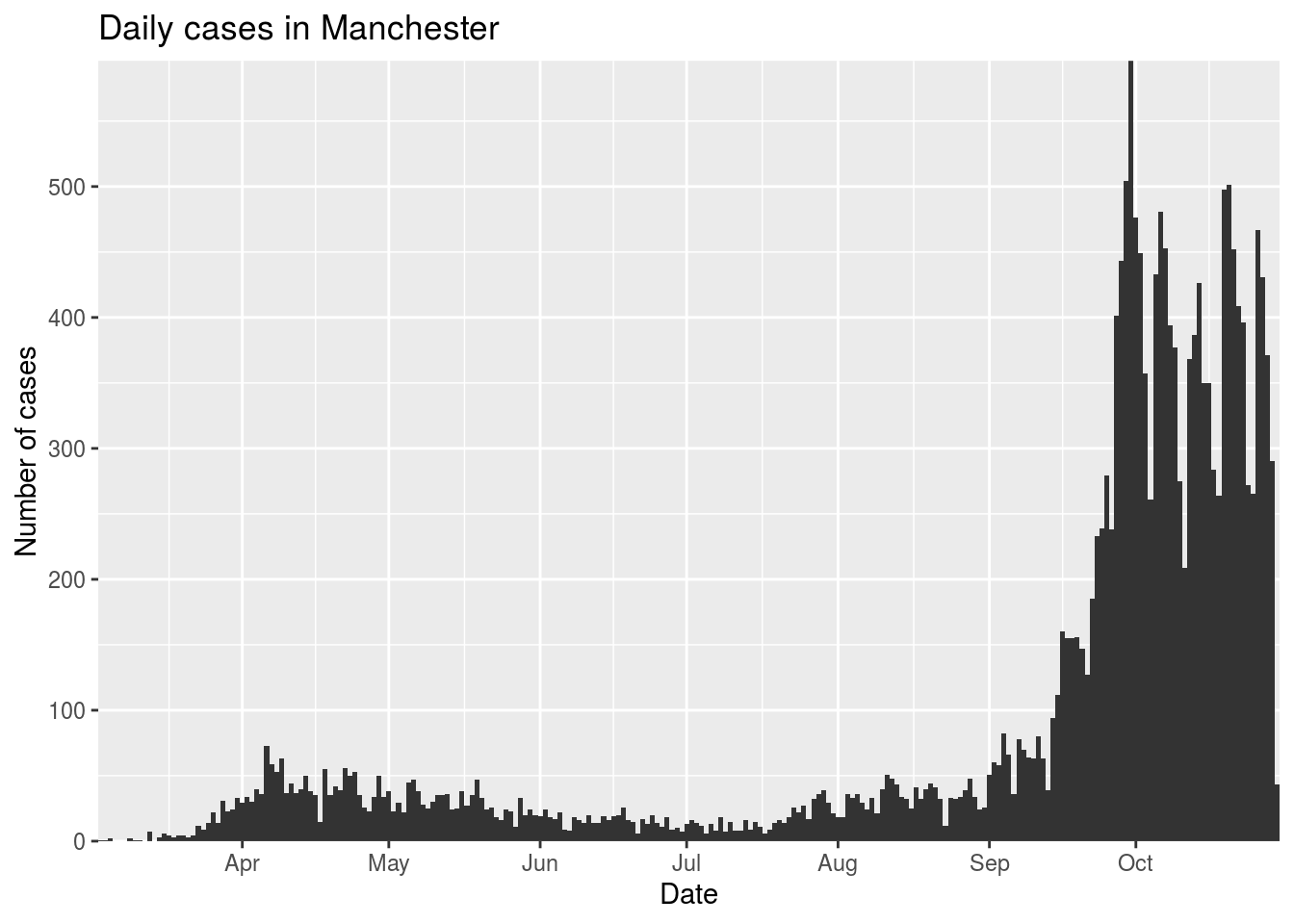
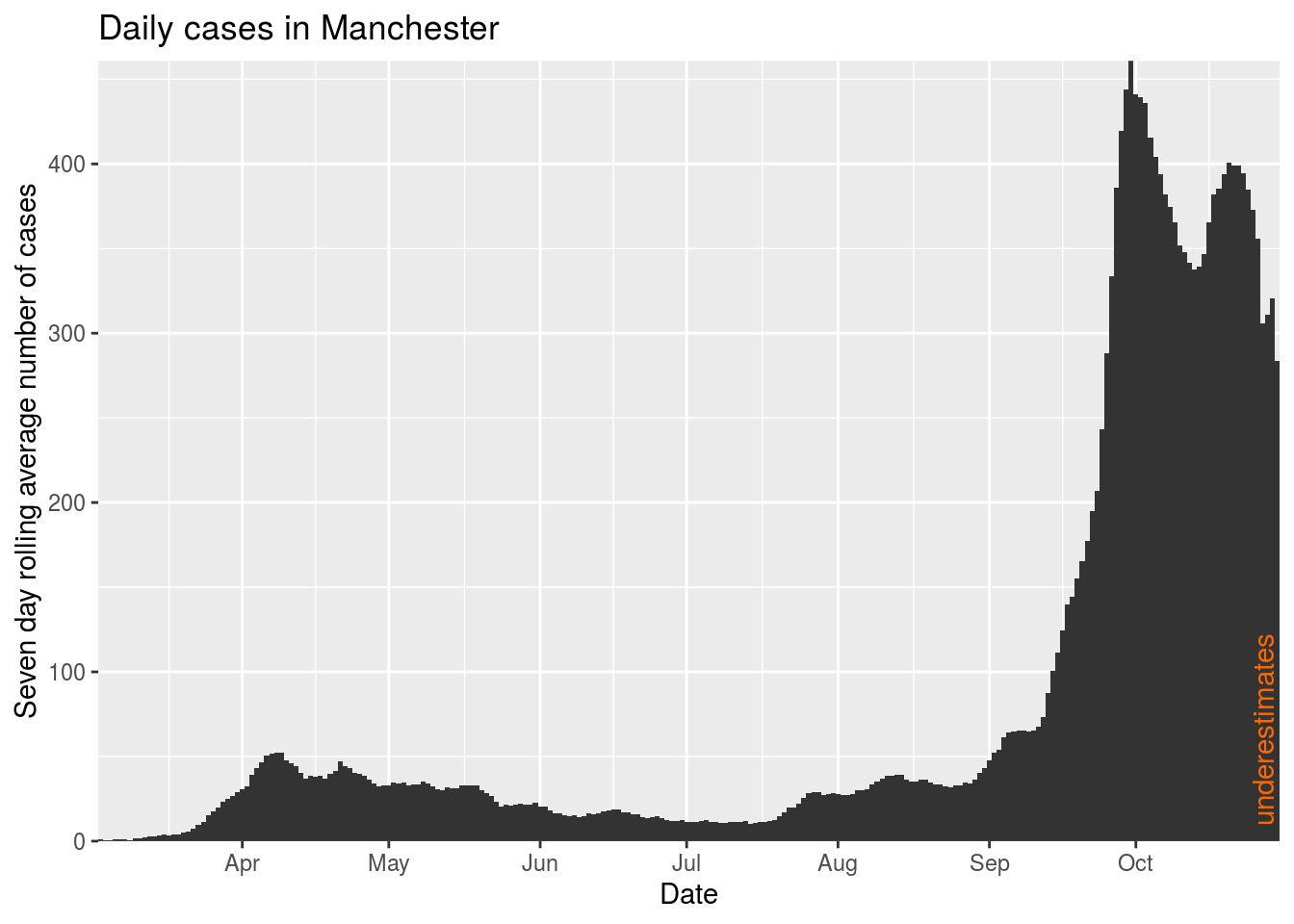
And this isn’t great, for two reasons. First, it’s extremely spiky, especially around weekends when there is less testing. So we’ll calculate a seven day rolling average, including 3 days each side of the day in question.
Second, we need to be careful about the figures from the last week: lab-confirmed cases are dated according to the date of the specimen (when the test was done) rather than when the result comes in, and they can take time to both process and report. As results come in, the data is updated to increase the figures on previous dates. So figures from the last week or so tend to be underestimates of the eventual numbers. We’re going to indicate that on the graphs using an annotation.
| Date | DailyCases | AverageDailyCases |
|---|---|---|
| 2020-10-30 | 43 | 283.7500 |
| 2020-10-29 | 290 | 320.4000 |
| 2020-10-28 | 371 | 311.1667 |
| 2020-10-27 | 431 | 305.5714 |
| 2020-10-26 | 467 | 356.0000 |
| 2020-10-25 | 265 | 373.0000 |
| 2020-10-24 | 272 | 384.5714 |
| 2020-10-23 | 396 | 394.5714 |
| 2020-10-22 | 409 | 399.0000 |
| 2020-10-21 | 452 | 398.8571 |
Indicating when restrictions are in place
I’ve created a Google spreadsheet of restrictions to make it easy for the graphs to indicate when restrictions are in place at different levels. Let’s take a look at this data.
Note that the data has missing EndDate values when the restrictions haven’t yet been lifted. To make the graphing work, we need to substitute any missing values with the most recent date.
| AreaCode | AreaName | StartDate | EndDate | LegislationRef | GuidanceRef | Tier |
|---|---|---|---|---|---|---|
| E07000129 | Blaby | 2020-07-04 | 2020-07-18 | NA | https://www.gov.uk/guidance/leicester-lockdown-what-you-can-and-cannot-do | NA |
| E07000130 | Charnwood | 2020-07-04 | 2020-07-18 | NA | https://www.gov.uk/guidance/leicester-lockdown-what-you-can-and-cannot-do | NA |
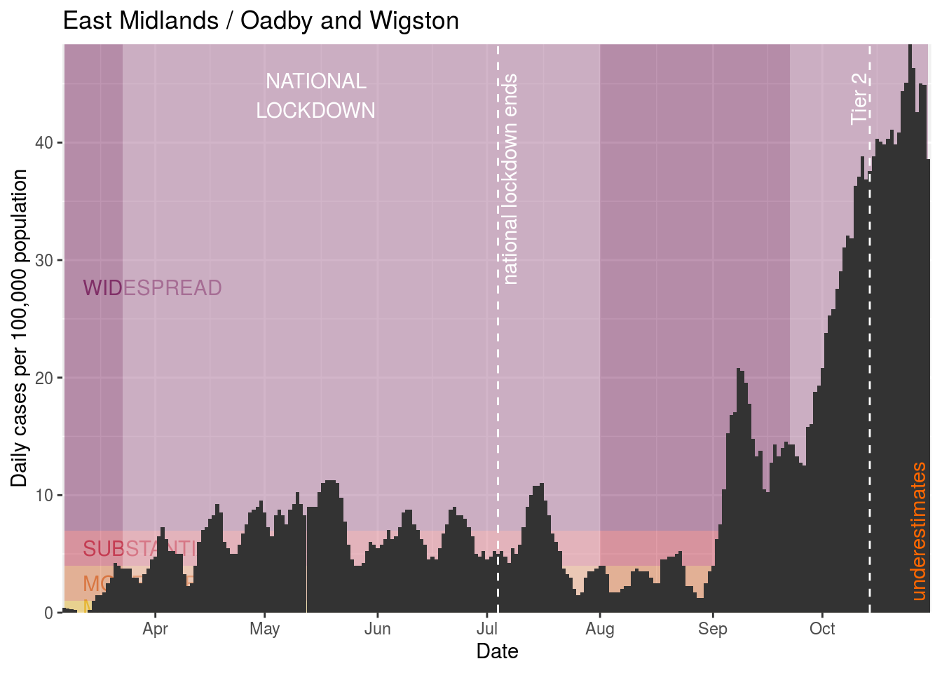
| E07000135 | Oadby and Wigston | 2020-07-04 | 2020-08-01 | https://www.legislation.gov.uk/uksi/2020/685 | https://www.gov.uk/guidance/leicester-lockdown-what-you-can-and-cannot-do | NA |
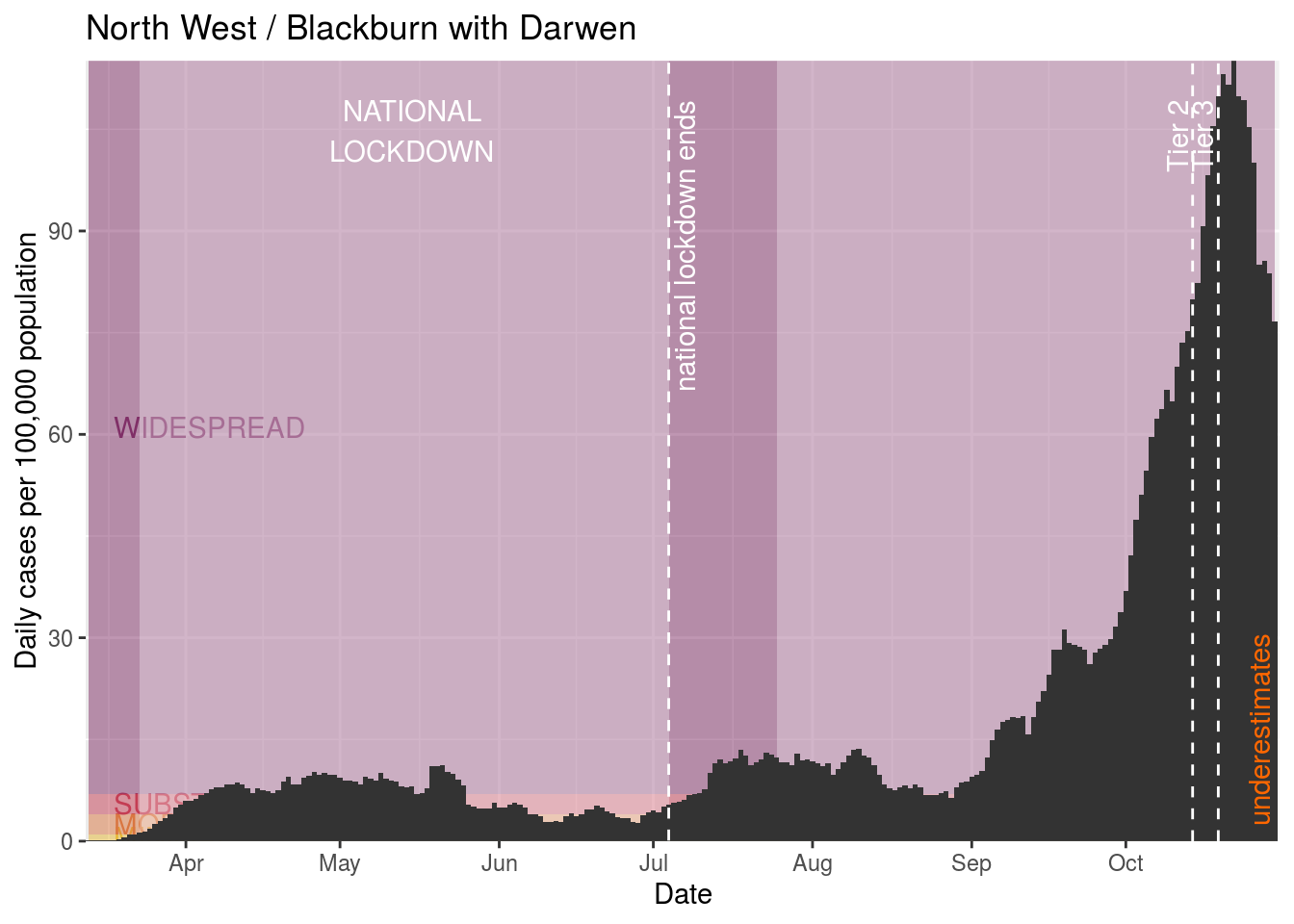
| E06000008 | Blackburn with Darwen | 2020-07-25 | 2020-08-01 | https://www.legislation.gov.uk/uksi/2020/800 | https://www.gov.uk/guidance/north-west-england-local-restrictions | NA |
| E06000032 | Luton | 2020-07-25 | 2020-08-01 | https://www.legislation.gov.uk/uksi/2020/800 | https://www.gov.uk/guidance/luton-local-restrictions | NA |
Now, when we plot the cases in a particular area, we can find any restrictions in that area and also plot those, alongside the nation-wide lockdown that ran from 23rd March to 4th July. Here I’ve shown that in blue.
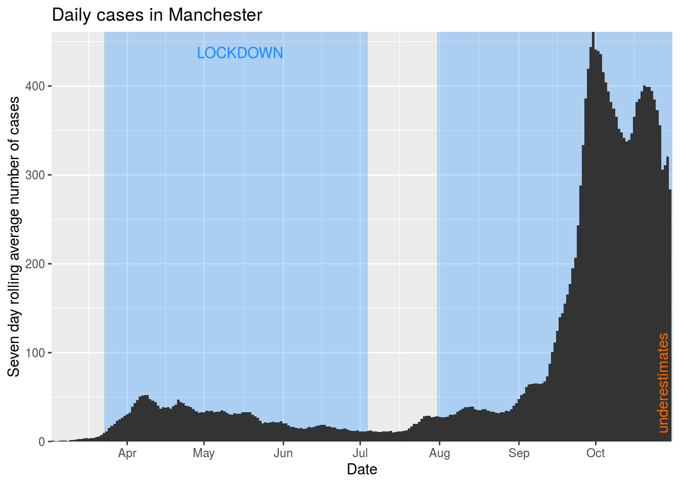
Here we can see that the national lockdown did have an effect in Manchester, but that the cases started rising again a couple of weeks before the local lockdown was put into effect. The local lockdown doesn’t seem to have had as big an effect on the number of cases.
Understanding testing levels
The graphs we’re creating here indicate underestimates due to the time it takes for new cases to filter through into reported data. Another thing that can cause an underestimate in the number of cases shown is the amount of testing that is going on and the degree to which people go and get testing (which they might not do for various reasons, such as if they think it will be unpleasant, time-consuming, or deprioritise their own testing in favour of others such as health and care workers). It would be good to be able to show where that’s likely to have been happening.
In the UK, the numbers of tests that are carried out are only available at the national level. We’ll load the data for England and take a look at it. (We’ll change the names of the columns because the data uses the pillar numbers which are a bit confusing if you’re not steeped in the data. The request I’m using to get this data doesn’t include surveillance data numbers - tests that are sent out randomly to get an understanding of prevalence across the country, rather than tests requested by people who have symptoms - because they only exist for the whole of the UK, not specifically for England.)
| Date | NewNHSTests | NewCommercialTests | NewAntibodyTests |
|---|---|---|---|
| 2020-10-29 | 60969 | 211541 | 3266 |
| 2020-10-28 | 69337 | 179225 | 3338 |
| 2020-10-27 | 68334 | 152302 | 3214 |
| 2020-10-26 | 51702 | 135491 | 2489 |
| 2020-10-25 | 51245 | 202720 | 622 |
Let’s graph those tests in a stacked bar chart.
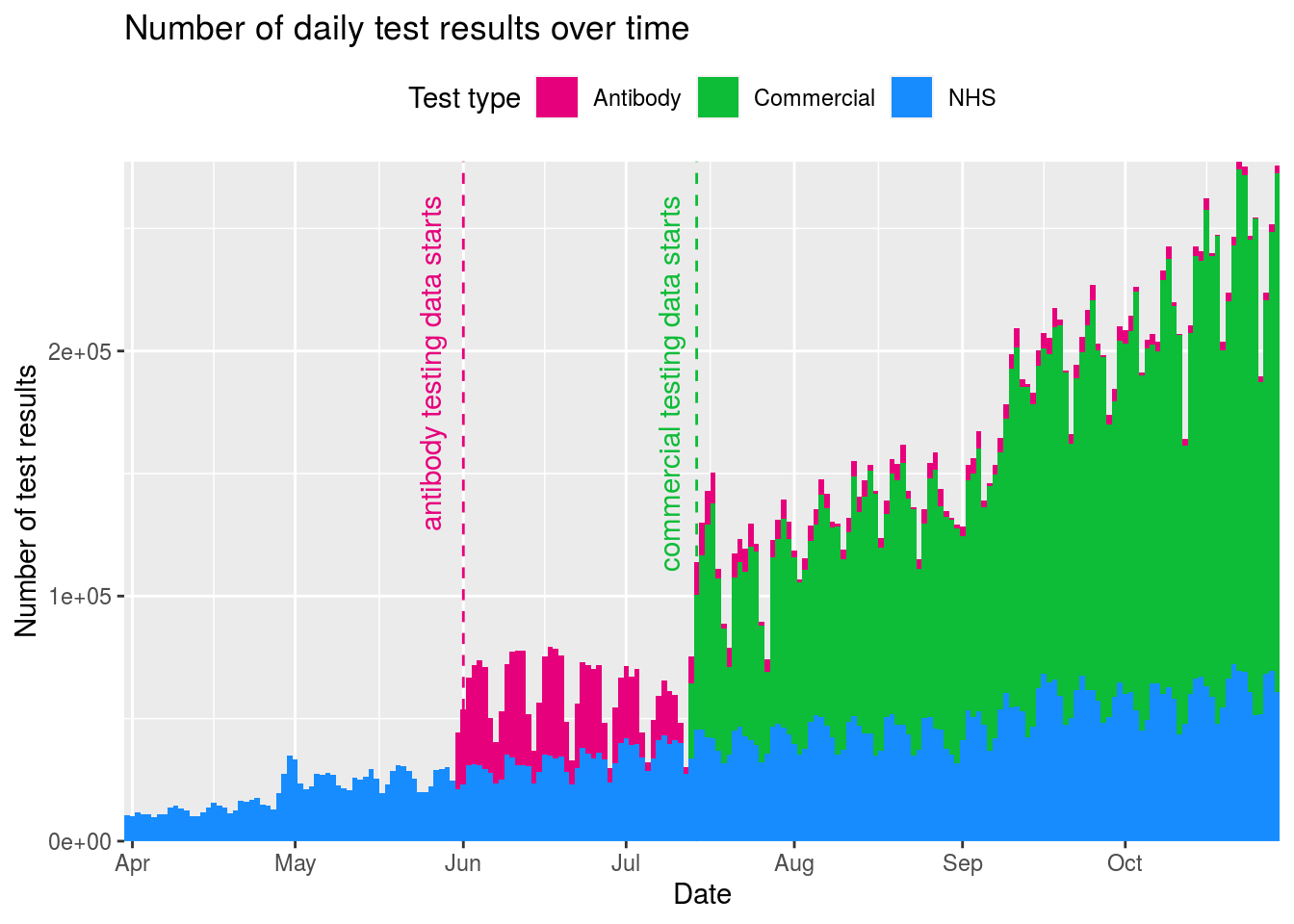
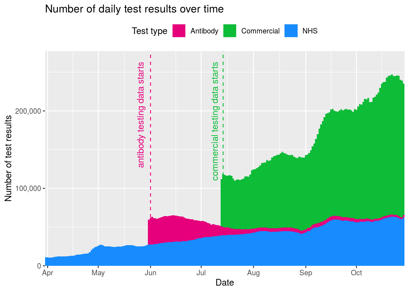
Again this data is very spikey so we’ll smooth it out.
Comparing tests to cases
One interesting thing to look at is the relative numbers of tests and lab-confirmed cases. Now this isn’t an exact science as the lab-confirmed cases are based on numbers of people while the tests are based on numbers of tests. The same person could receive lots of tests, and the number of tests each person receives could vary over time (for example as testing policy changes). More comparative measures would be the percentage of positive tests, or the number of people tested, but this data isn’t published (which may mean it doesn’t exist, or simply that it isn’t shared).
Since we’re dealing with data at a national scale, let’s join together the data we have for cases in England with this testing data to take a look at testing percentages. When doing this, we’ll sum together the NHS and commercial tests (but not the antibody tests, which measure when people have had Covid-19 rather than whether they currently have it) to see what population is being reached.
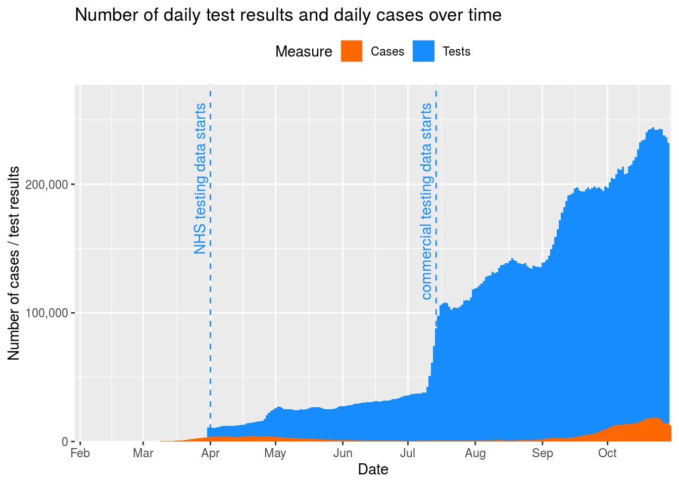
If we plot this data, we can see the scale of testing (in blue) is massive compared to the scale of cases (in orange).
We can work out the percentage of tests that are leading to cases each day, and plot that as follows.
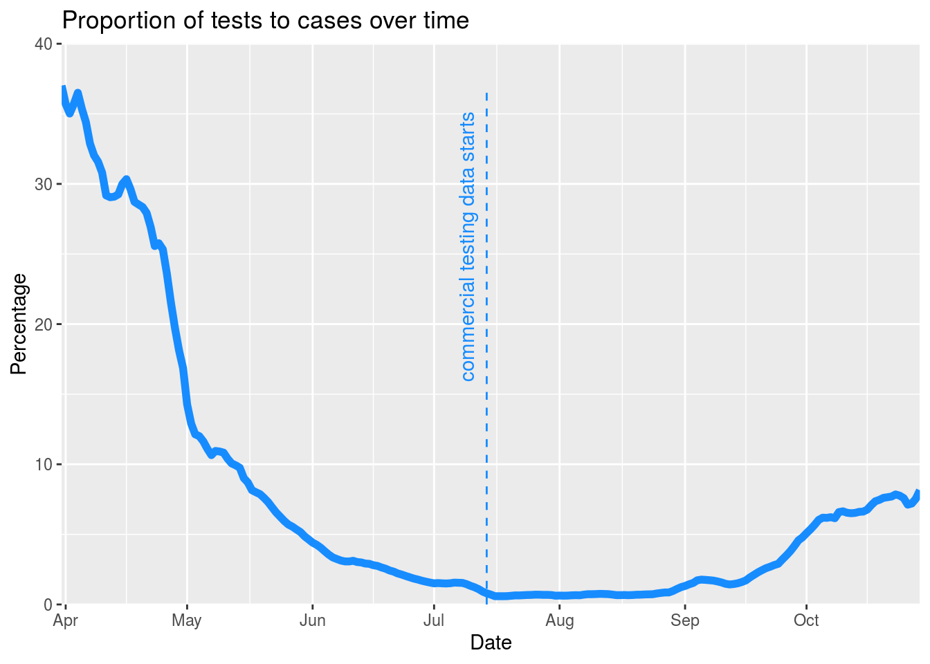
The graph shows how the relationship between number of lab-confirmed cases (all of which will have had a test) and overall numbers of tests has changed dramatically over time. At the start, the number of tests was only about three times the number of cases; more recently, there have been more than 100 tests per positive case.
This is a bit of a misleading picture, however. The data about commercial tests isn’t represented in the data until 14th July, so we have to consider before and after that date separately. Testing data is also only released every week, on a Thursday, so we should ignore everything after last Thursday. Let’s narrow down the data to the period between those dates and take another look.
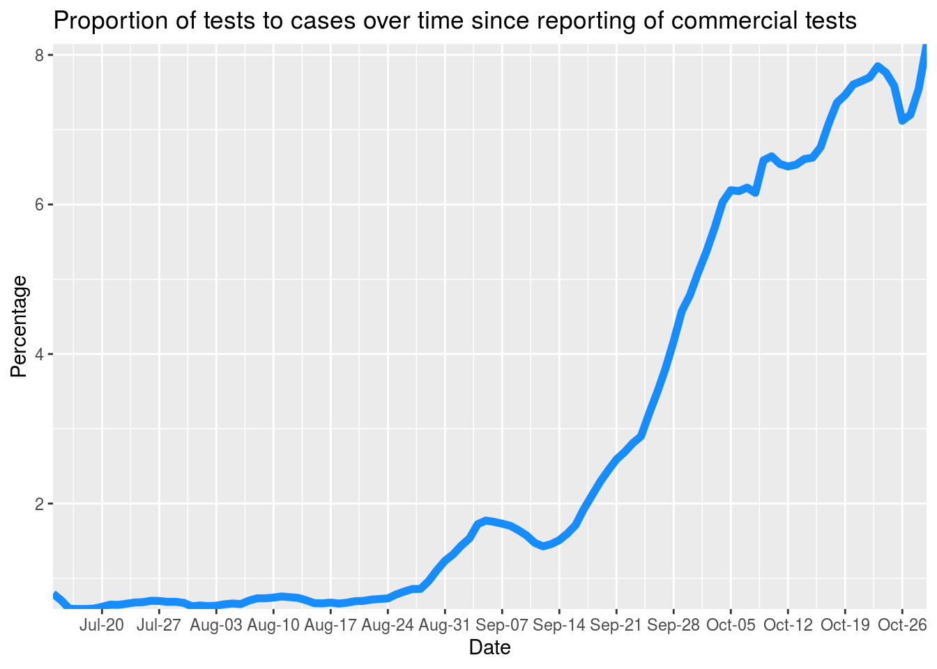
The proportion roughly doubled between mid and late August, but the proportion is still very low compared to that at the beginning of the UK epidemic. Given the proportions before the start of June, it’s likely that the number of cases before then were underestimates simply due to lower testing.
Comparing tests to capacity
An alternative mechanism for understanding the effect of testing is to use government figures for testing capacity. These are only available for the whole of the UK (when in fact capacity might be different in different nations and local authorities). Nevertheless, let’s look at what that data says.
| Date | NHSCapacity | CommercialCapacity | AntibodyCapacity | SurveillanceCapacity | NewNHSTests | NewCommercialTests | NewAntibodyTests | NewSurveillanceTests |
|---|---|---|---|---|---|---|---|---|
| 2020-10-29 | 167879 | 301100 | 120000 | 13082 | 74031 | 243216 | 3266 | 57566 |
| 2020-10-28 | 161869 | 297200 | 120000 | 9543 | 81764 | 203833 | 3338 | 54840 |
| 2020-10-27 | 137574 | 295900 | 120000 | 7167 | 80017 | 176920 | 3214 | 50982 |
| 2020-10-26 | 134112 | 293200 | 120000 | 19511 | 63458 | 158141 | 2489 | 40256 |
| 2020-10-25 | 83164 | 281000 | 120000 | 14932 | 60363 | 230862 | 622 | 29888 |
We can calculate what percentage of capacity we’ve been operating on based on these figures, and then plot them. We’ll exclude surveillance data since the reported capacity is inaccurate (the data shows more tests being done than there is capacity for, for example). We’ll also only look at data since 14th July, since that’s when commercial testing data started being properly reported across the UK.
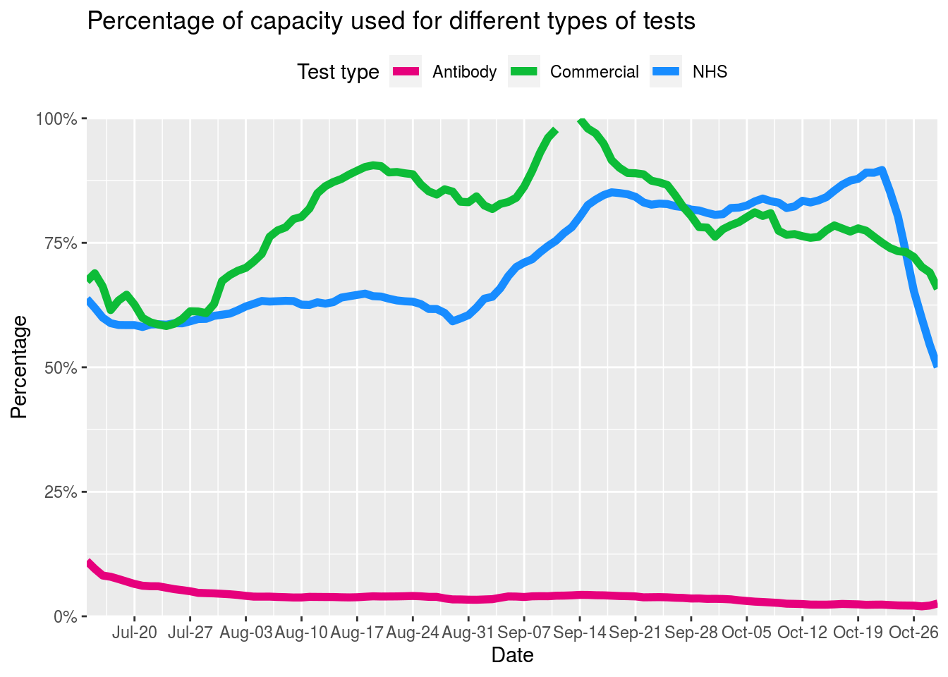
This shows in particular how reported commercial capacity was almost used up in mid August. The following graph shows overall NHS and commercial testing capacity since mid July.
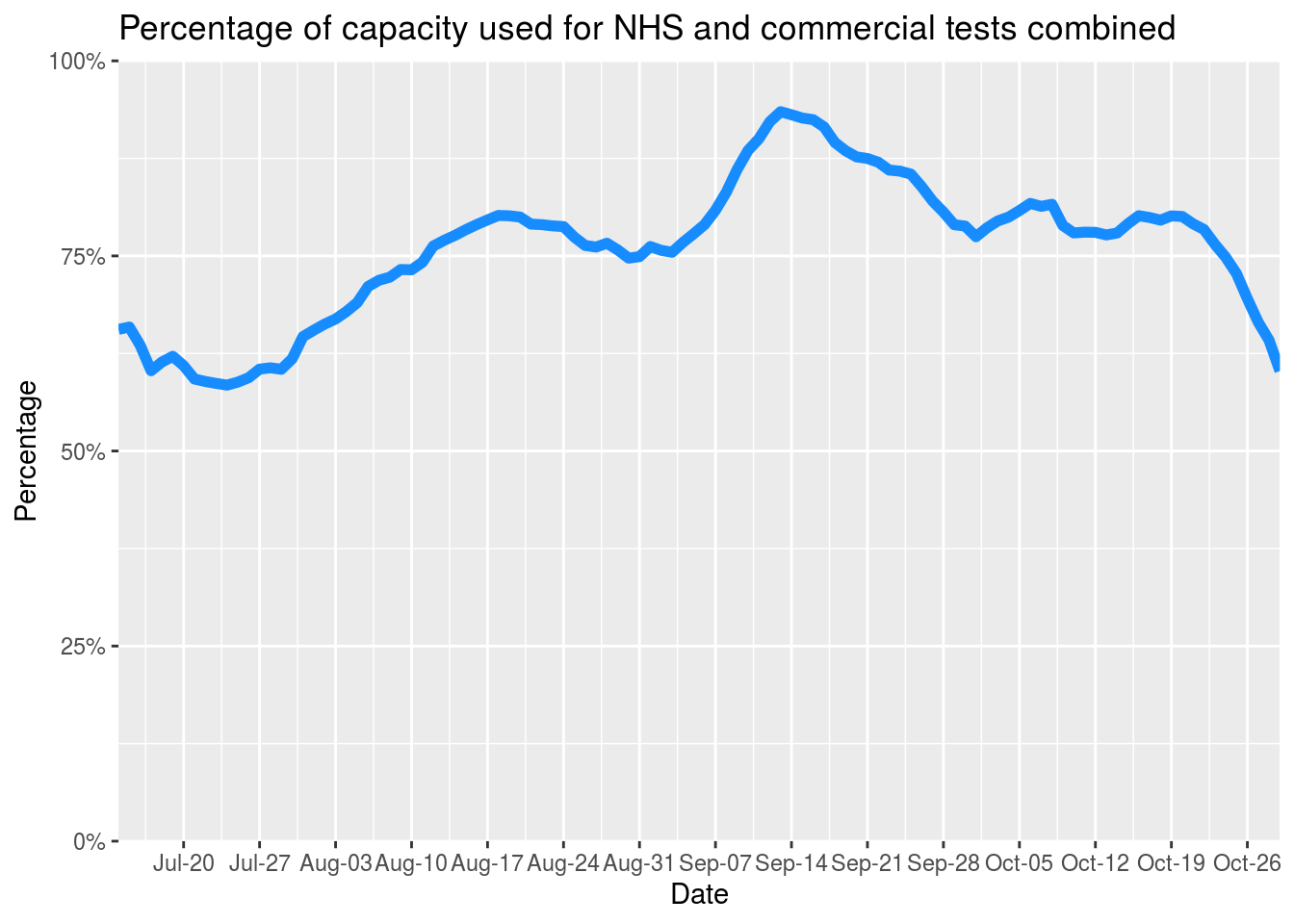
The overall testing capacity isn’t maxed out, but remember these are figures for the whole of the UK. It’s likely (especially given recent news reports) that testing capacity is different in different parts of the country, and perhaps most stretched in places with the most cases. So we might expect figures since mid August to also be underestimates (compared to those from earlier in the summer).
Overall, though, it’s hard to draw solid conclusions from the available testing data about the degree to which lack of testing might be influencing the numbers of cases reported in the data.
Comparing local authorities
Let’s return now to the overall data for local authorities. When we start looking across local authorities, we need to bear in mind that different local authorities have different sizes. A certain absolute number of cases in a small local authority is more concerning than if that number of cases were present in a larger local authority, because it would mean a greater percentage of the population were affected.
So we need to calculate infection rates. To do that, we need population data from the ONS which is only available as an Excel file. I’ve cheated and downloaded and converted it to a CSV file locally so that I can use it, rather than try to load the Excel file from source.
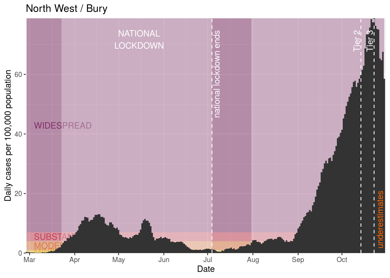
Now we can join that data together with the data we have on cases, and from it calculate rates per 100,000 people. The table shows those areas with the highest current average daily rate (which, remember, are likely to be underestimates because recent case numbers are underestimates).
| AreaName | Date | AverageDailyCases | All ages | AverageDailyRate |
|---|---|---|---|---|
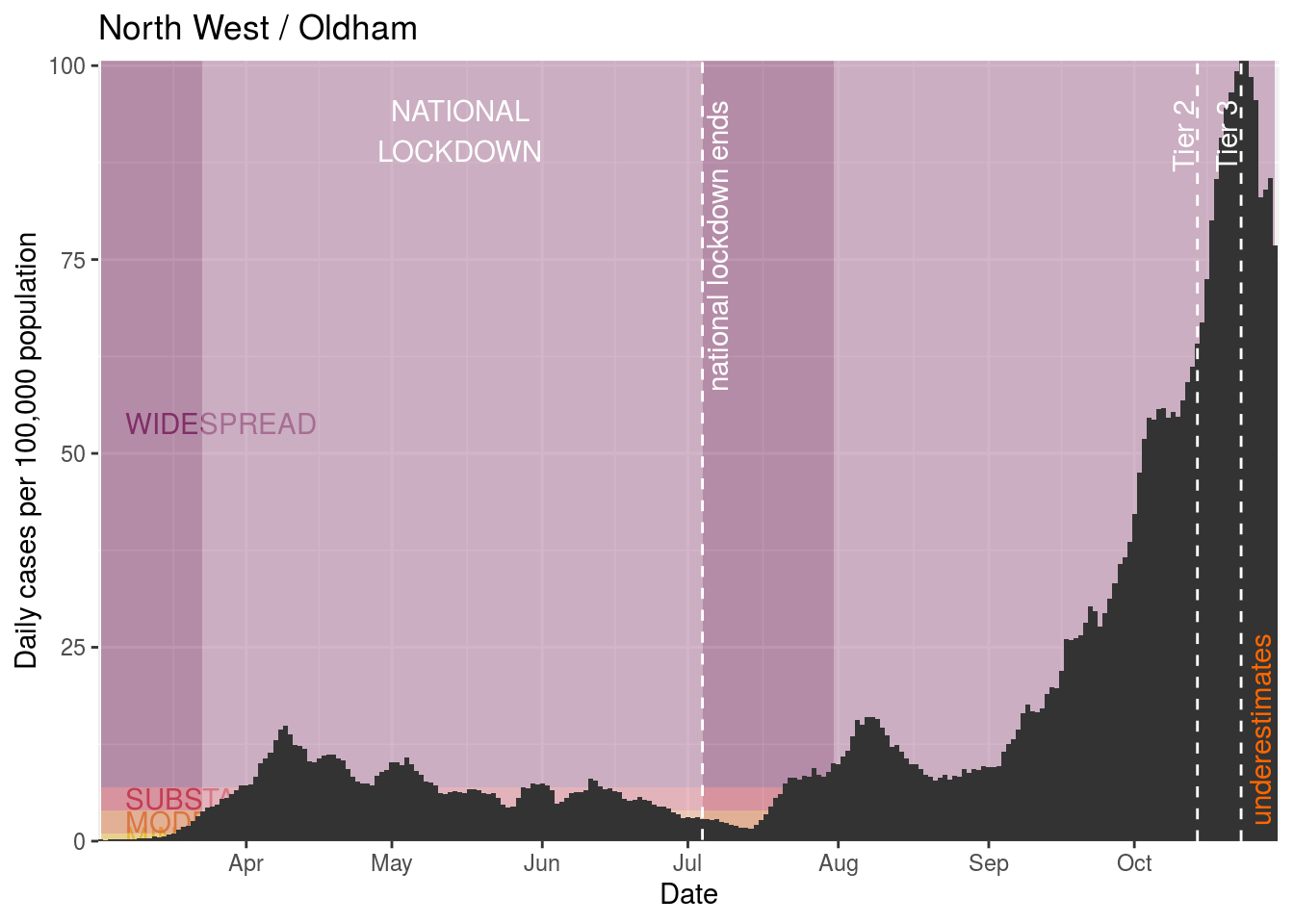
| Oldham | 2020-10-30 | 182.25 | 237110 | 76.86306 |
| Blackburn with Darwen | 2020-10-30 | 114.75 | 149696 | 76.65535 |
| Wigan | 2020-10-30 | 239.50 | 328662 | 72.87122 |
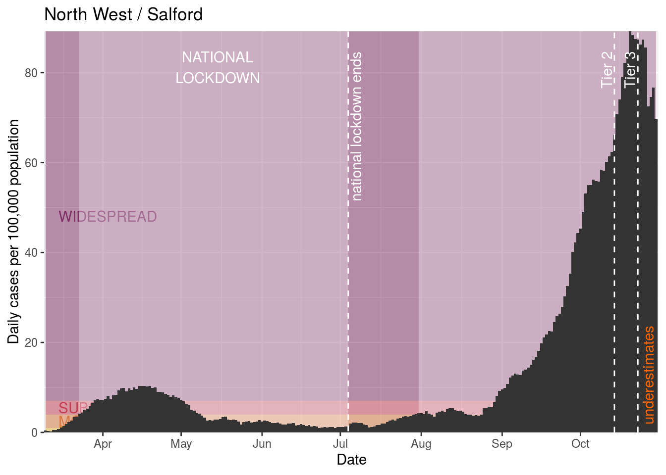
| Salford | 2020-10-30 | 180.25 | 258834 | 69.63923 |
| Rochdale | 2020-10-30 | 138.00 | 222412 | 62.04701 |
| Tameside | 2020-10-30 | 132.75 | 226493 | 58.61108 |
| Bury | 2020-10-30 | 111.75 | 190990 | 58.51092 |
| Bolton | 2020-10-30 | 166.00 | 287550 | 57.72909 |
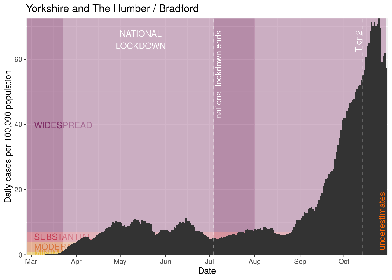
| Bradford | 2020-10-30 | 309.50 | 539776 | 57.33860 |
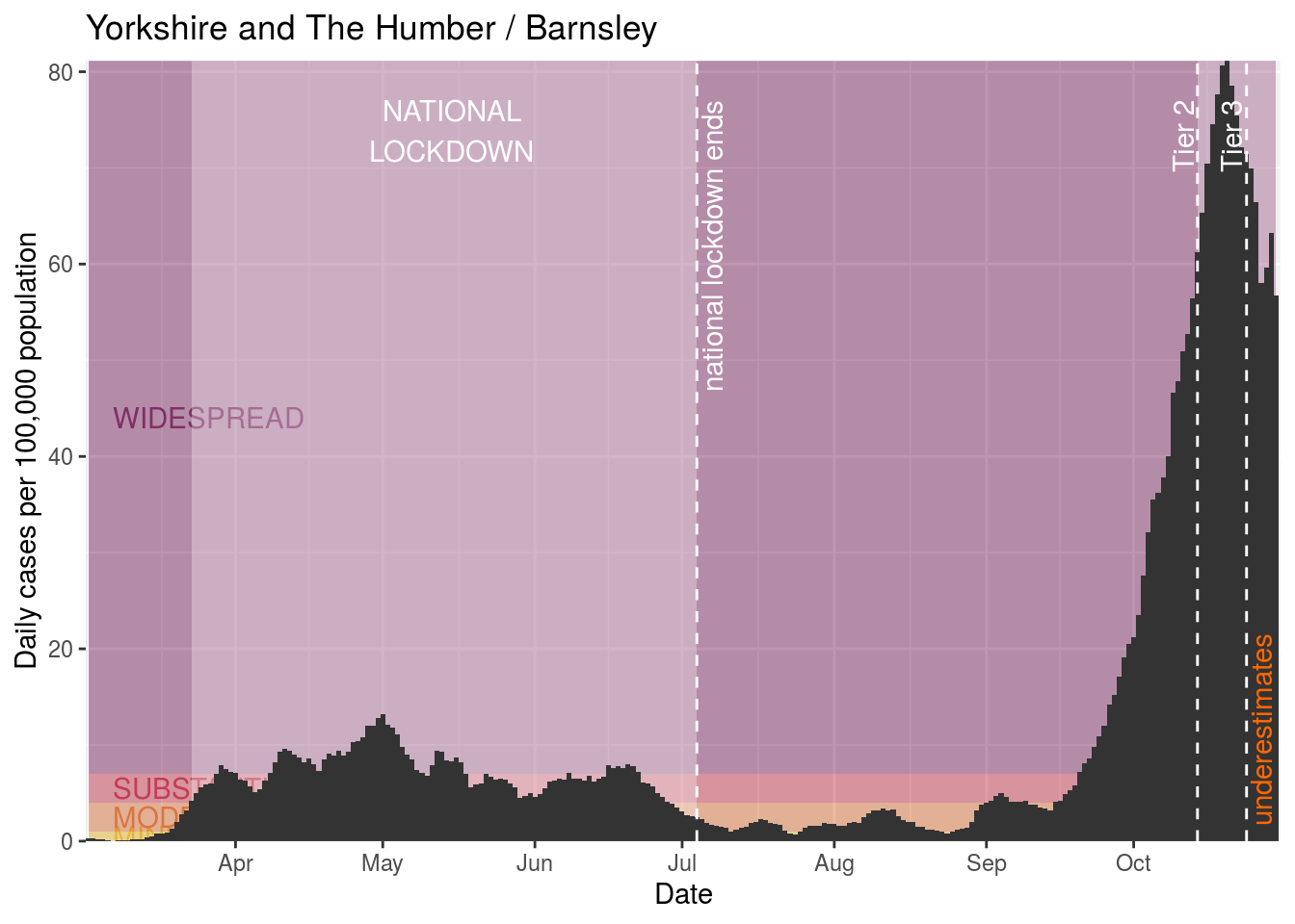
| Barnsley | 2020-10-30 | 140.00 | 246866 | 56.71093 |
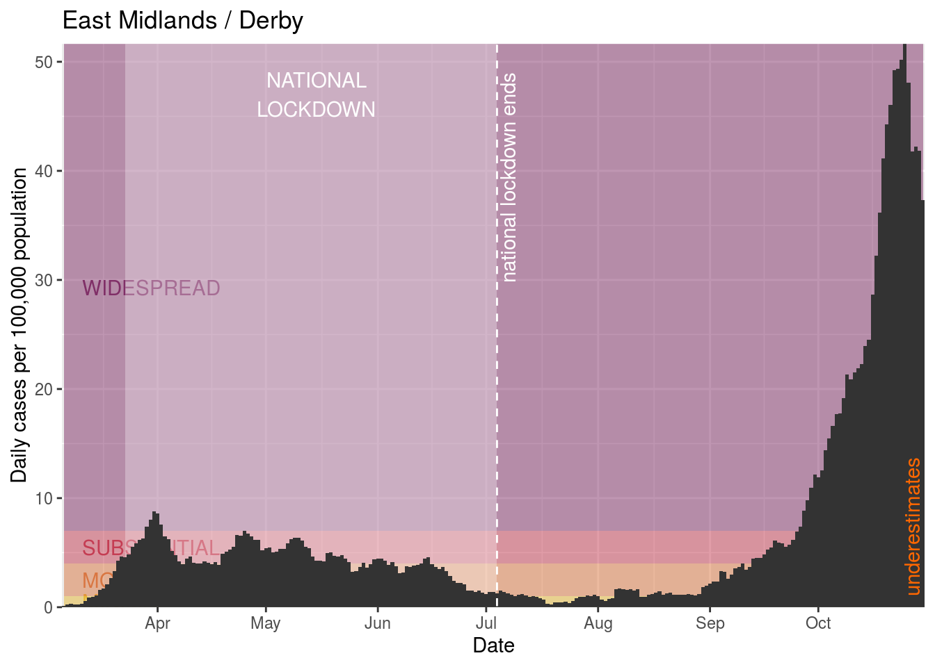
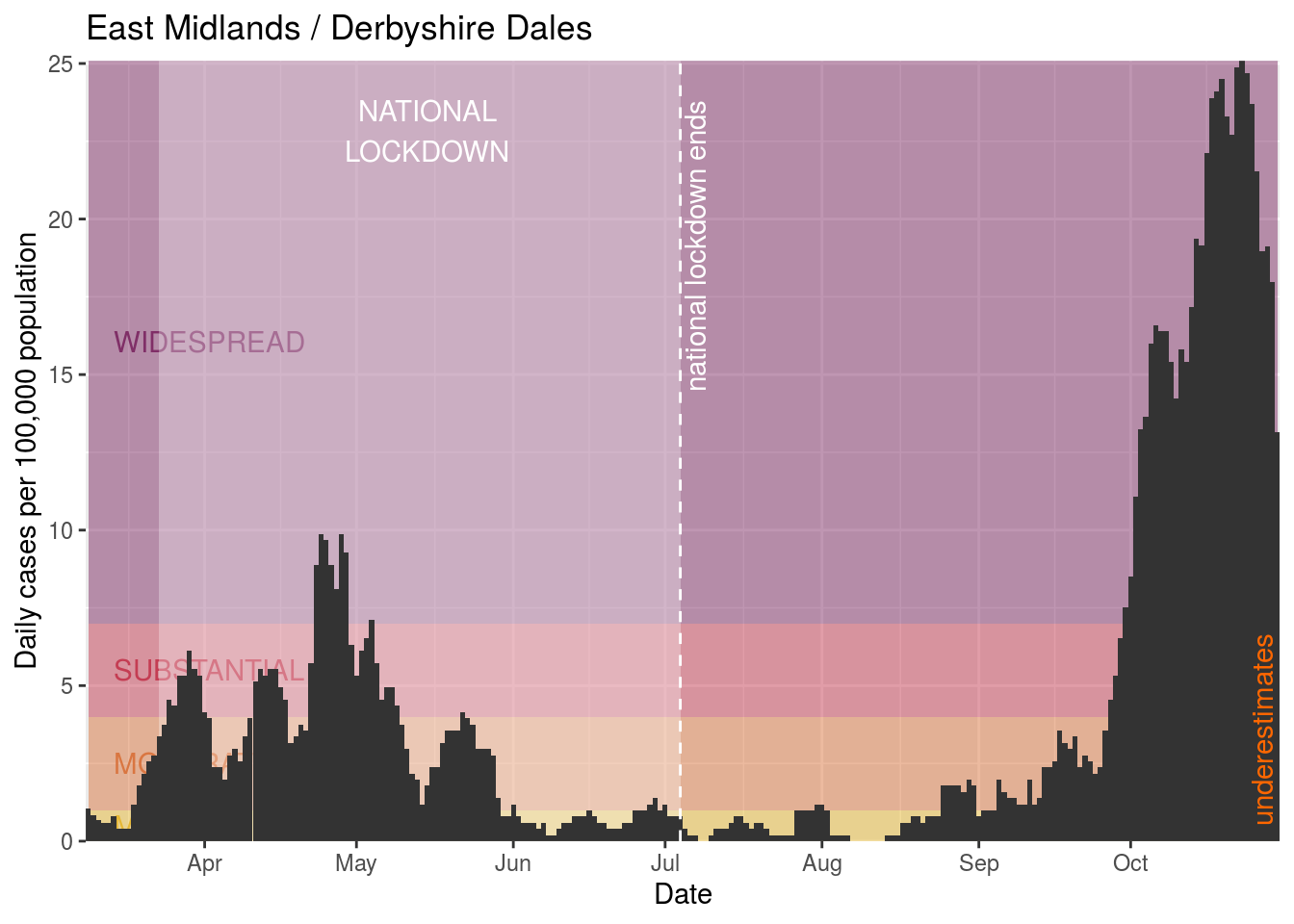
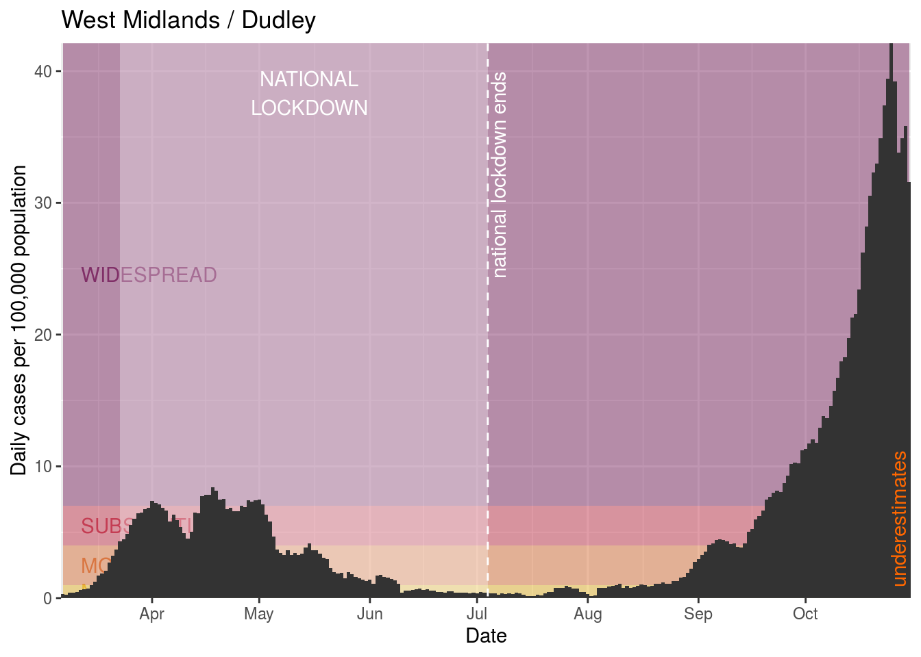
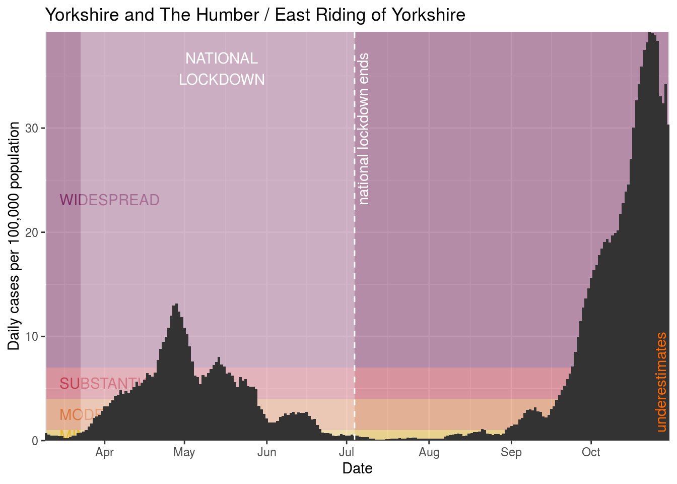
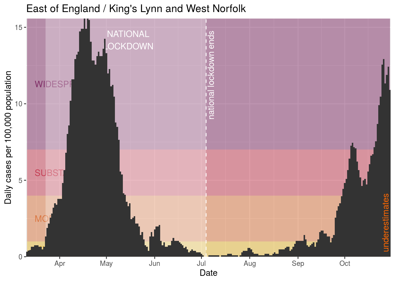
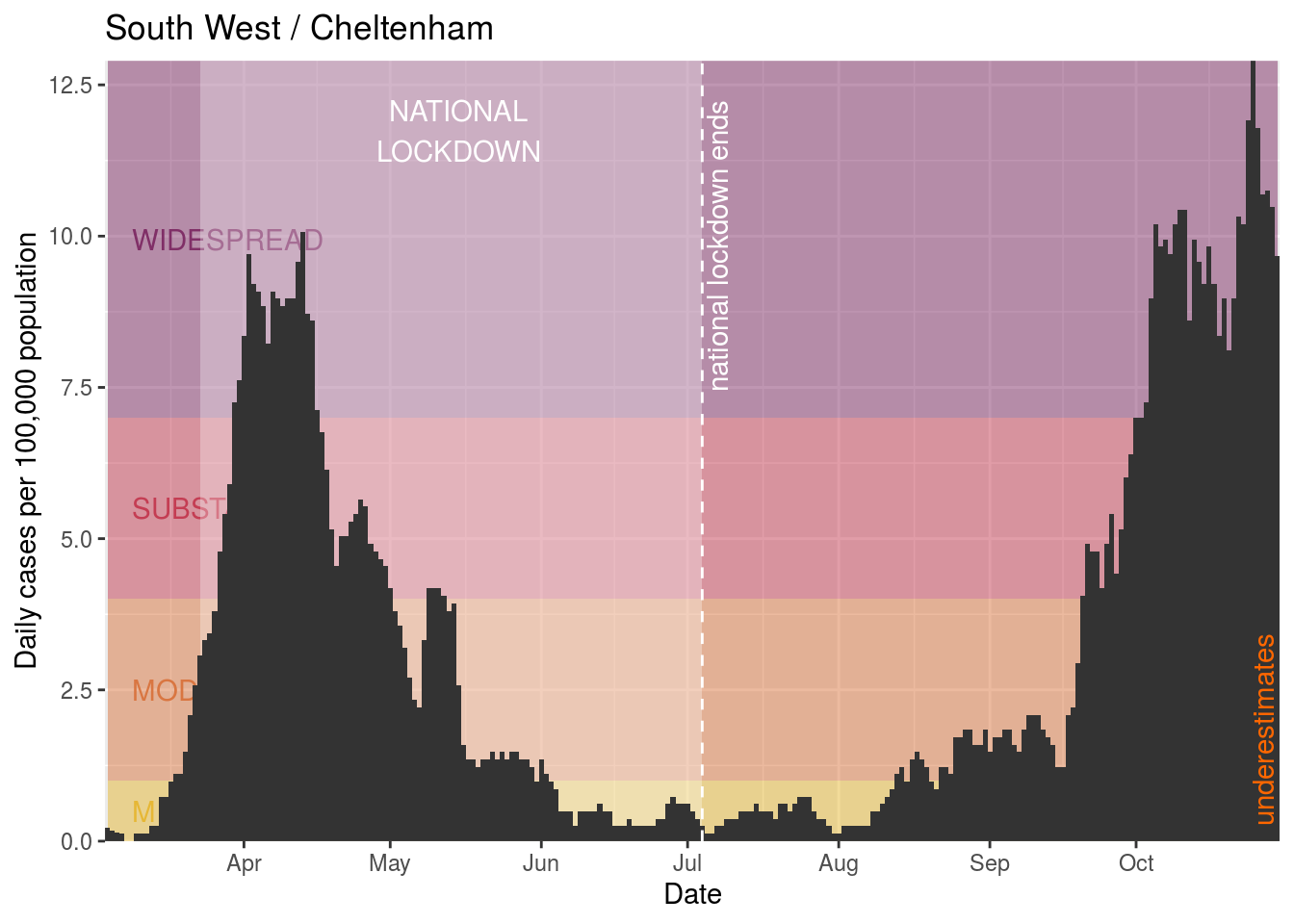
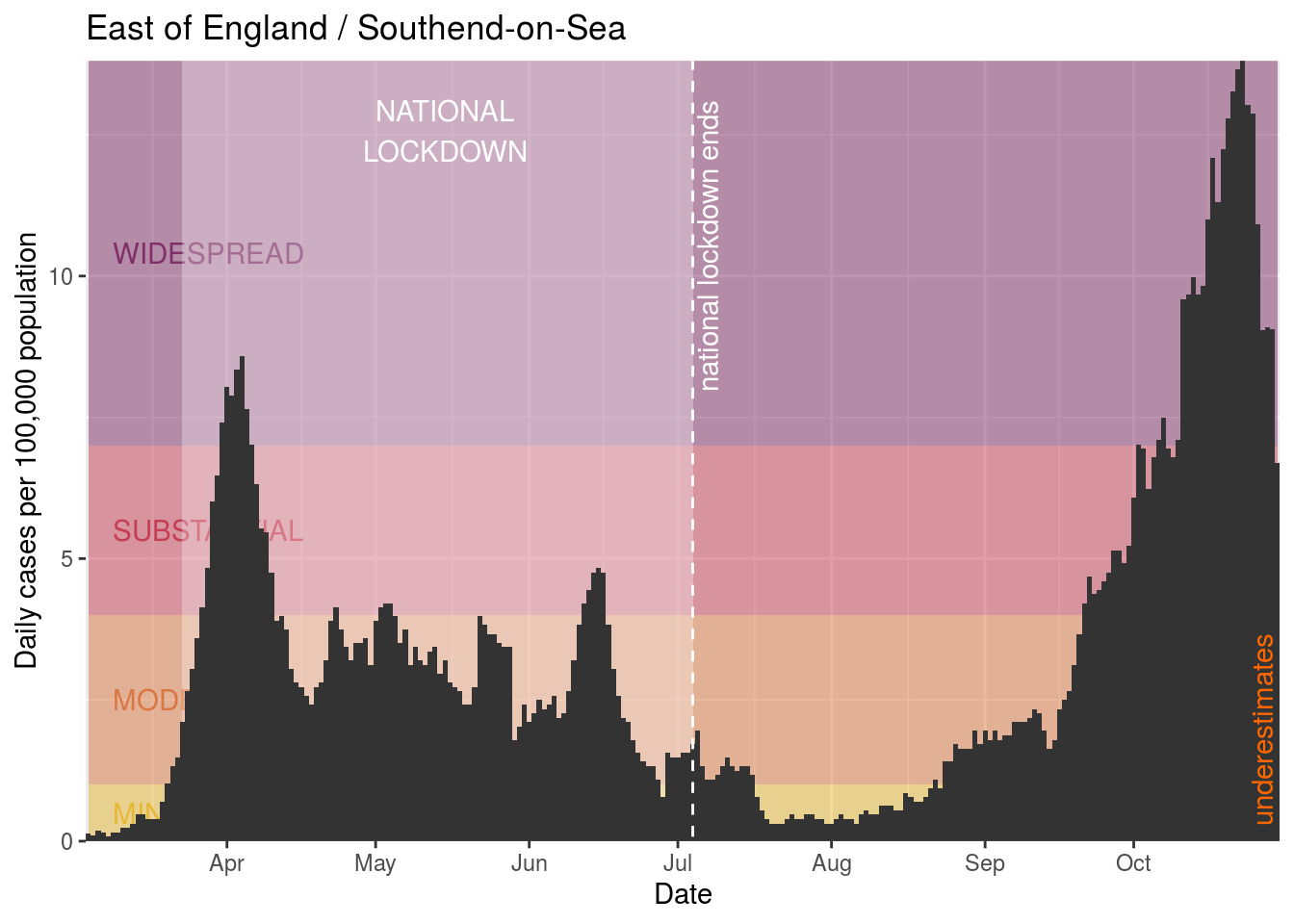
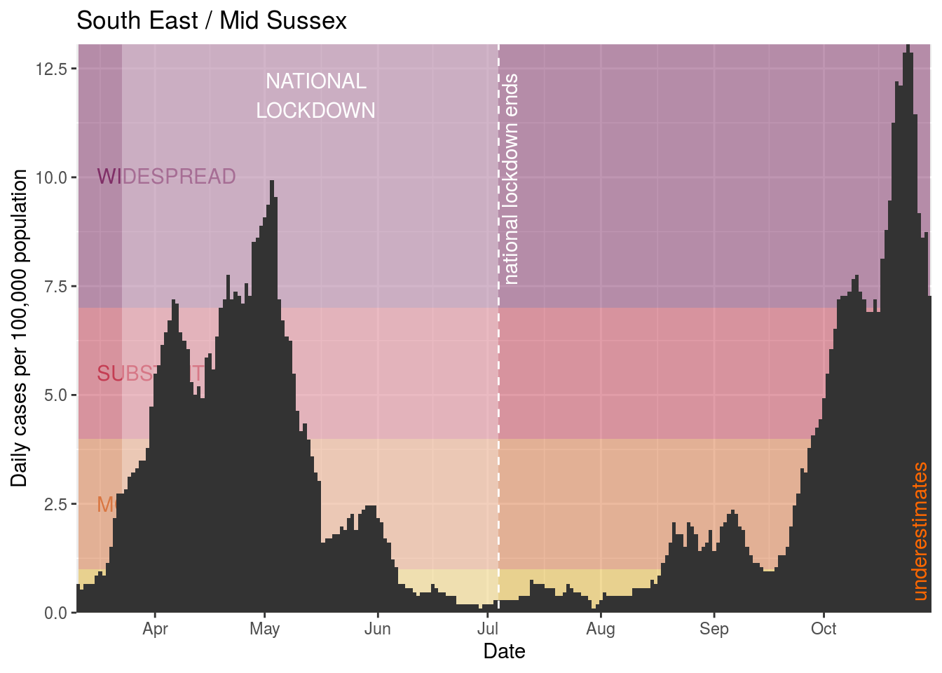
What kind of rate of new cases should we worry about? Well, in California, they have defined four levels of risk:
- Widespread: more than 7 daily new cases / 100,000
- Substantial: between 4-7 daily new cases / 100,000
- Moderate: between 1-4 daily new cases / 100,000
- Minimal: less than 1 daily new case / 100,000
As discussed, it is possible to reduce the number of new cases in the data by simply not testing as many people. In the UK, testing capacity is probably not limited in this way, but there isn’t enough granularity in the public testing figures to be able to tell. Regardless, the figures above give a rough indication of how concerned to be about the level of infection in an area.
We’ll try to plot these on a map. There’s a great tutorial for this which we’ll just follow. We’re using ultra generalised 2019 boundaries from ONS, which like the population data we’ve downloaded locally into a folder.
First we load the shape file and ensure that it knows what regions we’re using from it.
Then we filter the local authority data to the most recent date (2020-10-30) and retain only area code and the average daily rate. This is the data that’s relevant for the map.
Then we merge the map data into the shape data and plot the map.
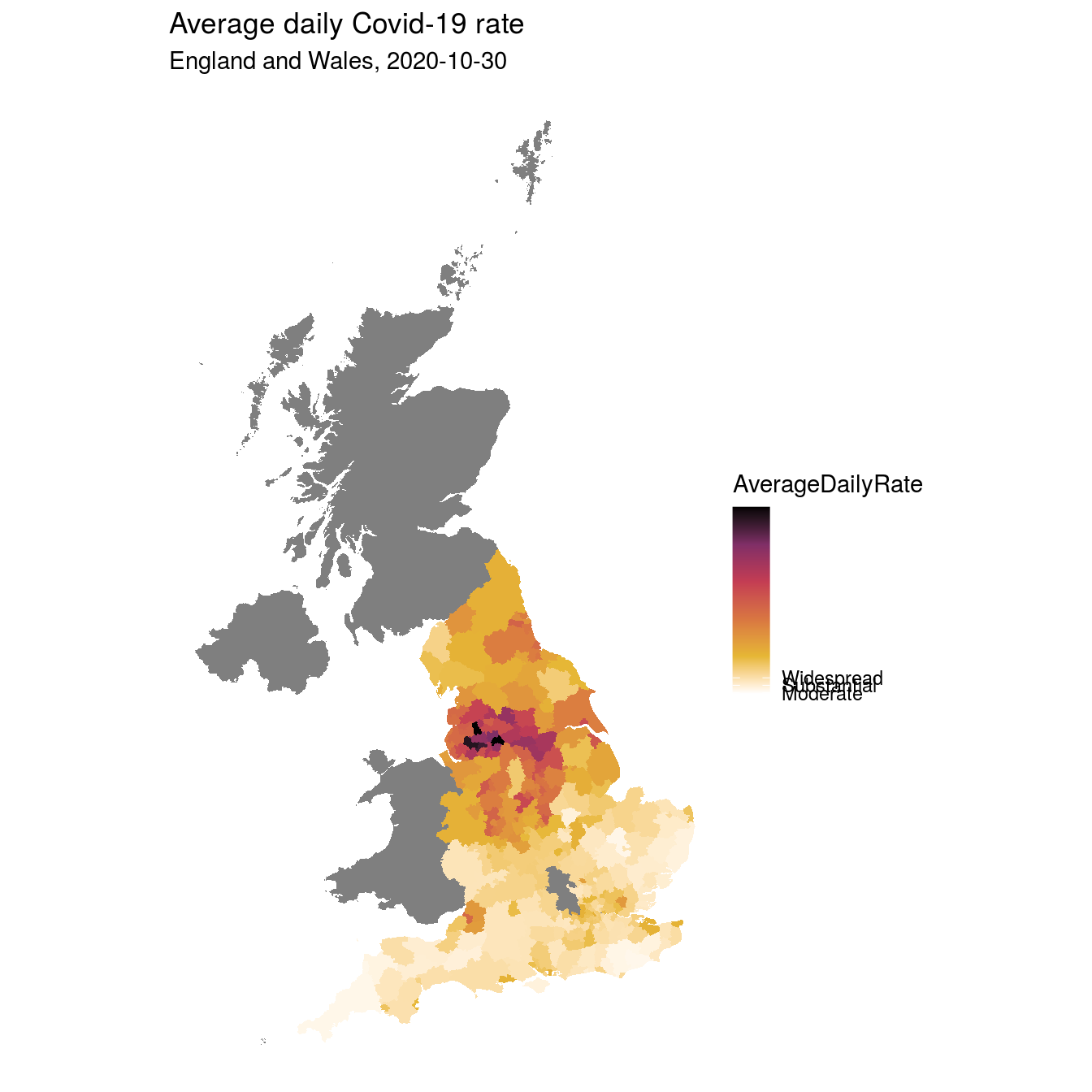
This highlights some areas that have high rates of cases, but unless you’re great at UK geography you might struggle to name them. So we’ll move on to look at some individually in a bit.
Areas where there are or have been government lockdowns
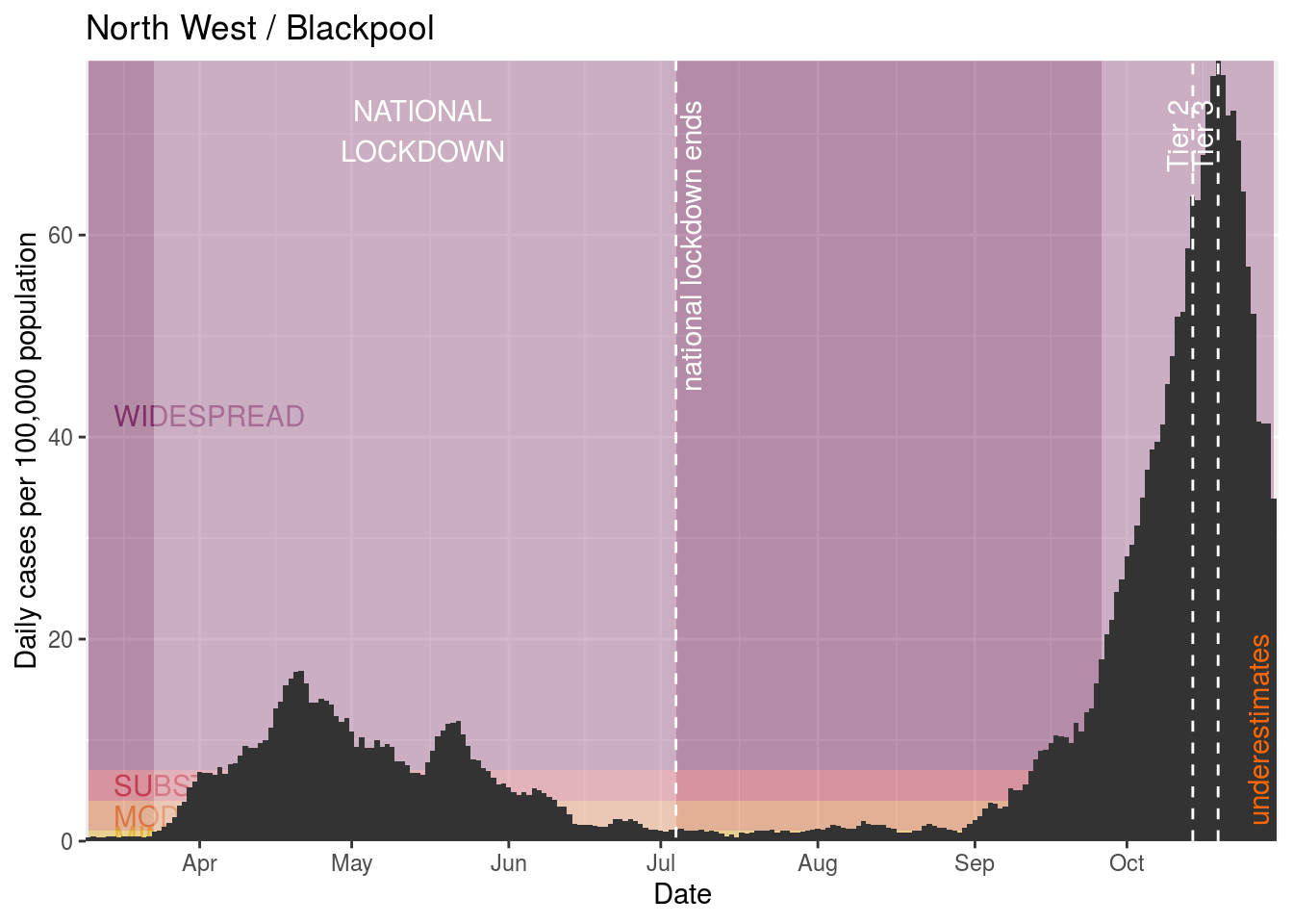
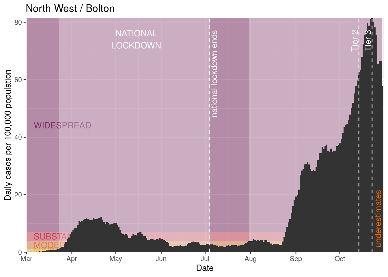
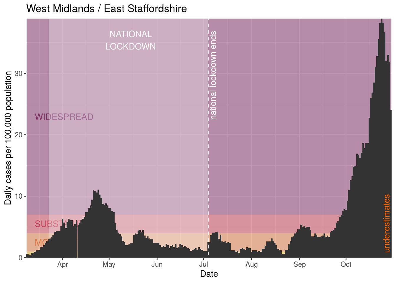
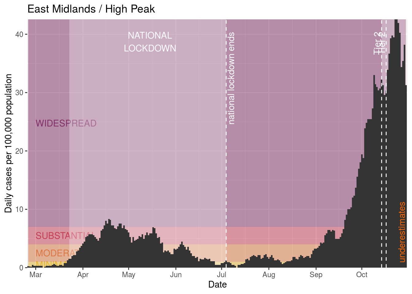
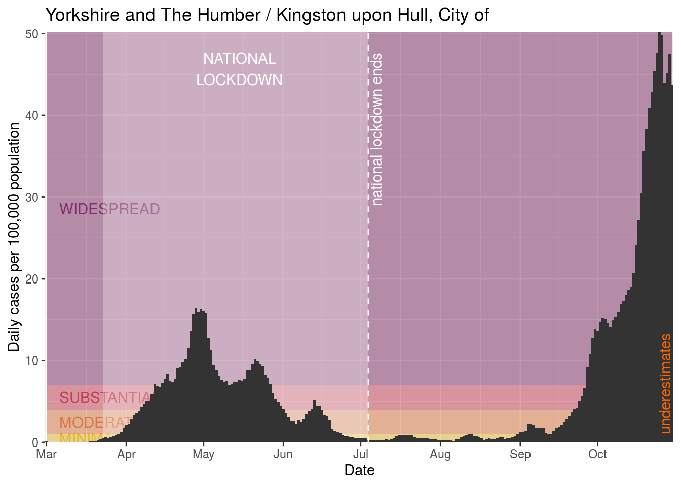
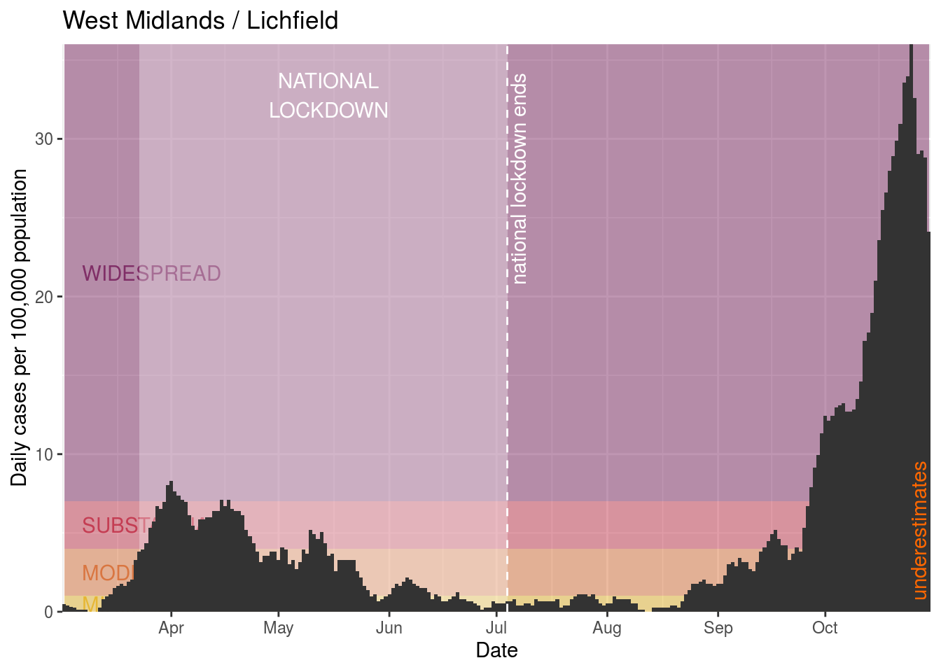
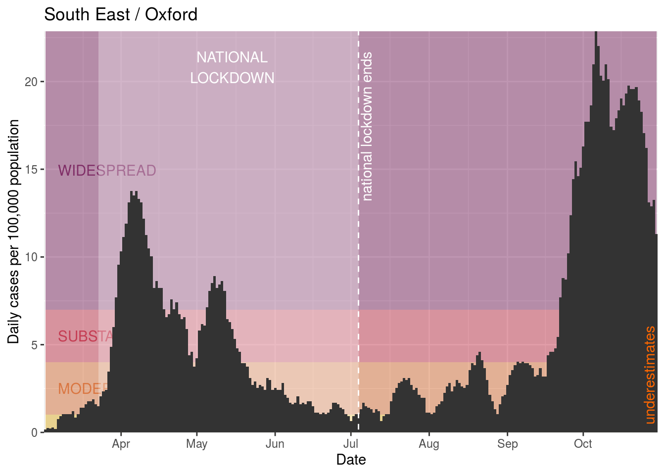
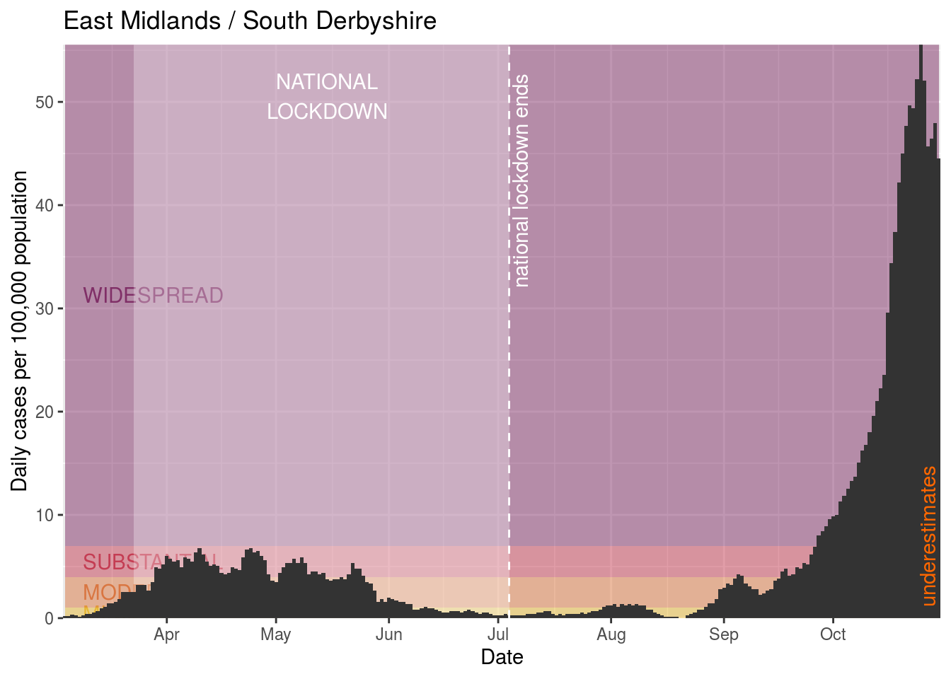
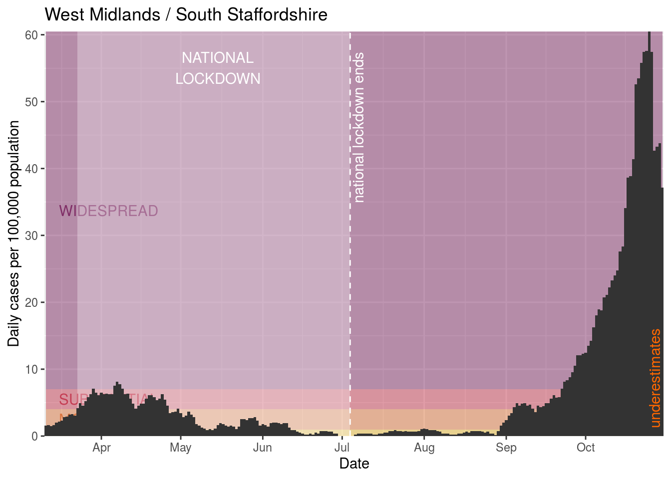
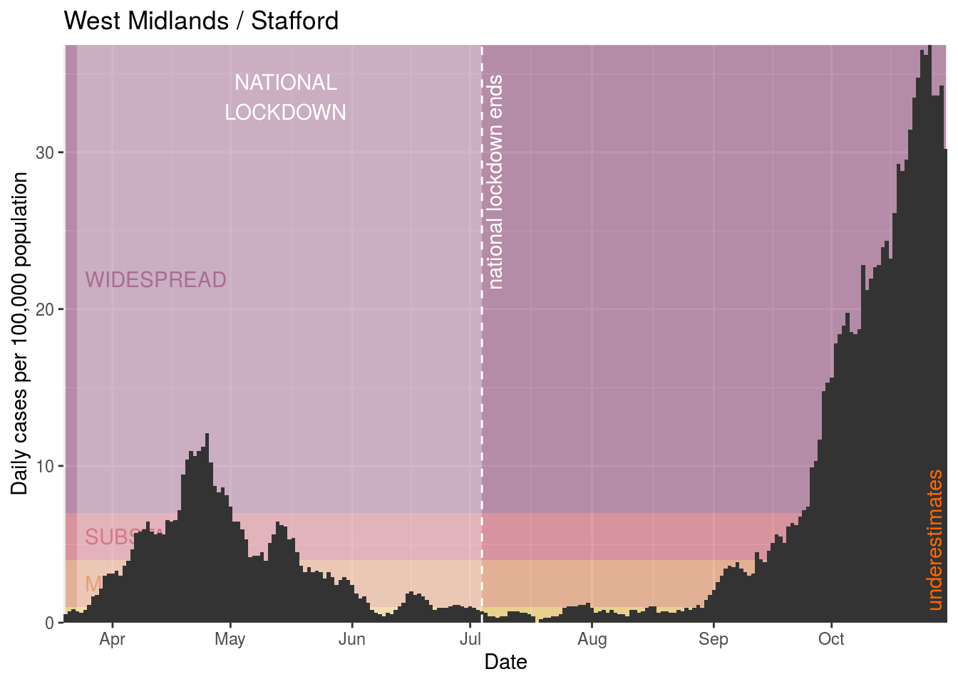
First, we’ll have a look at what’s going on in the areas where there are or have been government lockdowns. These are listed in the restrictions table. We can cycle through them - here we’re sorting the areas based on the tier of the restriction, then by name - to take a look at what’s happening there.
Interesting areas to look at here are:
- Northampton, where there was a local outbreak in the Greencore factories. The data shows a big spike in the middle of August, probably due to extensive local testing around those outbreaks.
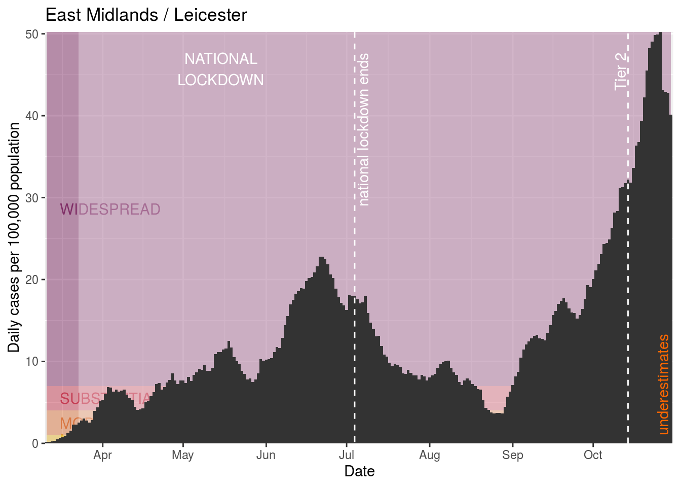
- Leicester, which shows a peak during June, when the majority of the rest of the country had come out the other side of the first wave.
- Areas like Bolton and Salford, which were in a local lockdown from the beginning of August - probably because of their physical proximity to Manchester - despite their rate of infection being relatively low, but where case numbers have escalated significantly during this local lockdown, in the second half of August.
Current restrictions
Tier 3 restrictions
Current Tier 3 restrictions
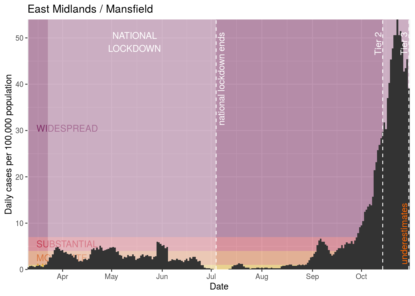
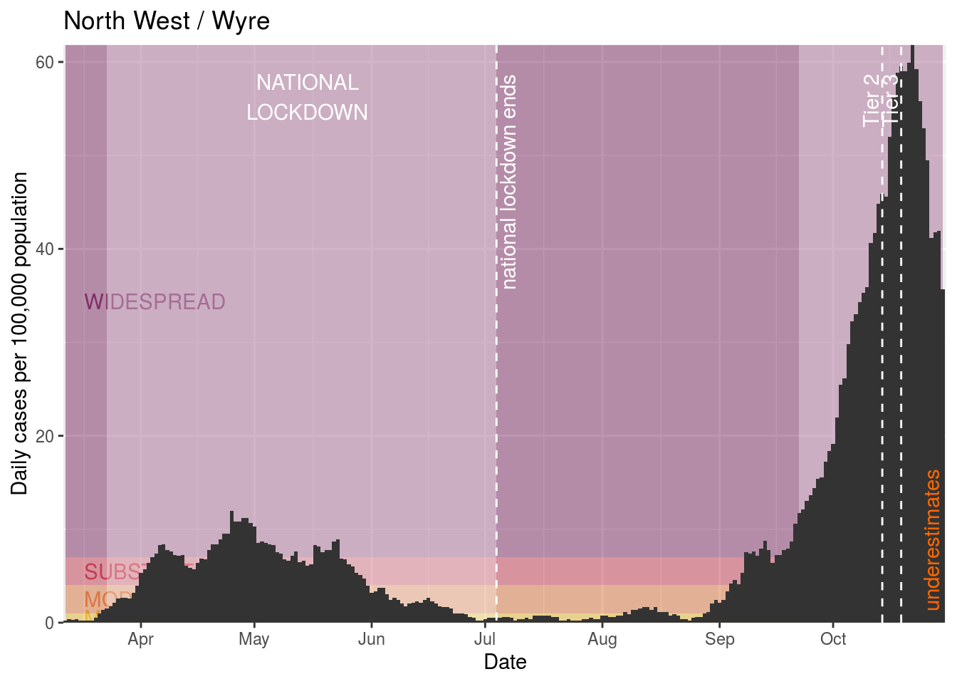
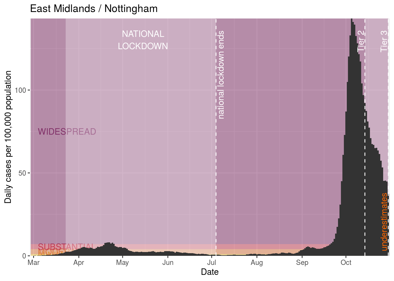
Ashfield

Barnsley

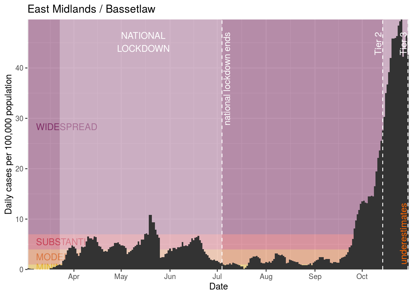
Bassetlaw

Blackburn with Darwen
Blackpool
Bolton
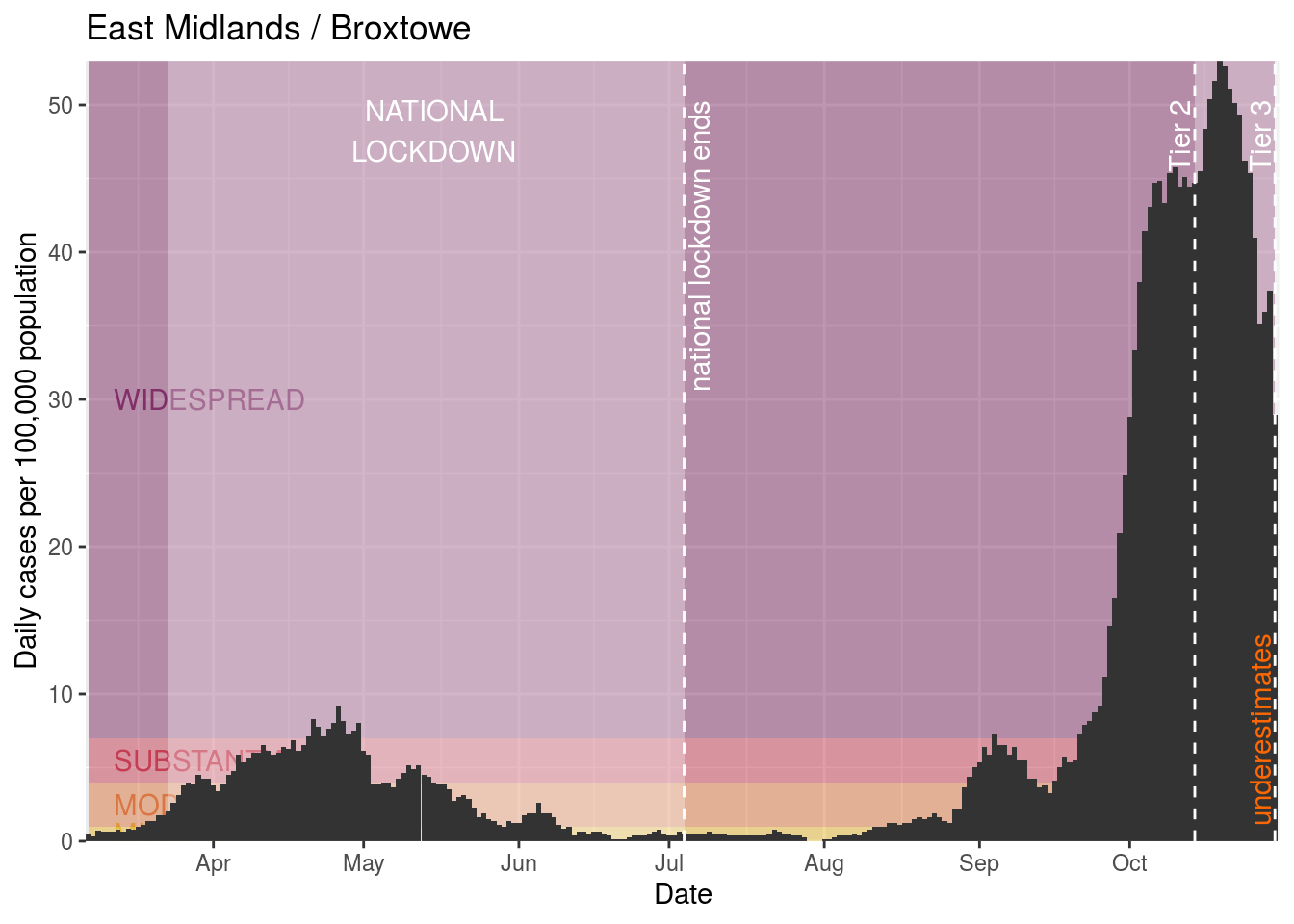
Broxtowe
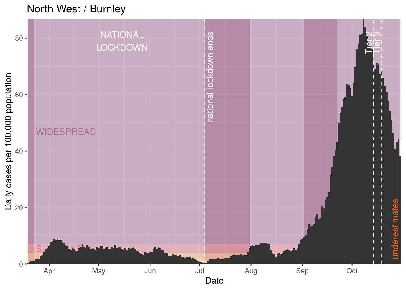
Burnley
Bury
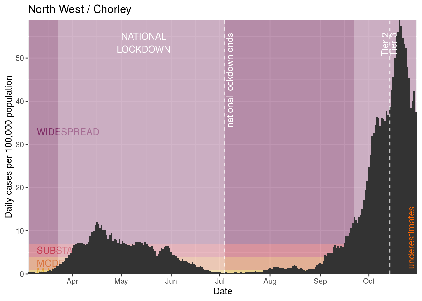
Chorley
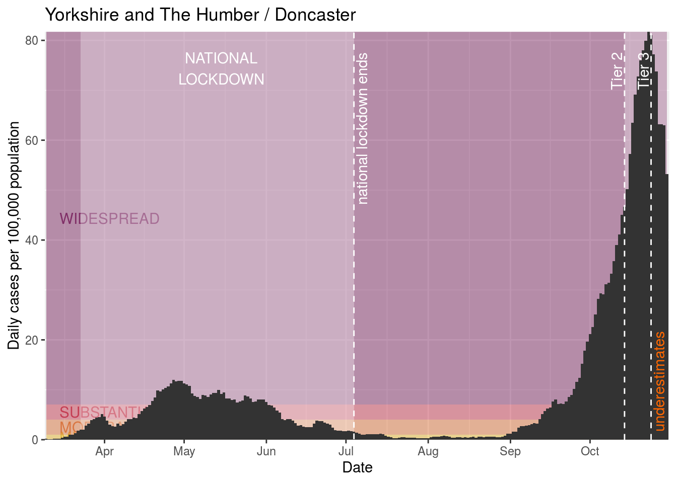
Doncaster
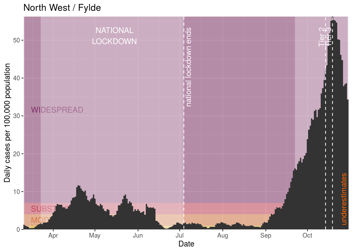
Fylde
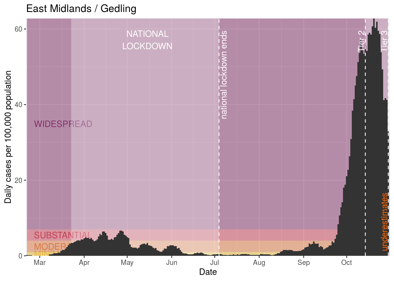
Gedling

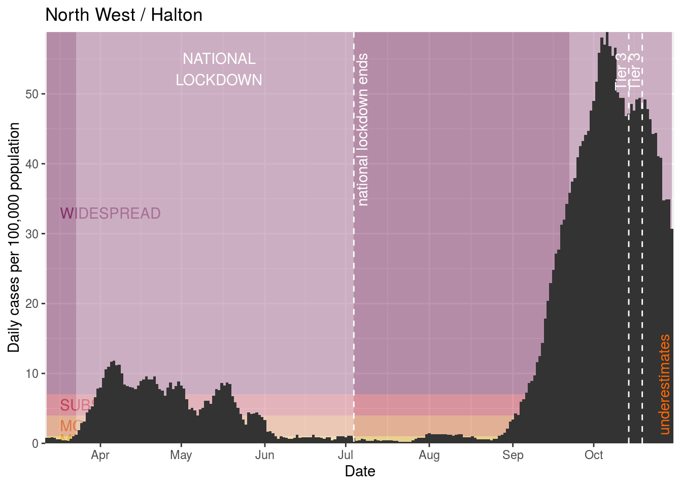
Halton
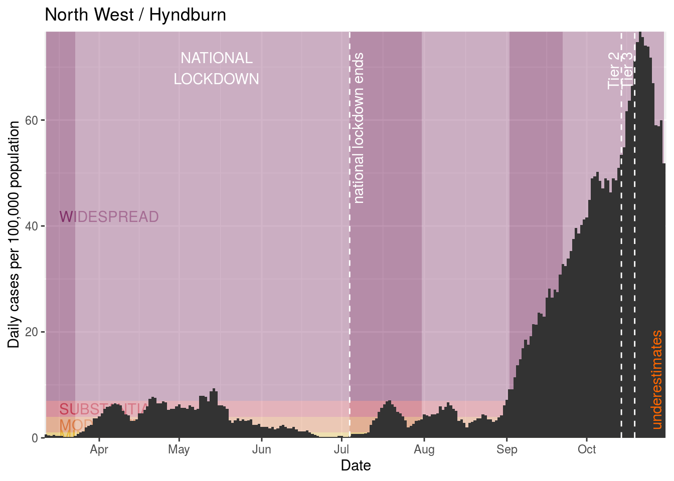
Hyndburn
Knowsley
Lancaster
Liverpool
Manchester
Mansfield
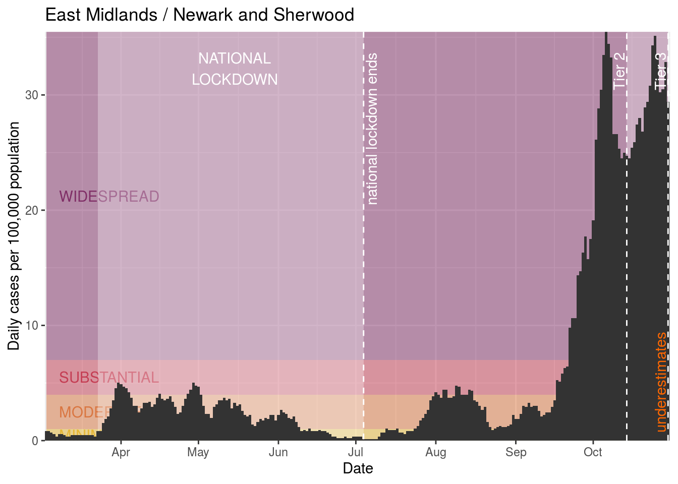
Newark and Sherwood
Nottingham

Oldham

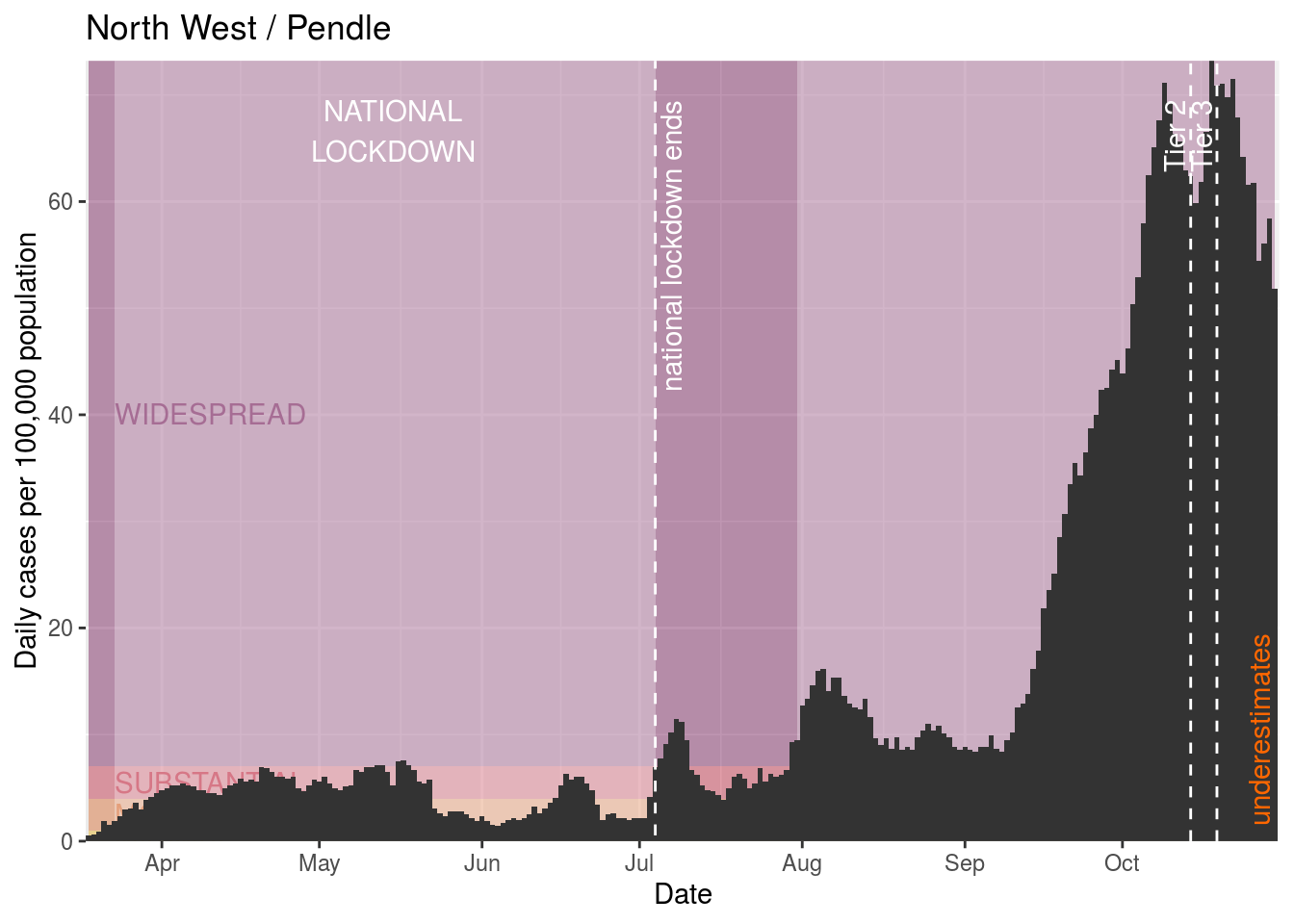
Pendle
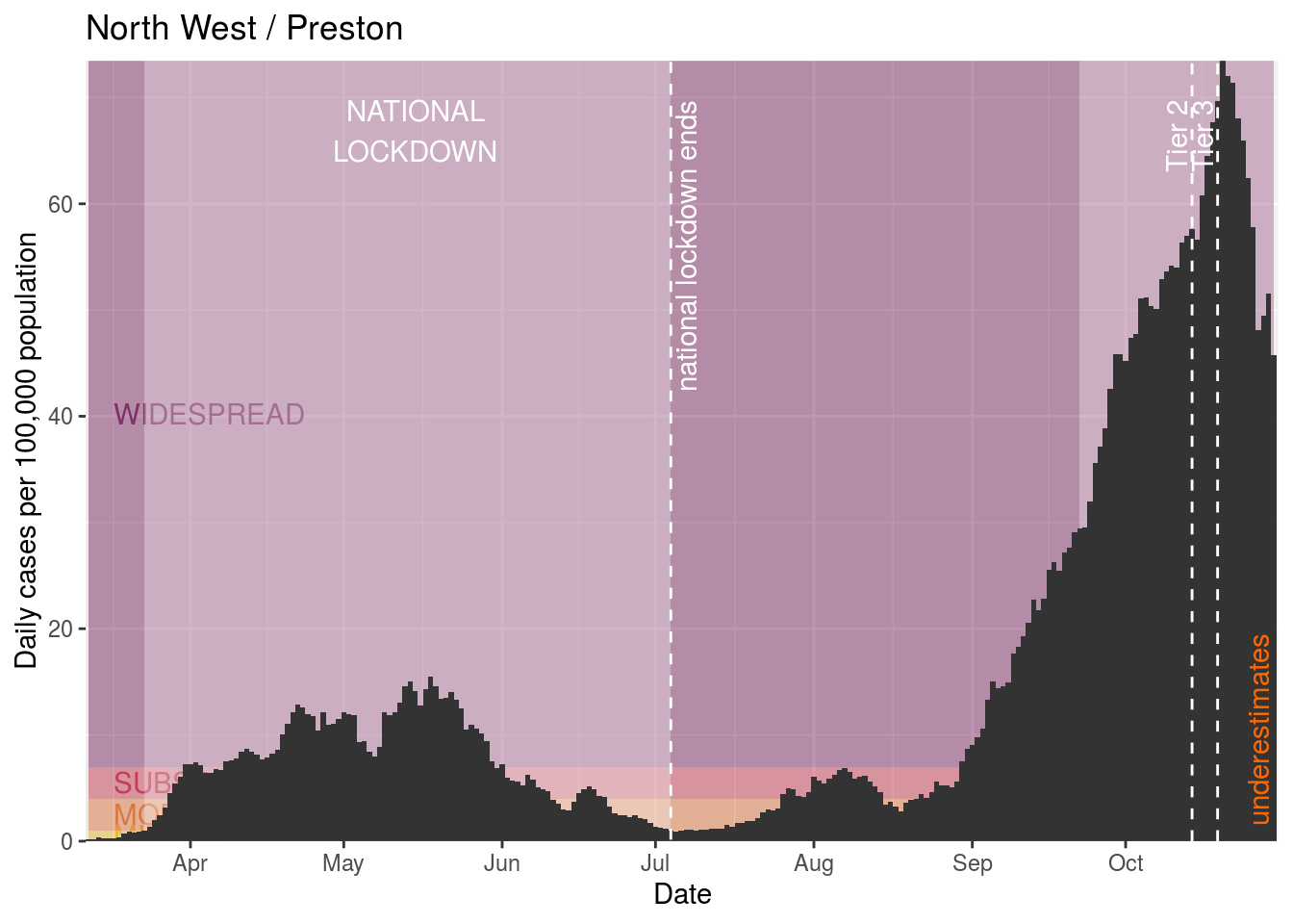
Preston
Ribble Valley
Rochdale
Rossendale
Rotherham
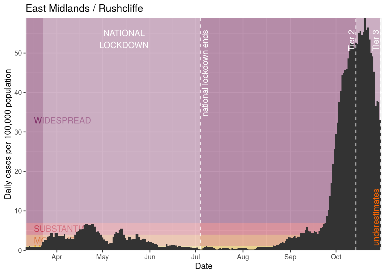
Rushcliffe

Salford

Sefton

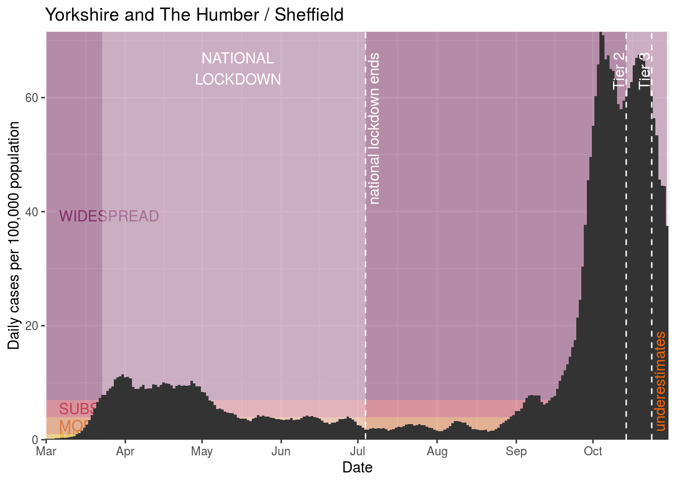
Sheffield

South Ribble
St. Helens
Stockport
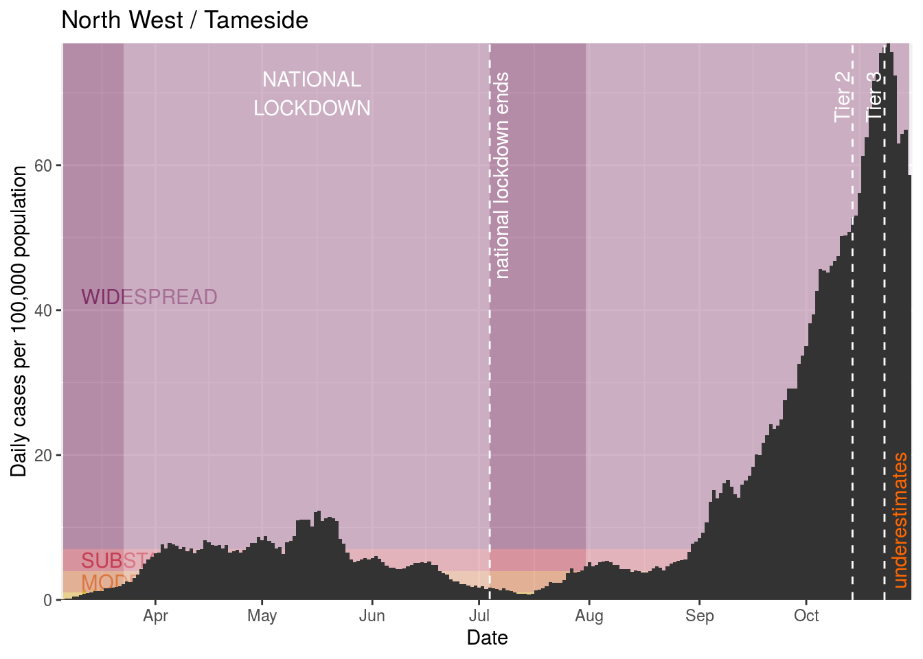
Tameside

Trafford
Warrington
West Lancashire
Wigan
Wirral
Wyre
Upcoming Tier 3 restrictions
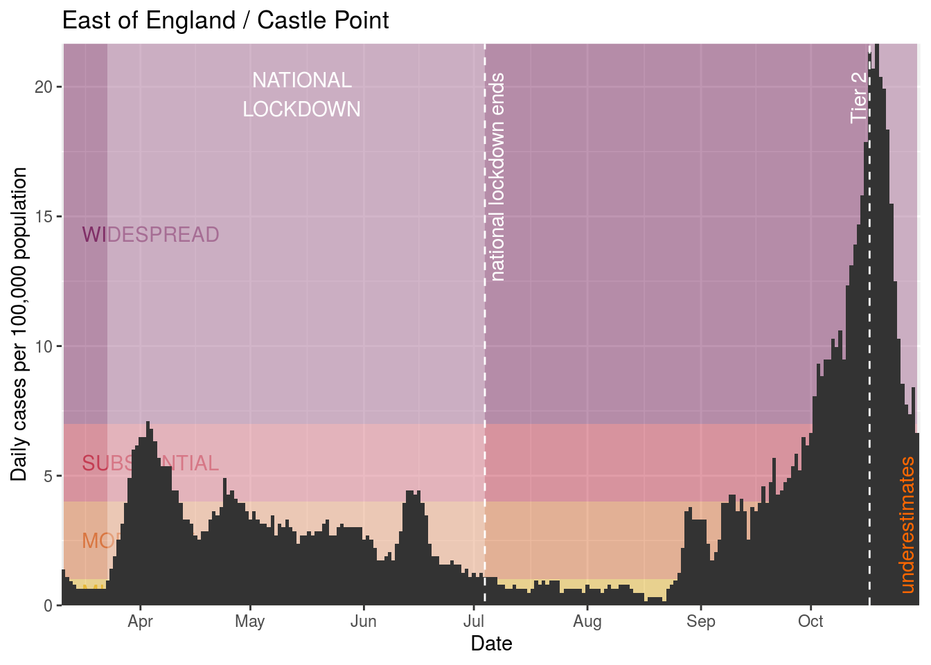
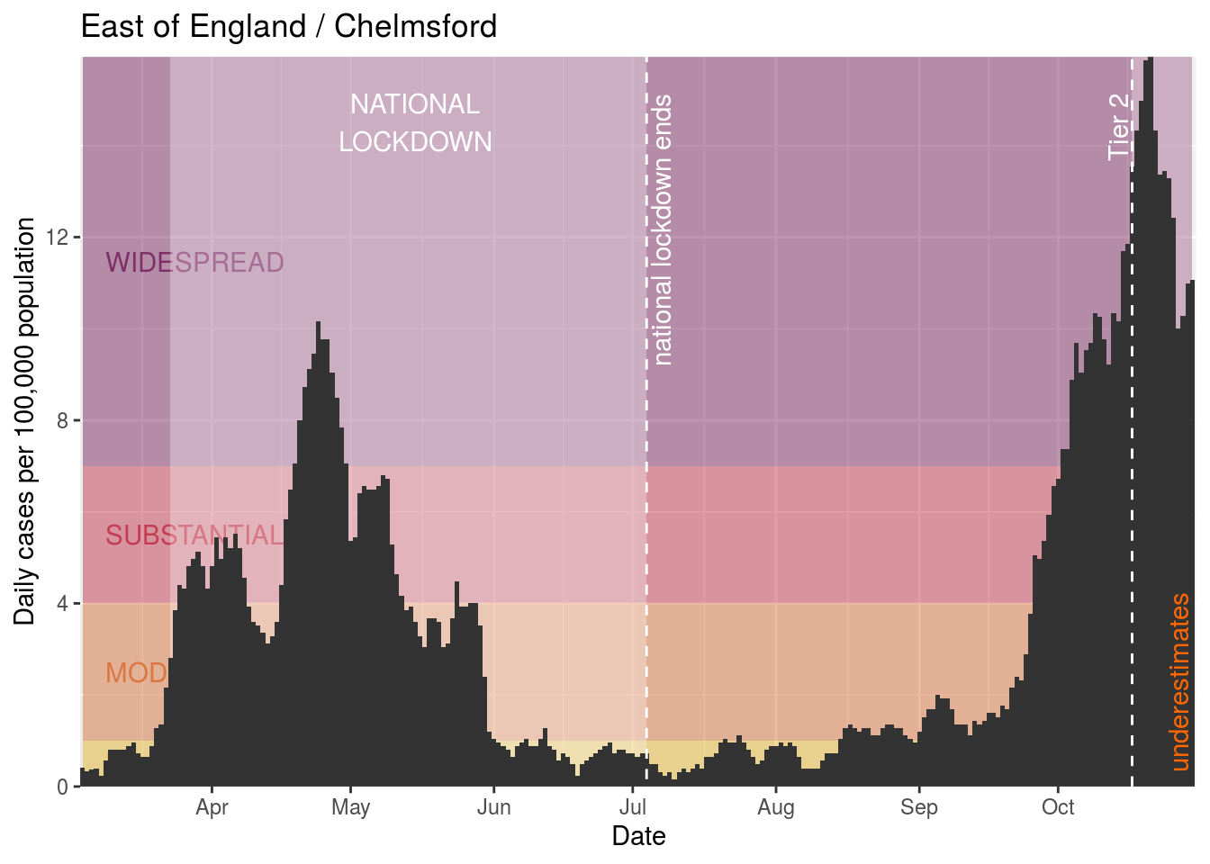
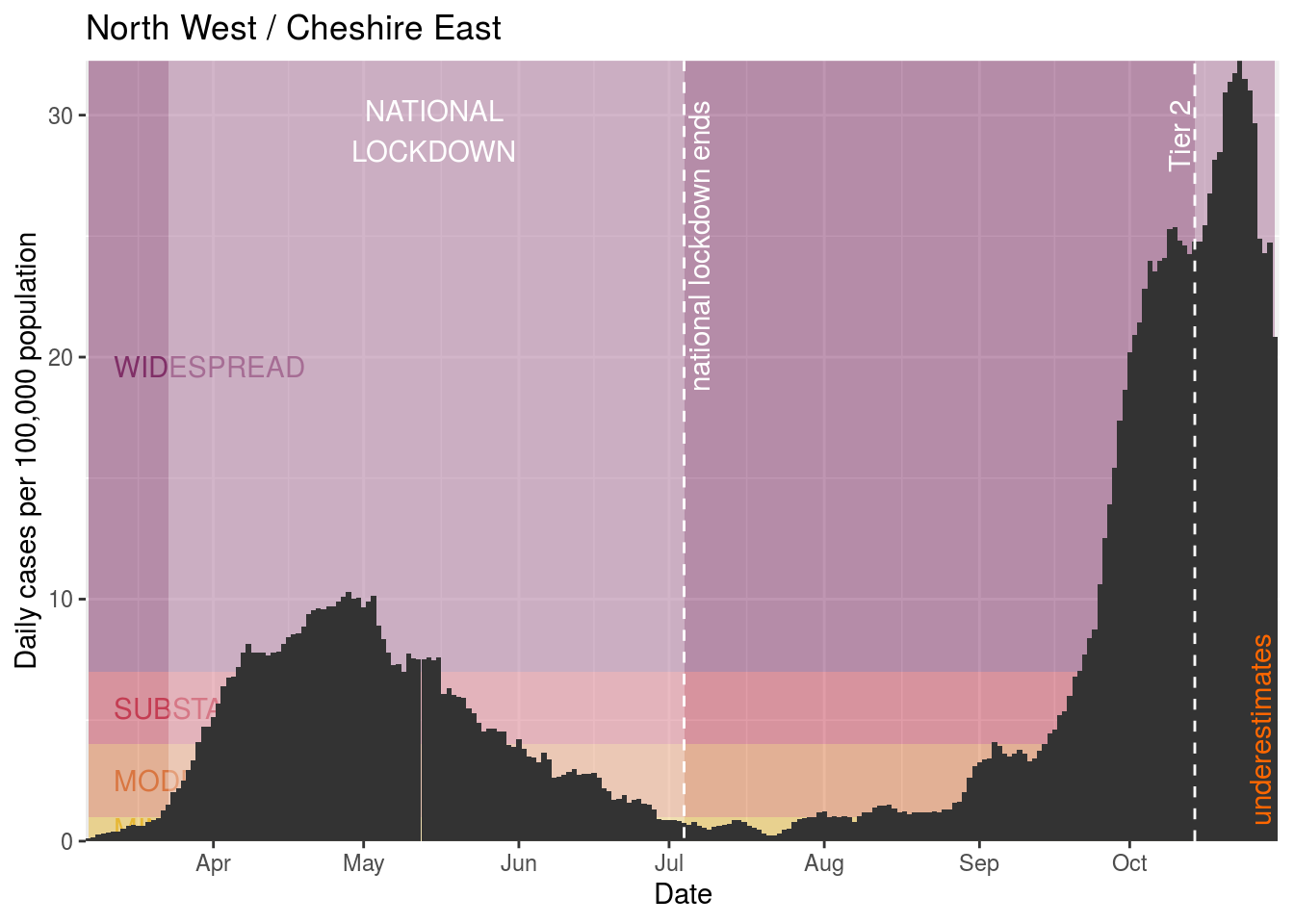
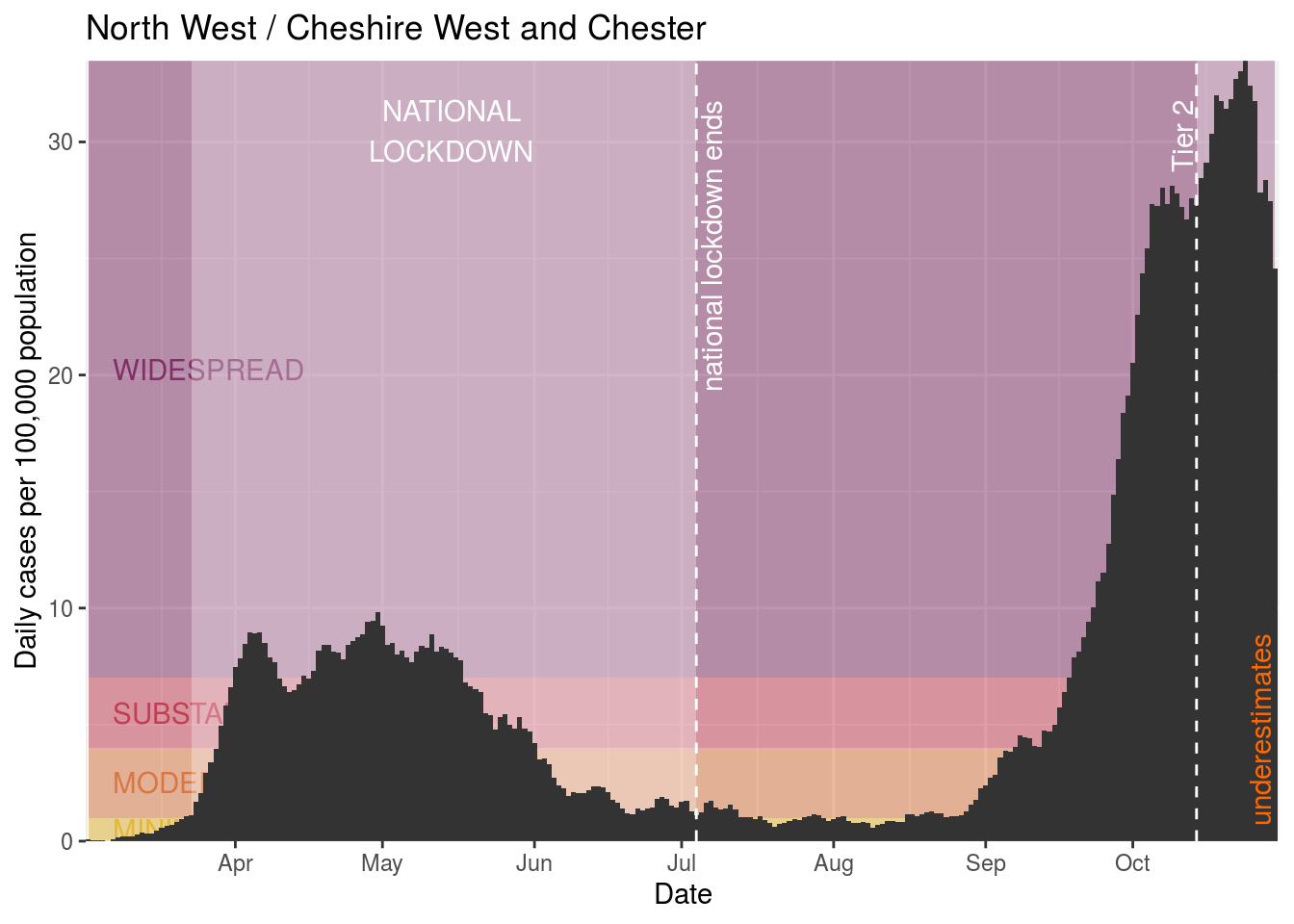
Tier 2 restrictions
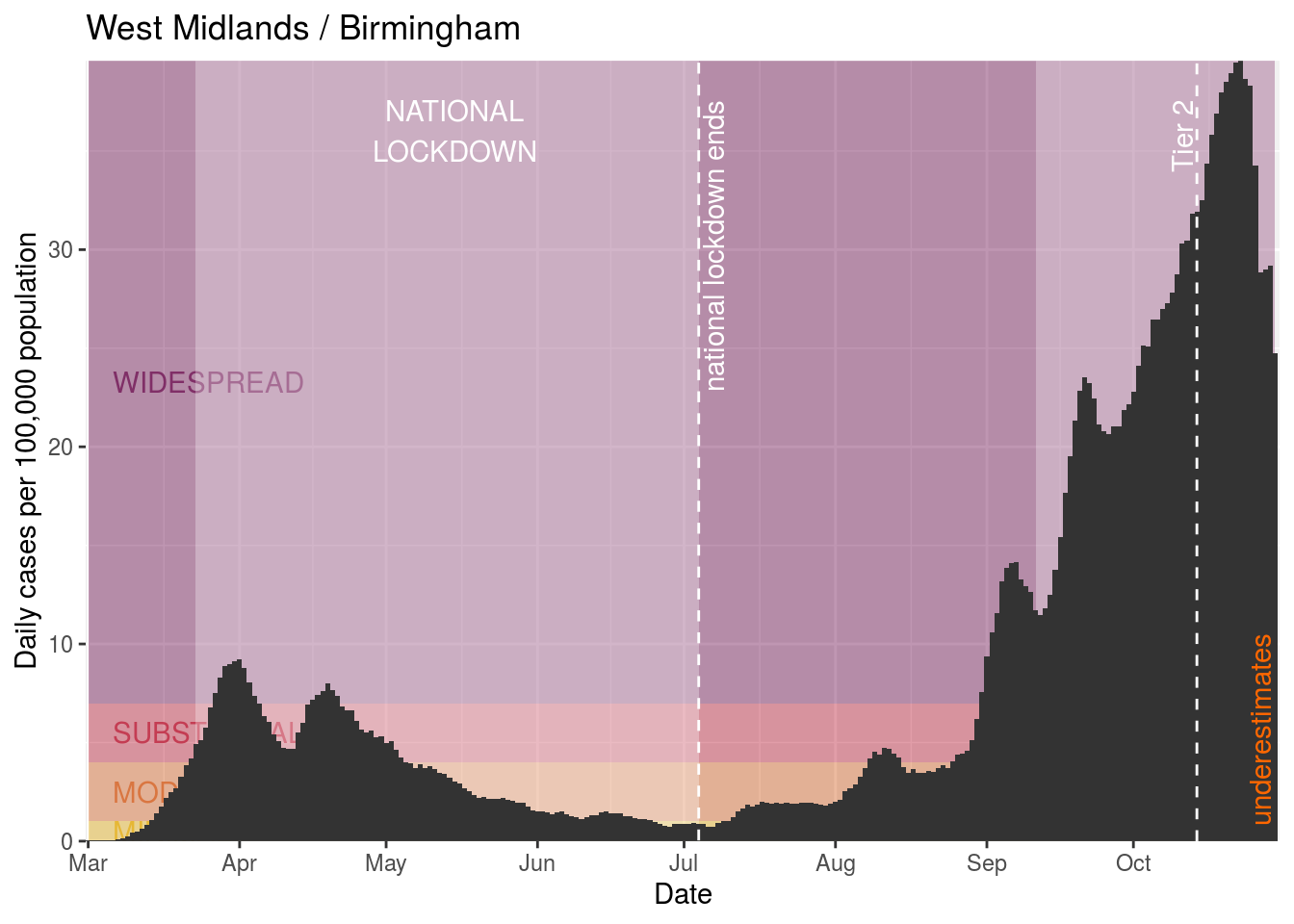
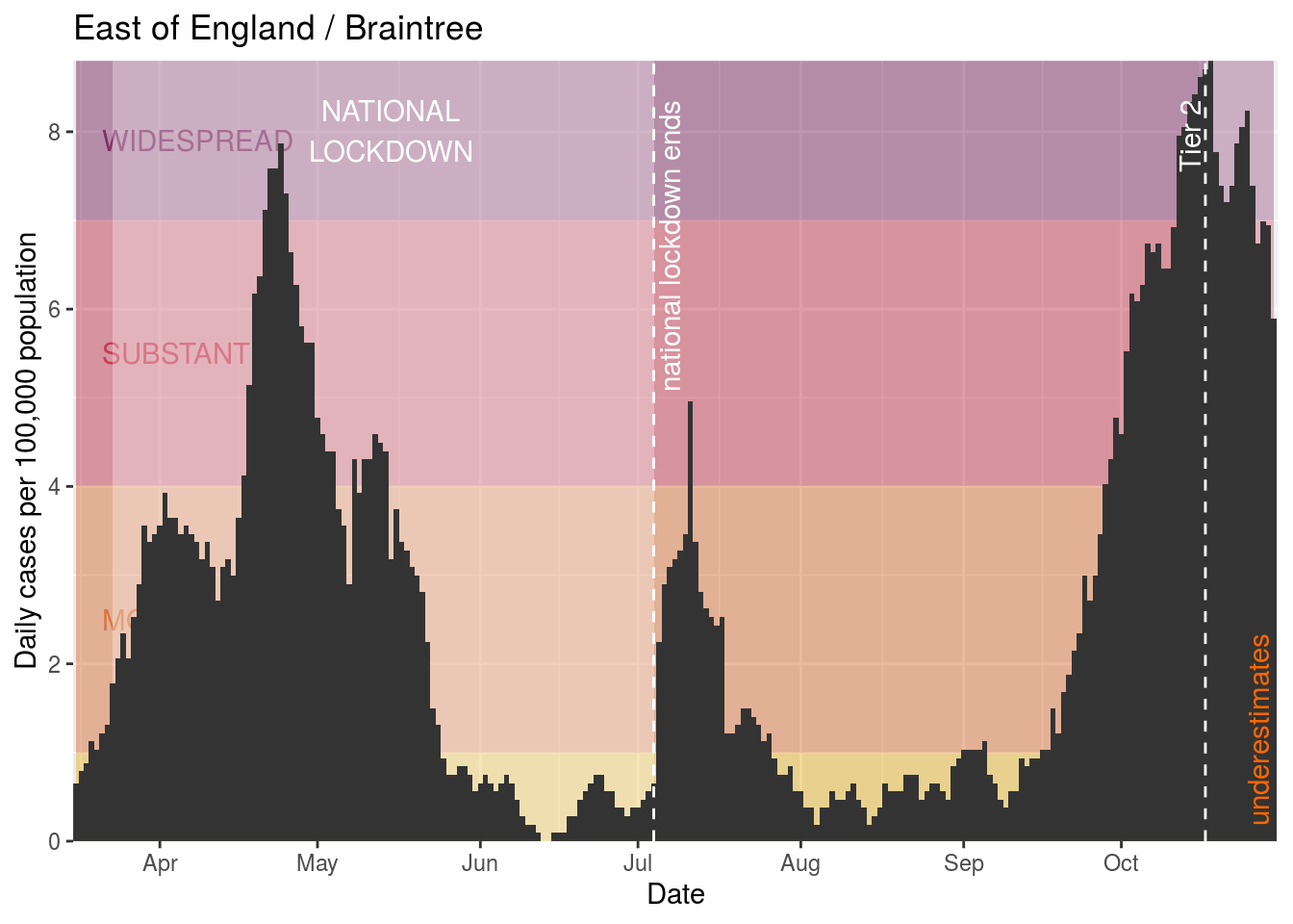
Current Tier 2 restrictions
Ashfield
Barking and Dagenham

Barnet

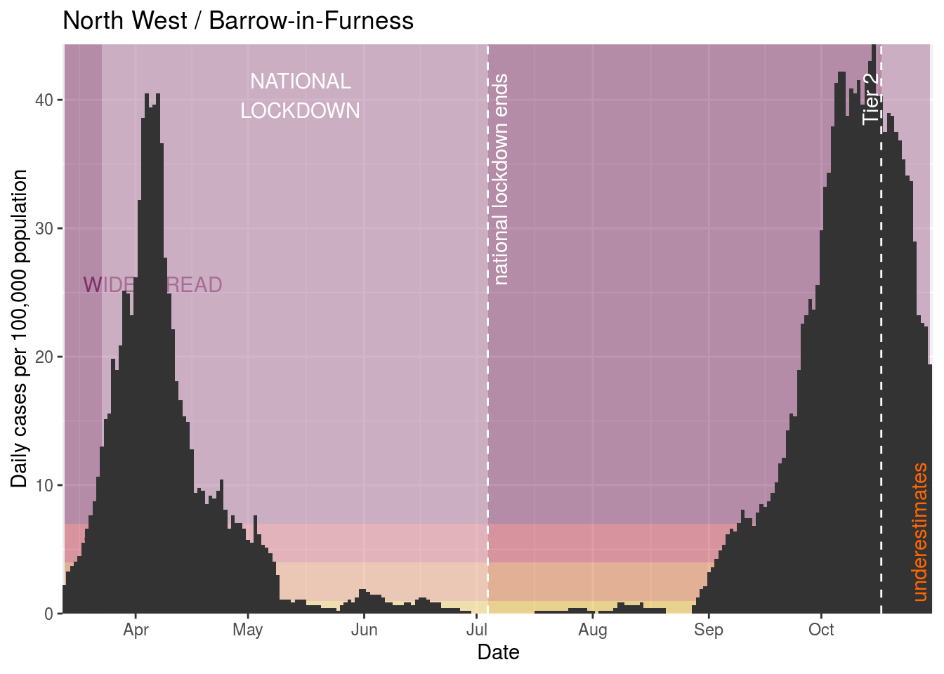
Barrow-in-Furness
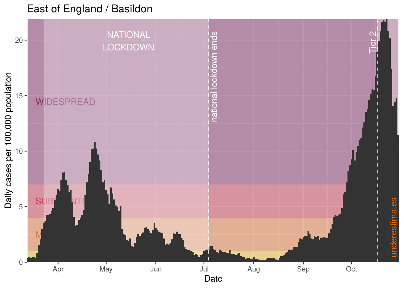
Basildon
Bassetlaw
Bexley

Birmingham
Bradford
Braintree
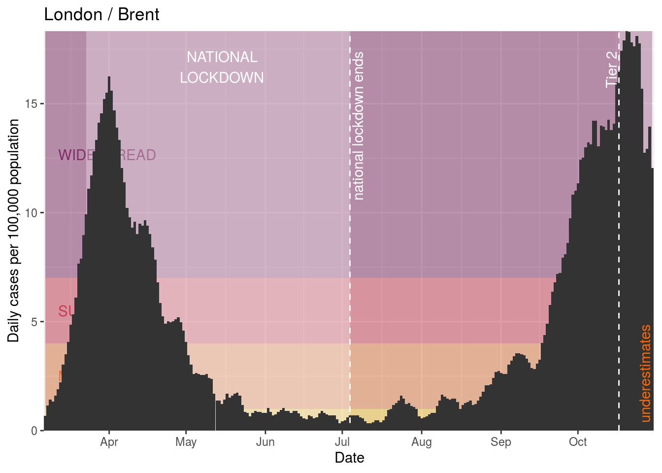
Brent
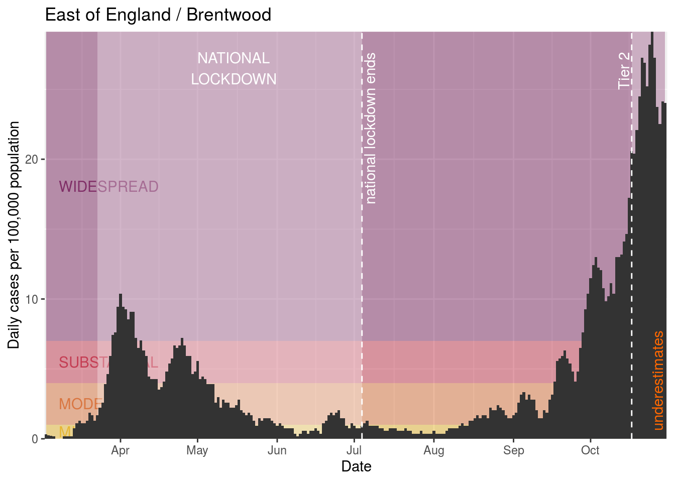
Brentwood
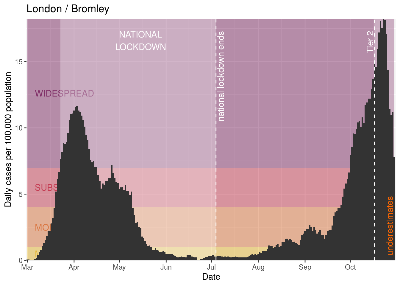
Bromley
Broxtowe

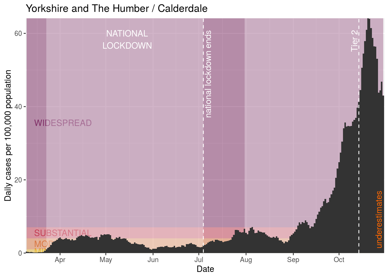
Calderdale
Camden

Castle Point
Chelmsford
Cheshire East
Cheshire West and Chester
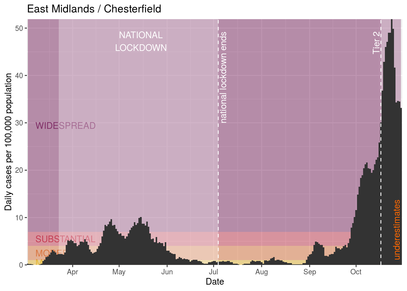
Chesterfield
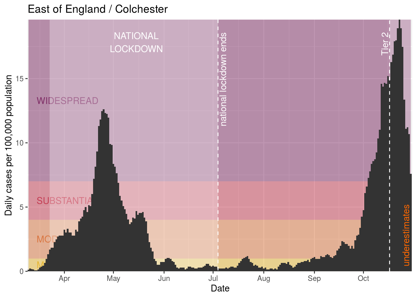
Colchester
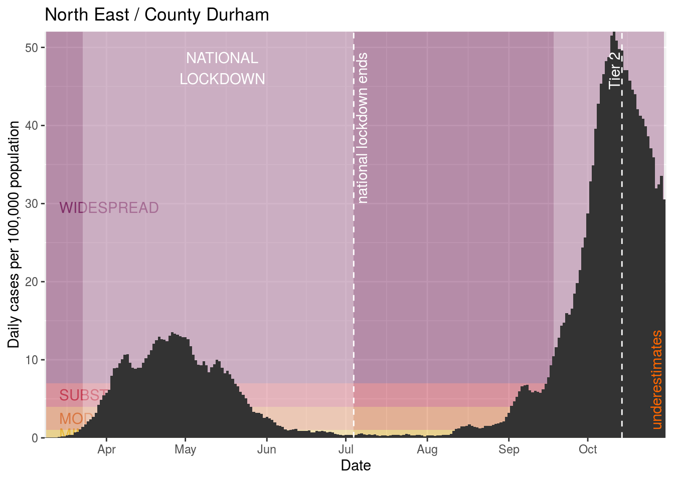
County Durham
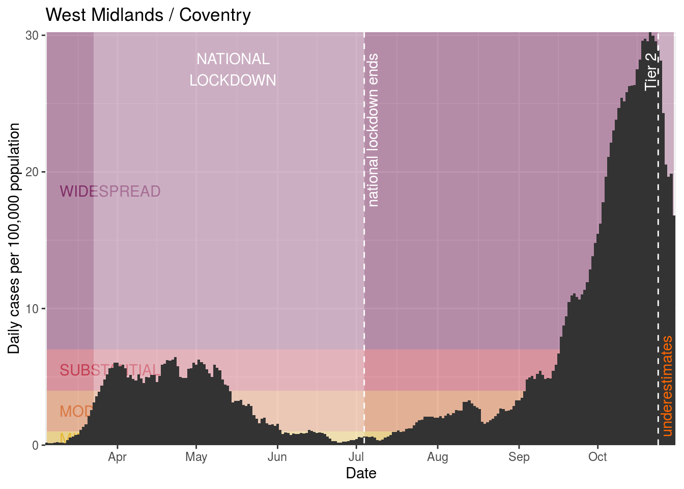
Coventry
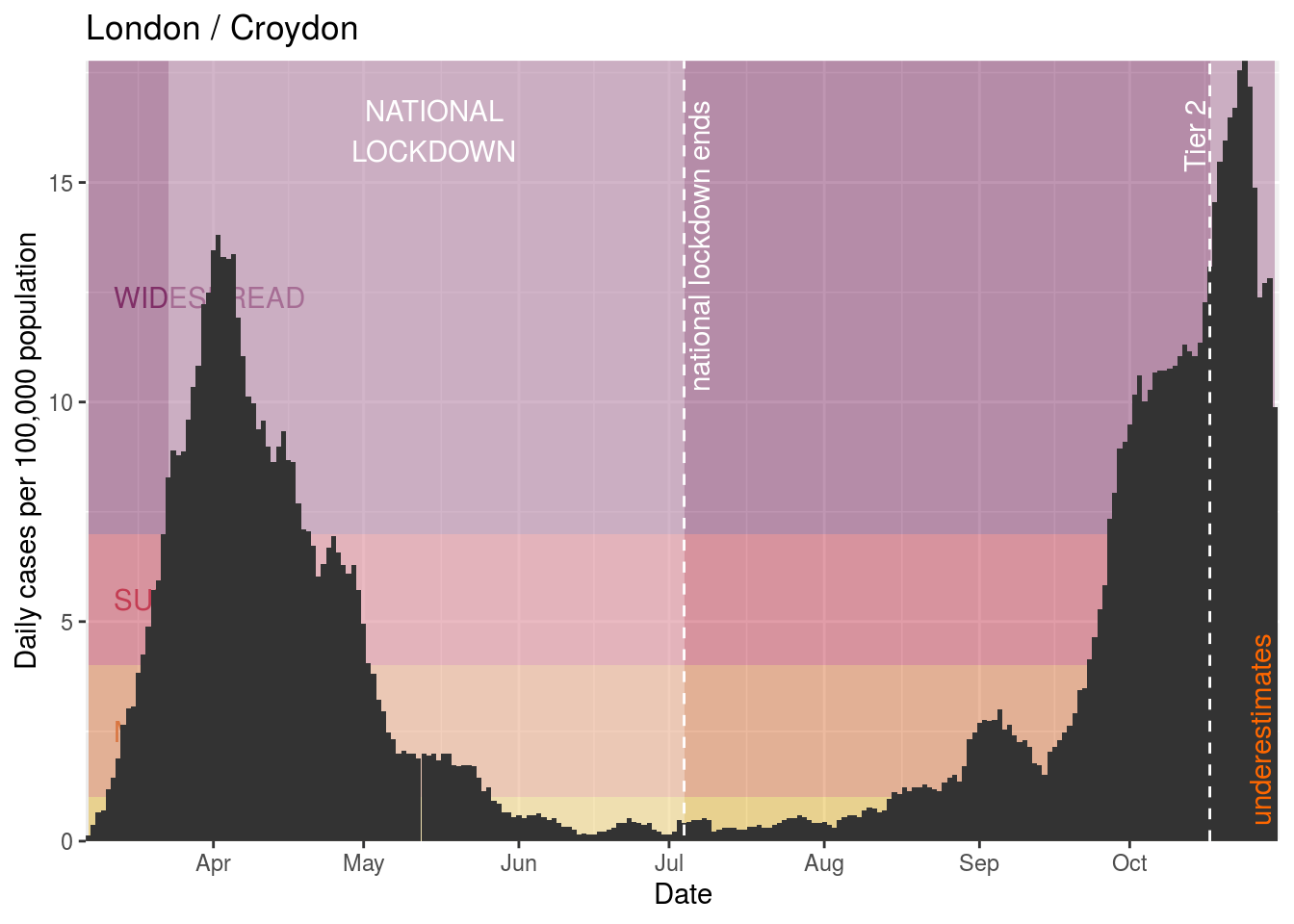
Croydon
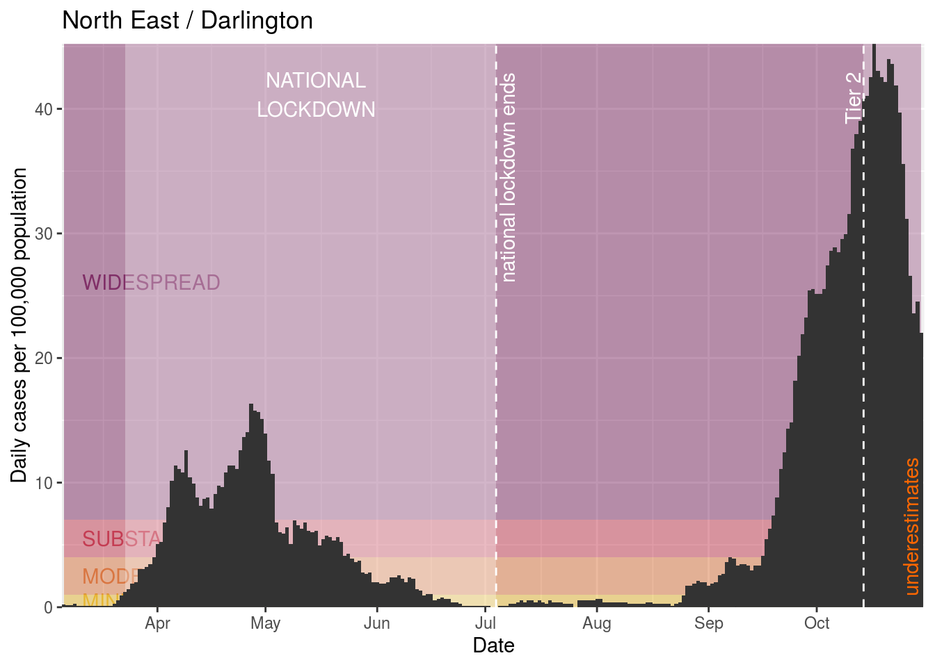
Darlington
Ealing

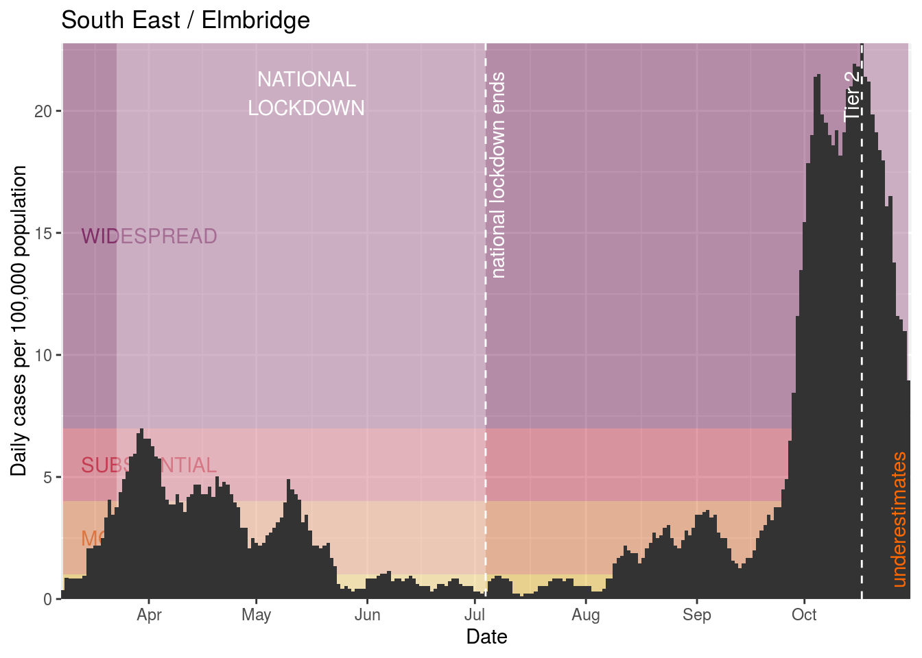
Elmbridge
Enfield

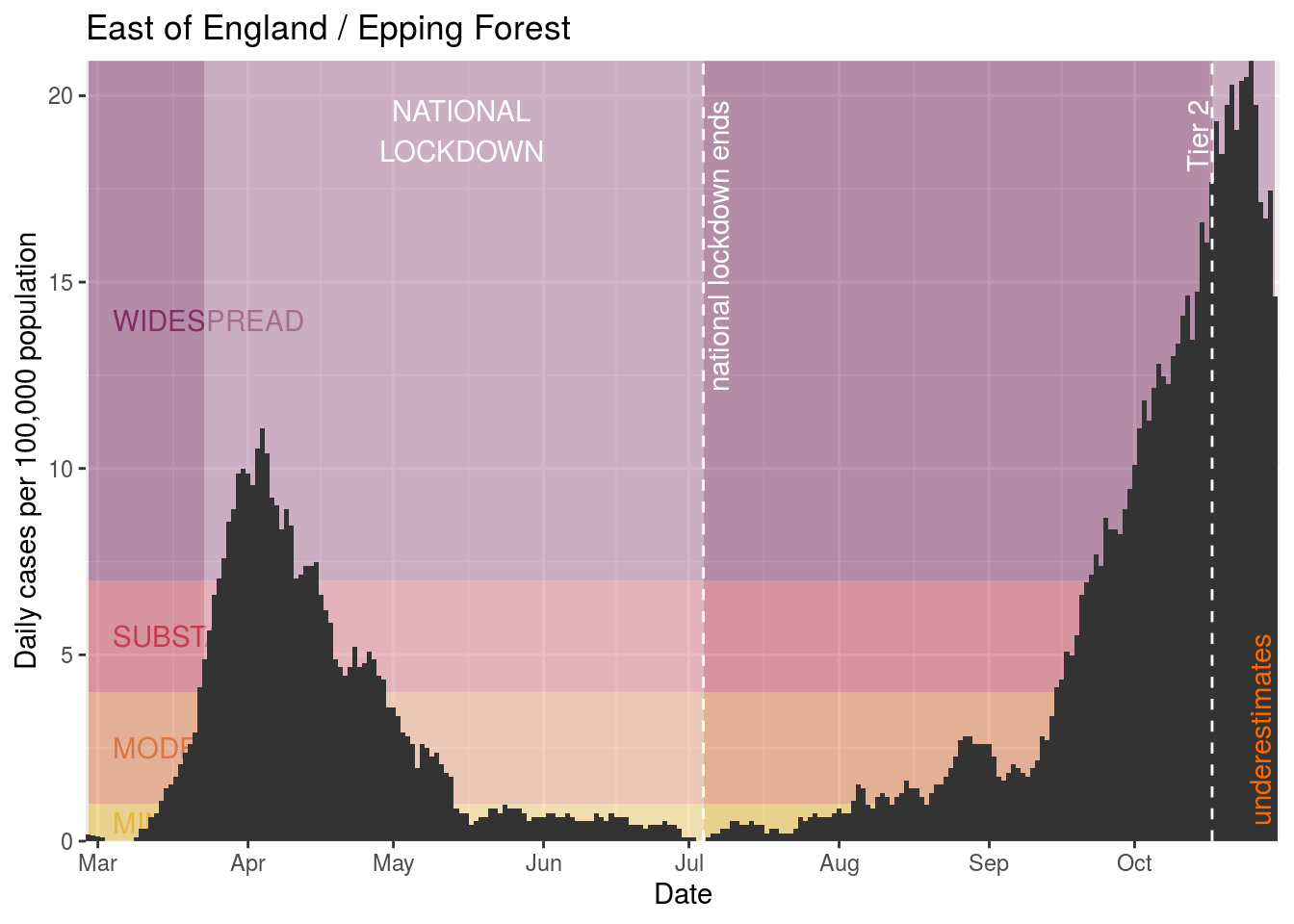
Epping Forest
Erewash

Gateshead
Gedling
Greenwich

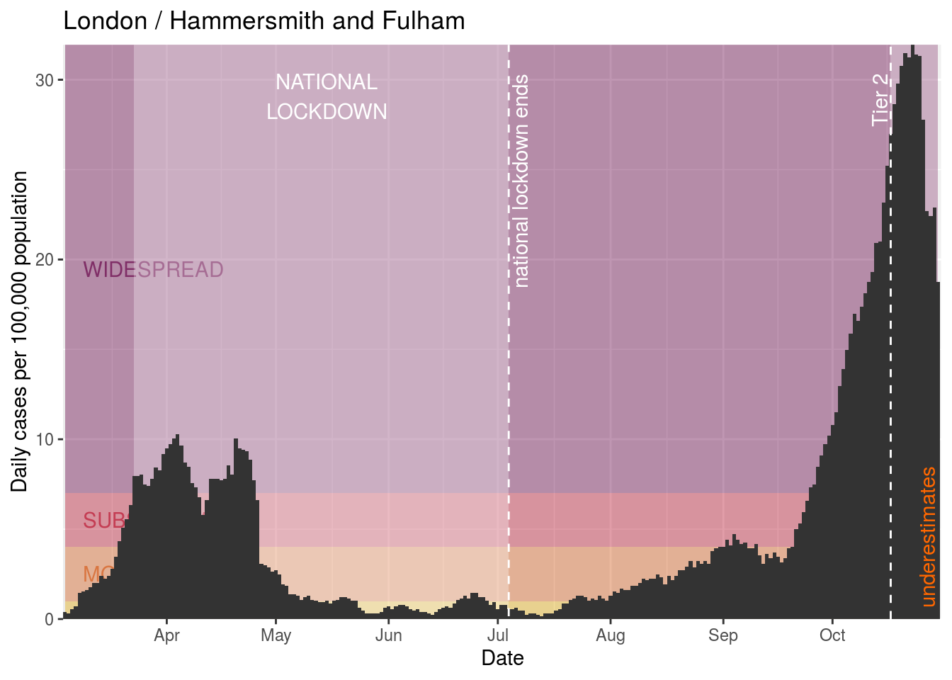
Hammersmith and Fulham
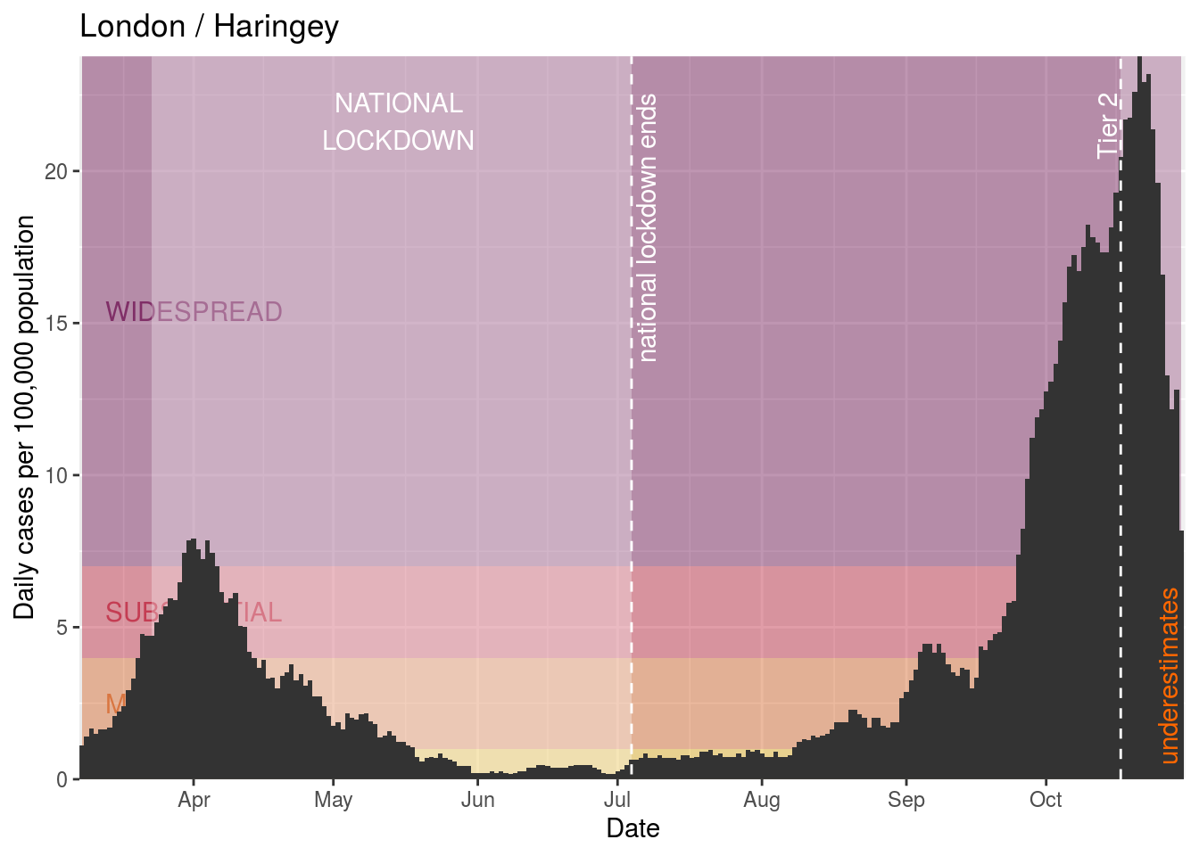
Haringey
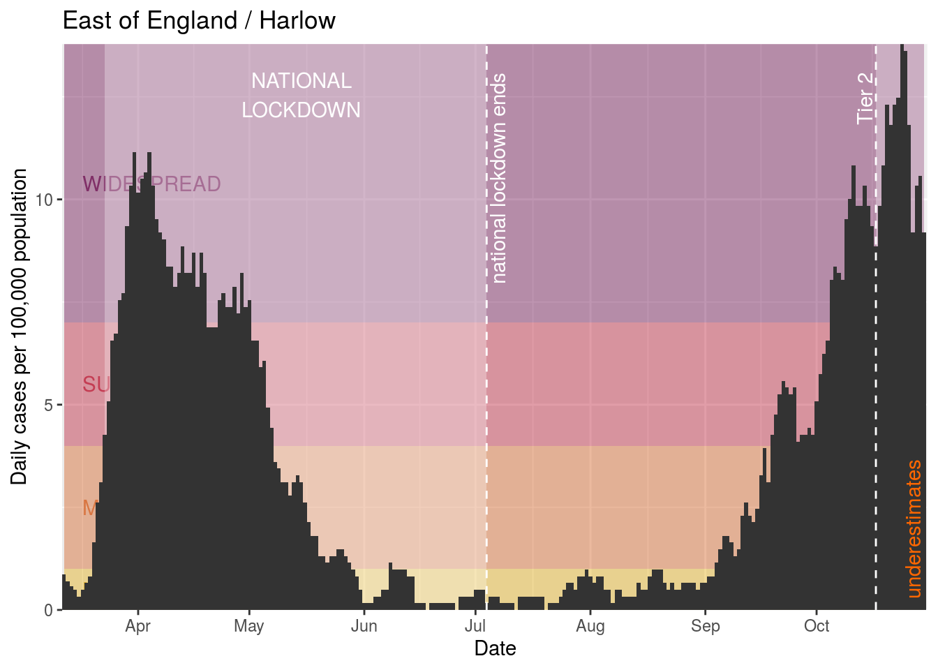
Harlow
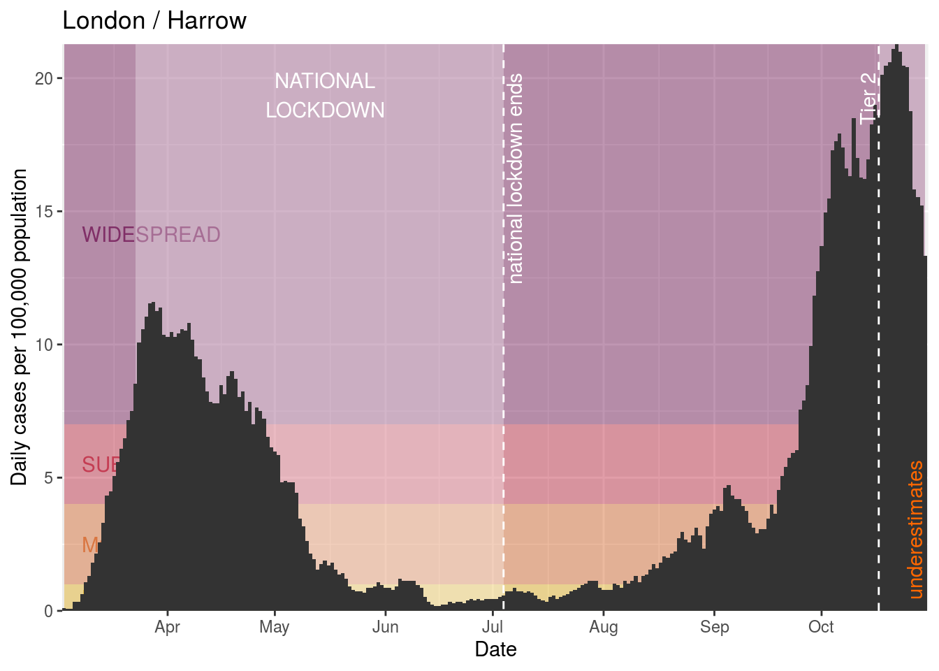
Harrow
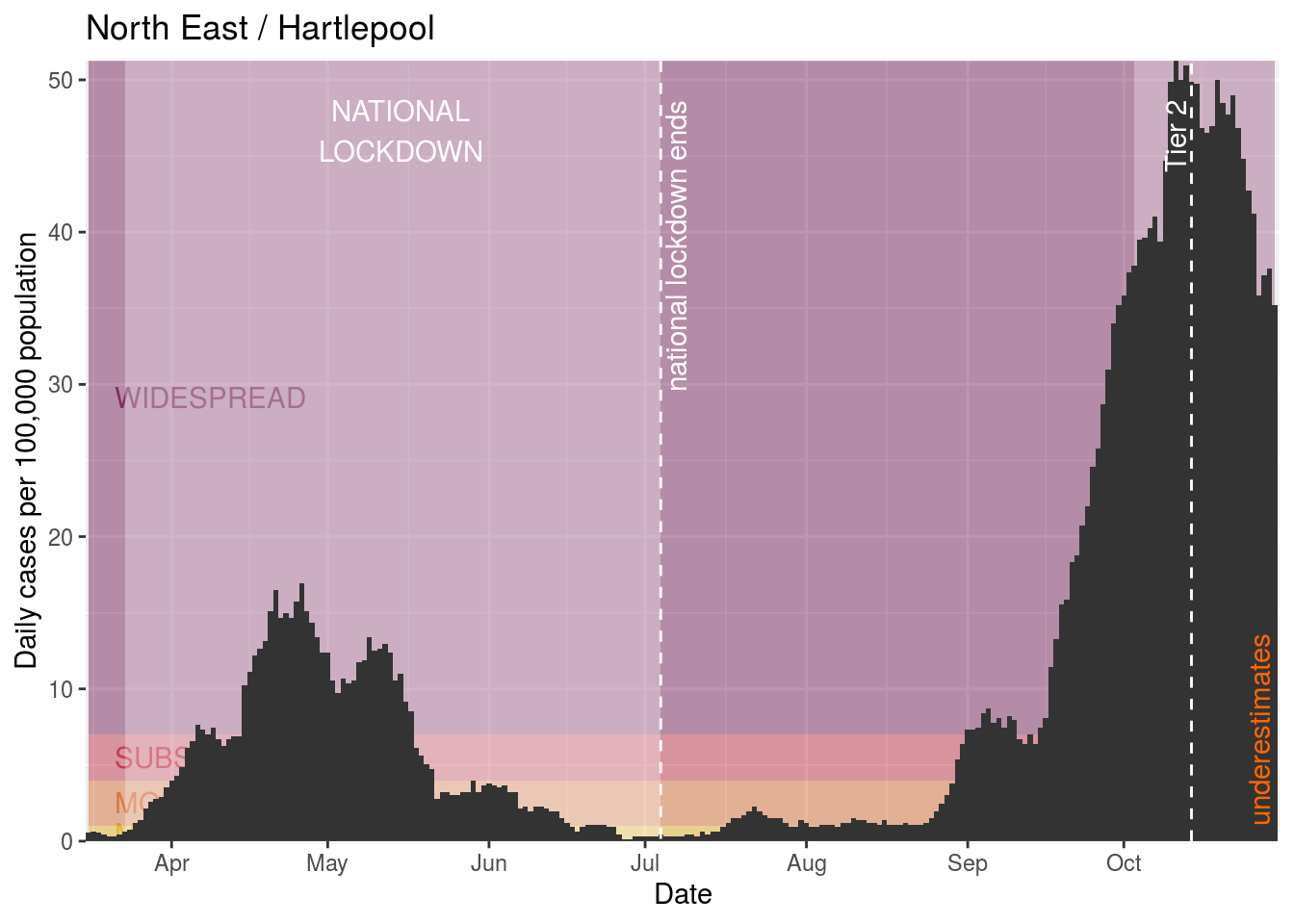
Hartlepool
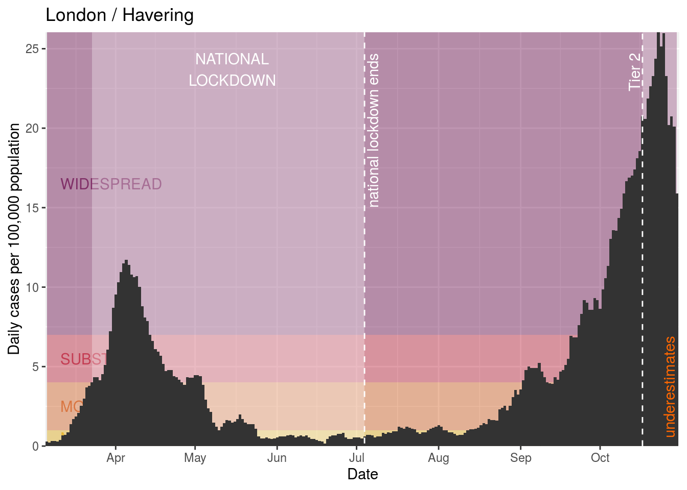
Havering
High Peak

Hillingdon

Hounslow

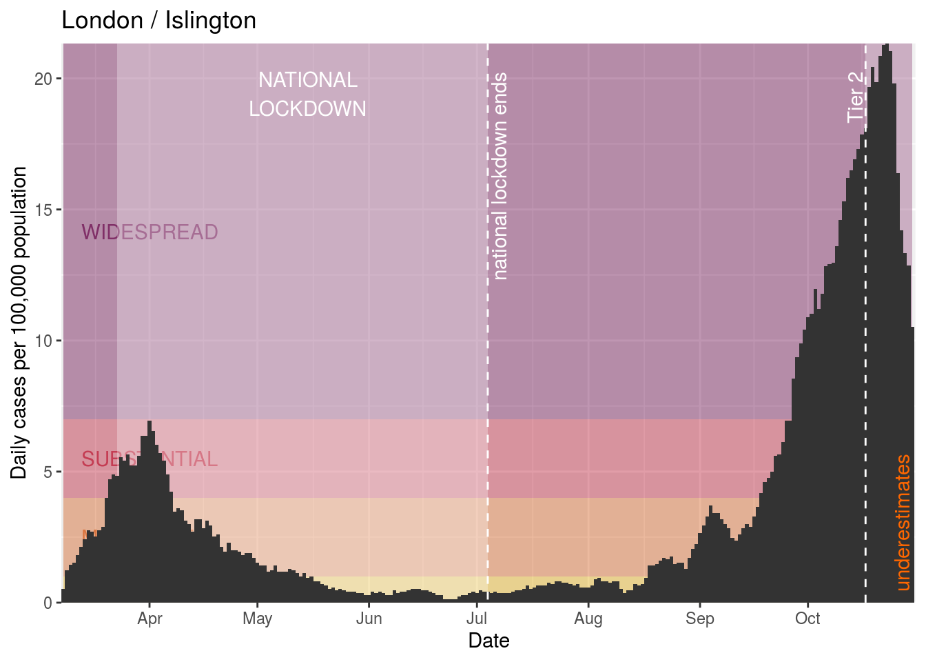
Islington
Kensington and Chelsea

Kingston upon Thames

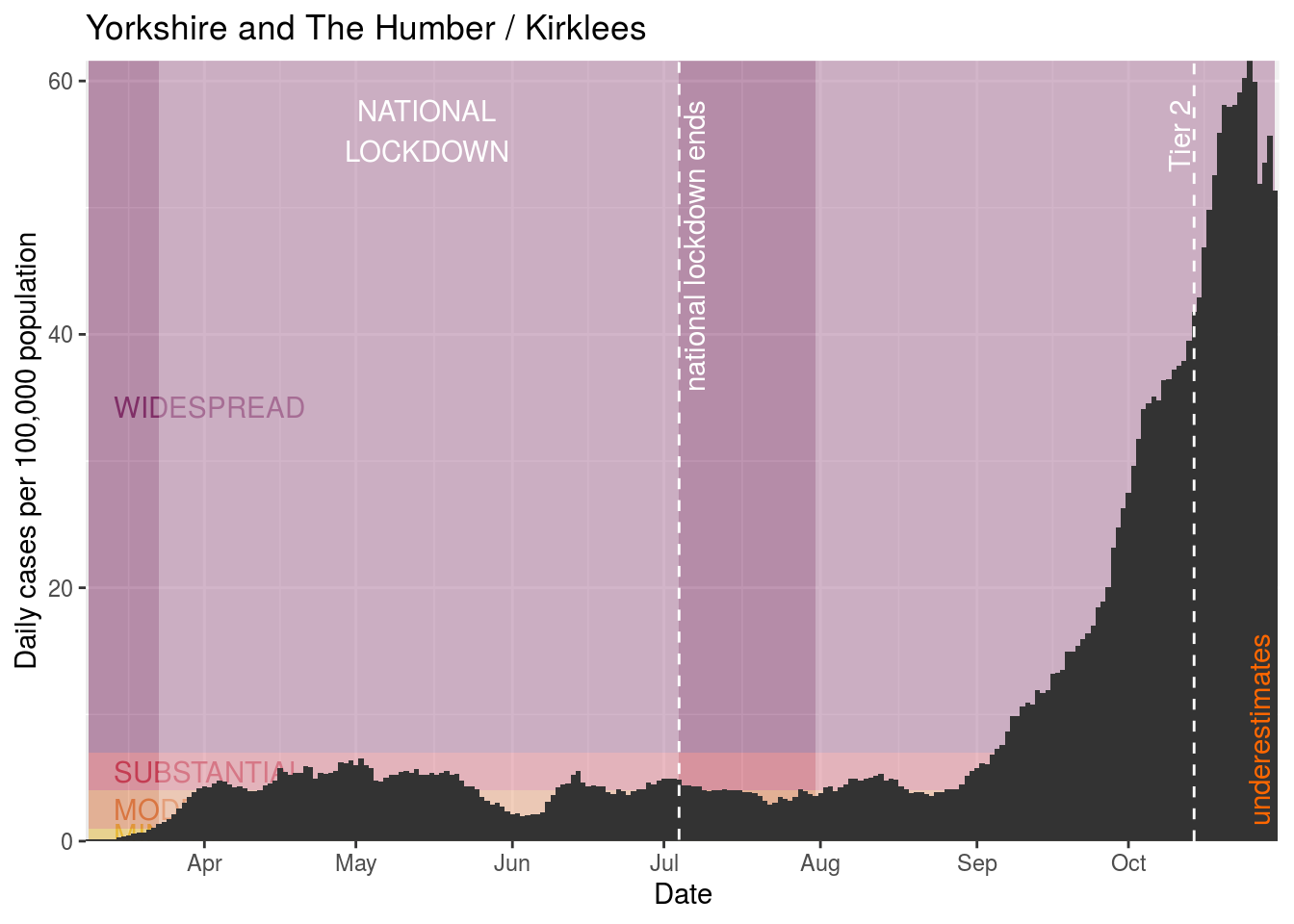
Kirklees
Lambeth

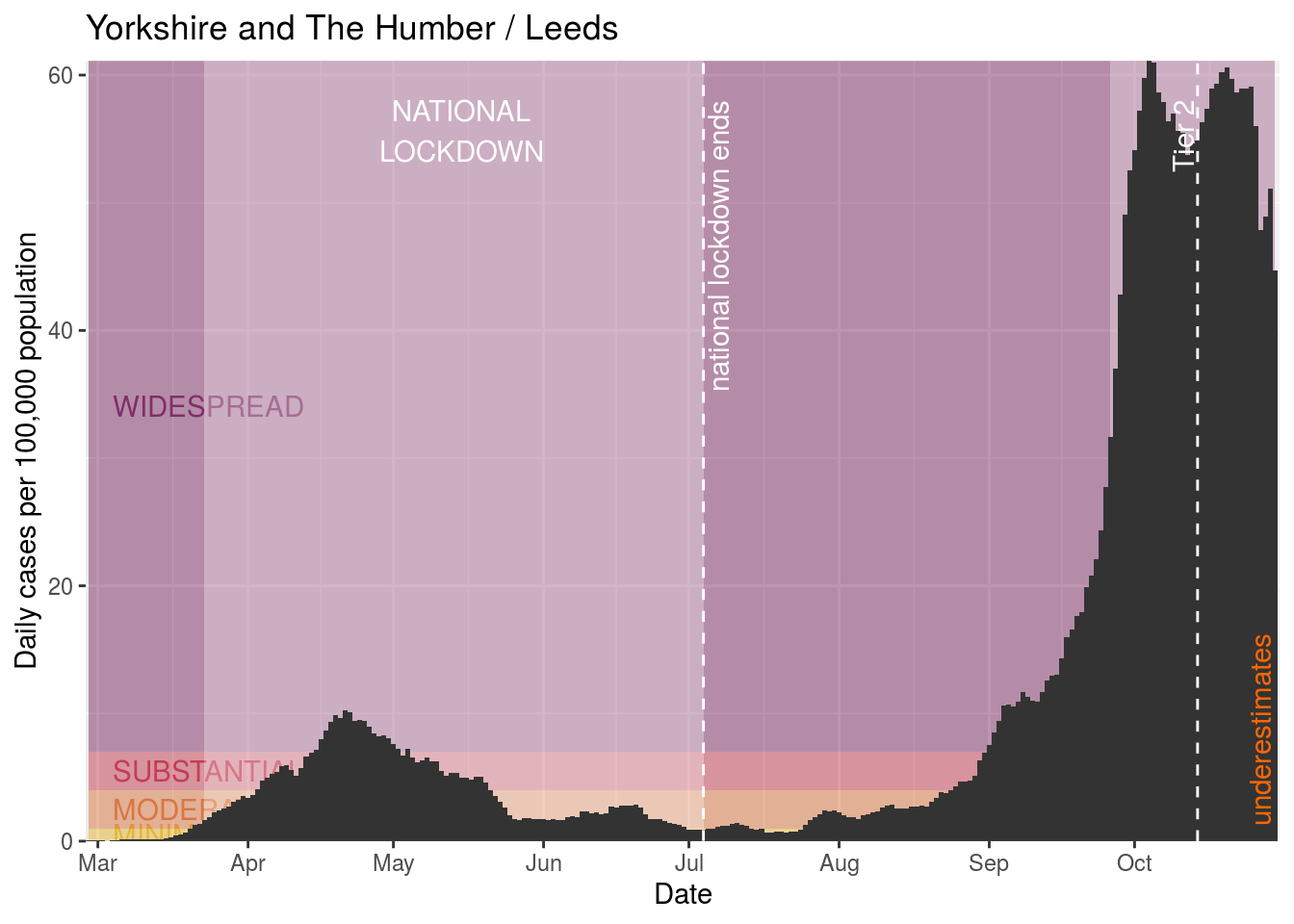
Leeds
Leicester
Lewisham
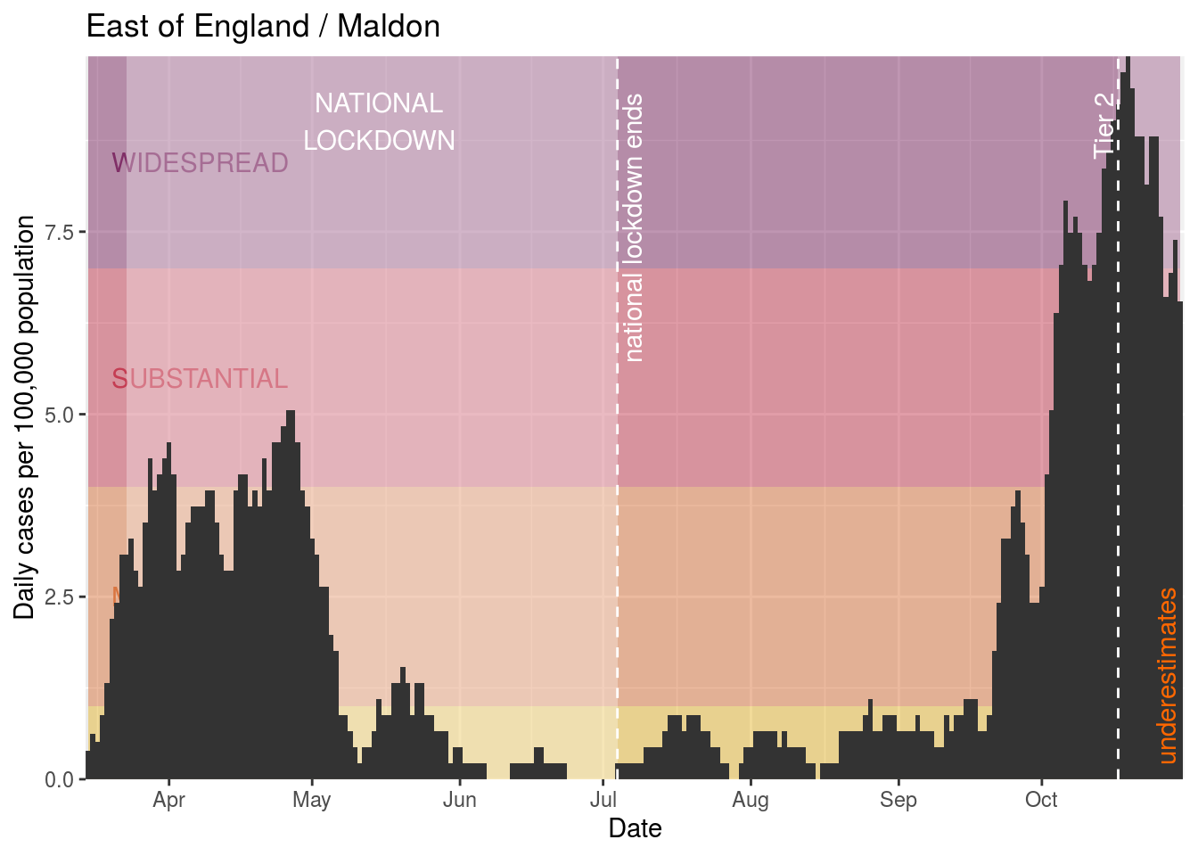
Maldon
Mansfield

Merton

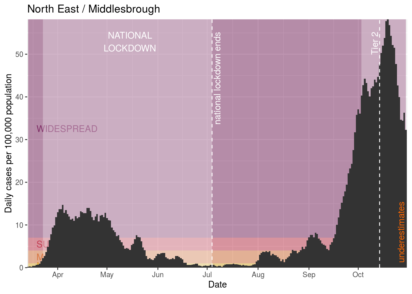
Middlesbrough
Newark and Sherwood

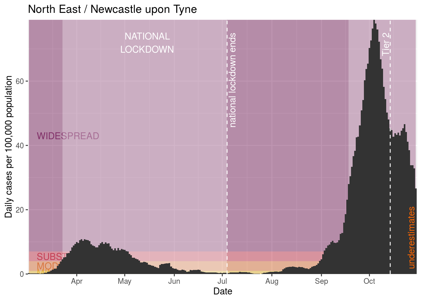
Newcastle upon Tyne
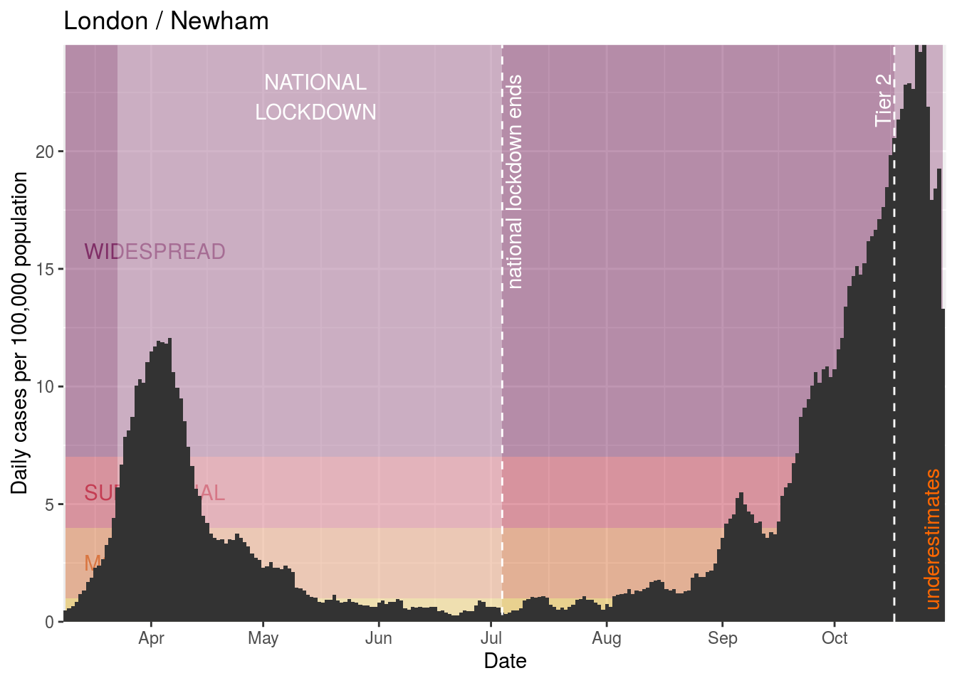
Newham
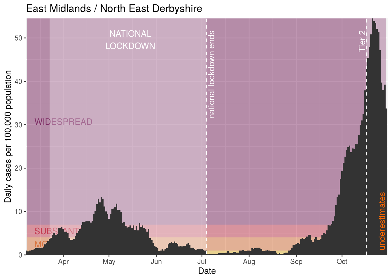
North East Derbyshire
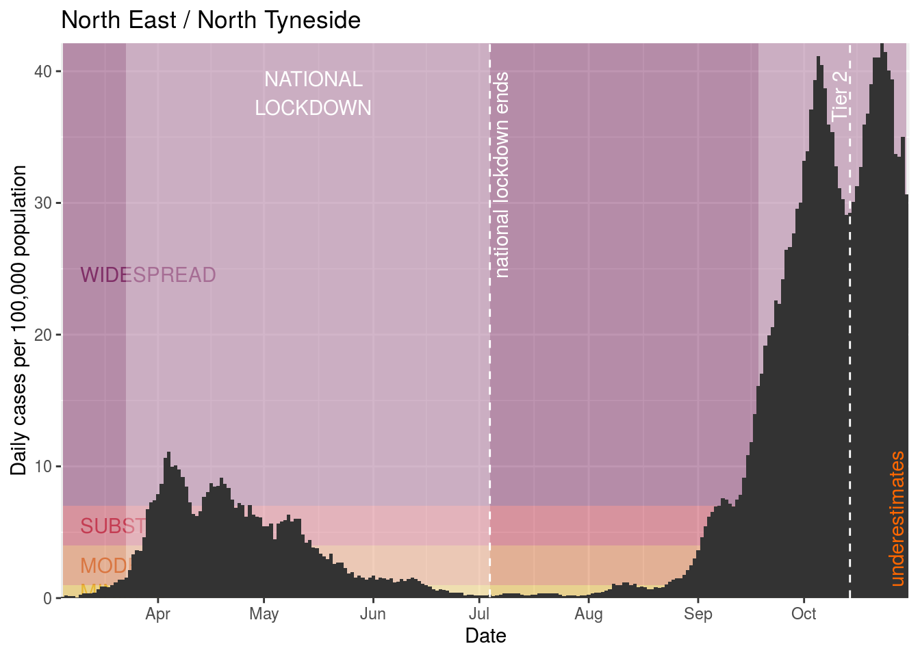
North Tyneside
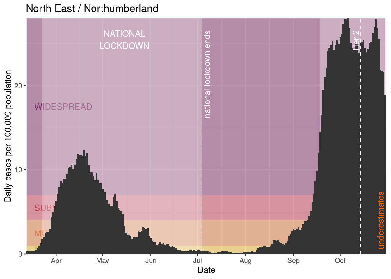
Northumberland
Nottingham
Oadby and Wigston
Redbridge

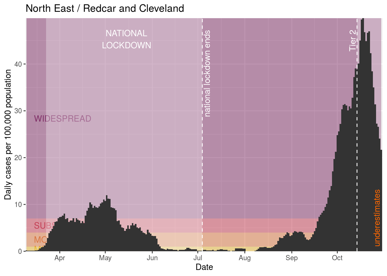
Redcar and Cleveland
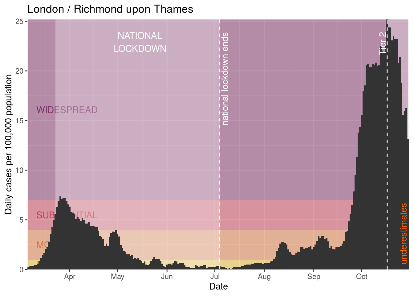
Richmond upon Thames
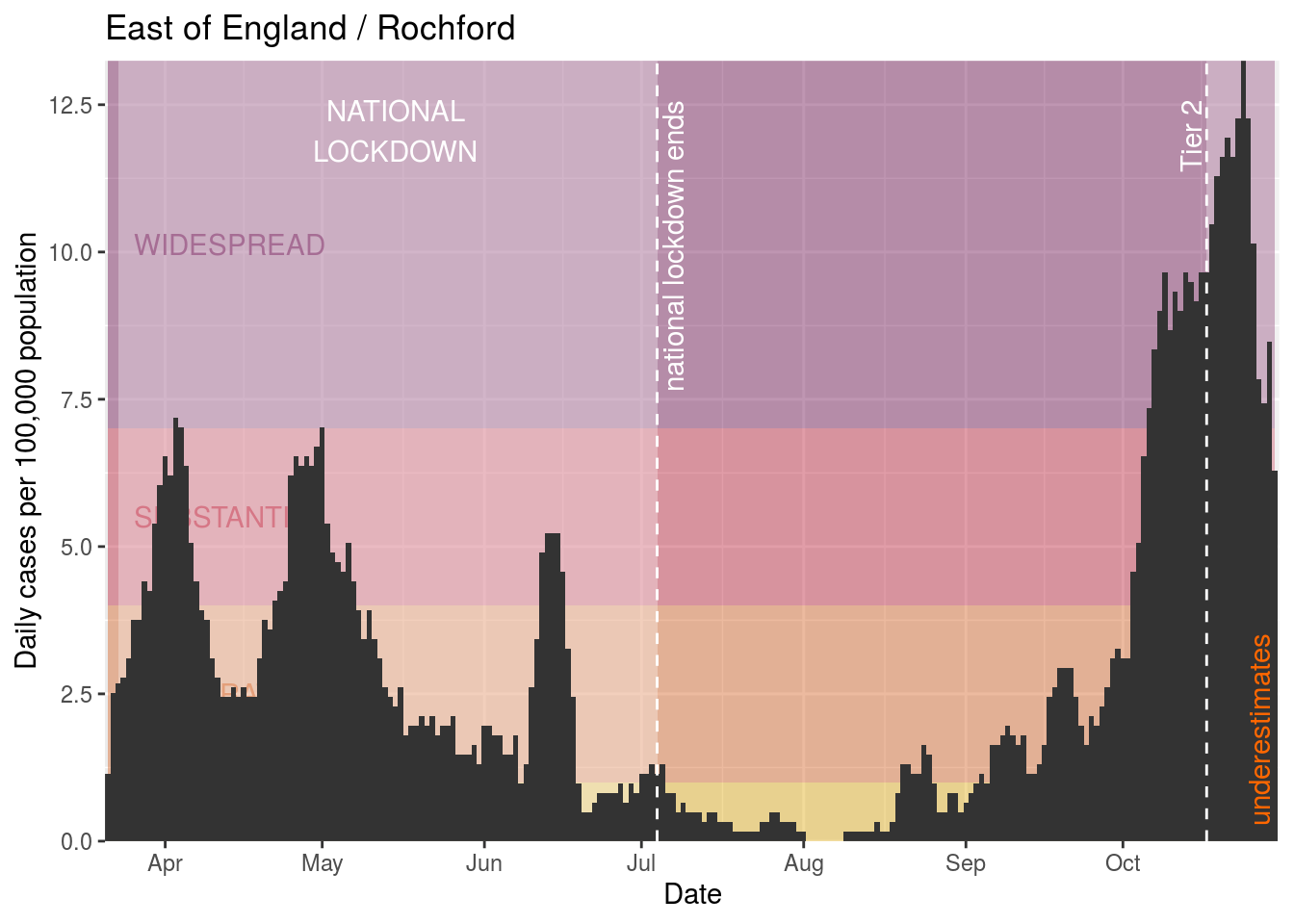
Rochford
Rushcliffe
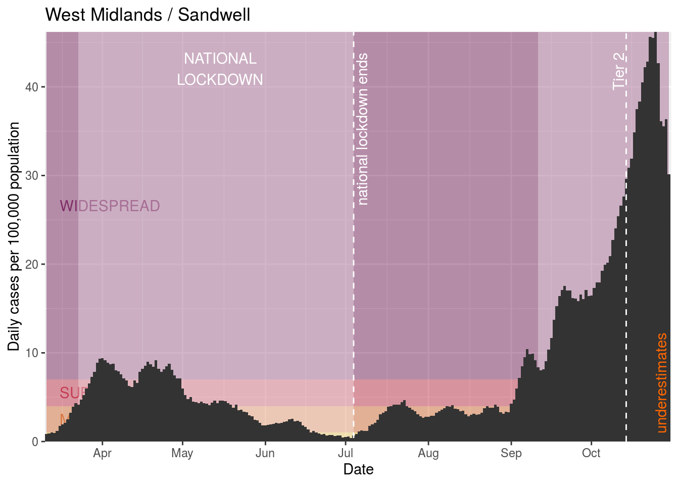
Sandwell
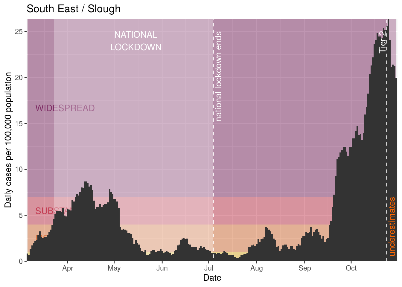
Slough
Solihull
South Tyneside
Southwark
Stockton-on-Tees

Stoke-on-Trent
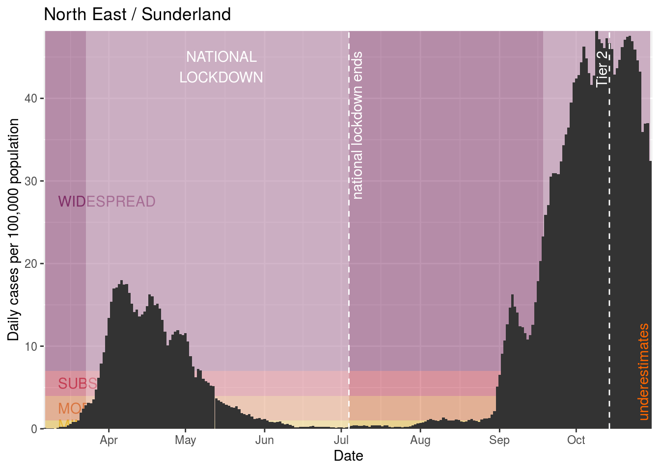
Sunderland
Sutton

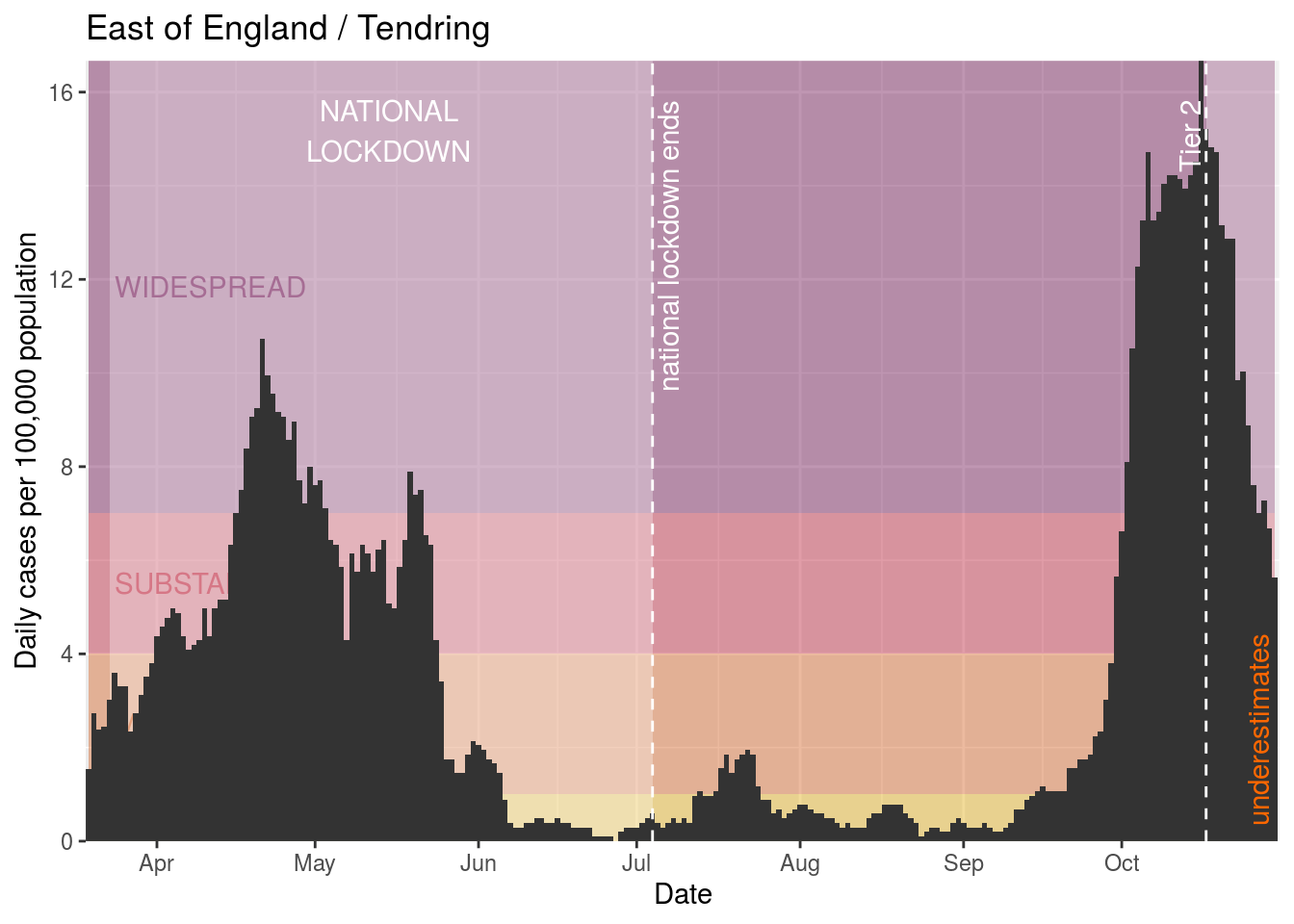
Tendring
Tower Hamlets

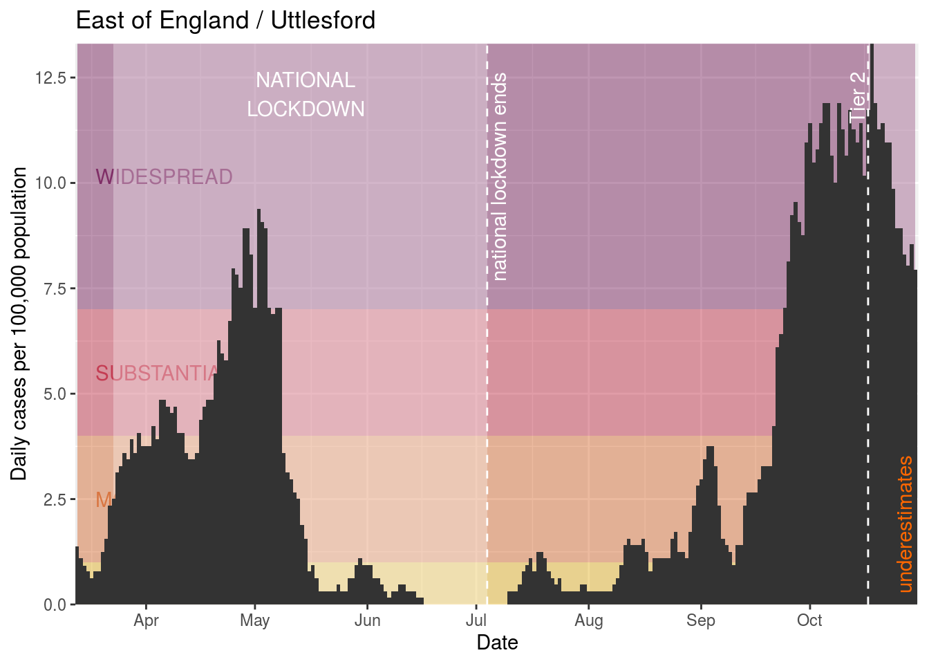
Uttlesford
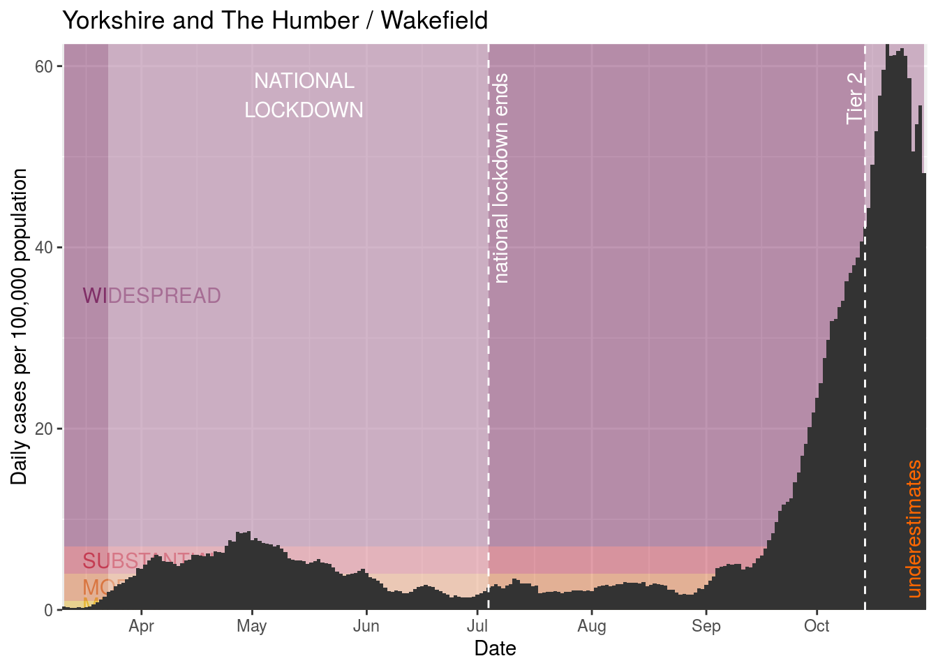
Wakefield
Walsall

Waltham Forest

Wandsworth
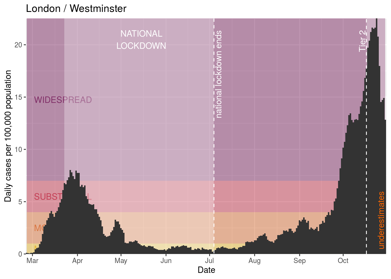
Westminster

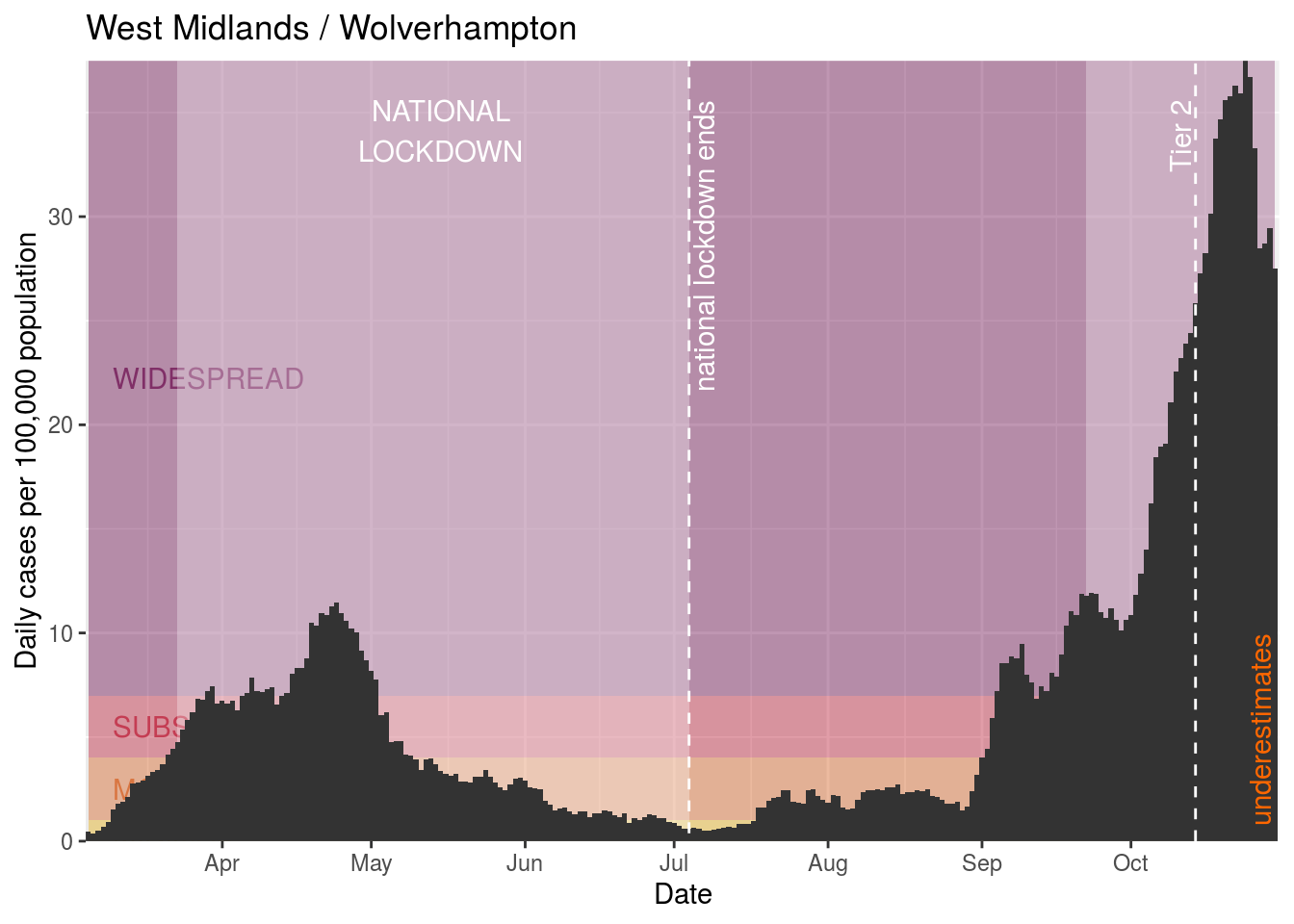
Wolverhampton
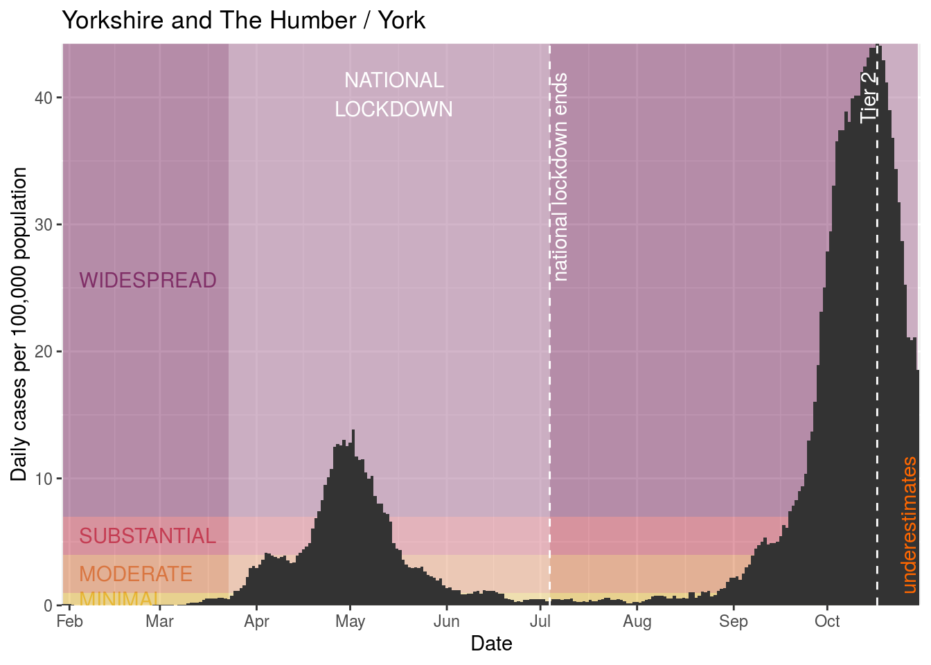
York
Upcoming Tier 2 restrictions
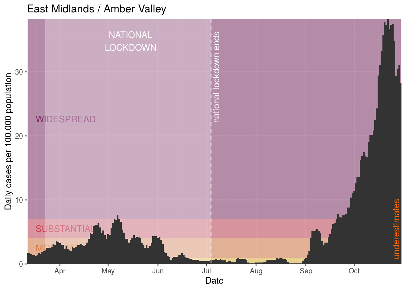
Amber Valley
Bolsover
Cannock Chase
Carlisle
Charnwood
Derby
Derbyshire Dales
Dudley
East Riding of Yorkshire
East Staffordshire
High Peak
Kingston upon Hull, City of
Lichfield
Luton
Newcastle-under-Lyme
North East Lincolnshire
North Lincolnshire
Oxford
South Derbyshire
South Staffordshire
Stafford
Staffordshire Moorlands
Tamworth
Telford and Wrekin
Previous restrictions
Blaby

Northampton
Identifying worrying areas
The areas we really care about are those where there’s a high daily rate, and particularly those where that rate is increasing. We’ll add a couple of columns that track the degree to which the average daily rate is increasing or decreasing.
| Date | DailyRate | AverageDailyRate | DailyRateIncreasePercentage | AverageRateIncreasePercentage |
|---|---|---|---|---|
| 2020-10-30 | 7.777766 | 51.32421 | -0.13 | -0.06 |
| 2020-10-29 | 52.454699 | 57.95340 | 0.03 | -0.06 |
| 2020-10-28 | 67.105839 | 56.28329 | 0.02 | -0.06 |
| 2020-10-27 | 77.958535 | 55.27123 | -0.17 | -0.05 |
| 2020-10-26 | 84.470153 | 64.39266 | -0.05 | -0.03 |
Now let’s narrow down to places that have seen concerning levels of cases over the last week.
Widespread infection
The most recent date is 2020-10-30 so one week ago is 2020-10-24. First let’s look at those who had widespread daily rates (over 7 cases / day / 100,000 population) at some point in the last week.
There are 304 areas where there is widespread infection, 159 of which aren’t currently in lockdown. Those are:
- Bristol, City of
- Blaby
- Lincoln
- North Warwickshire
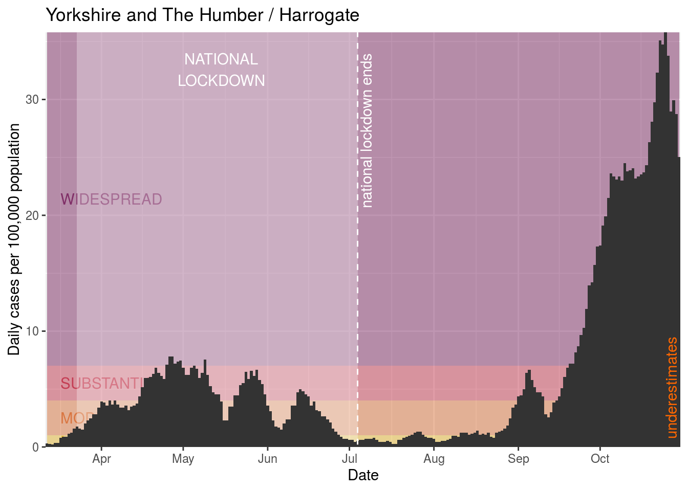
- Harrogate
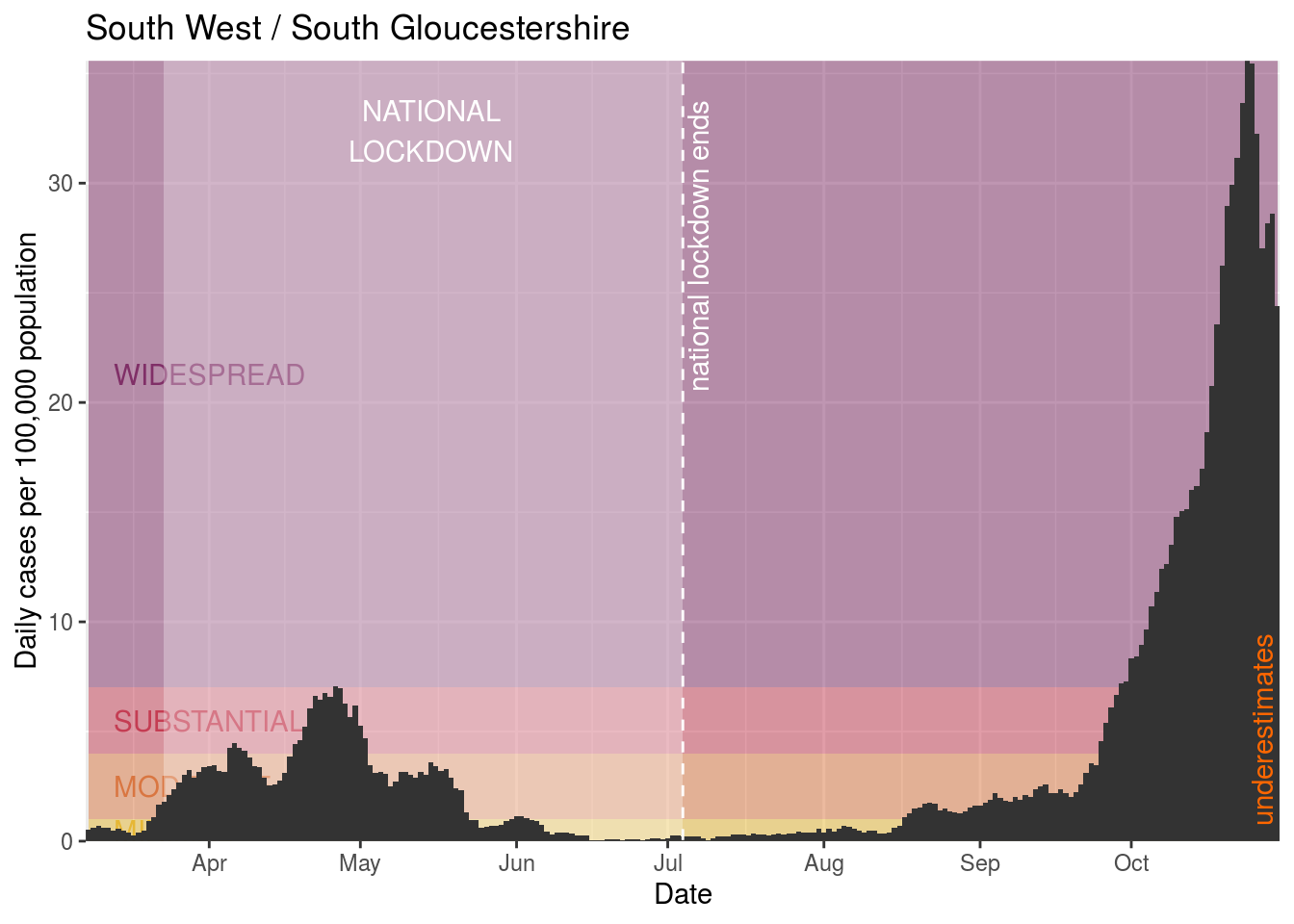
- South Gloucestershire
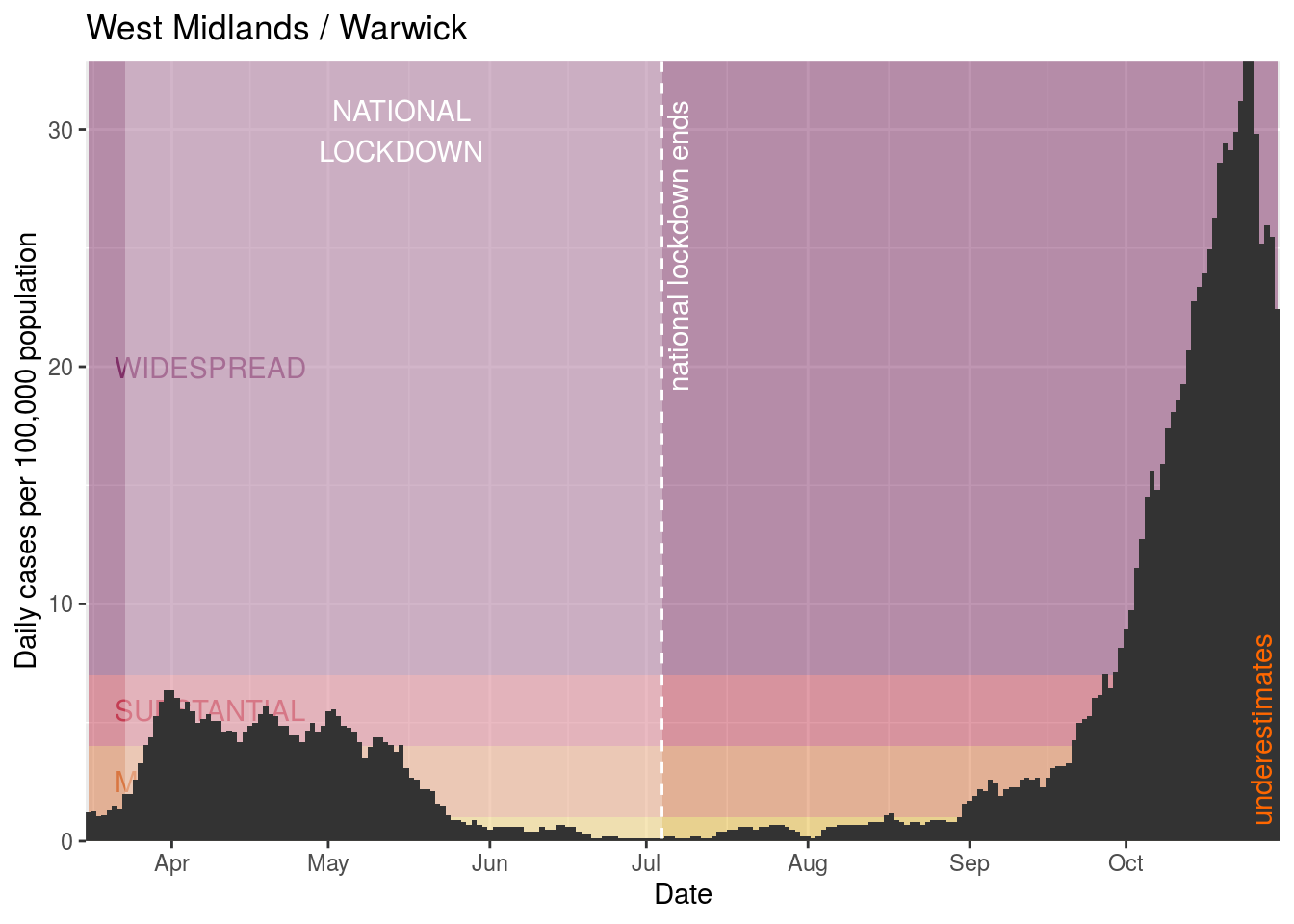
- Warwick
- Bath and North East Somerset
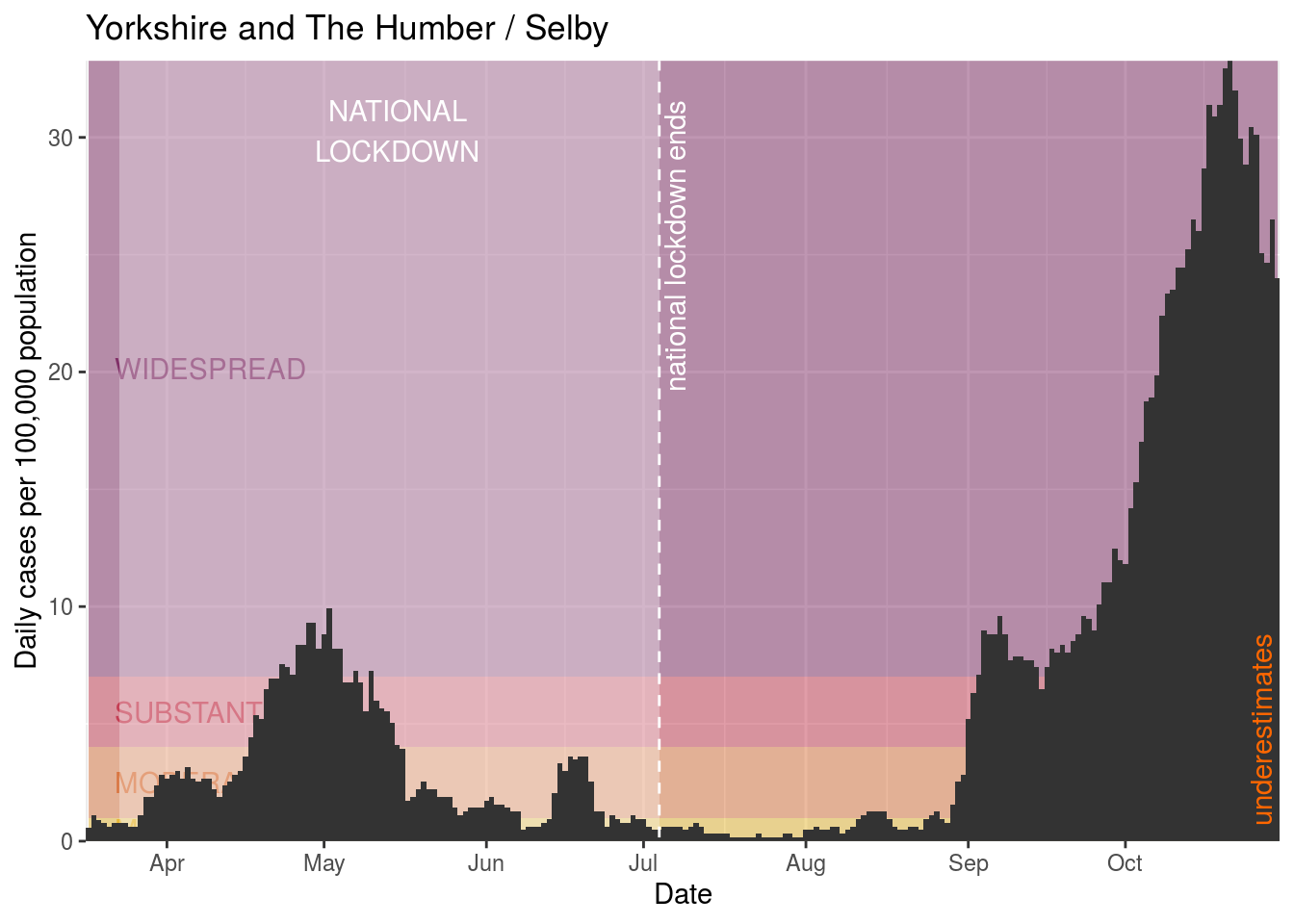
- Selby
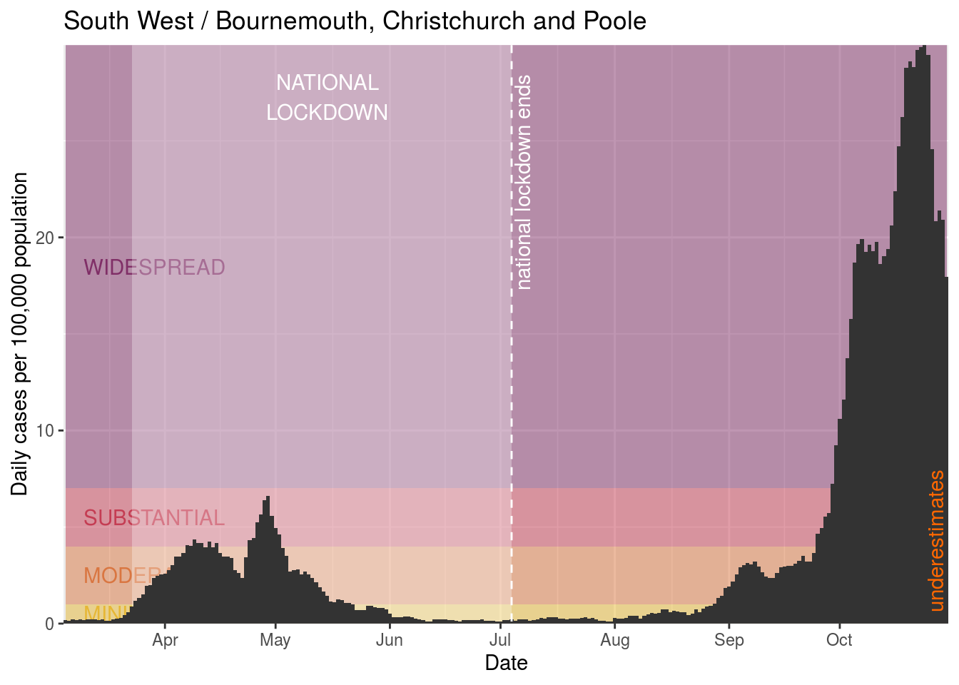
- Bournemouth, Christchurch and Poole
- Portsmouth
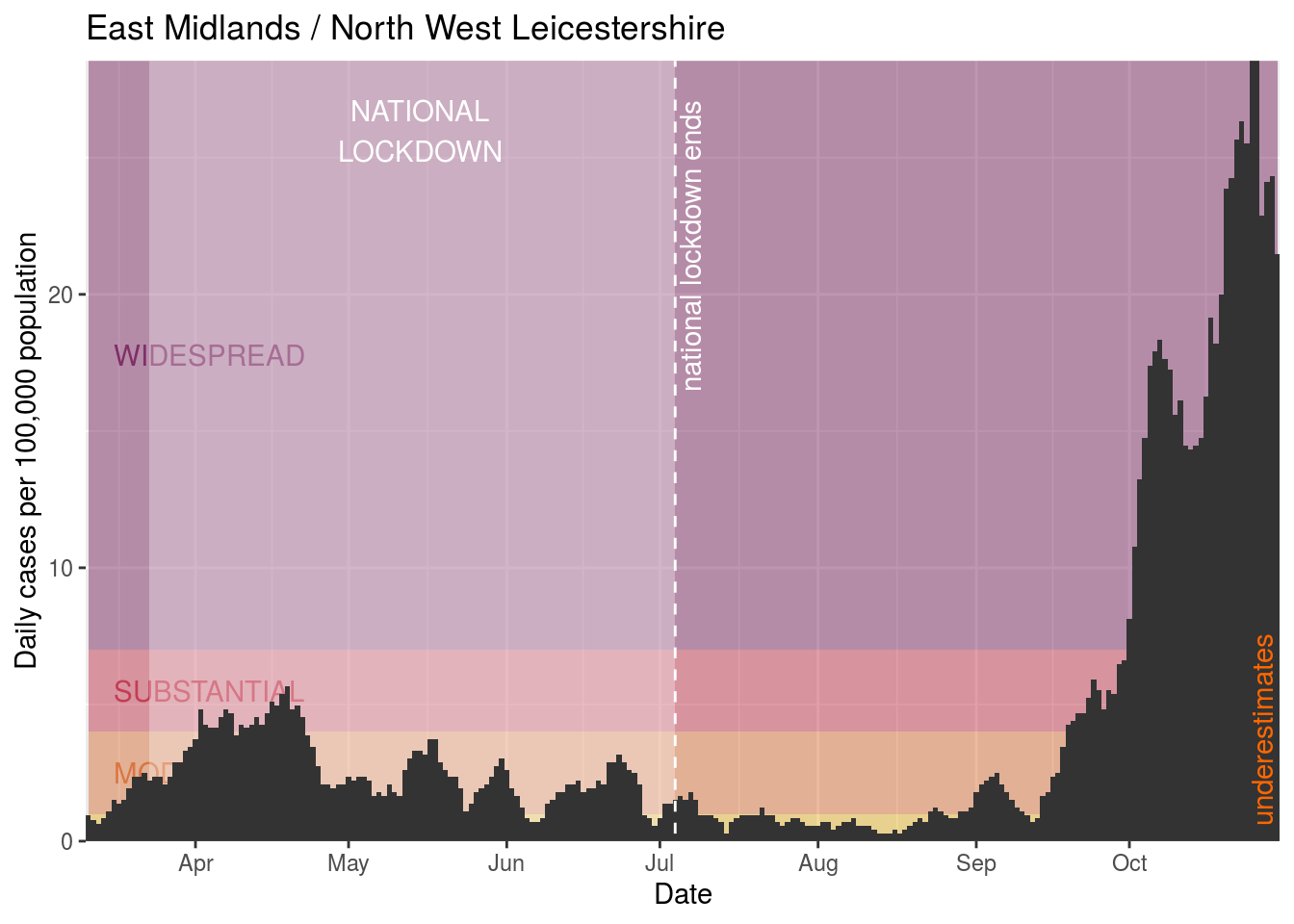
- North West Leicestershire
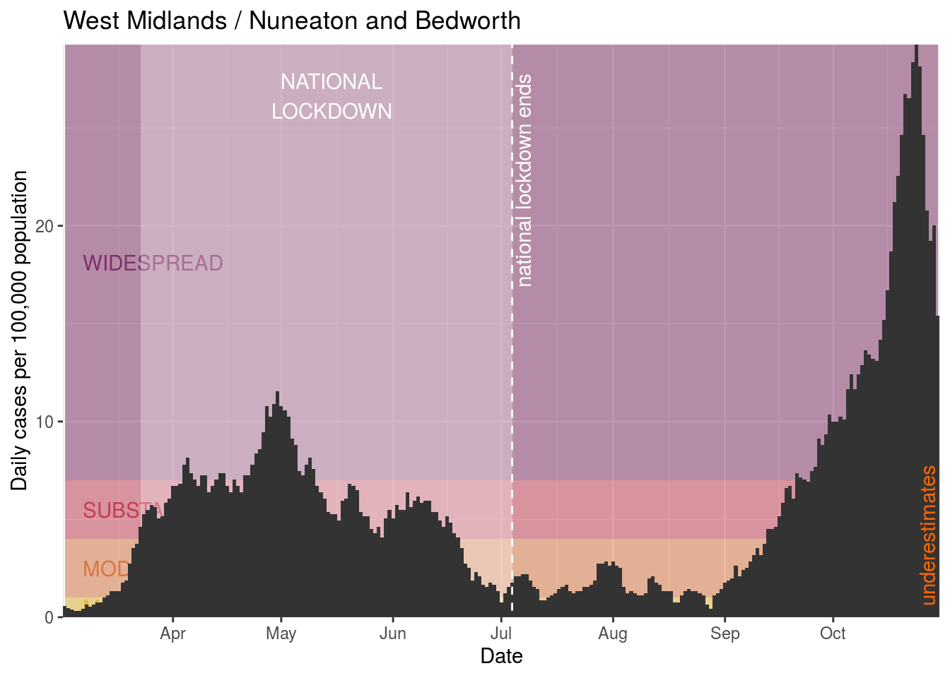
- Nuneaton and Bedworth
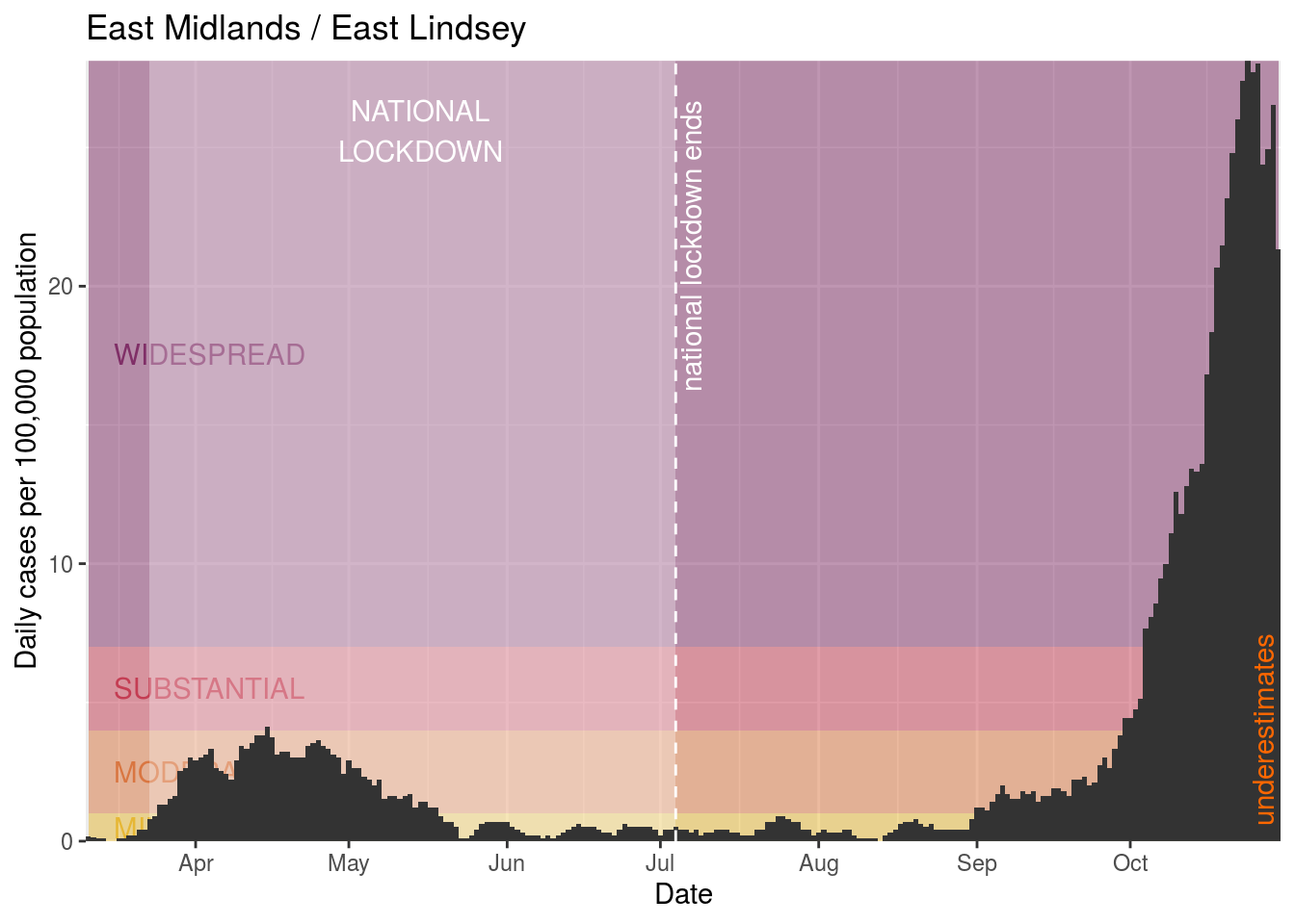
- East Lindsey
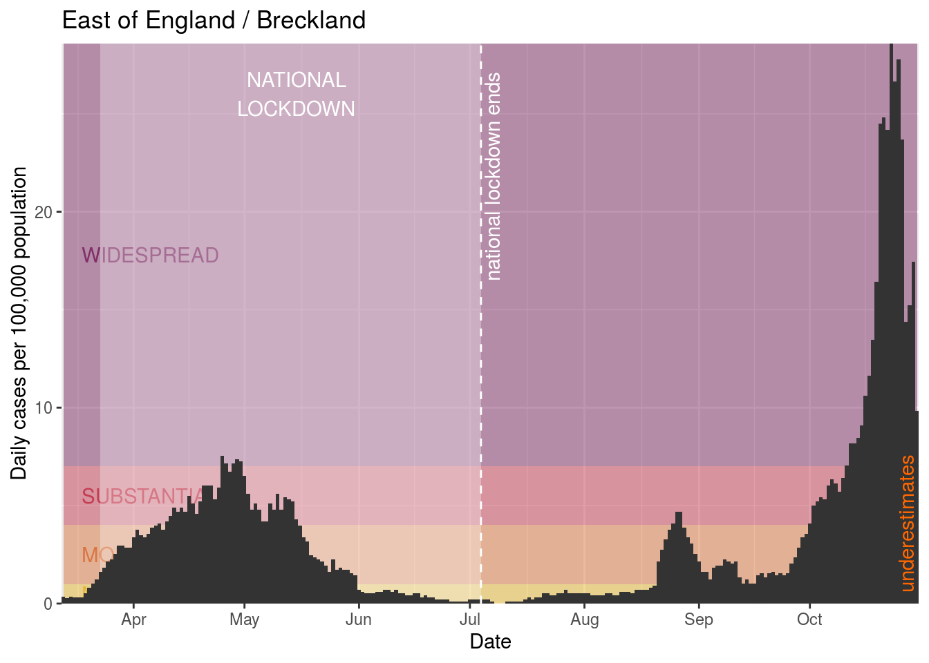
- Breckland
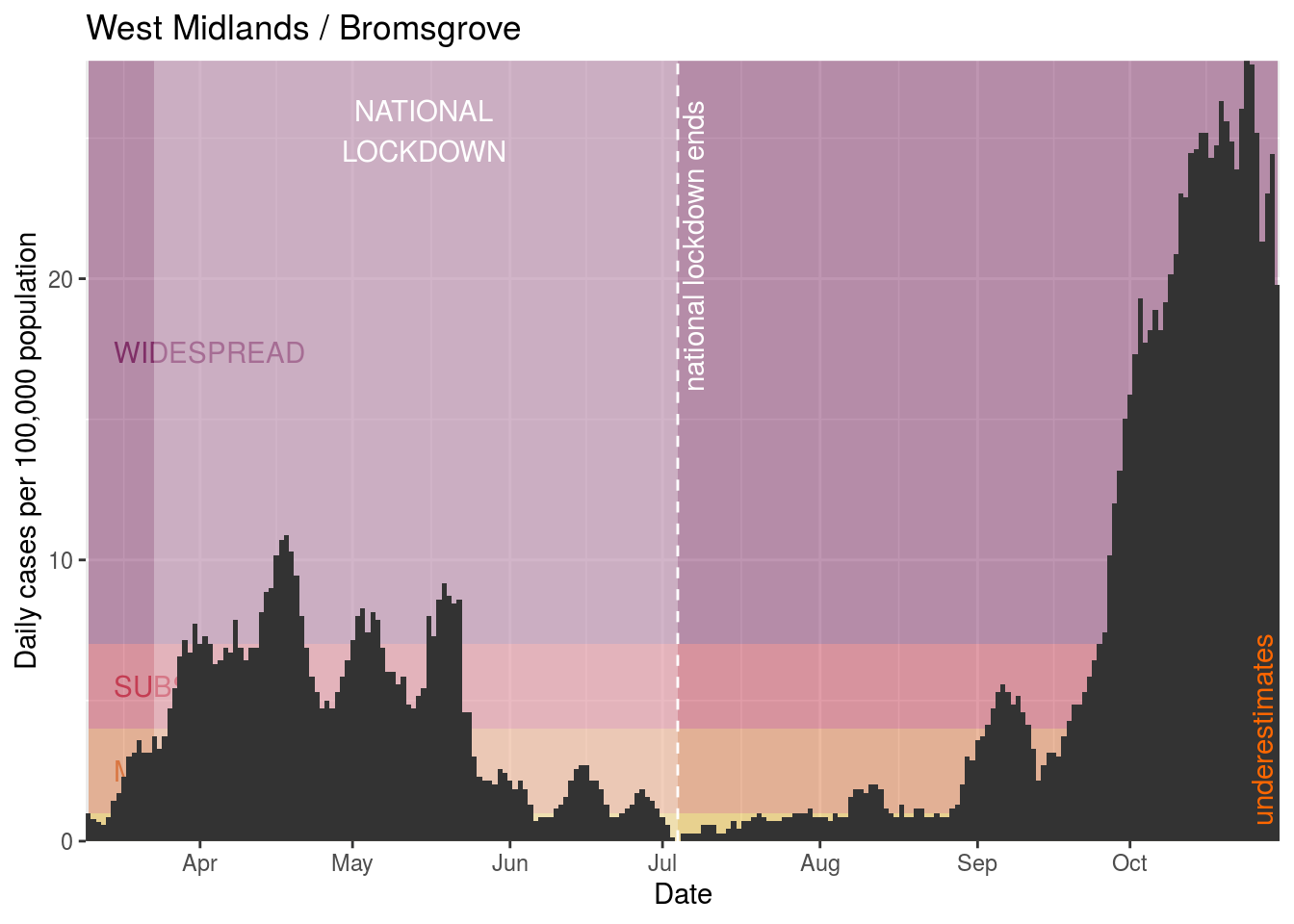
- Bromsgrove
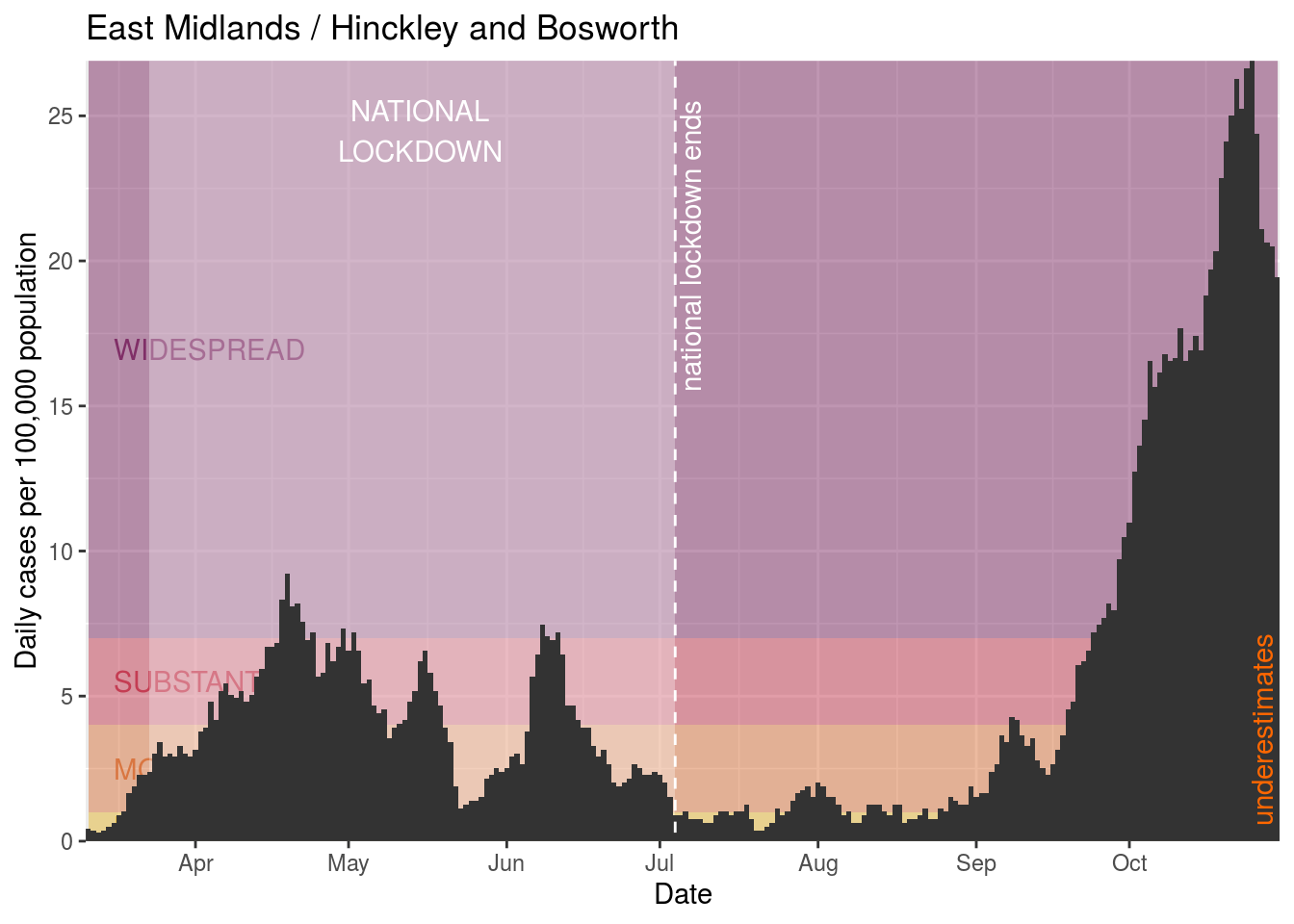
- Hinckley and Bosworth
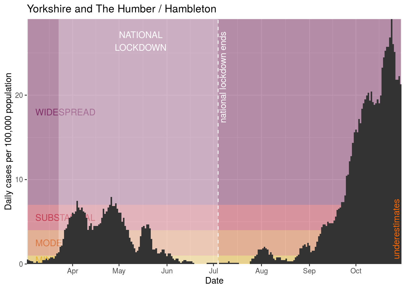
- Hambleton
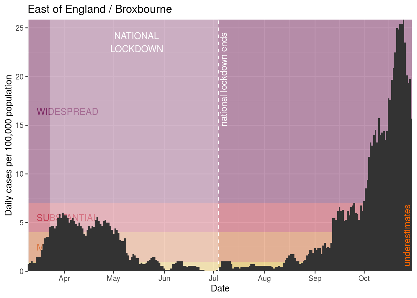
- Broxbourne
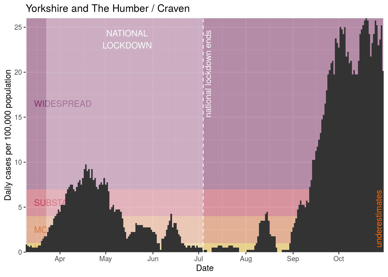
- Craven
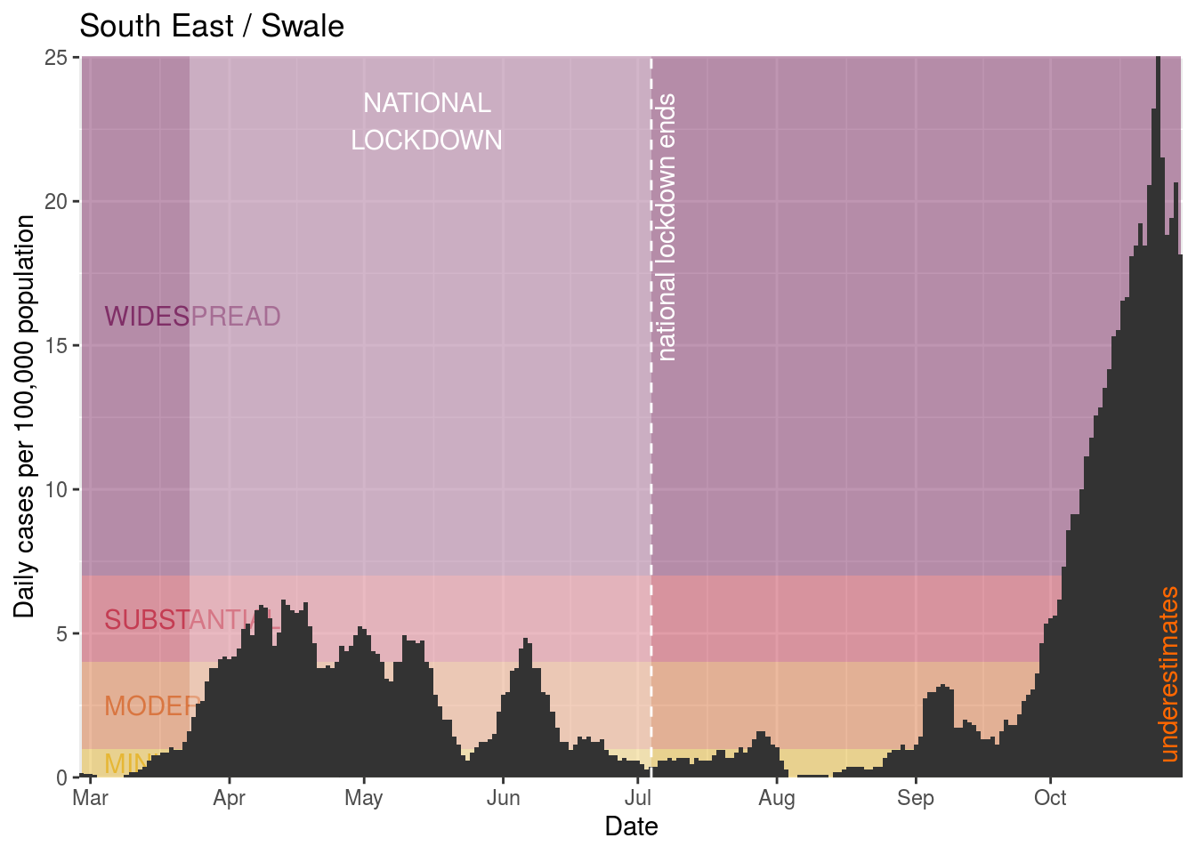
- Swale
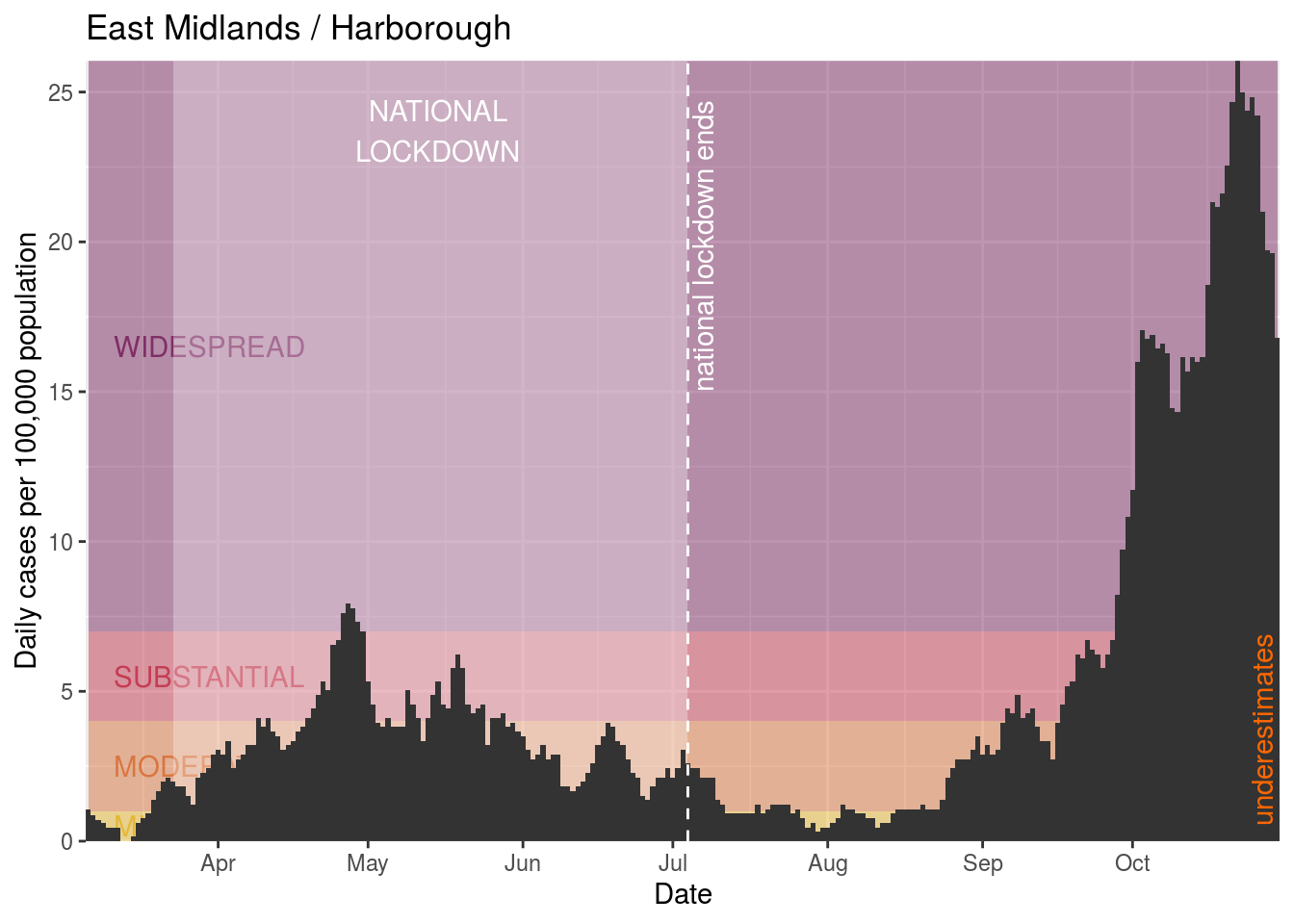
- Harborough
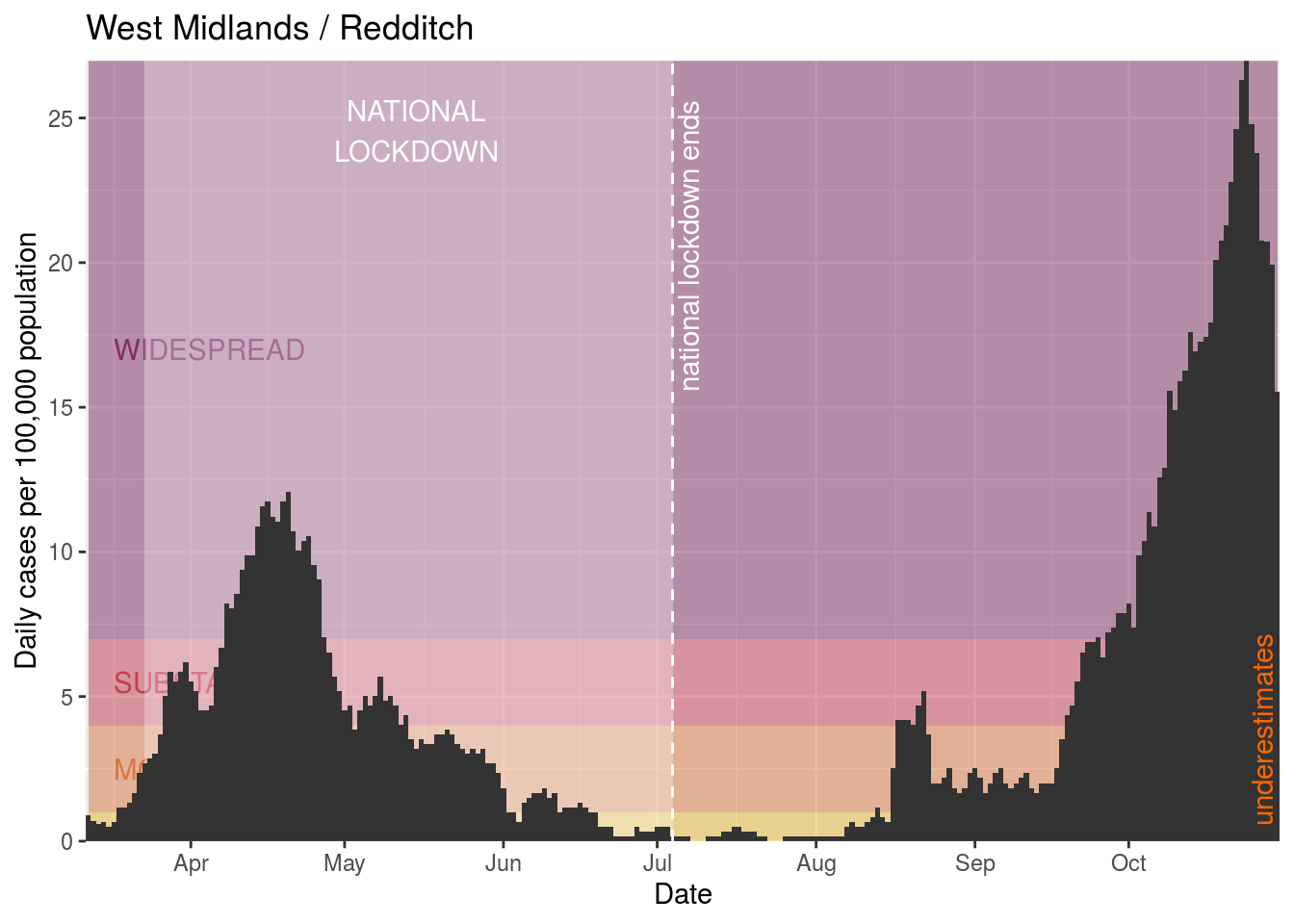
- Redditch
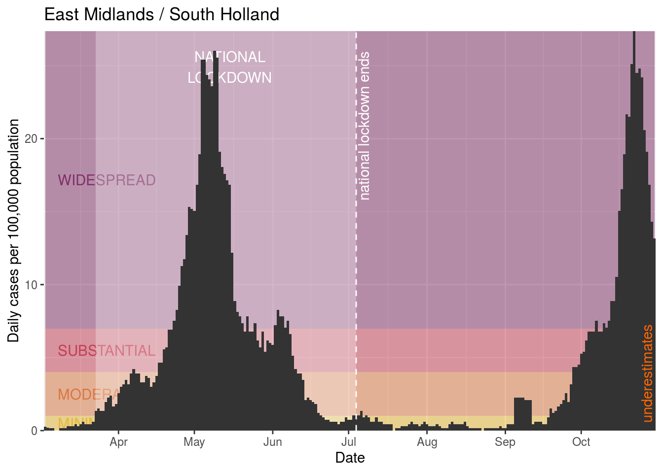
- South Holland
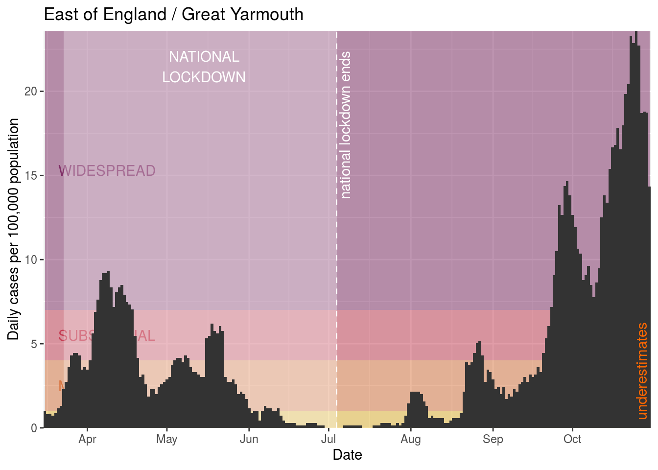
- Great Yarmouth
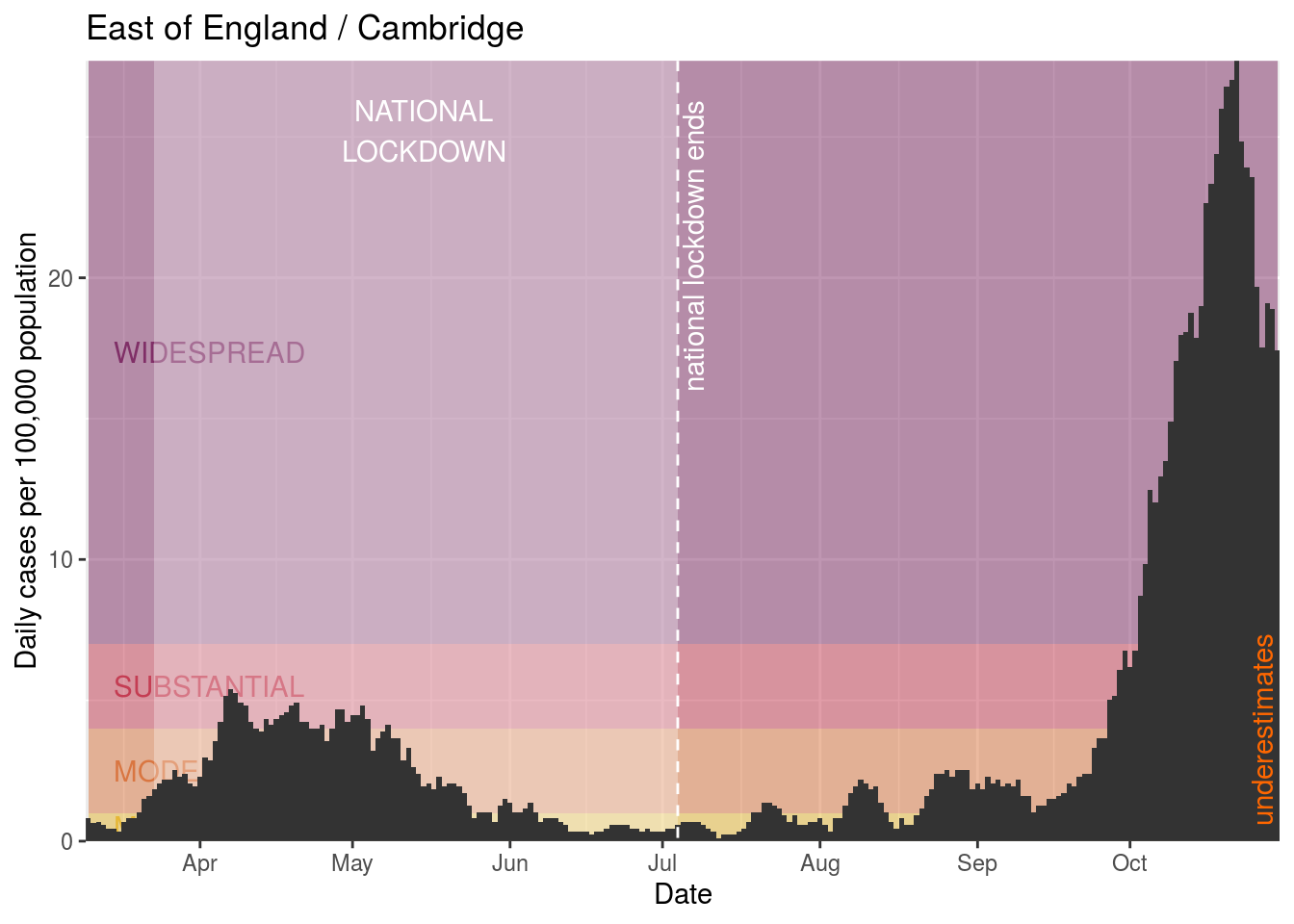
- Cambridge
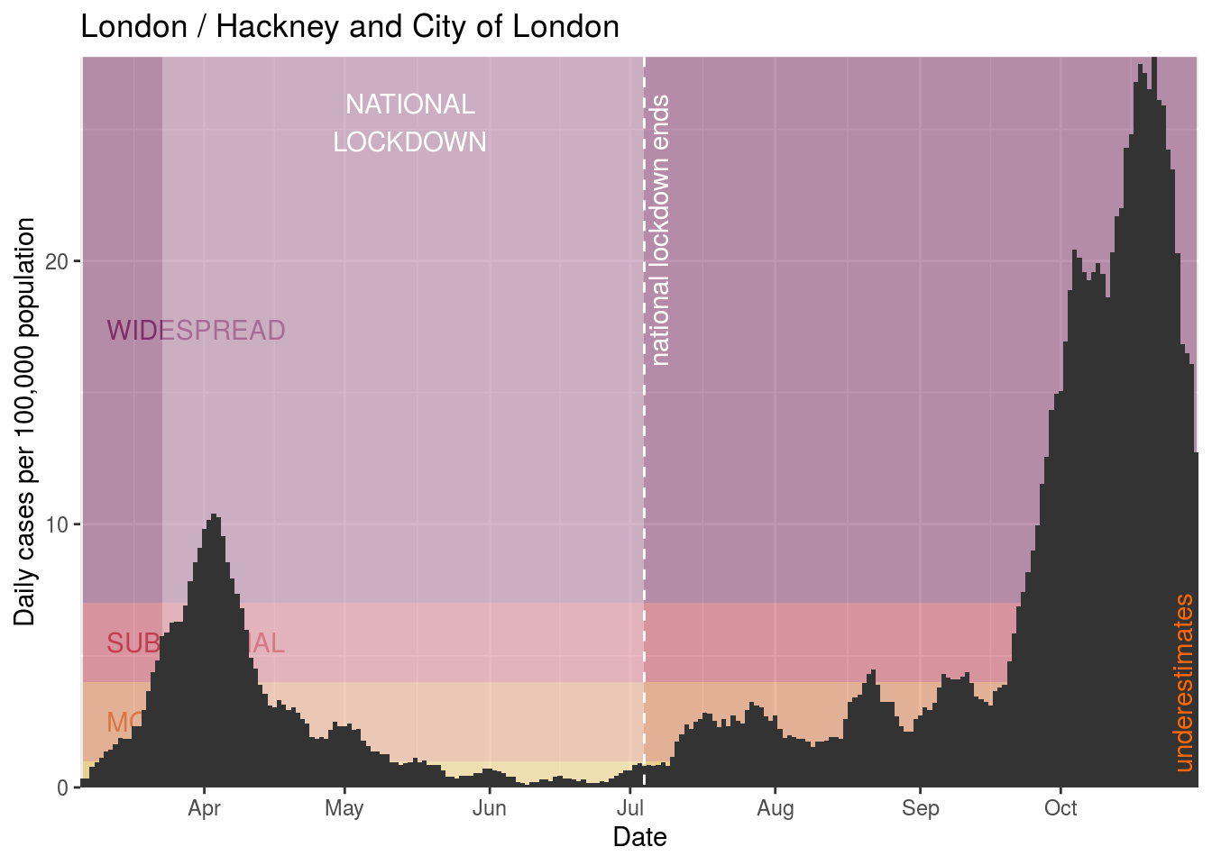
- Hackney and City of London
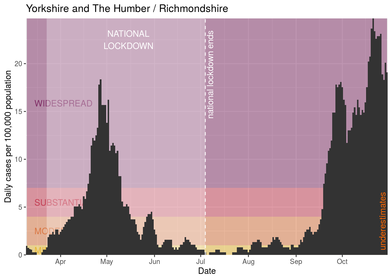
- Richmondshire
- Northampton
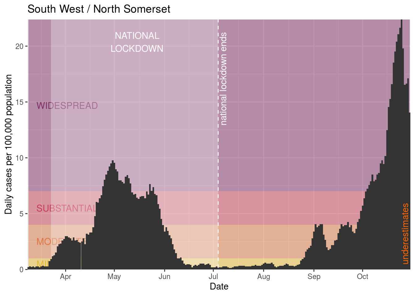
- North Somerset
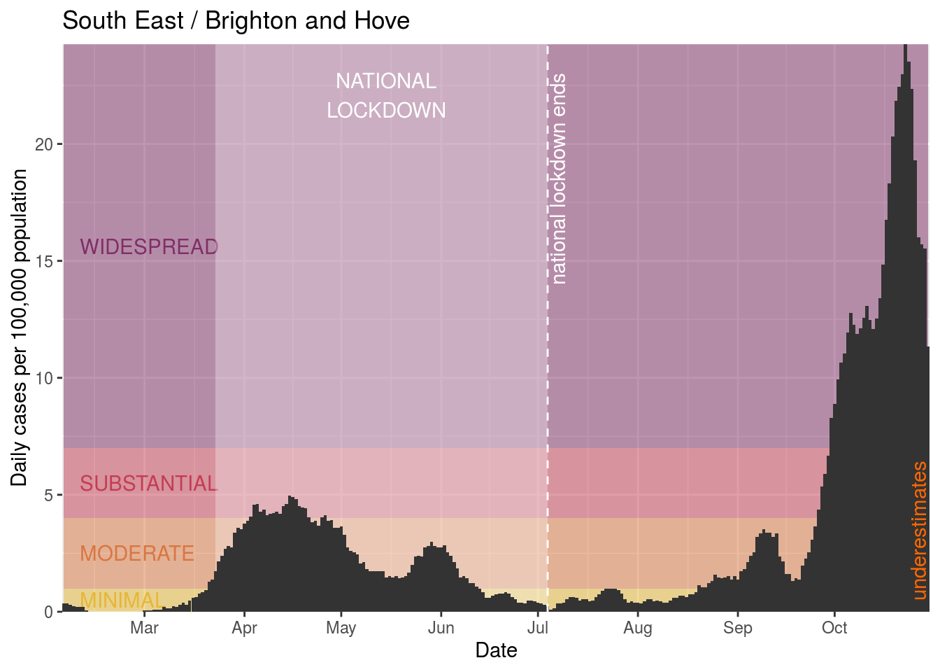
- Brighton and Hove
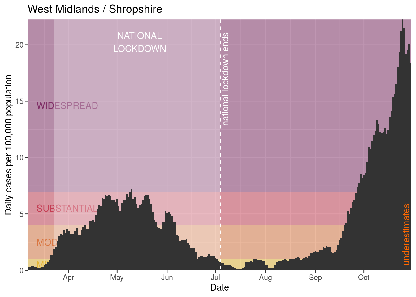
- Shropshire
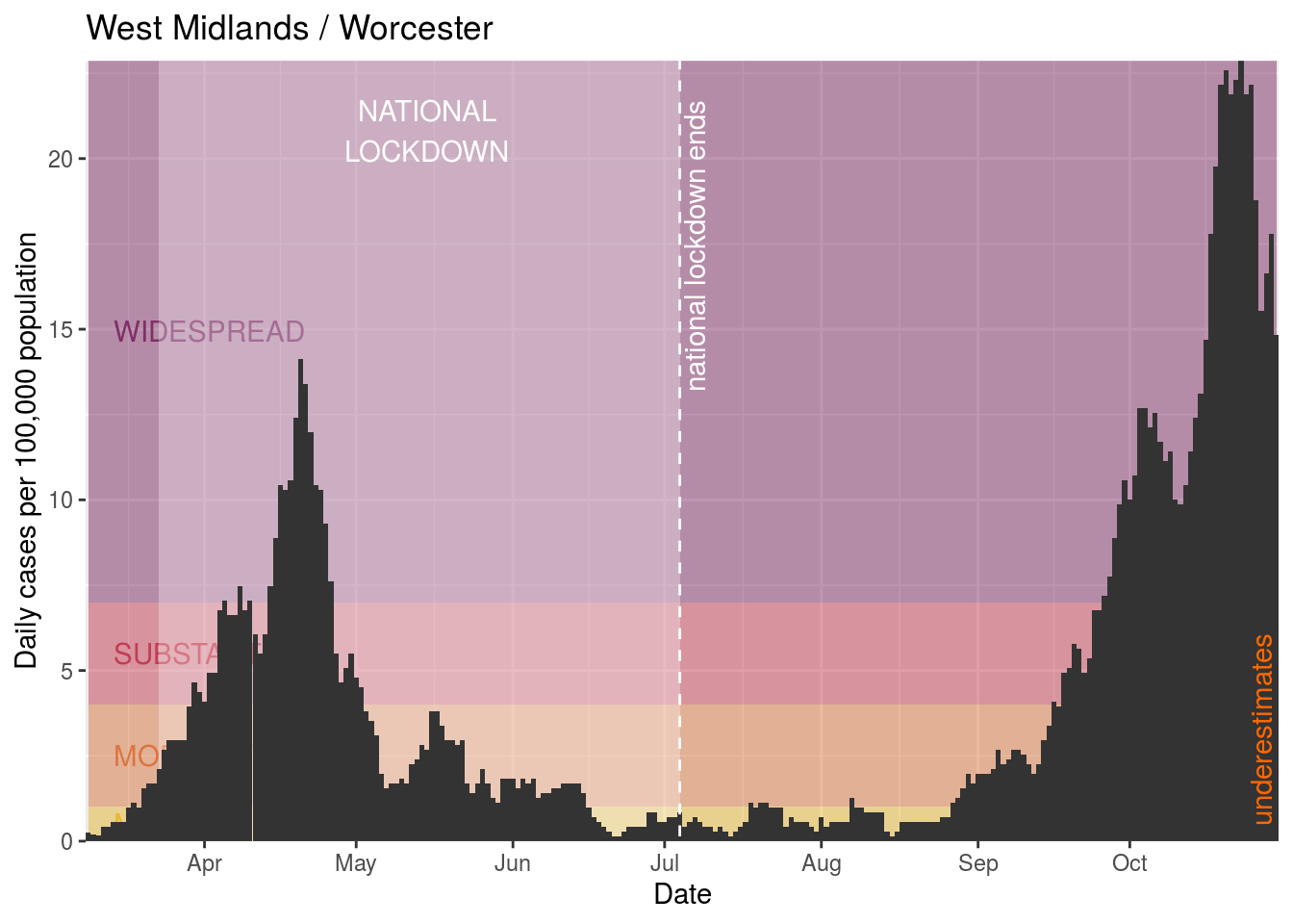
- Worcester
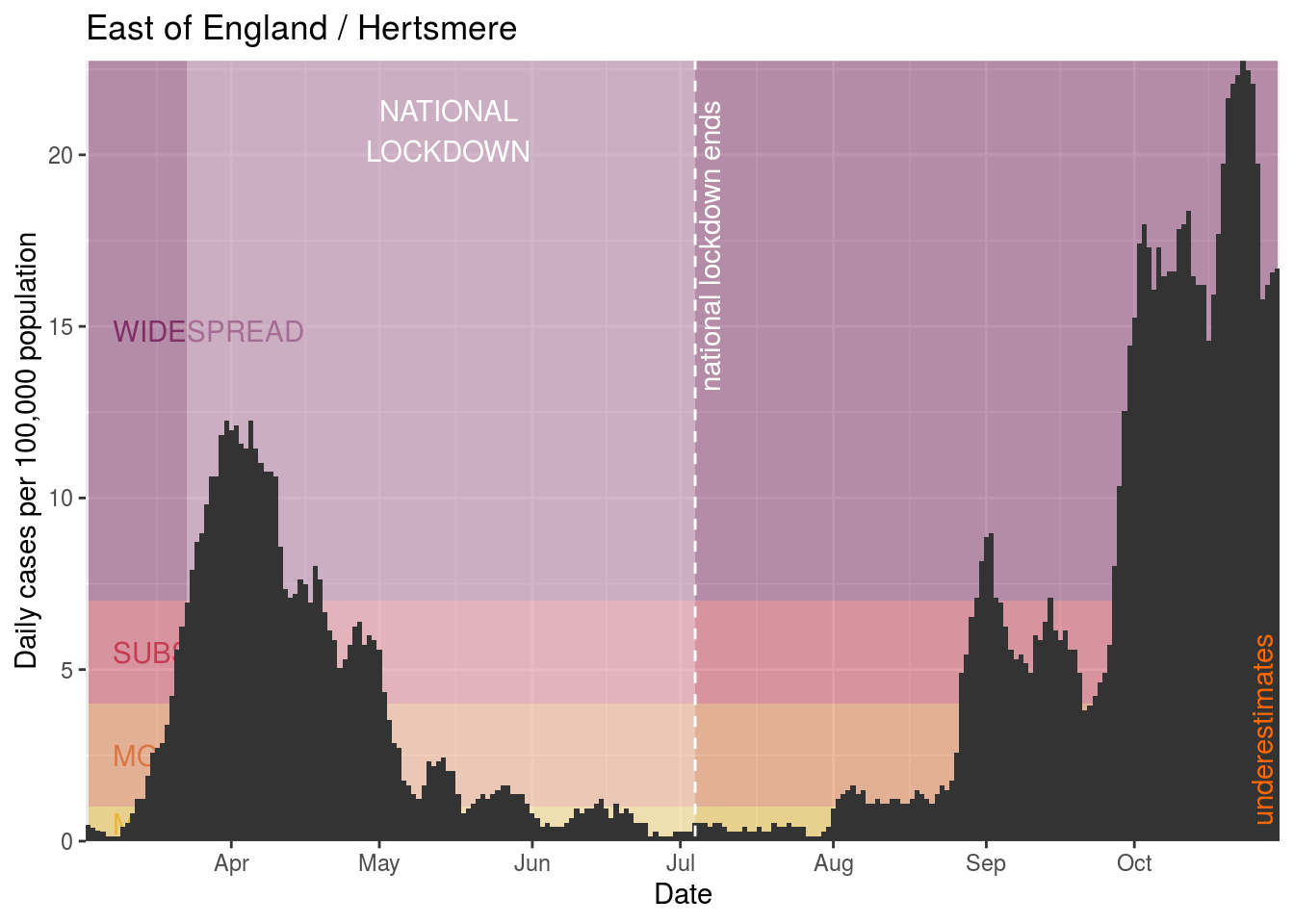
- Hertsmere
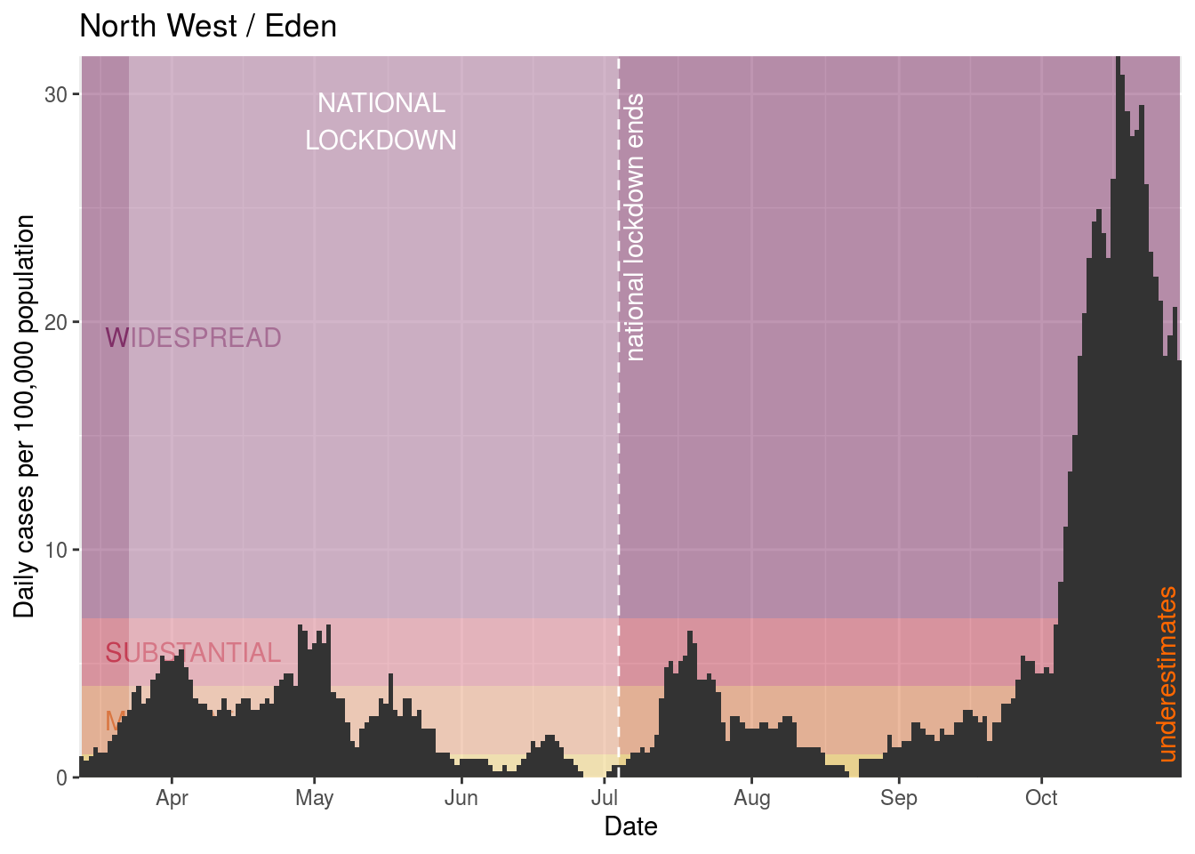
- Eden
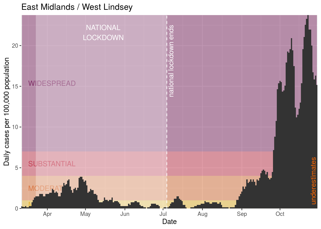
- West Lindsey
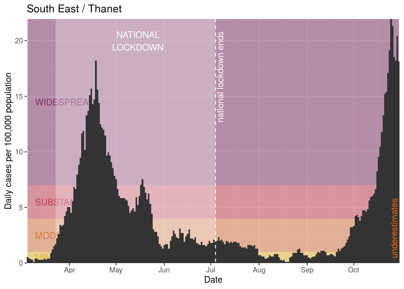
- Thanet
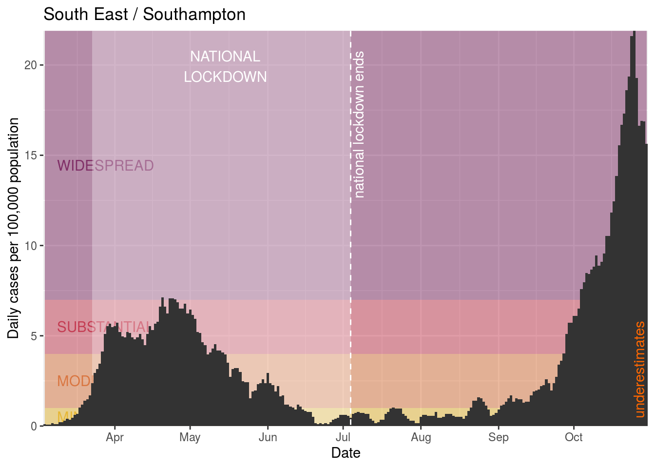
- Southampton
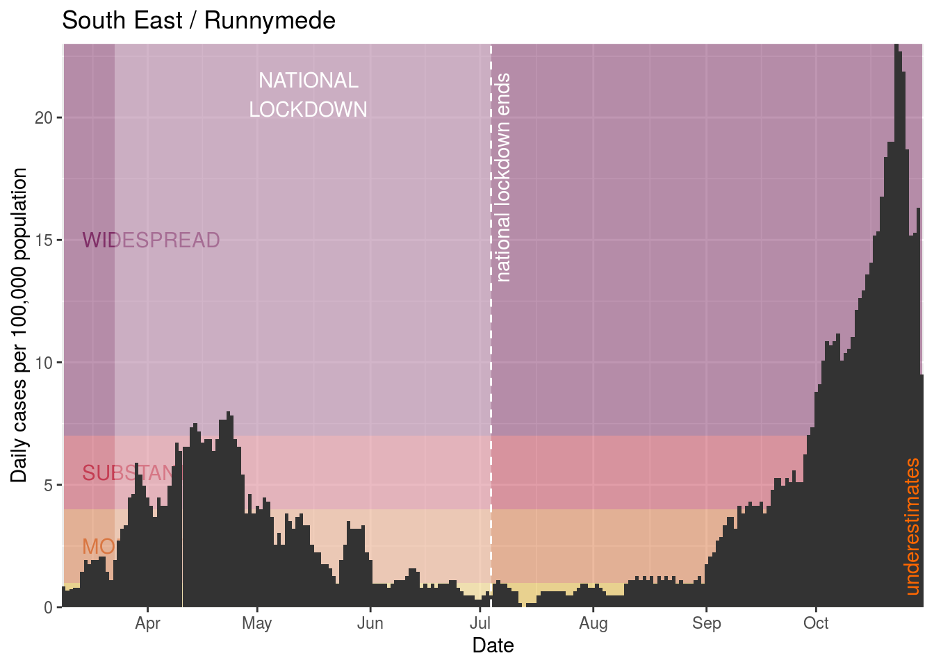
- Runnymede
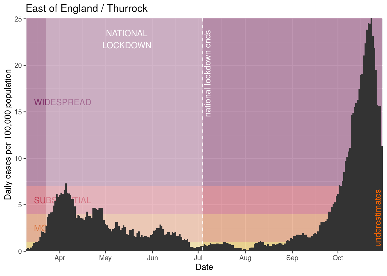
- Thurrock
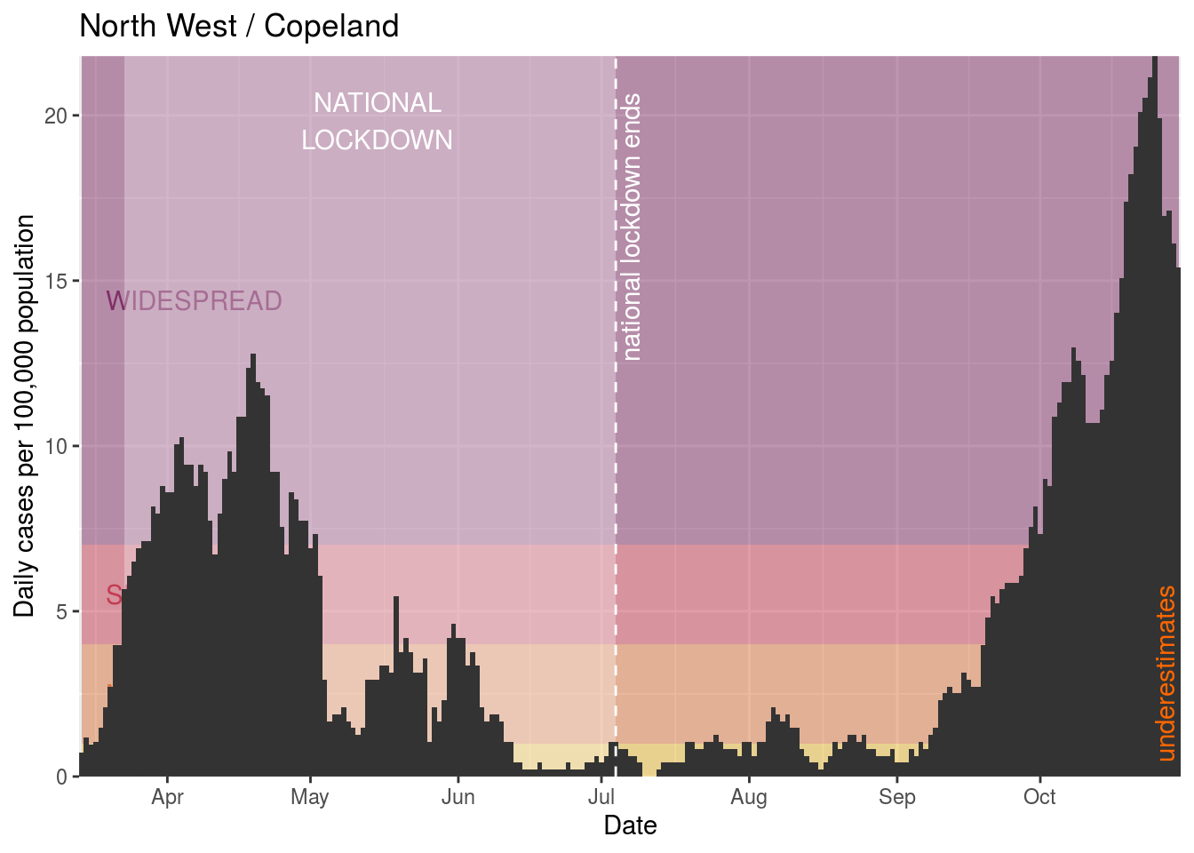
- Copeland
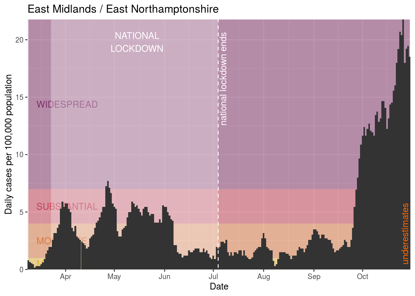
- East Northamptonshire
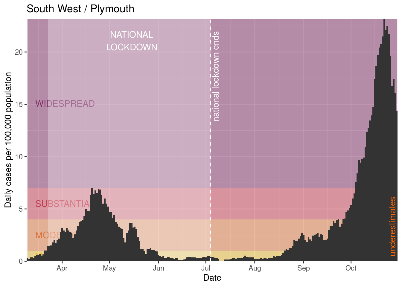
- Plymouth
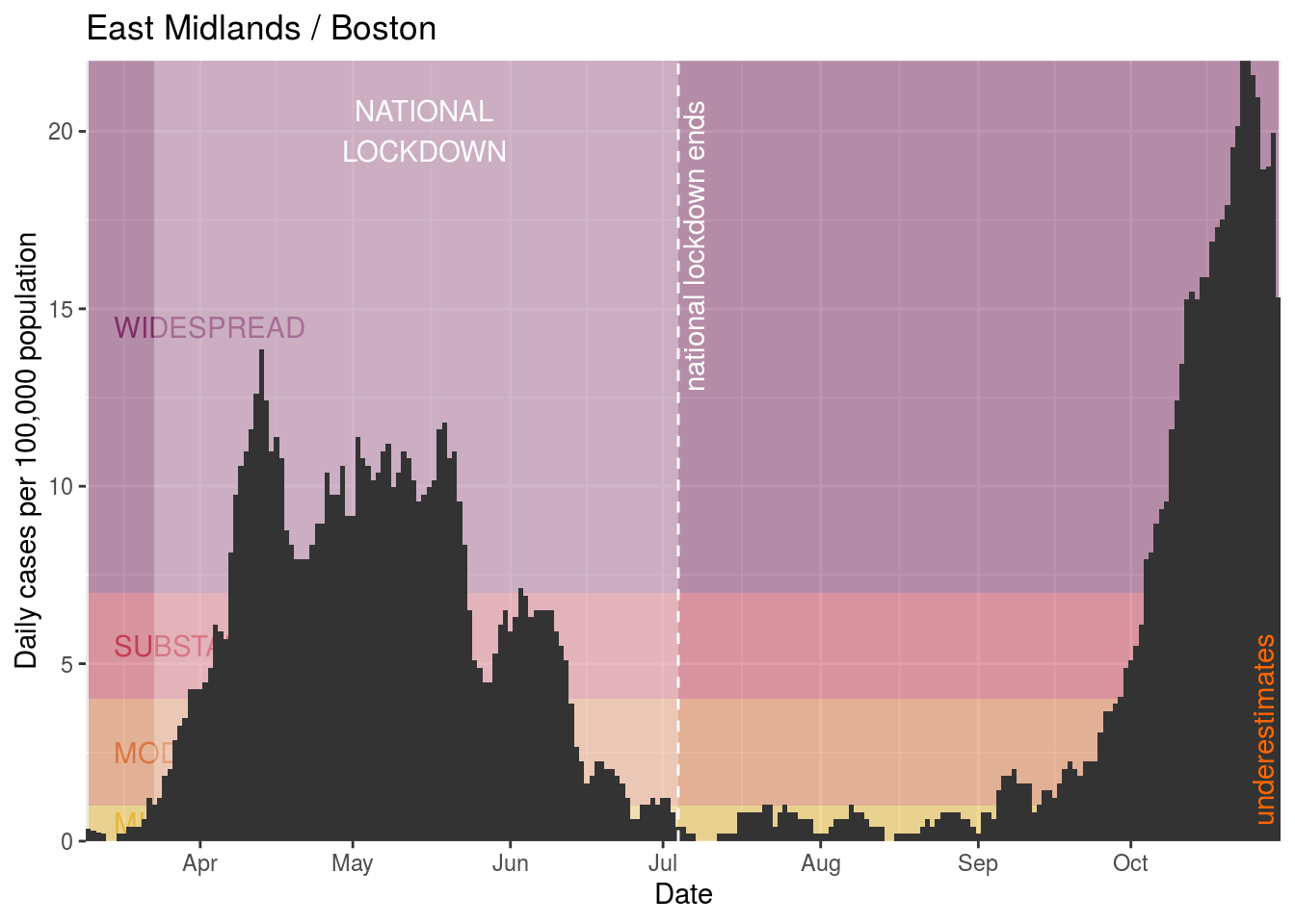
- Boston
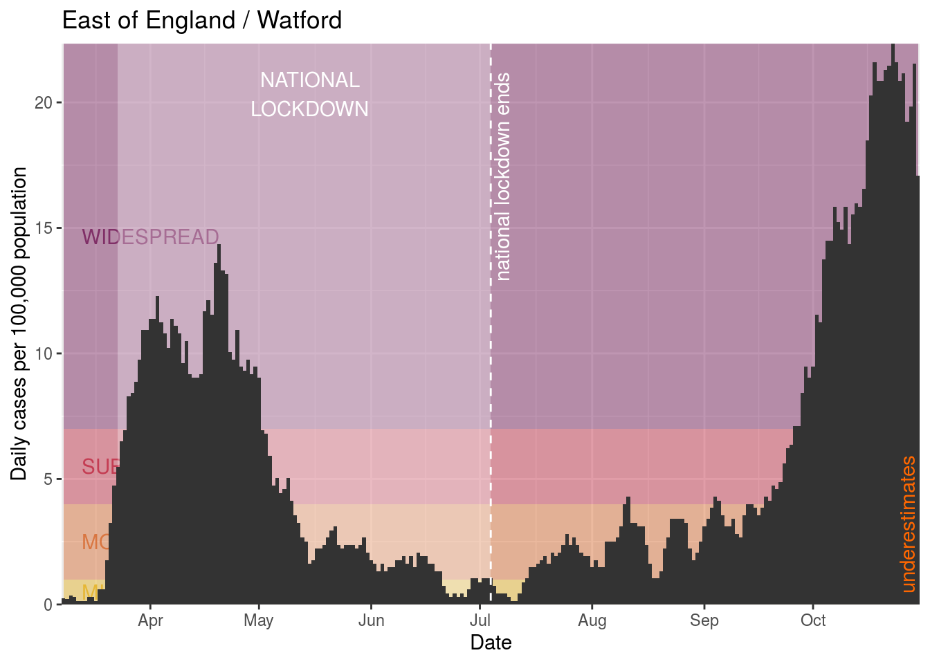
- Watford
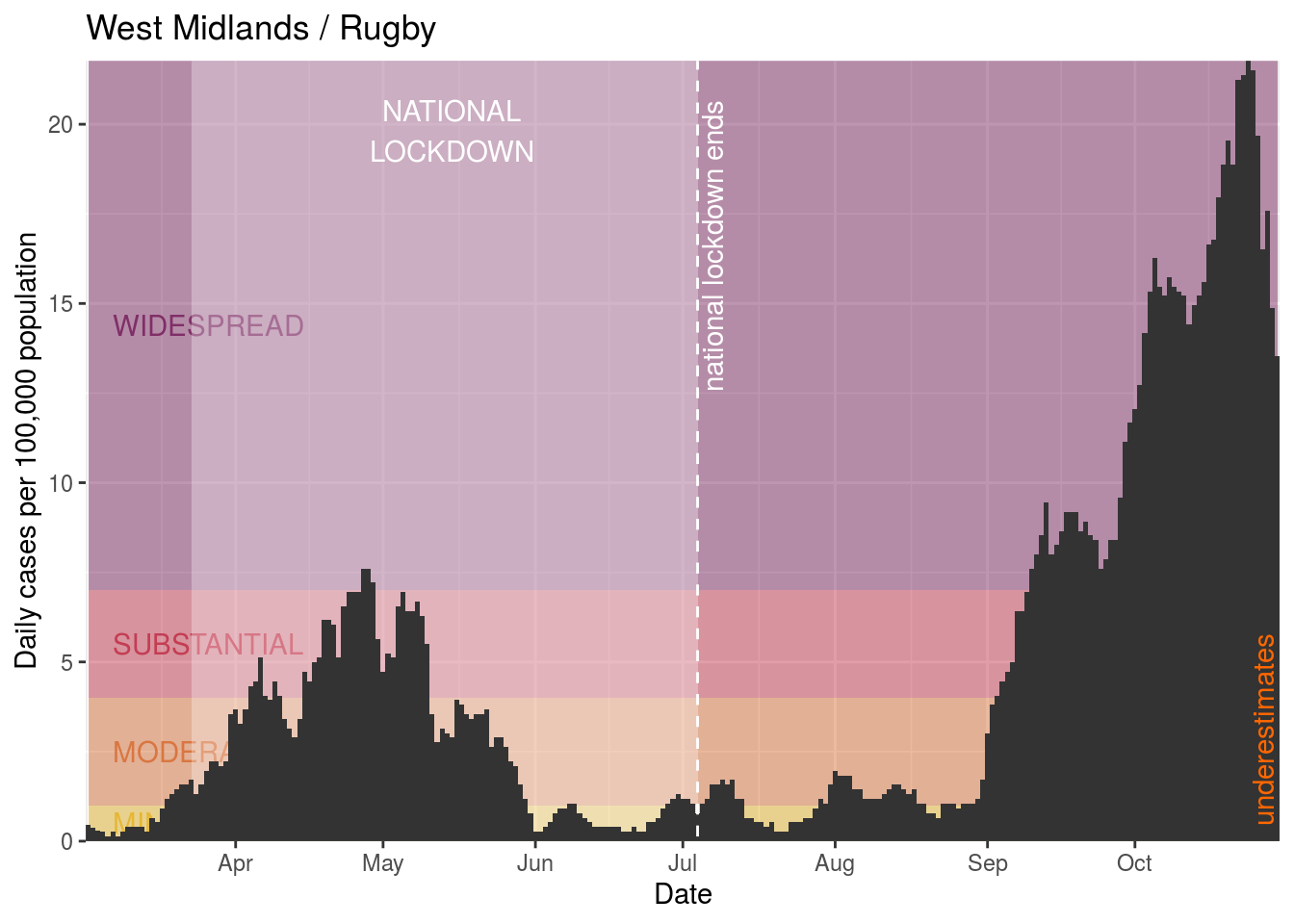
- Rugby
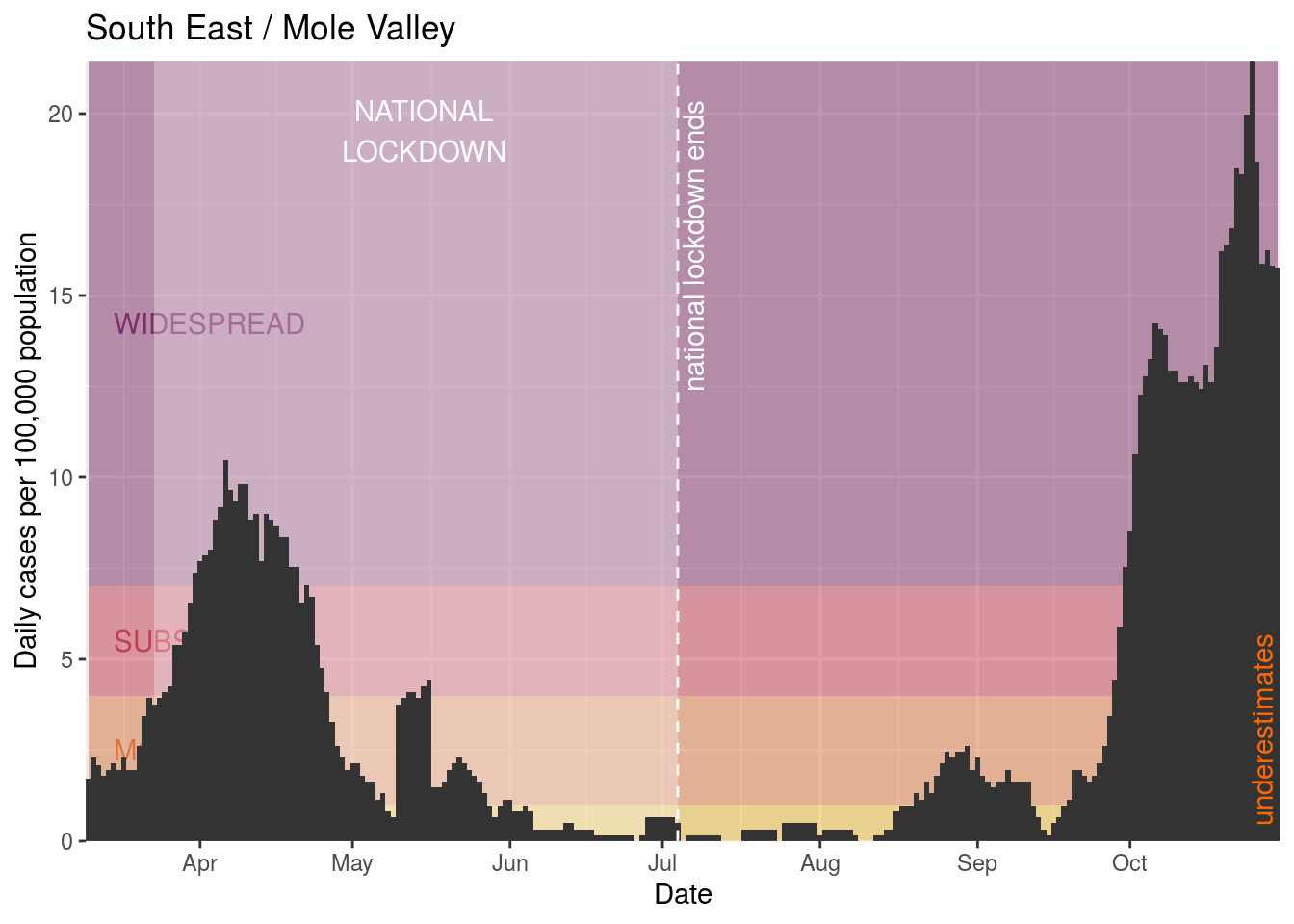
- Mole Valley
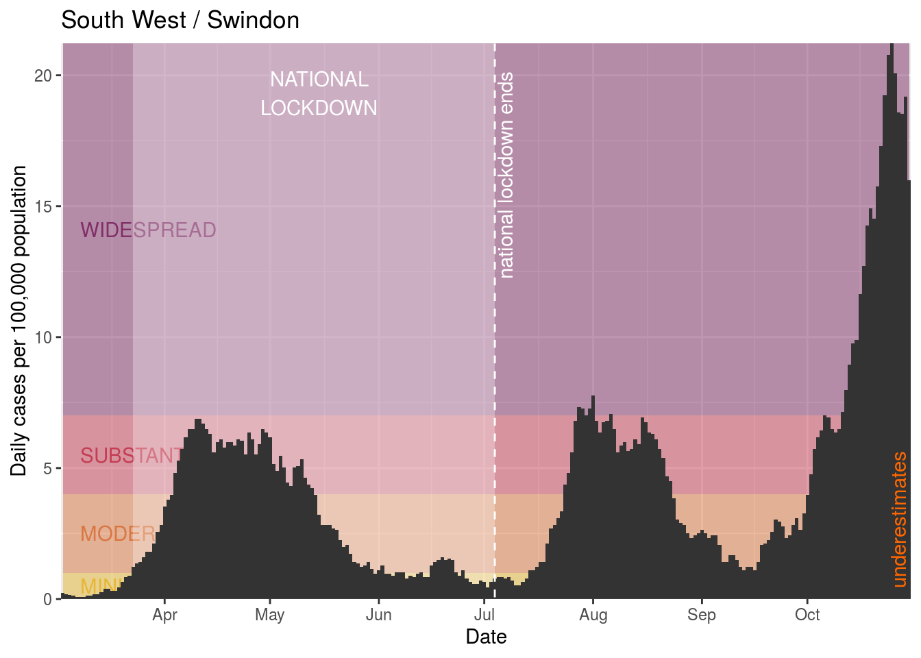
- Swindon
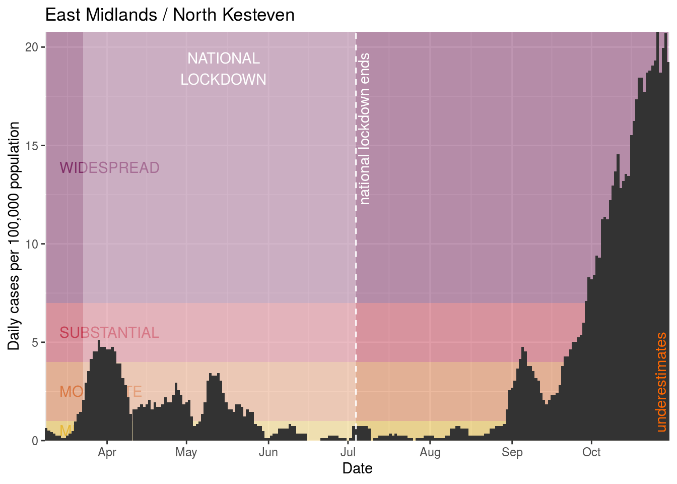
- North Kesteven
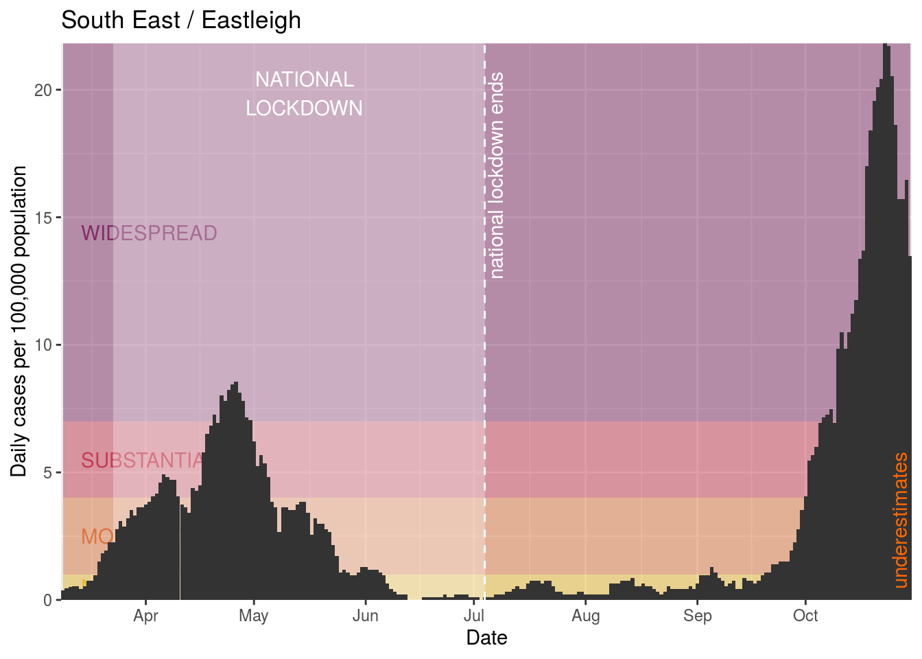
- Eastleigh
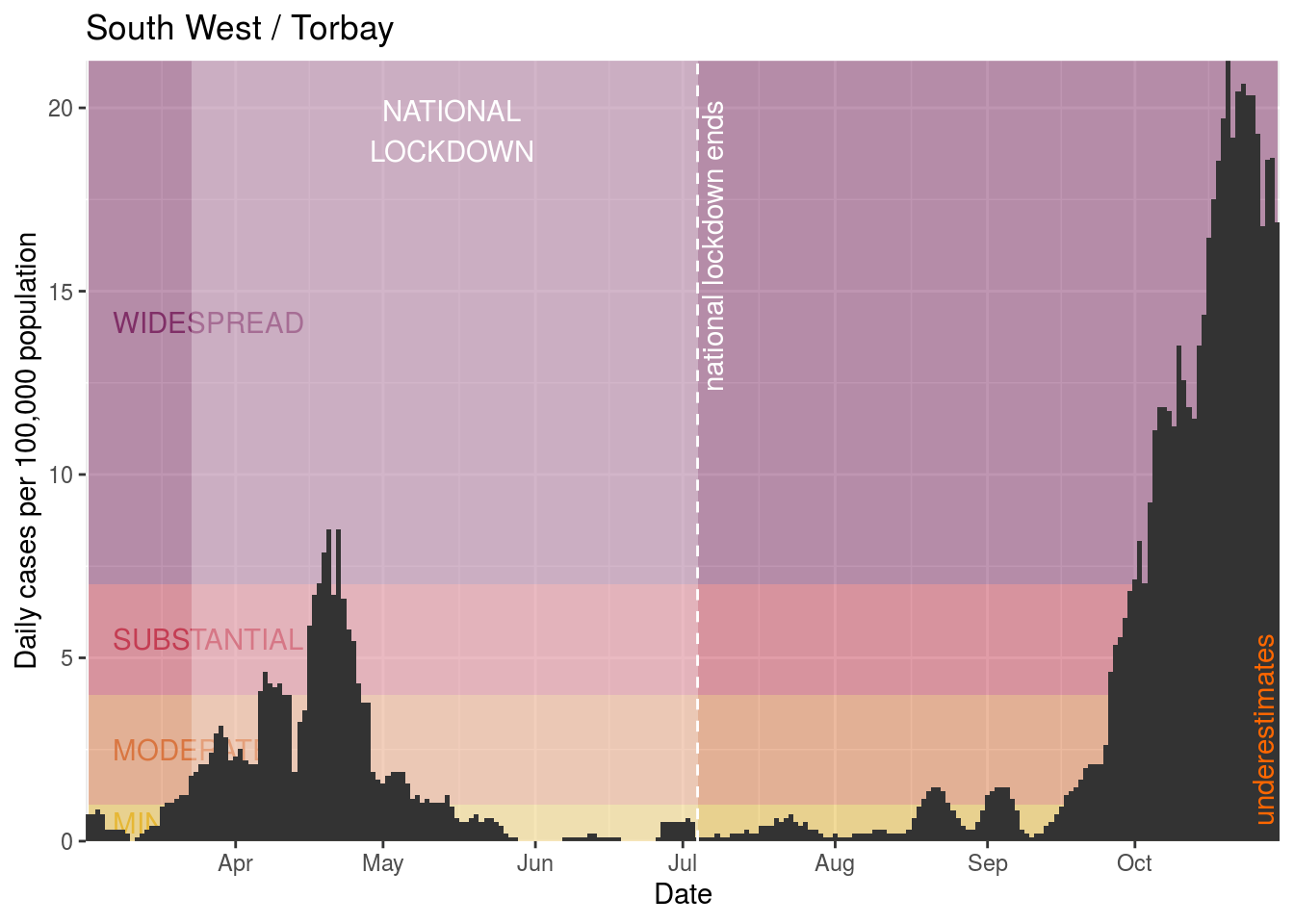
- Torbay
- Windsor and Maidenhead
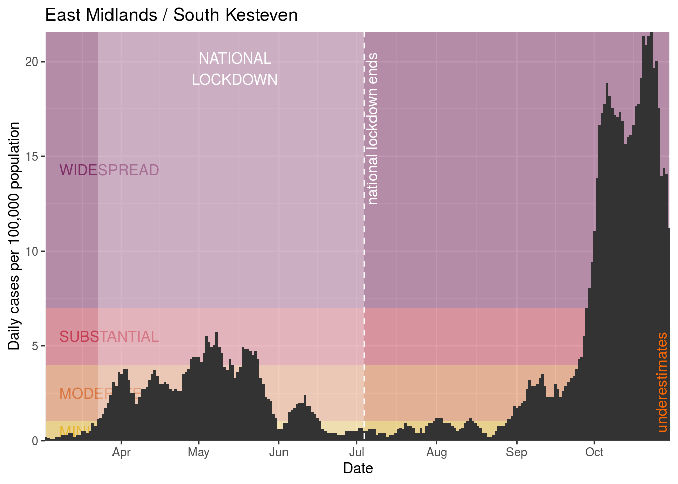
- South Kesteven
- Stratford-on-Avon
- Wyre Forest
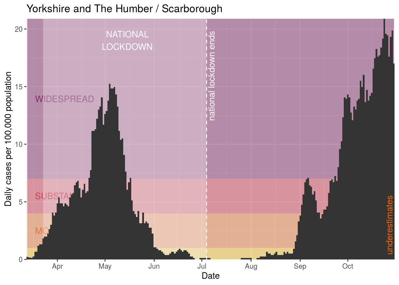
- Scarborough
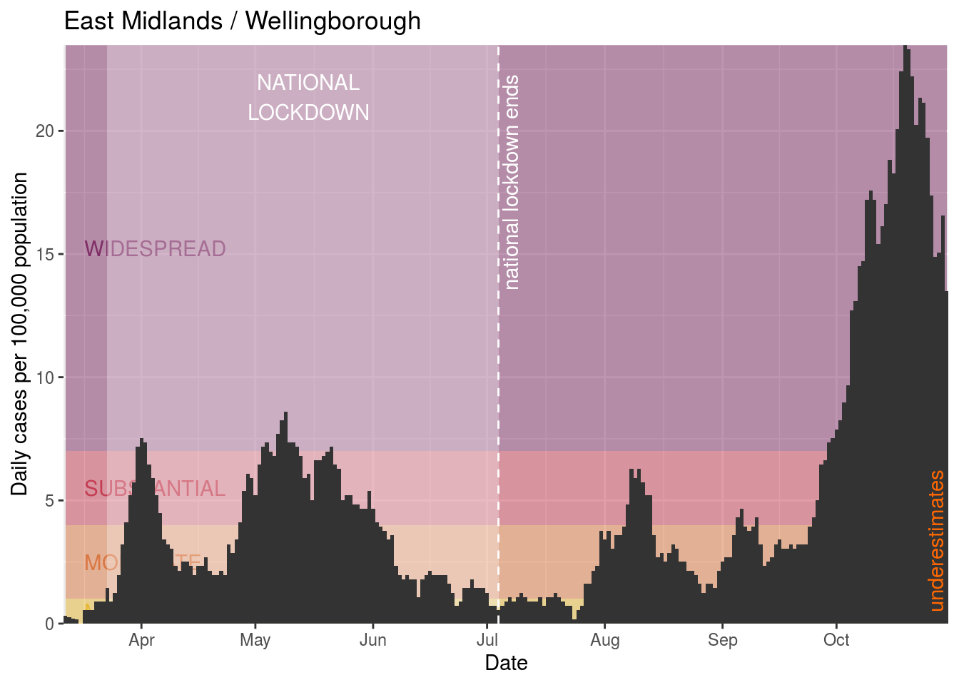
- Wellingborough
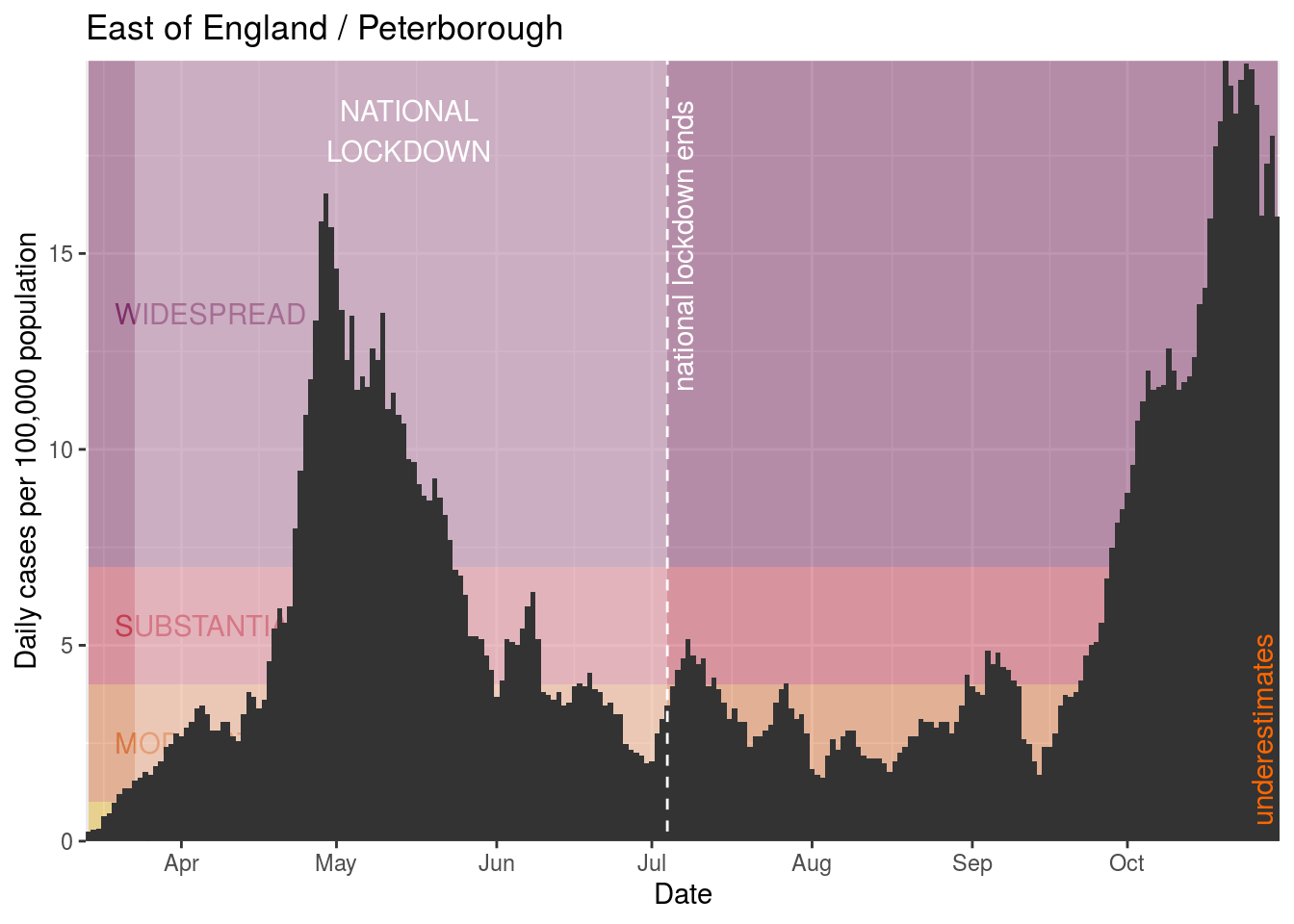
- Peterborough
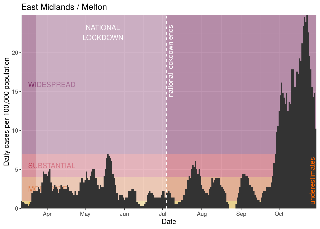
- Melton
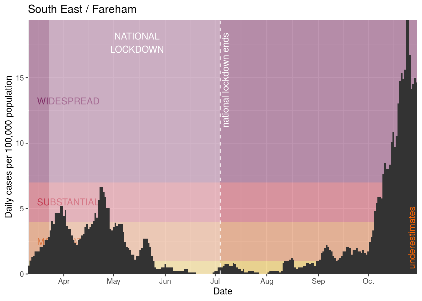
- Fareham
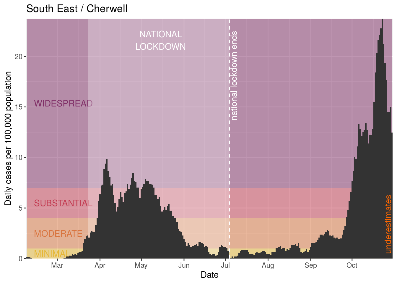
- Cherwell
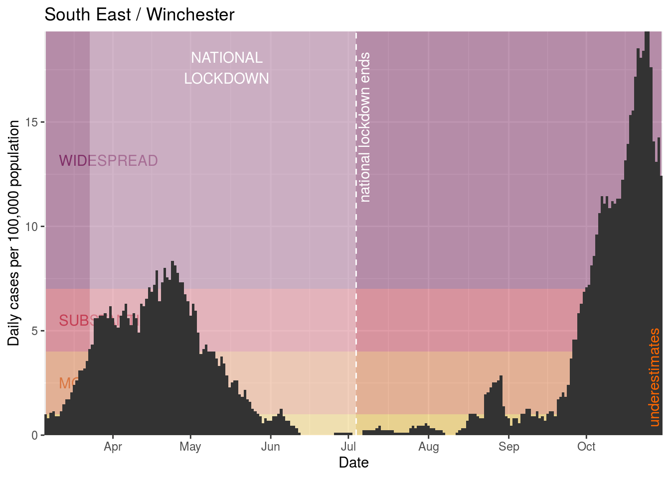
- Winchester
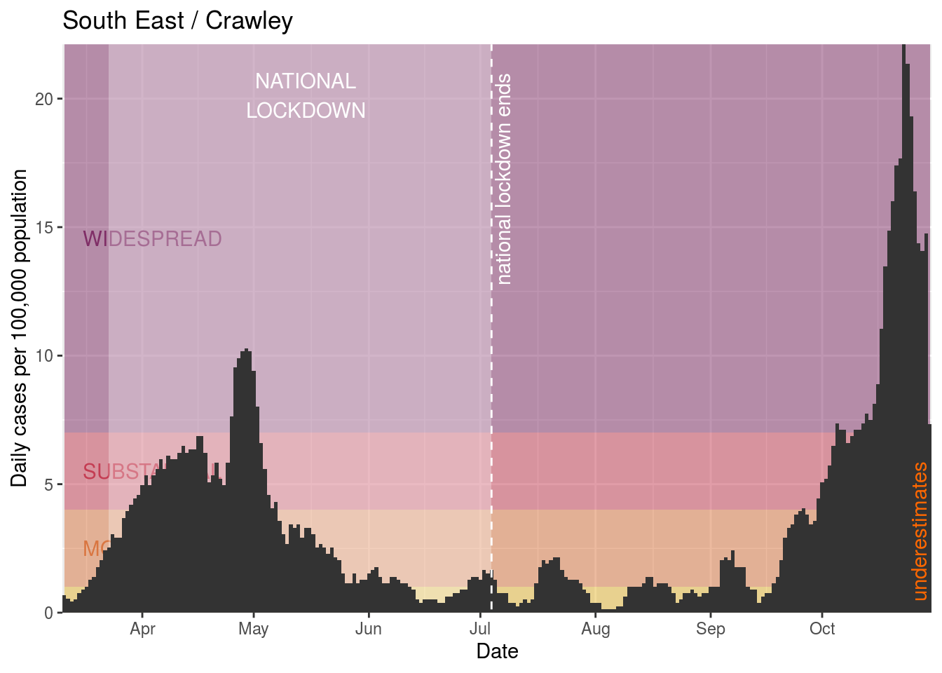
- Crawley
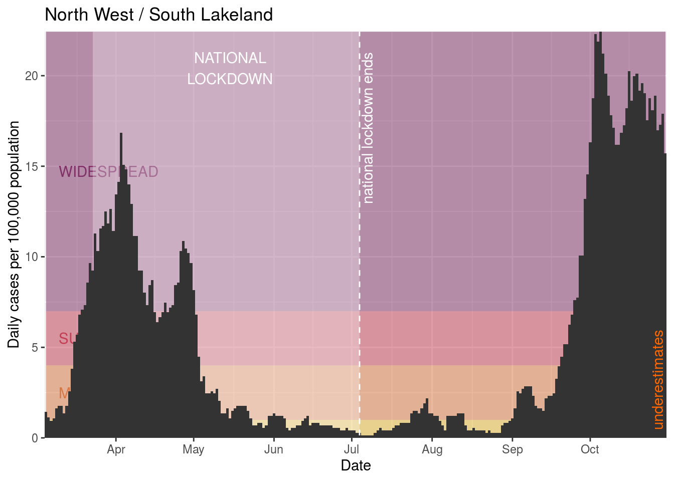
- South Lakeland
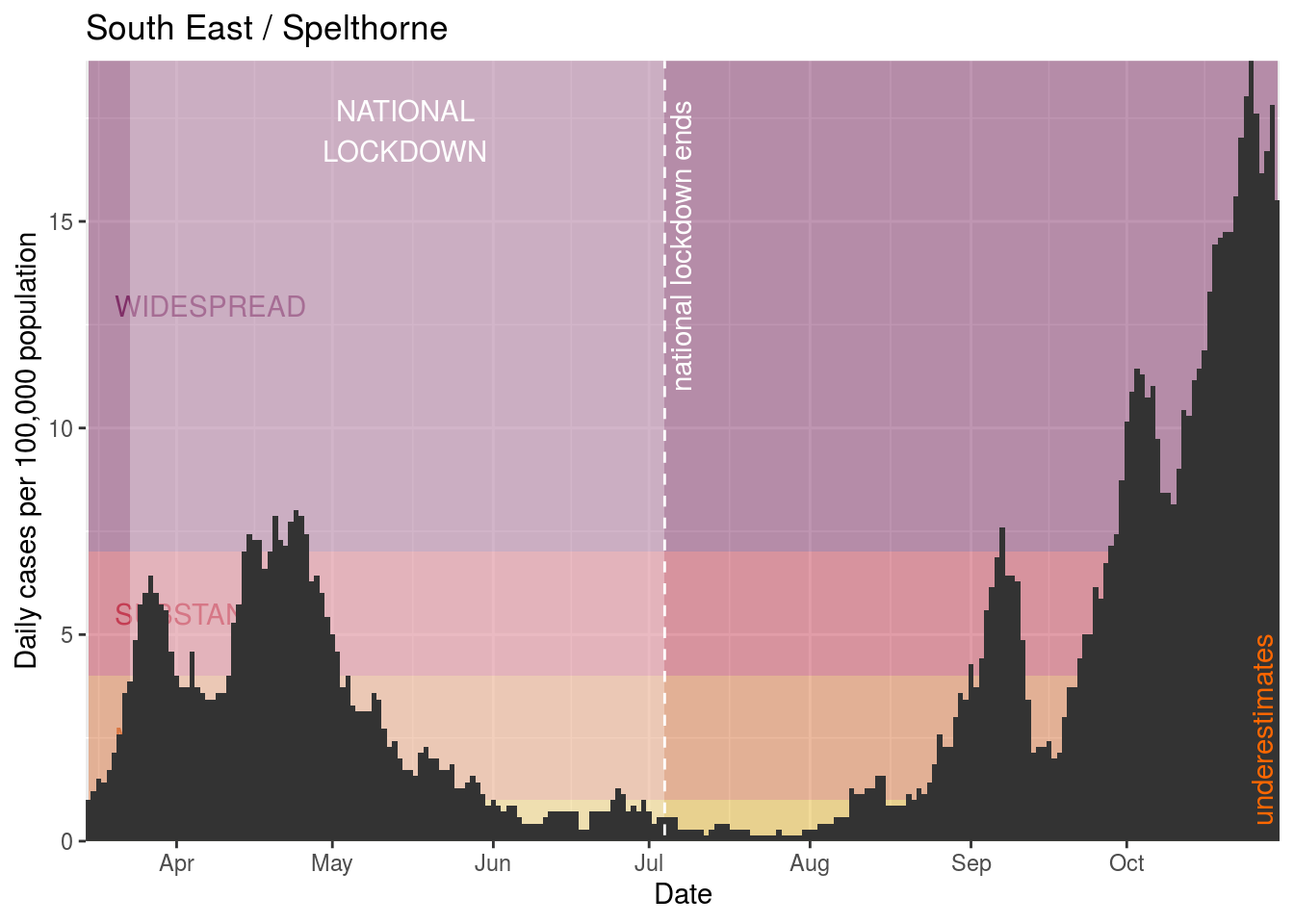
- Spelthorne
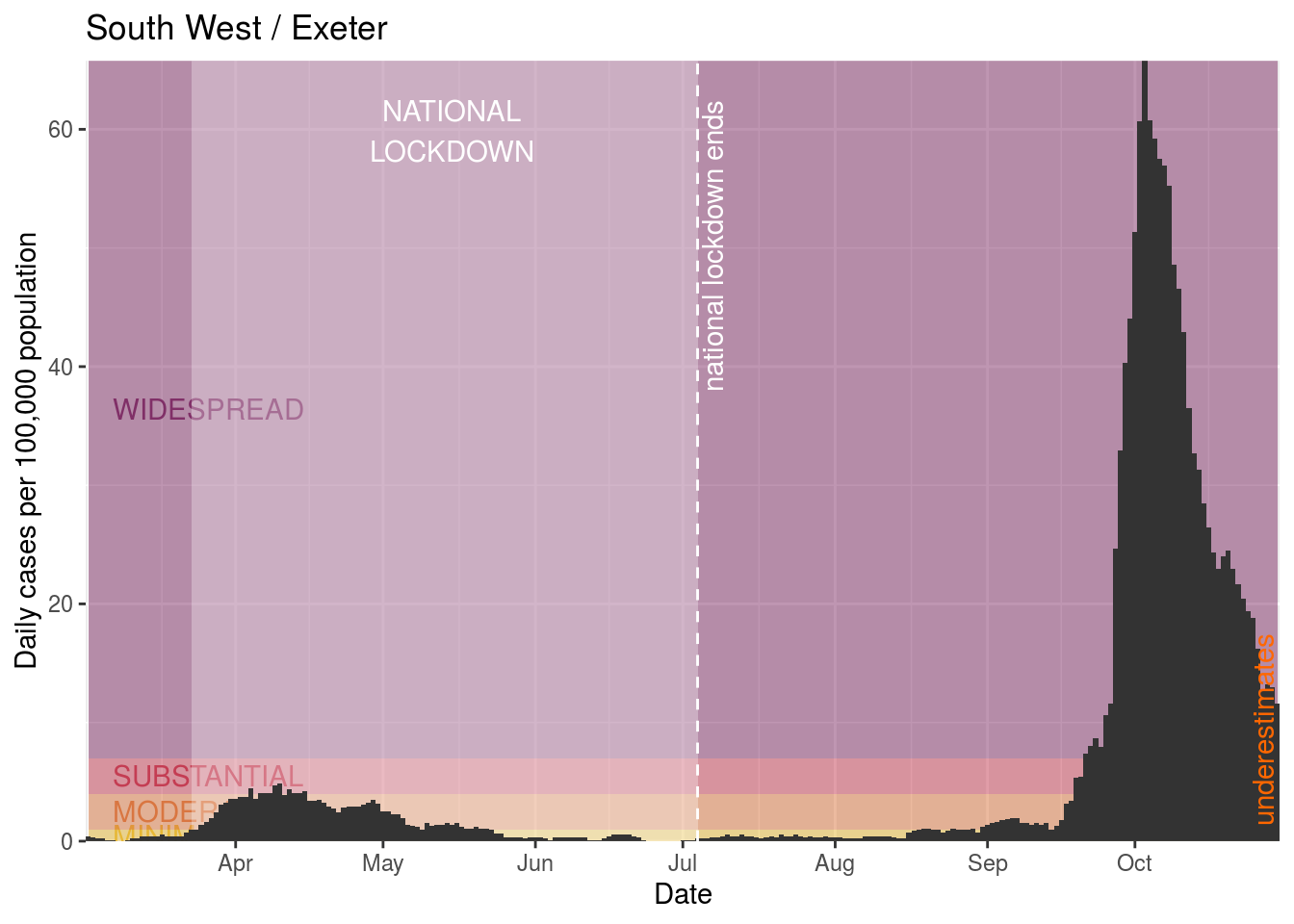
- Exeter
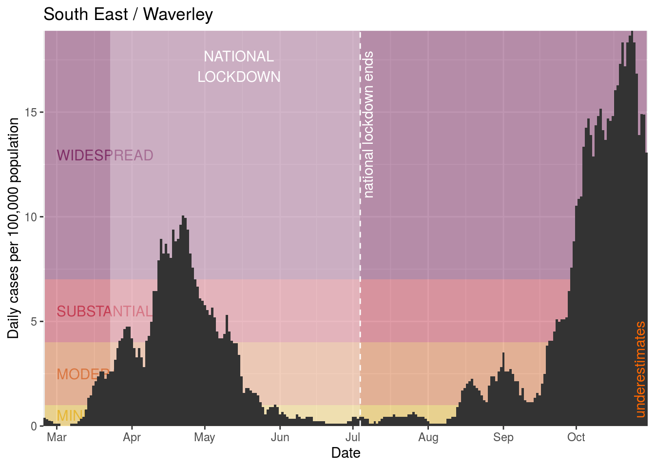
- Waverley
- Epsom and Ewell
- Wychavon
- Woking
- Reading
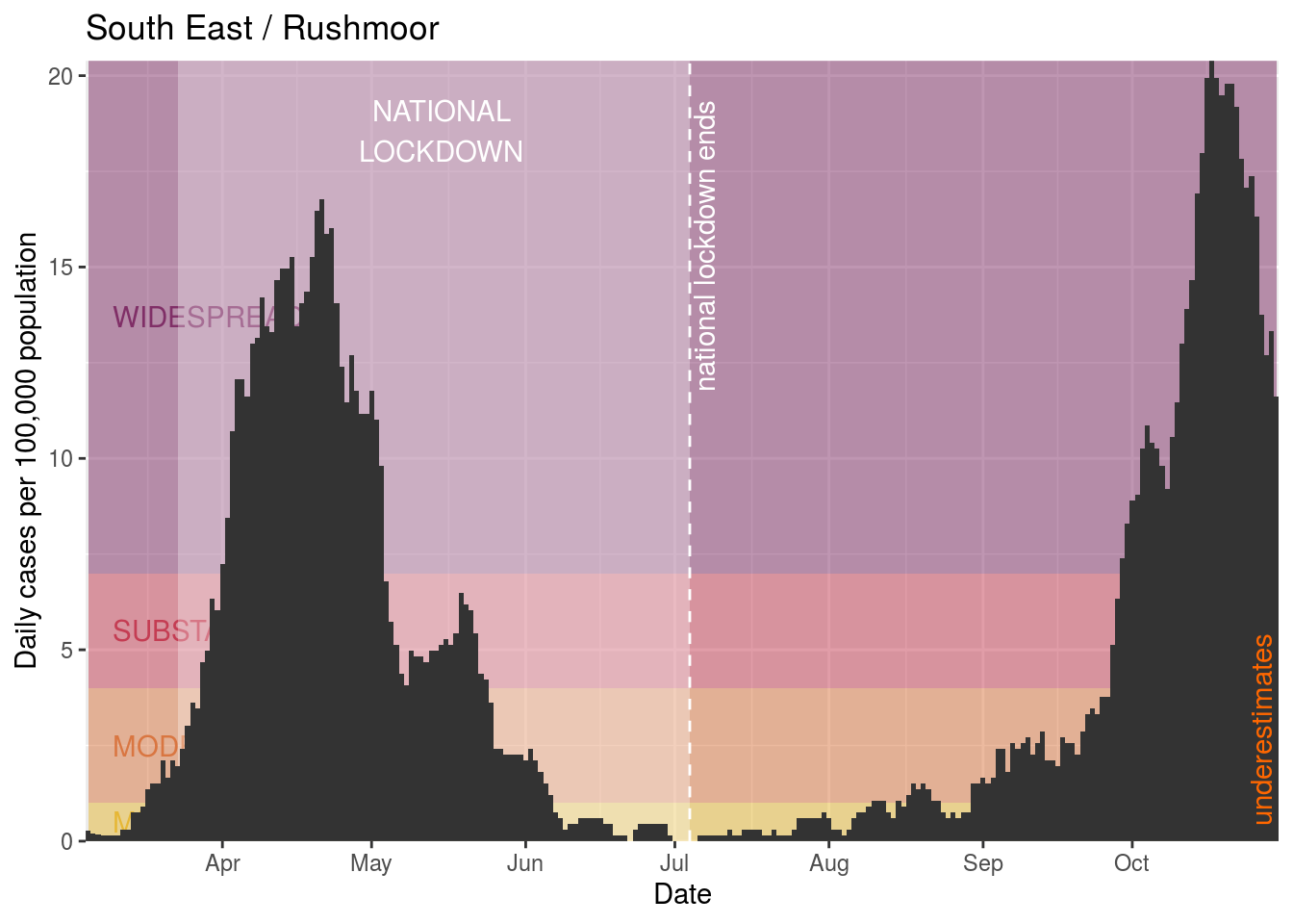
- Rushmoor
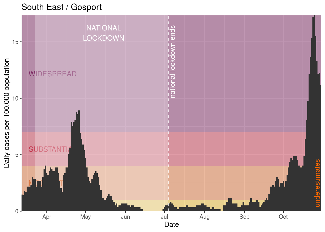
- Gosport
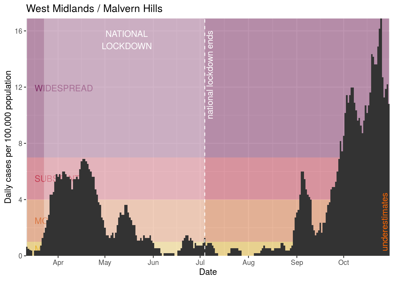
- Malvern Hills
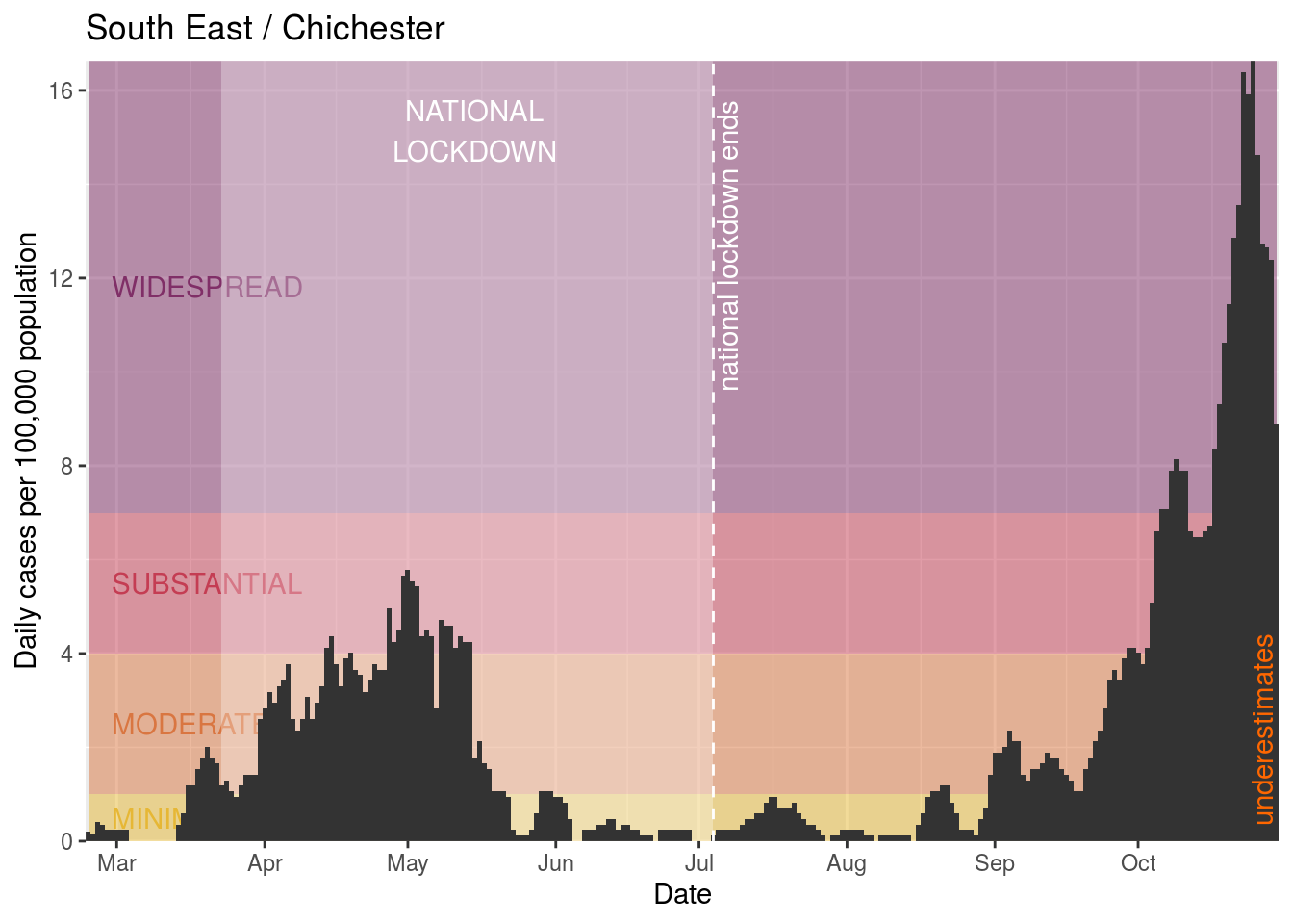
- Chichester
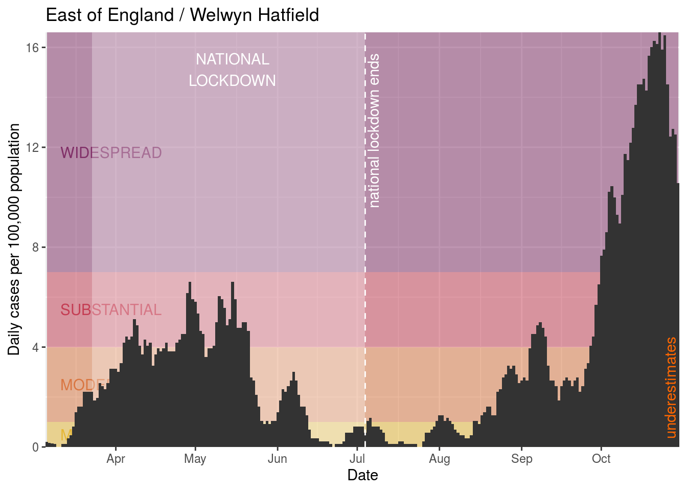
- Welwyn Hatfield
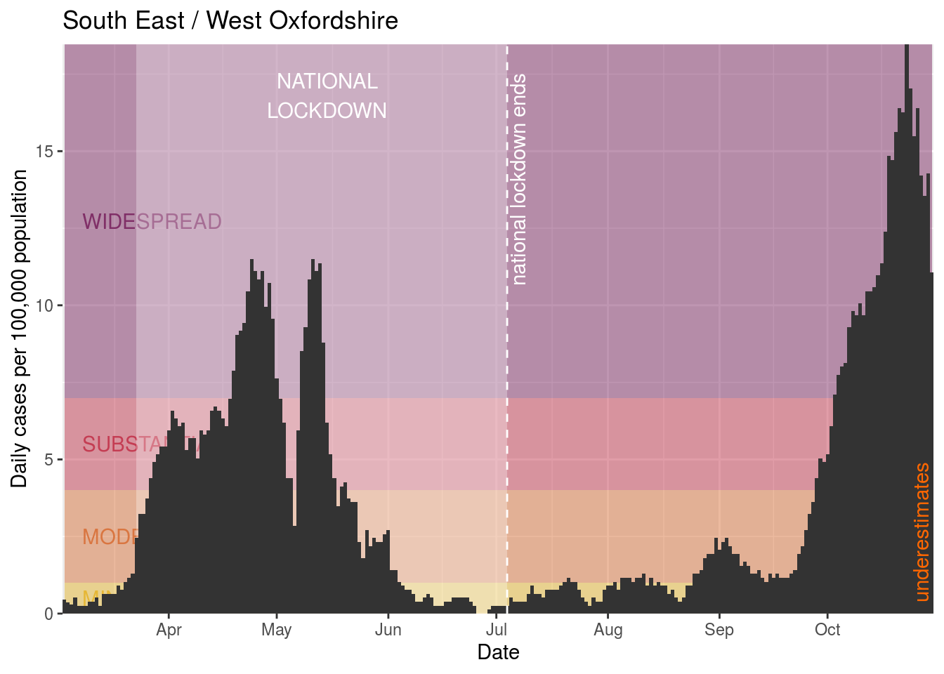
- West Oxfordshire
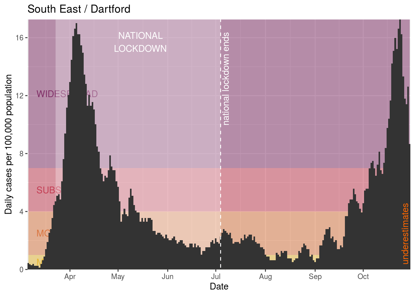
- Dartford
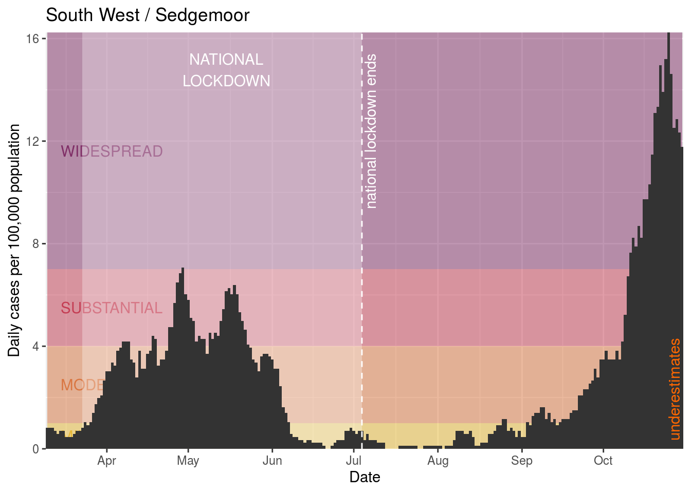
- Sedgemoor
- Guildford
- Medway
- Stevenage
- South Northamptonshire
- Milton Keynes
- Allerdale
- Three Rivers
- Dorset
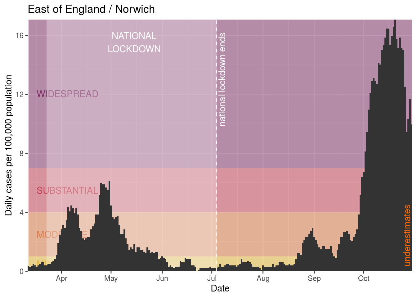
- Norwich
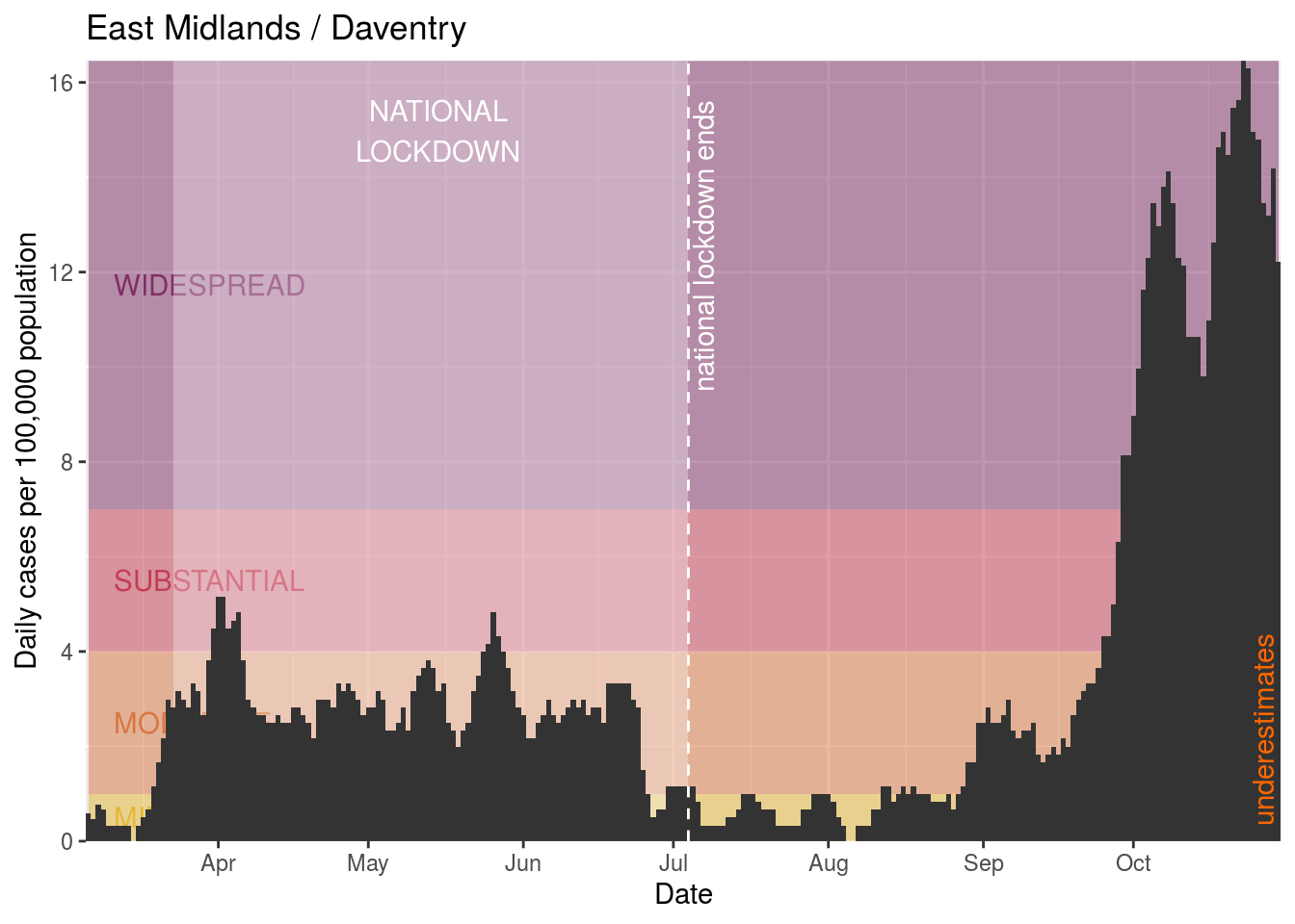
- Daventry
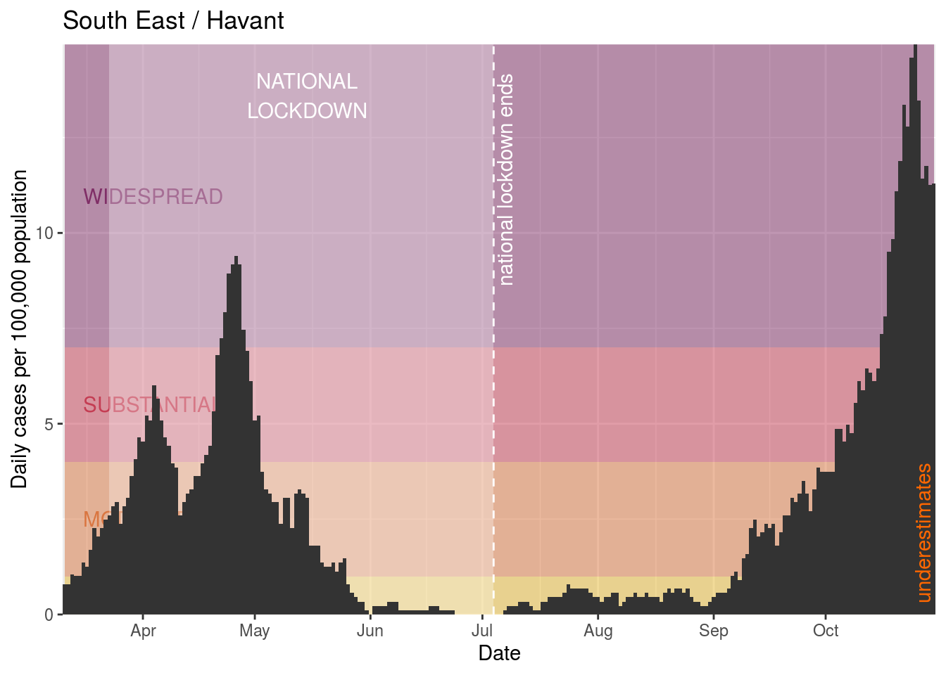
- Havant
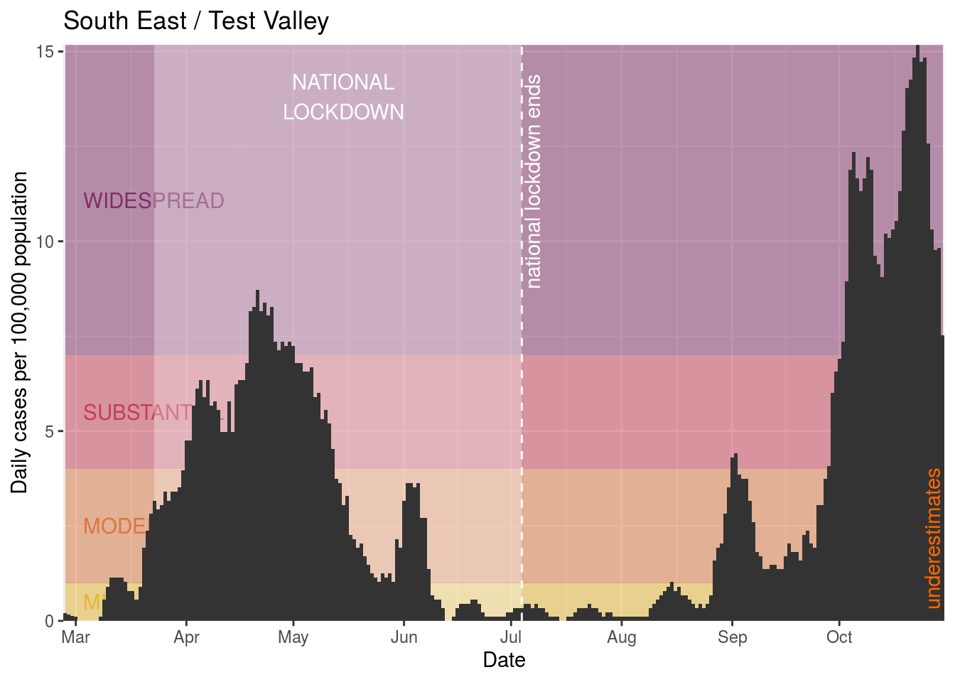
- Test Valley
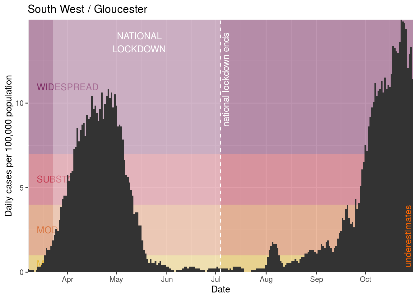
- Gloucester
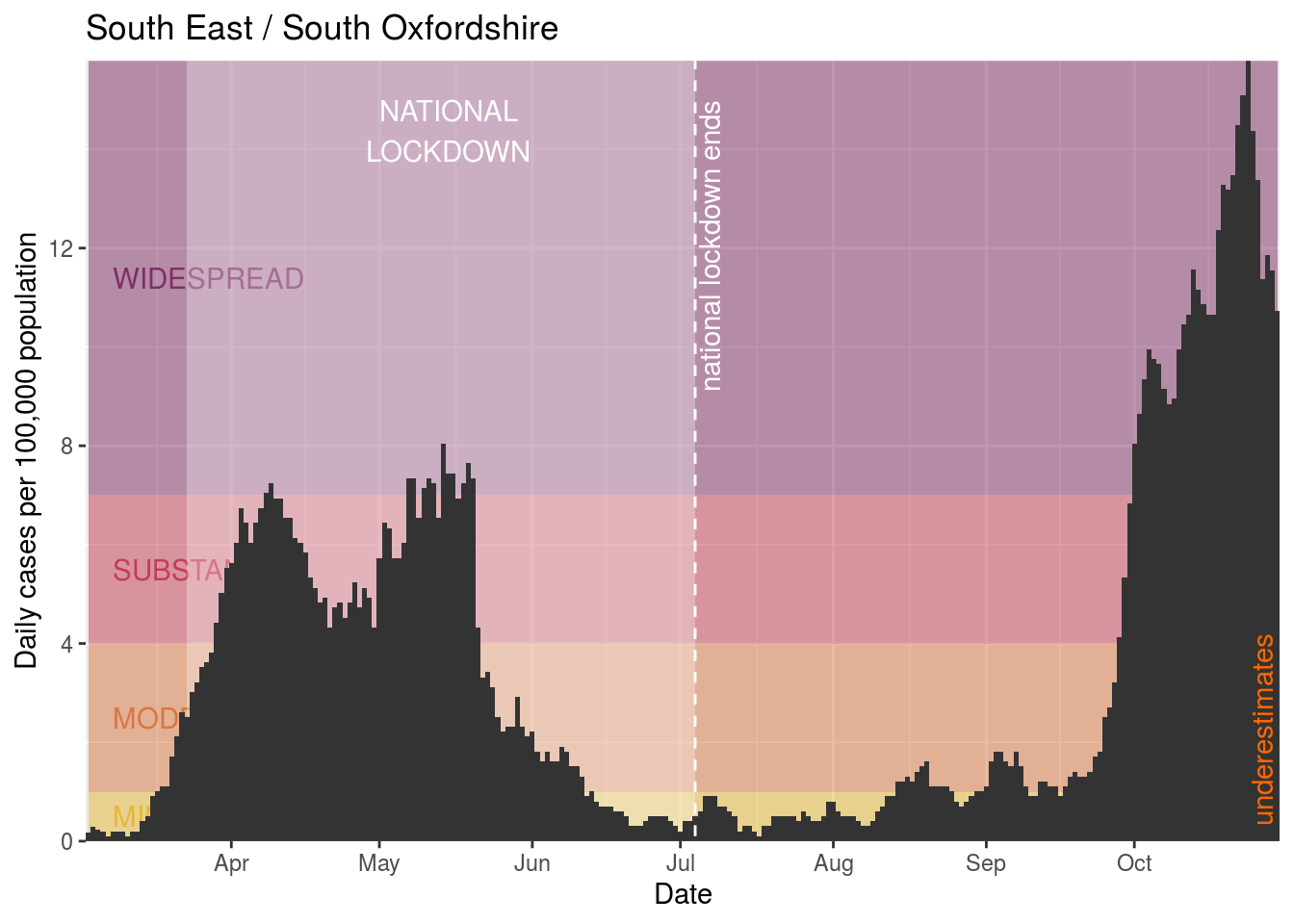
- South Oxfordshire
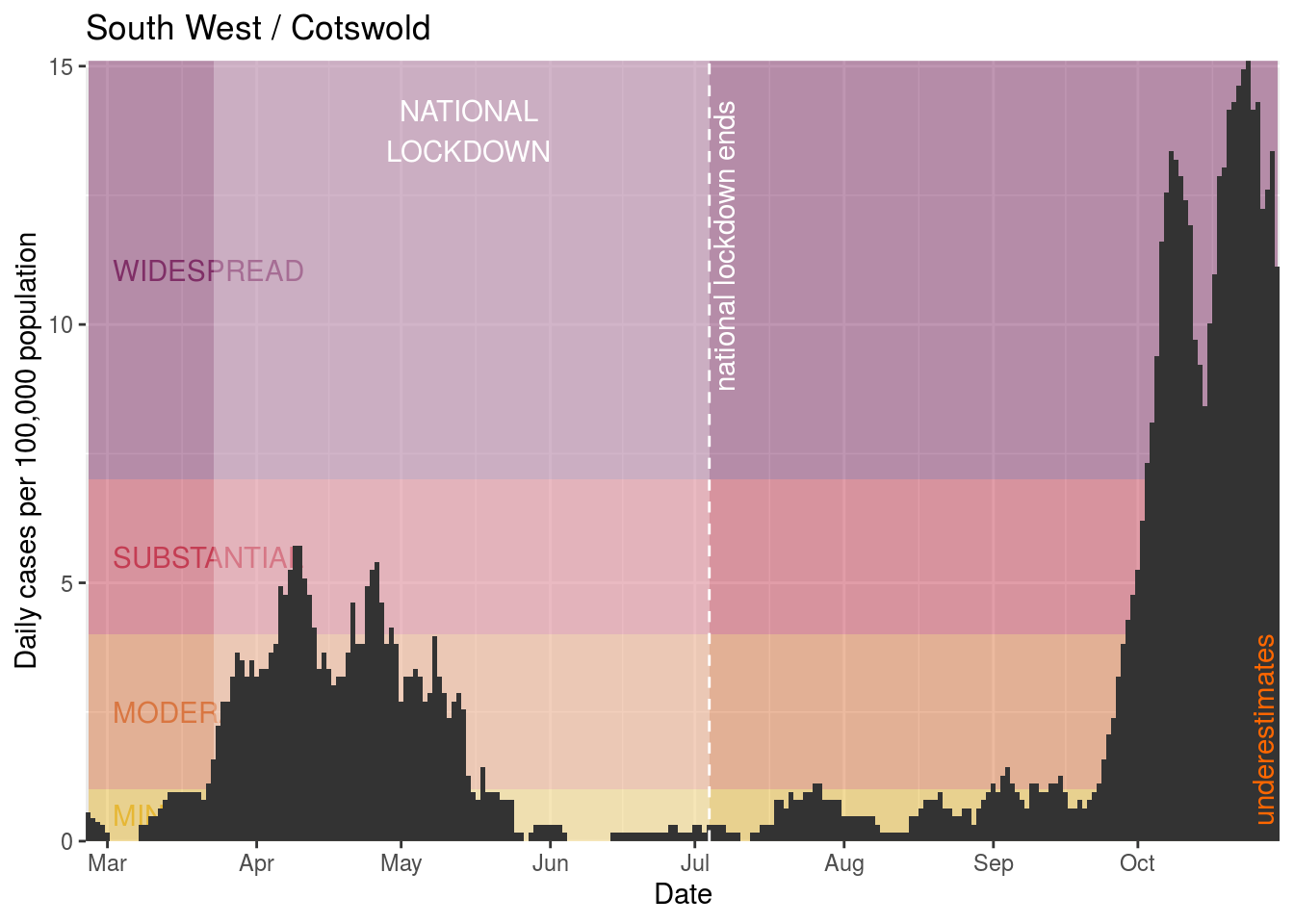
- Cotswold
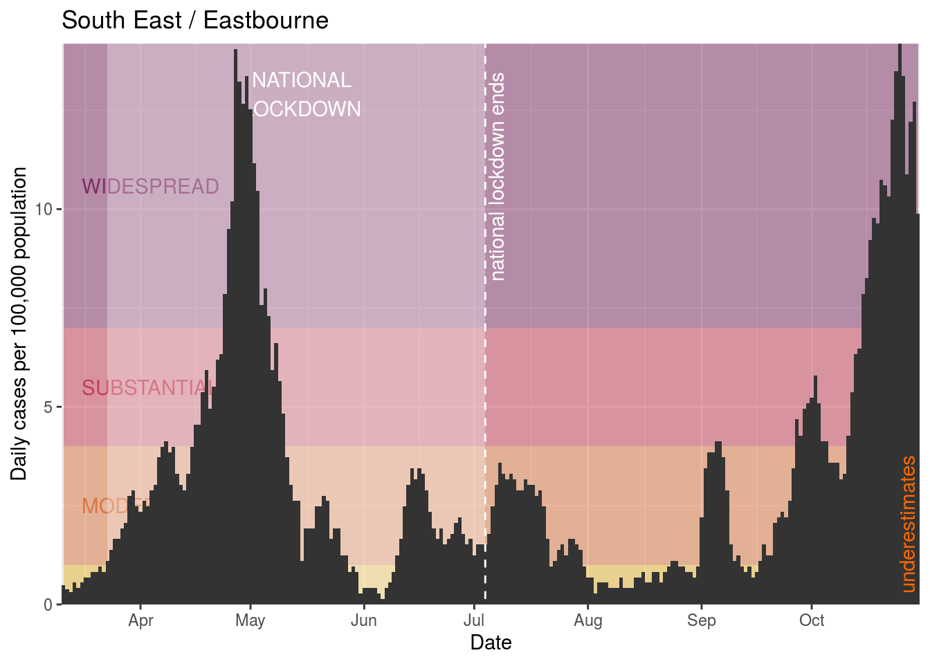
- Eastbourne
- East Hertfordshire
- Tandridge
- Bedford
- Ryedale
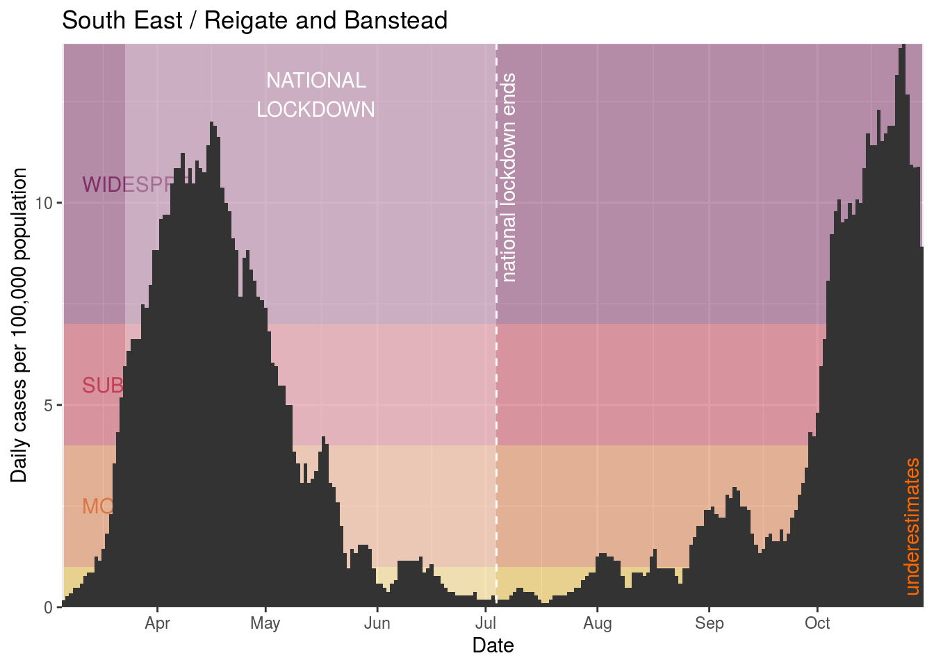
- Reigate and Banstead
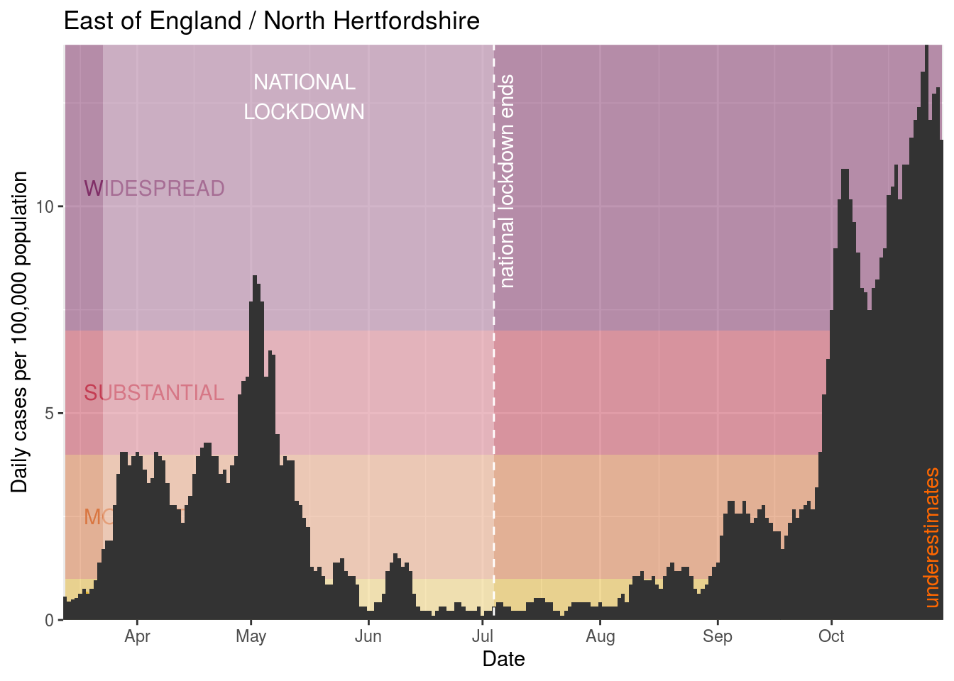
- North Hertfordshire
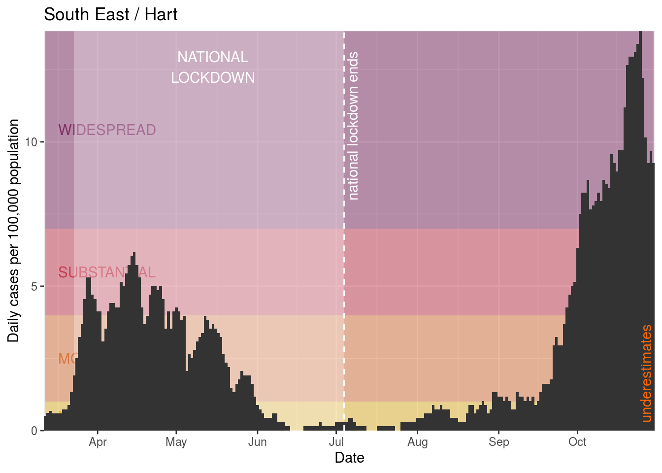
- Hart
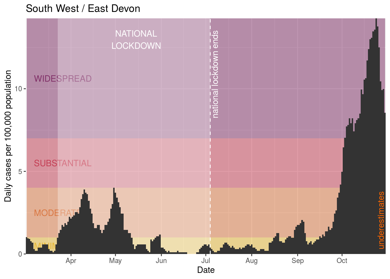
- East Devon
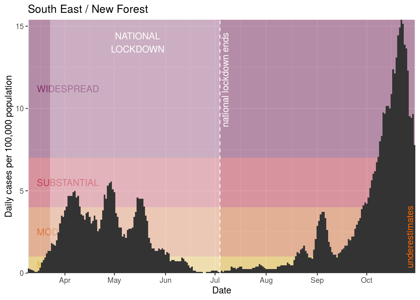
- New Forest
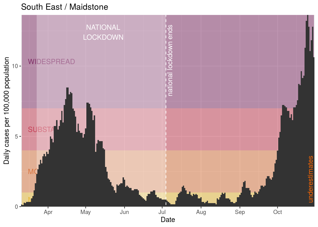
- Maidstone
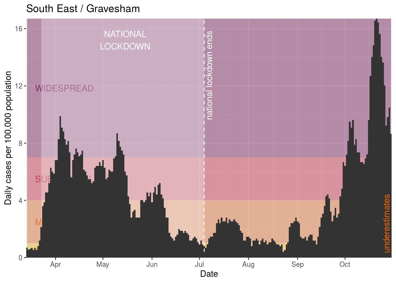
- Gravesham
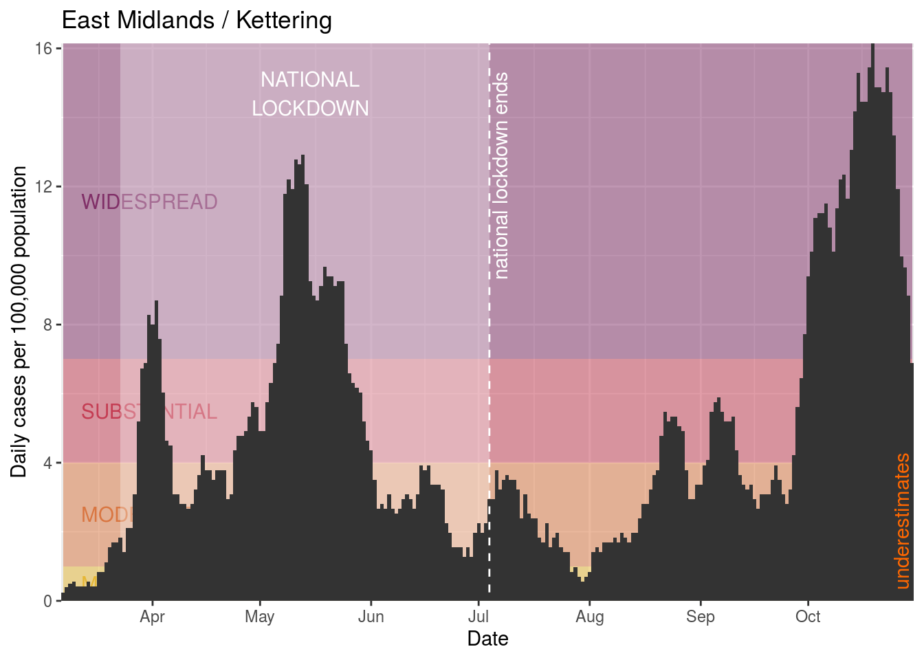
- Kettering
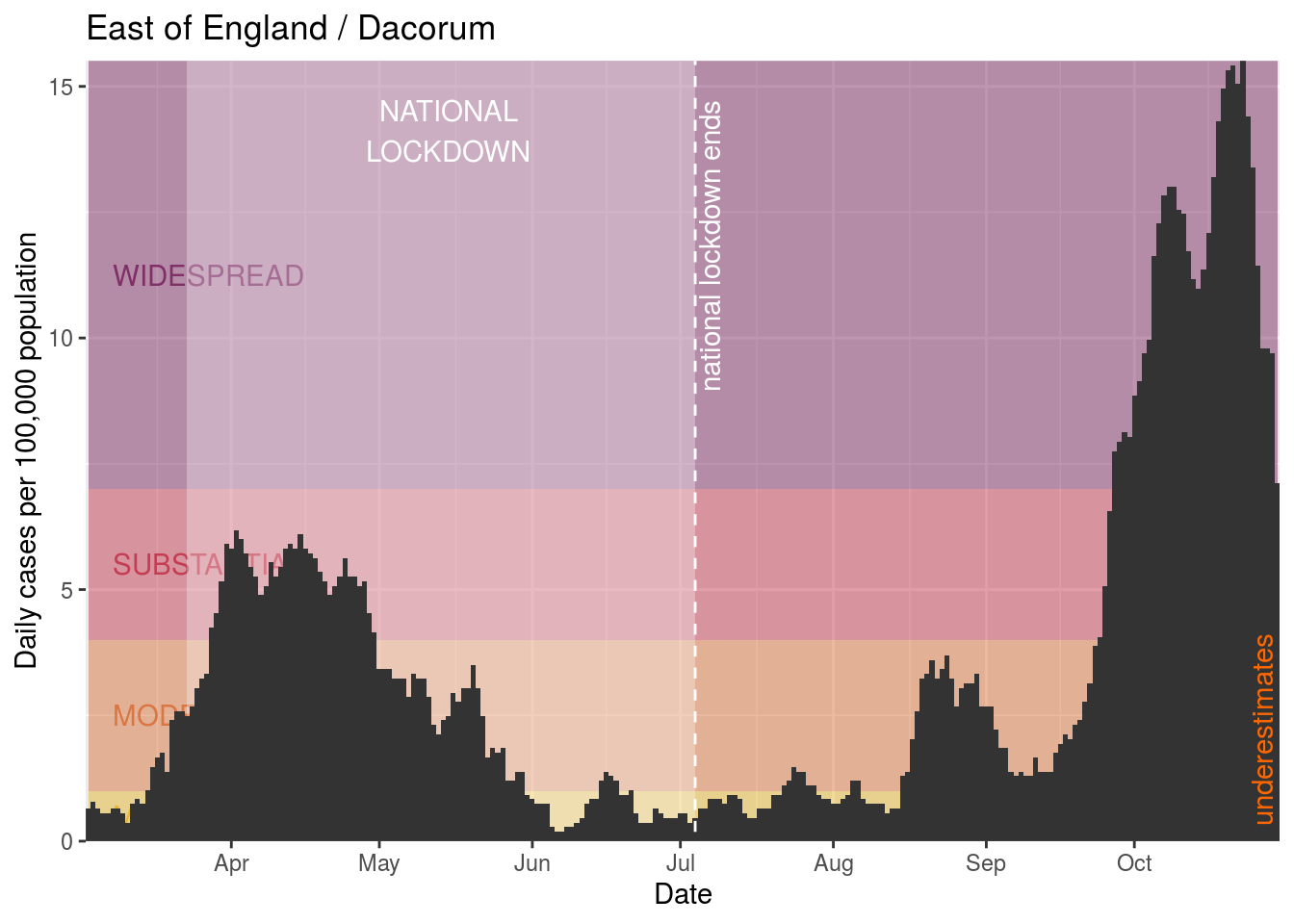
- Dacorum
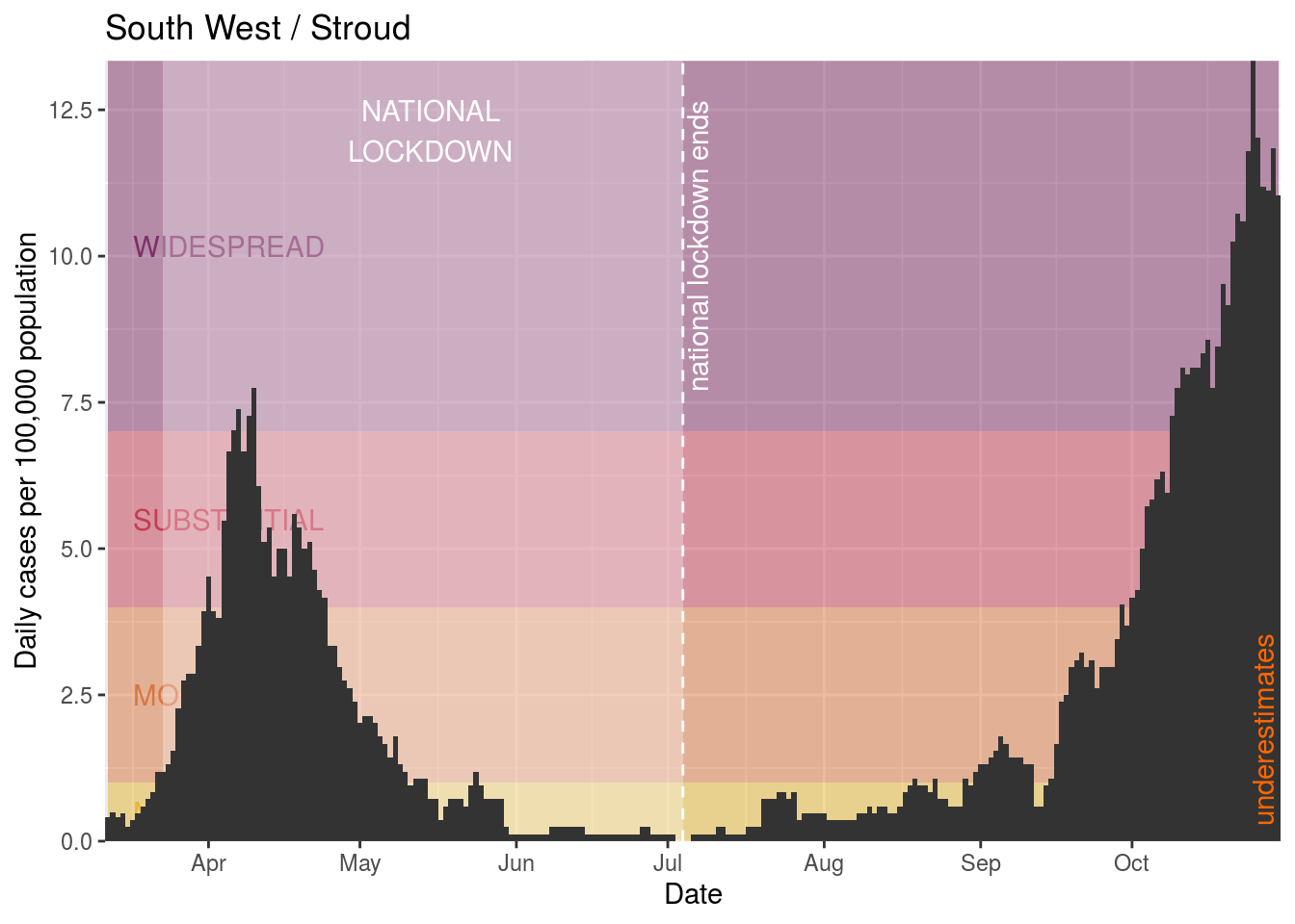
- Stroud
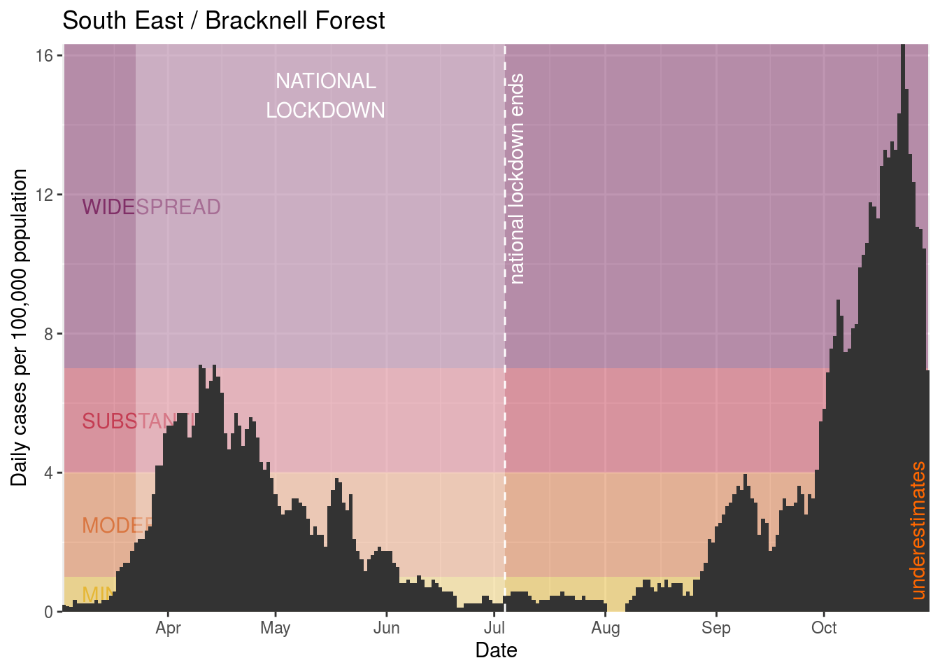
- Bracknell Forest
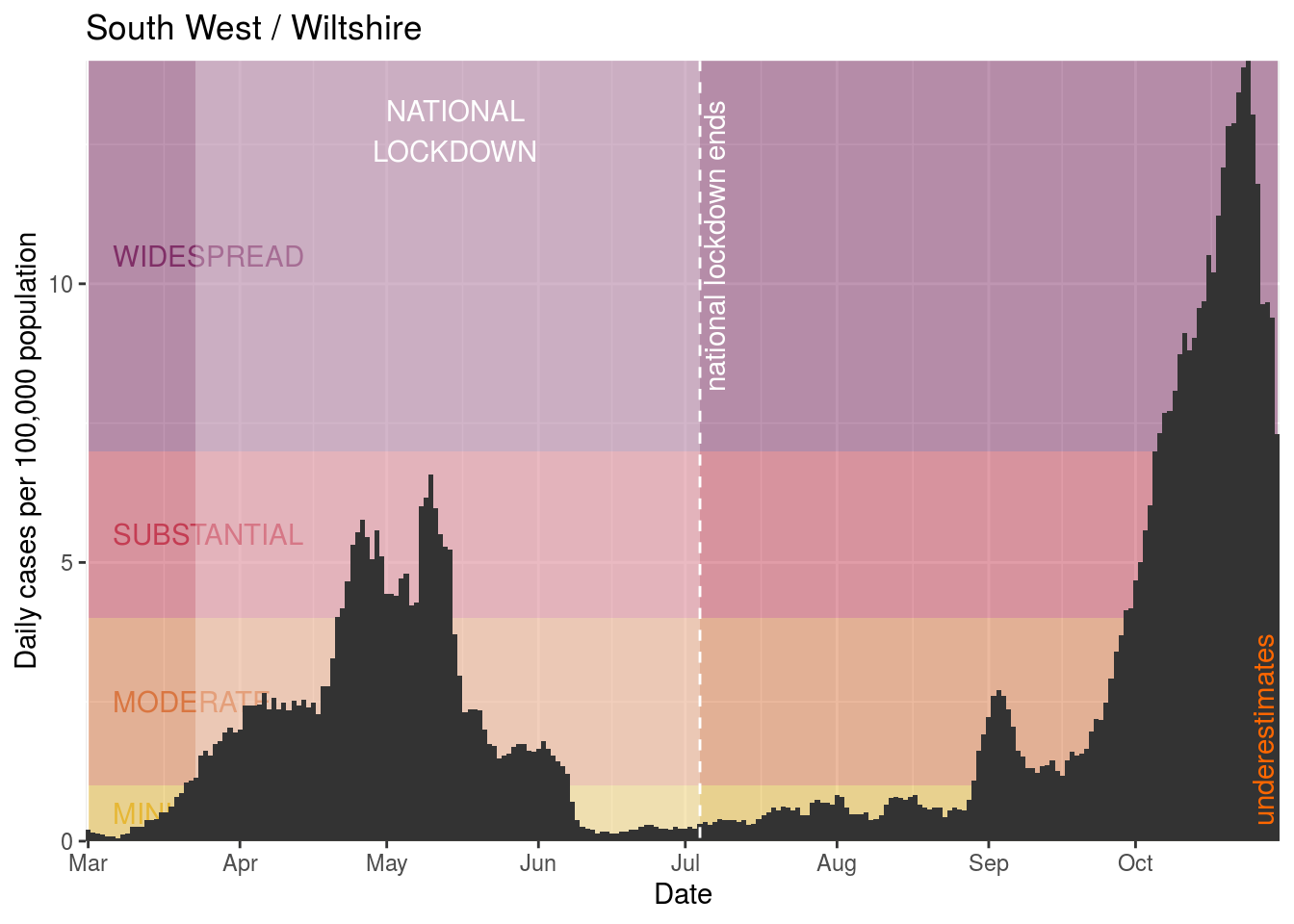
- Wiltshire
- King’s Lynn and West Norfolk
- Cheltenham
- Southend-on-Sea
- Mid Sussex
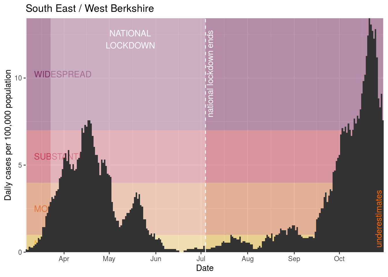
- West Berkshire
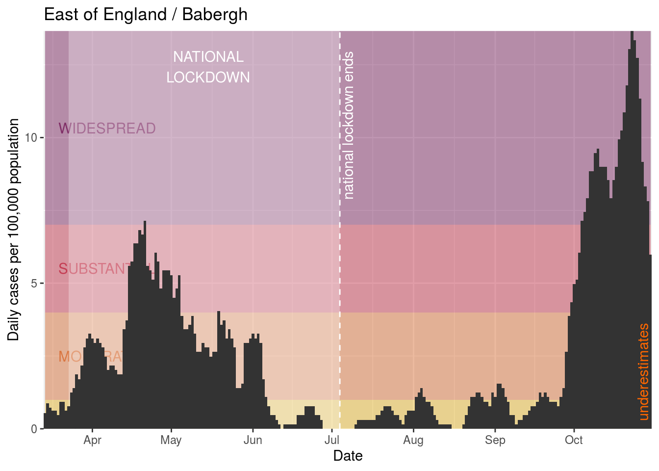
- Babergh
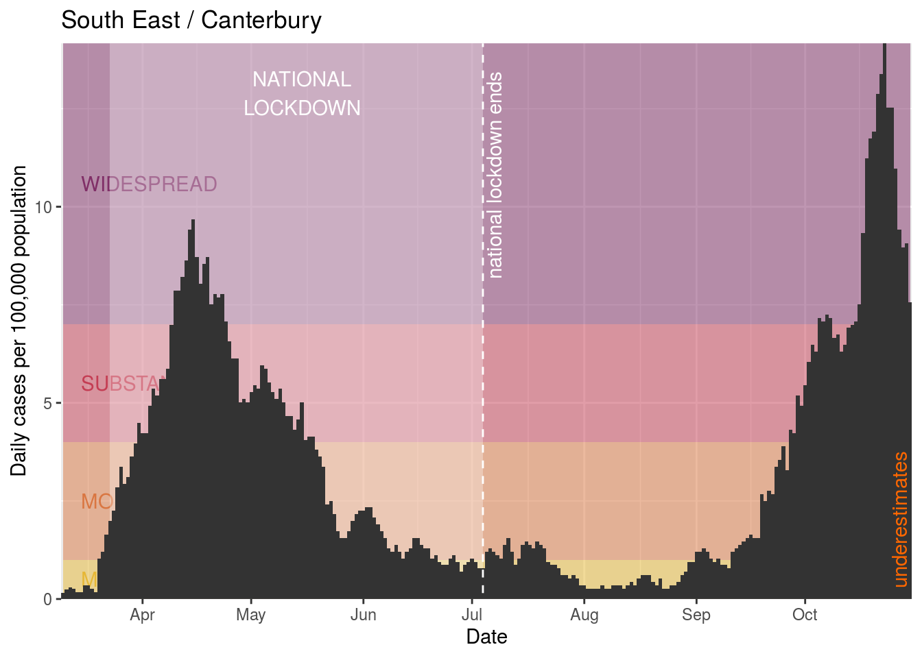
- Canterbury
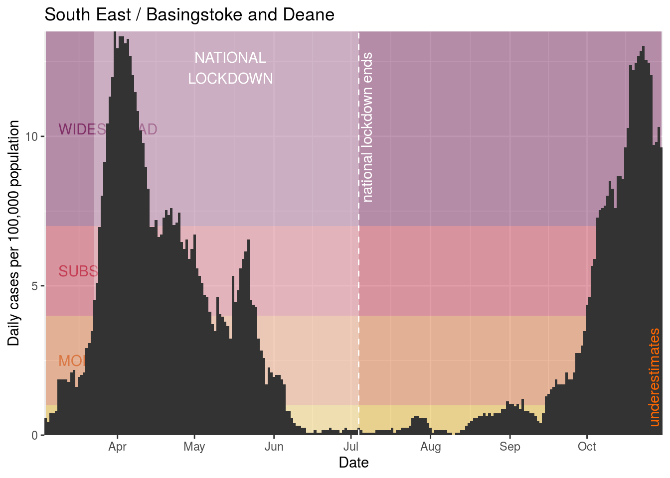
- Basingstoke and Deane
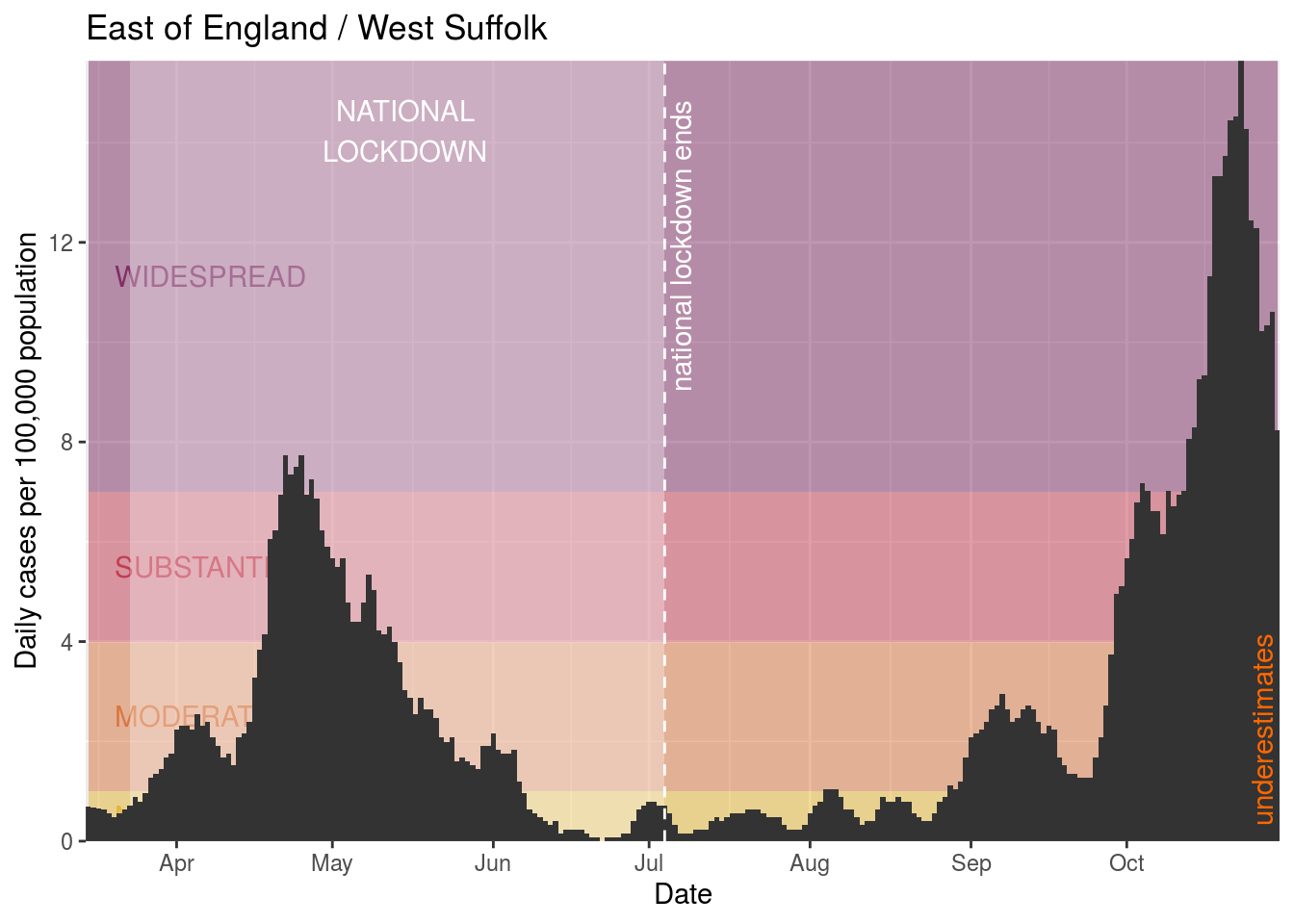
- West Suffolk
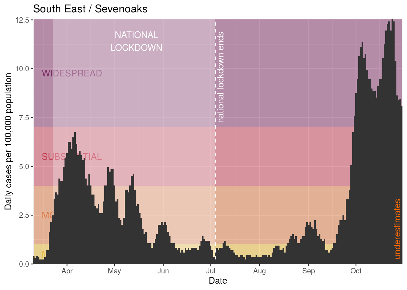
- Sevenoaks
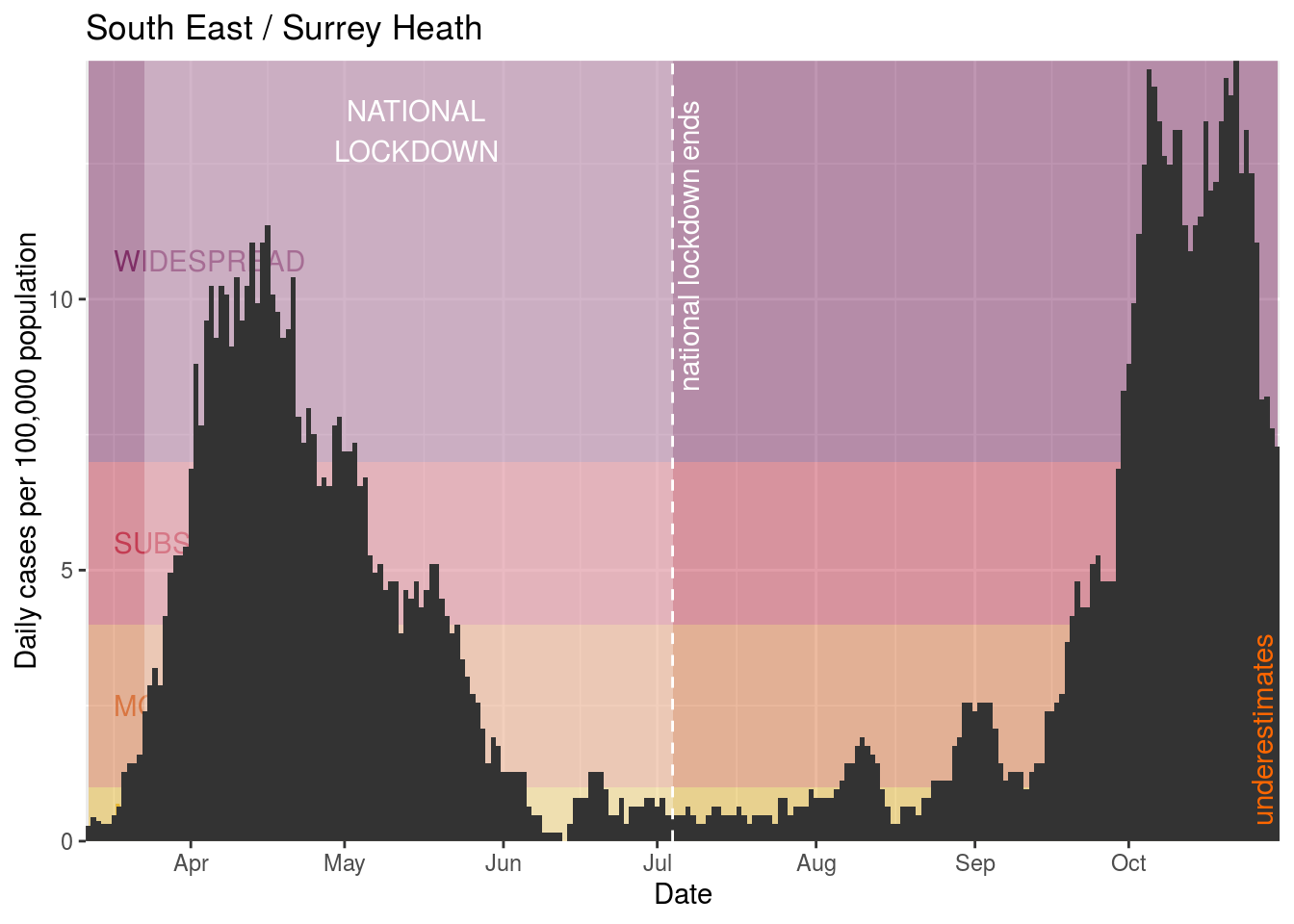
- Surrey Heath
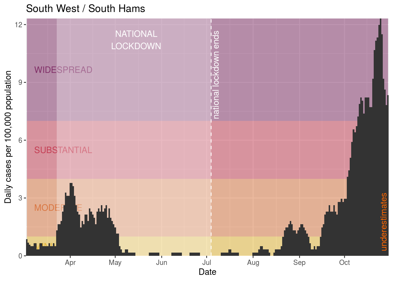
- South Hams
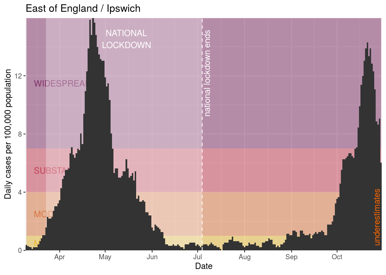
- Ipswich
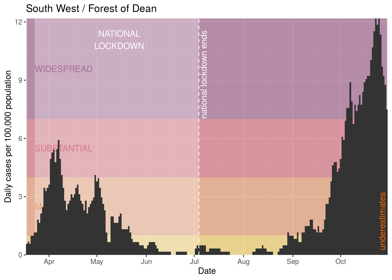
- Forest of Dean
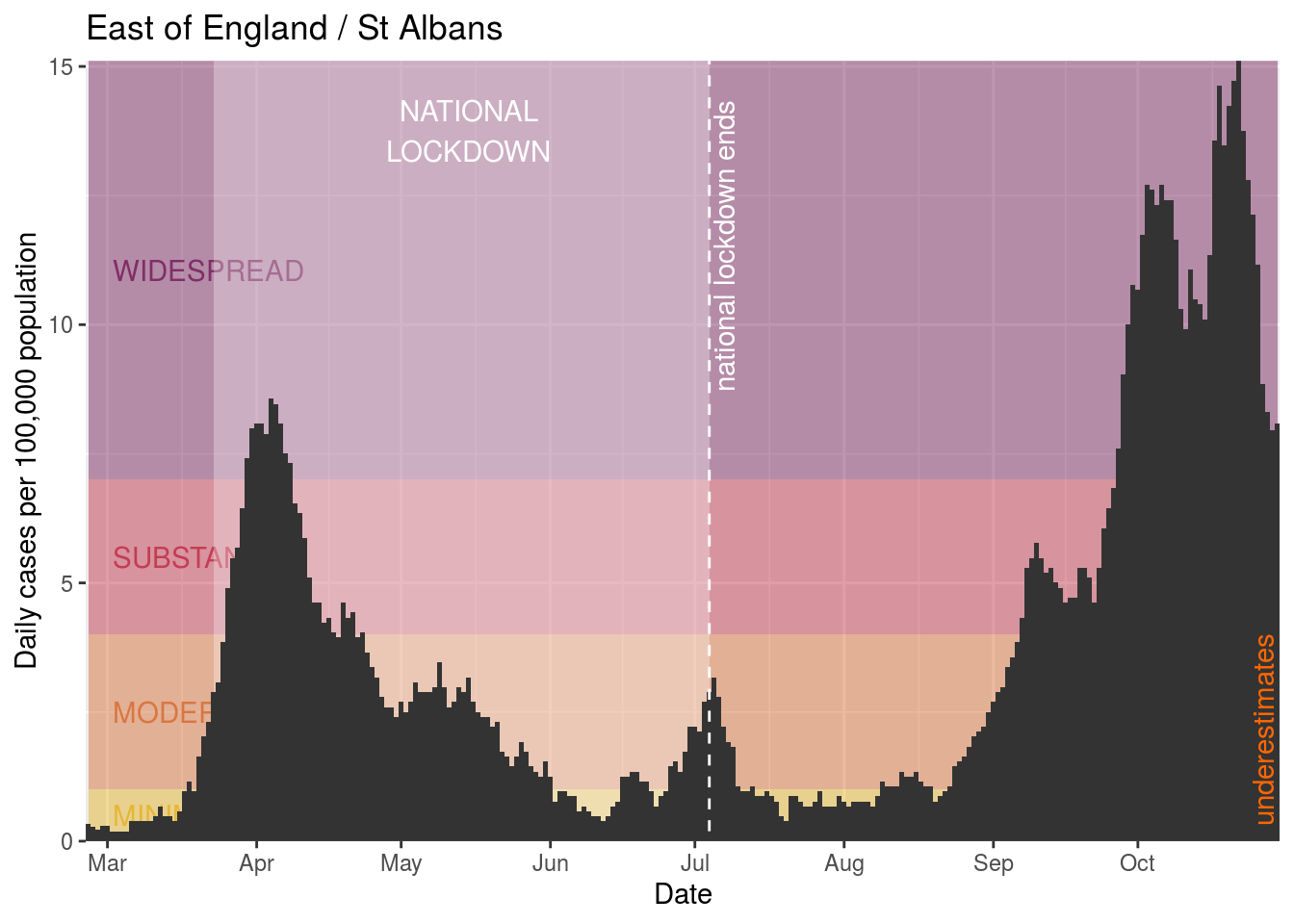
- St Albans
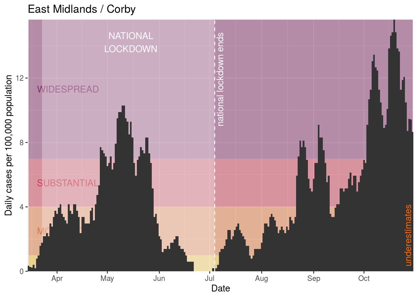
- Corby
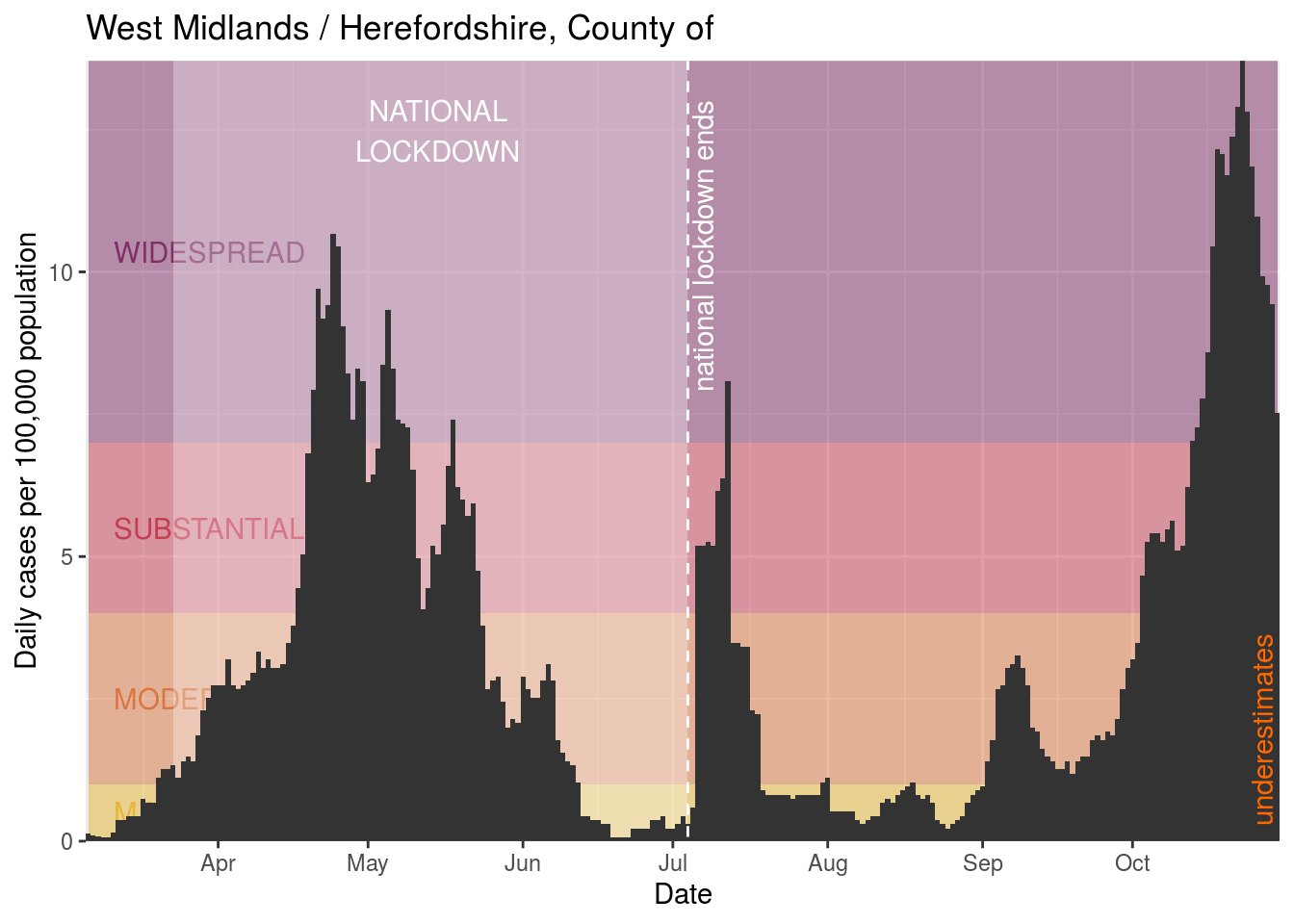
- Herefordshire, County of
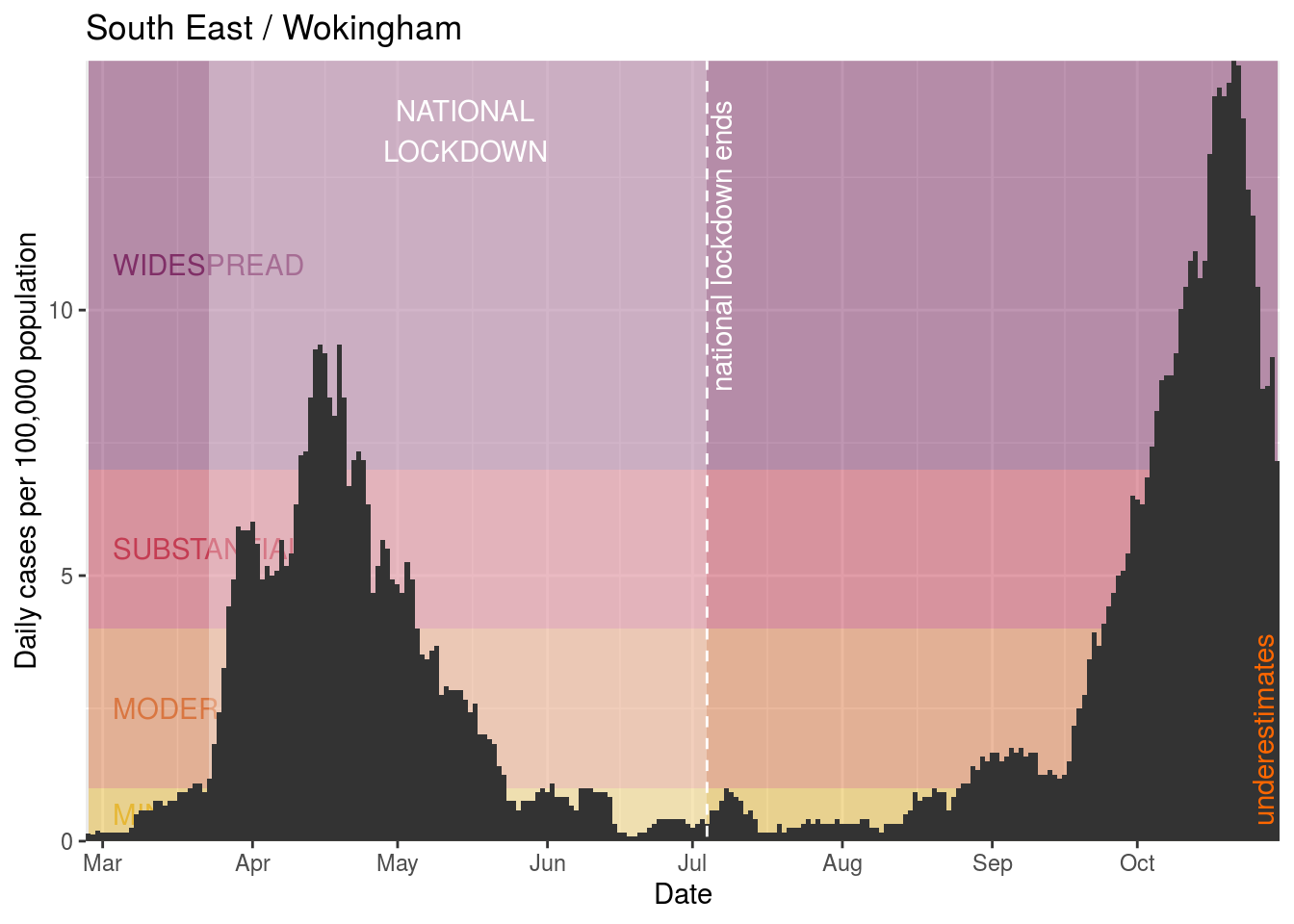
- Wokingham
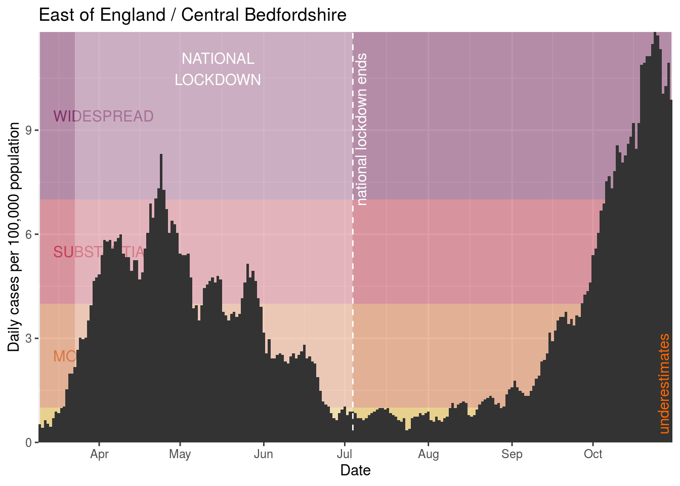
- Central Bedfordshire
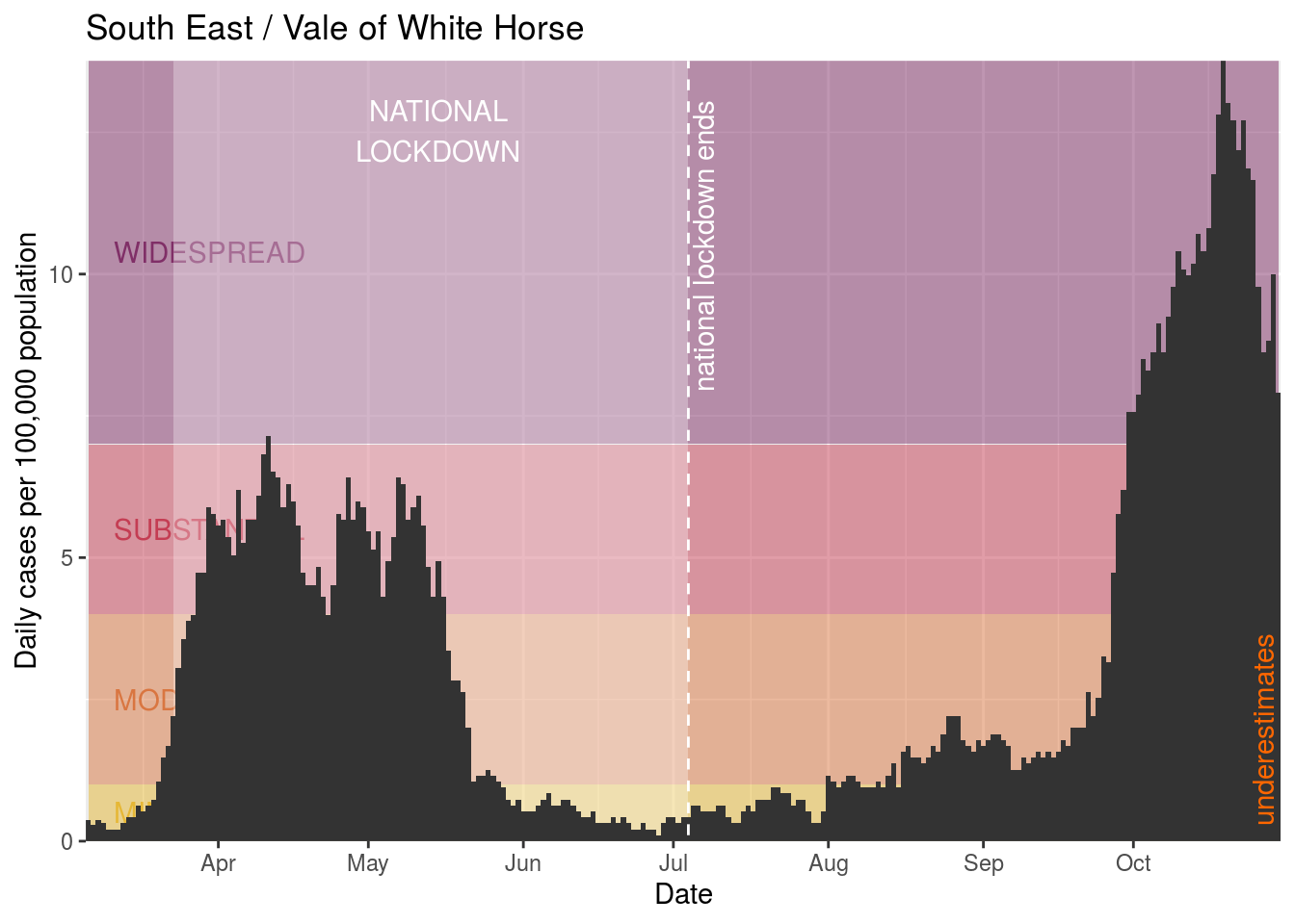
- Vale of White Horse
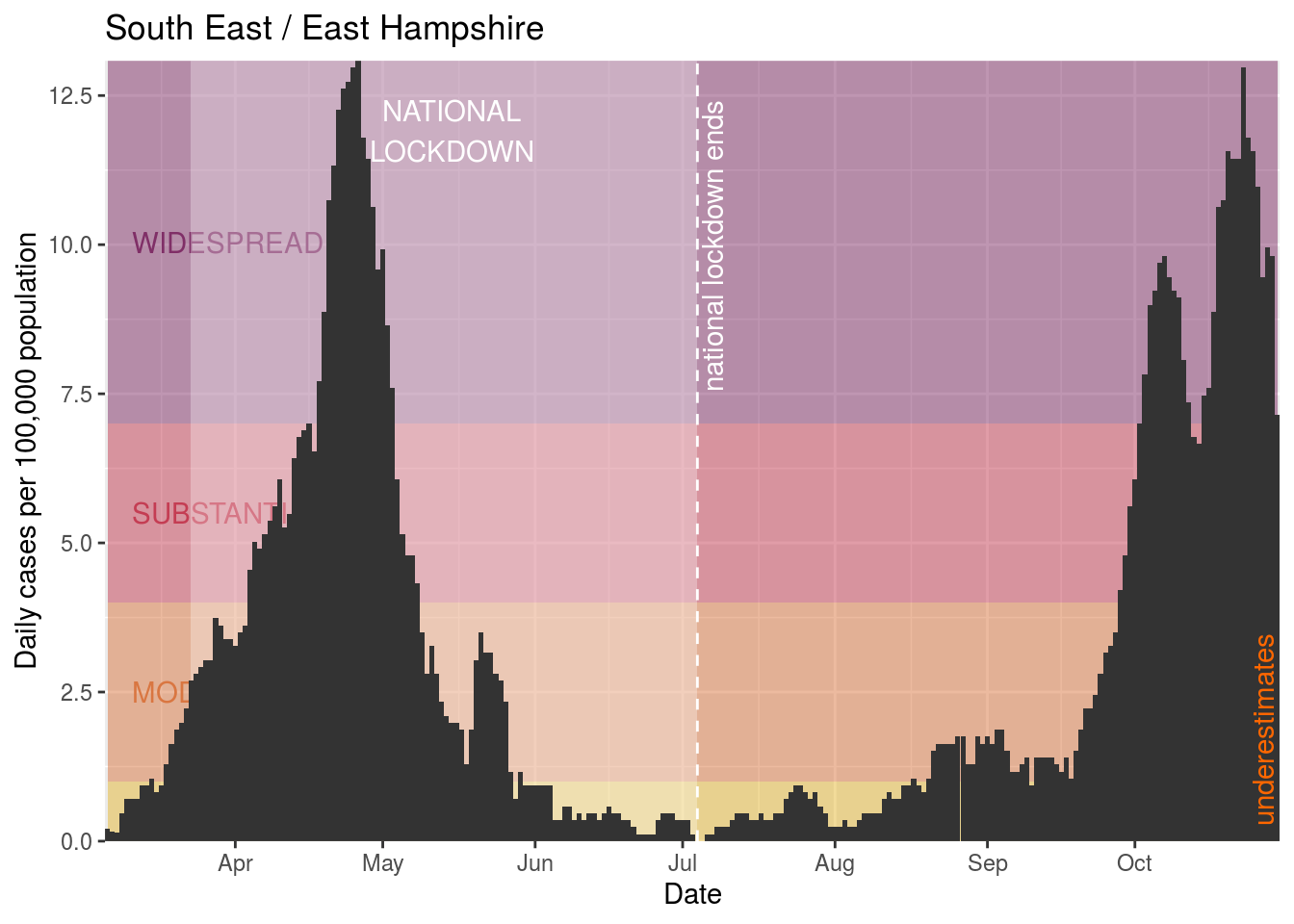
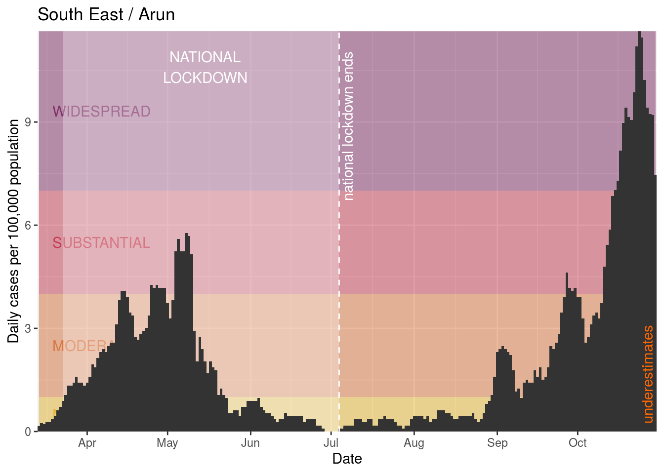
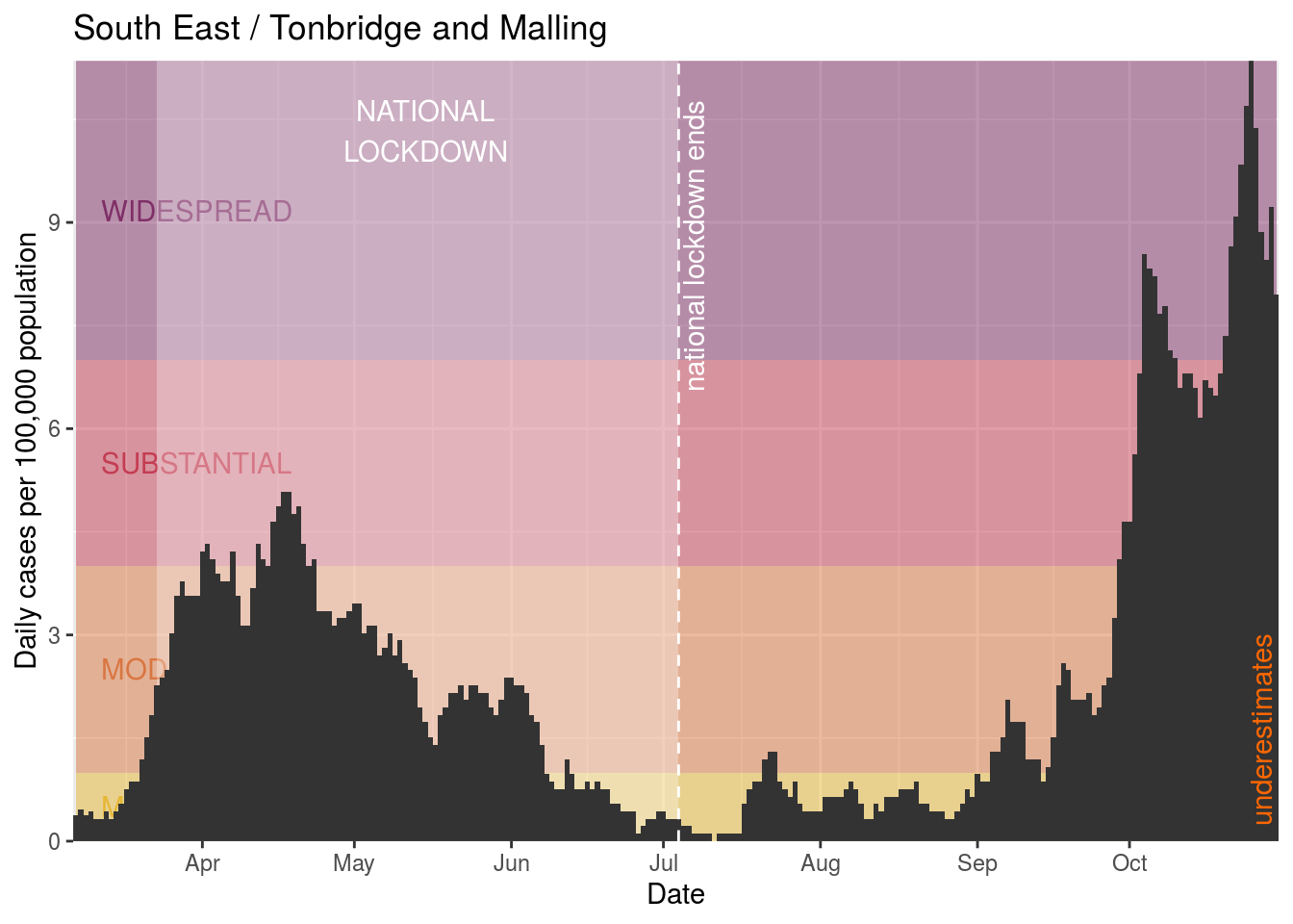
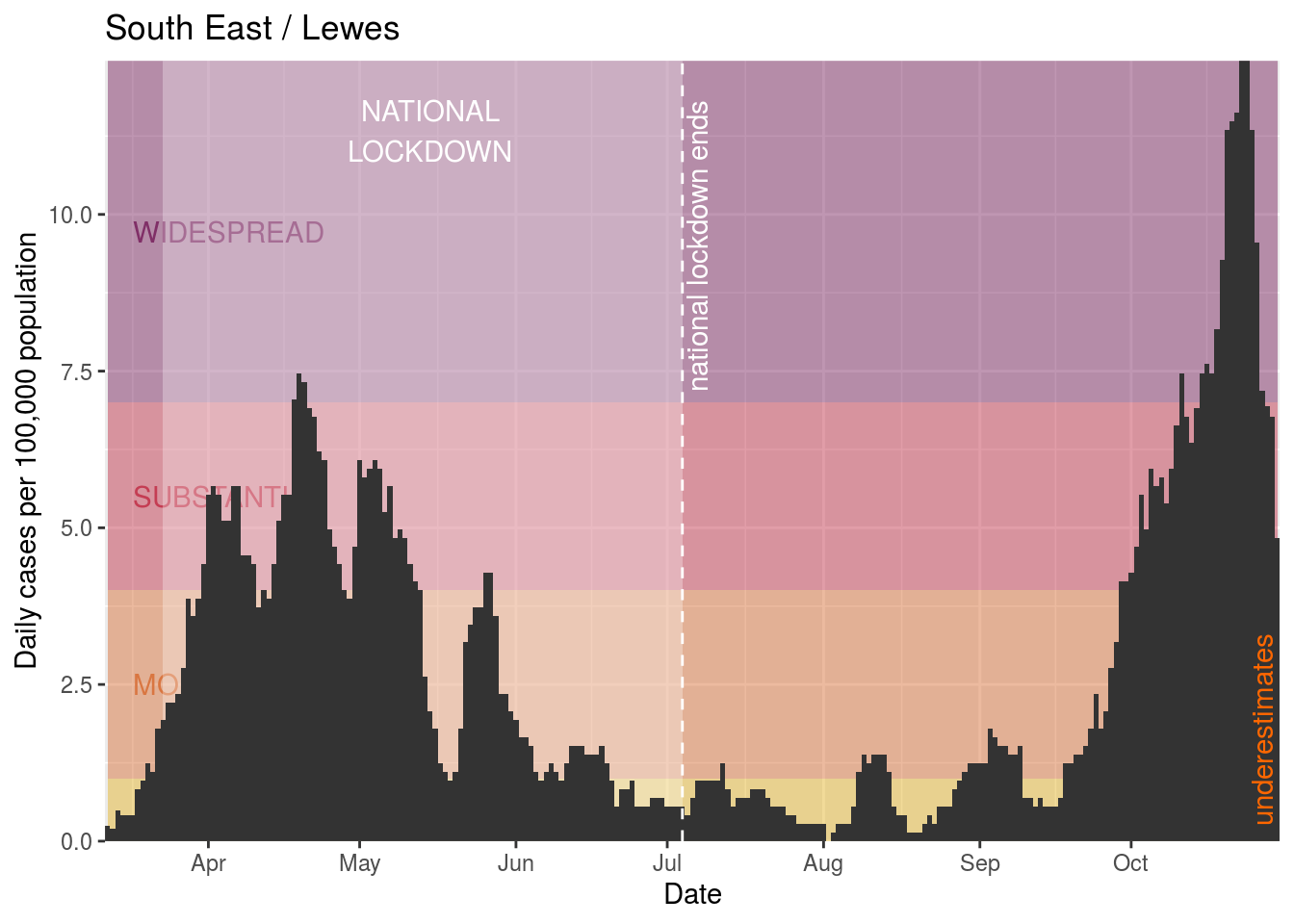
- East Hampshire
- Arun
- Tonbridge and Malling
- Lewes
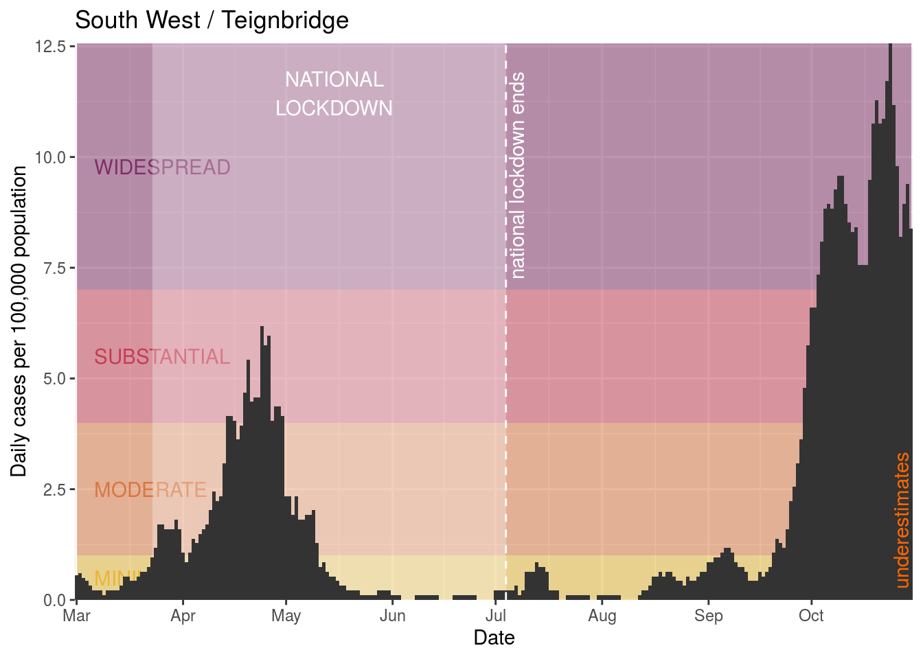
- Teignbridge
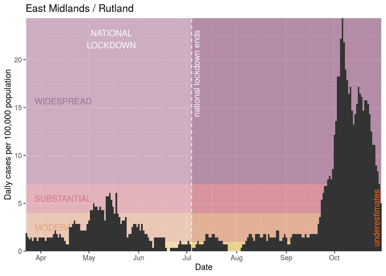
- Rutland
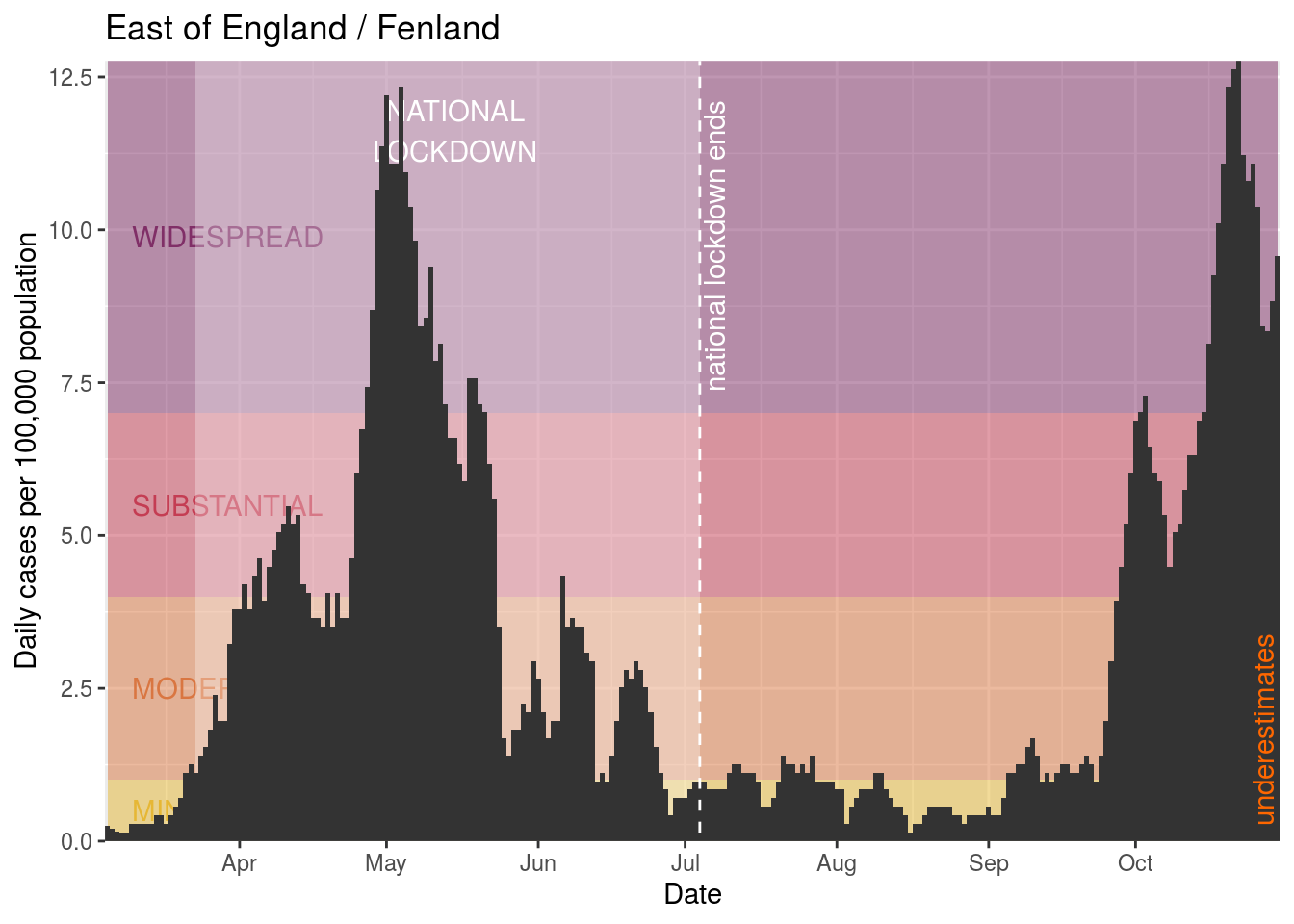
- Fenland
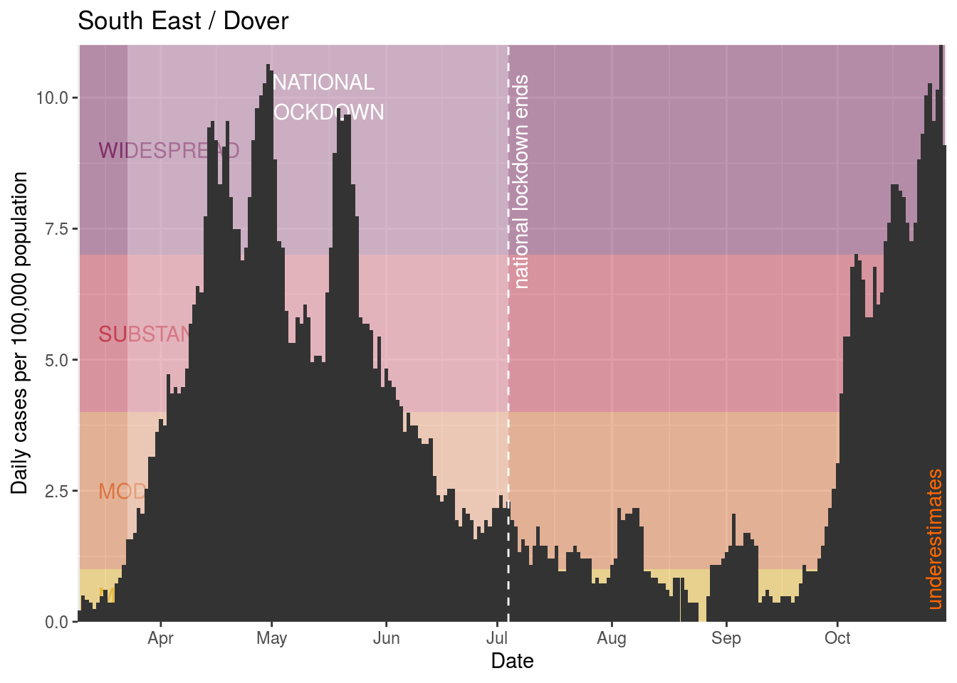
- Dover
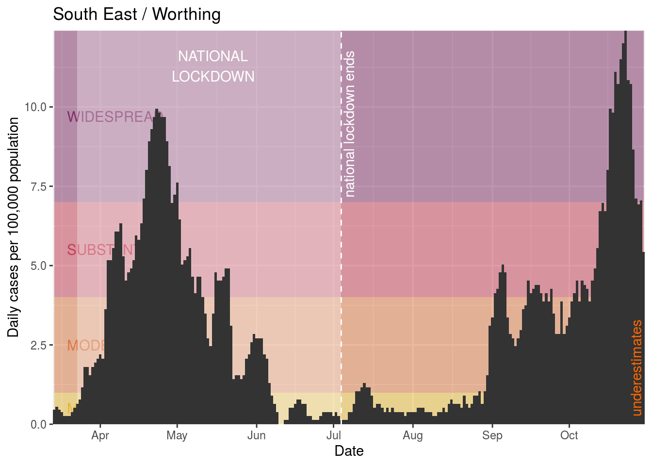
- Worthing
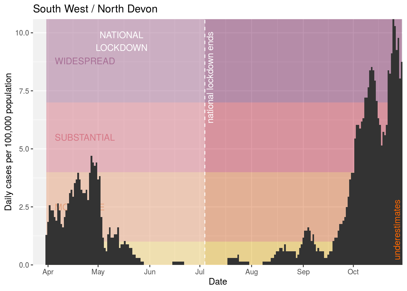
- North Devon
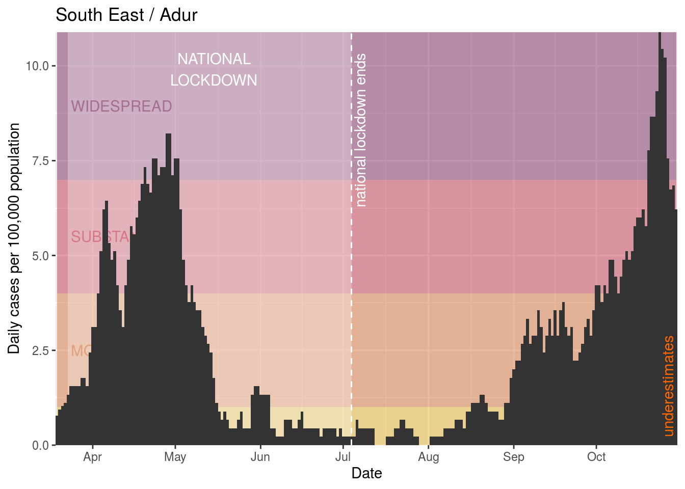
- Adur
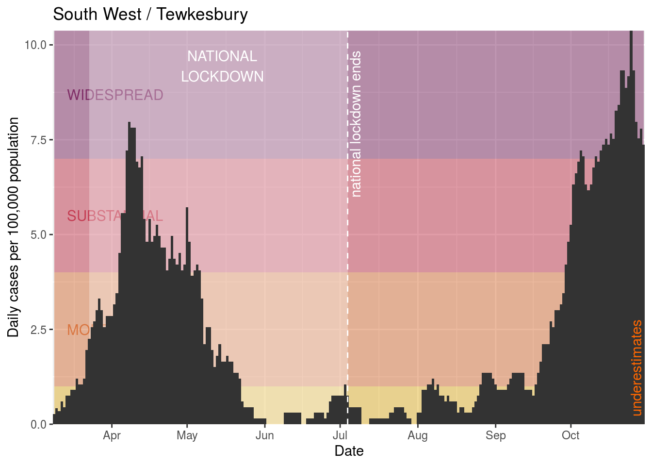
- Tewkesbury
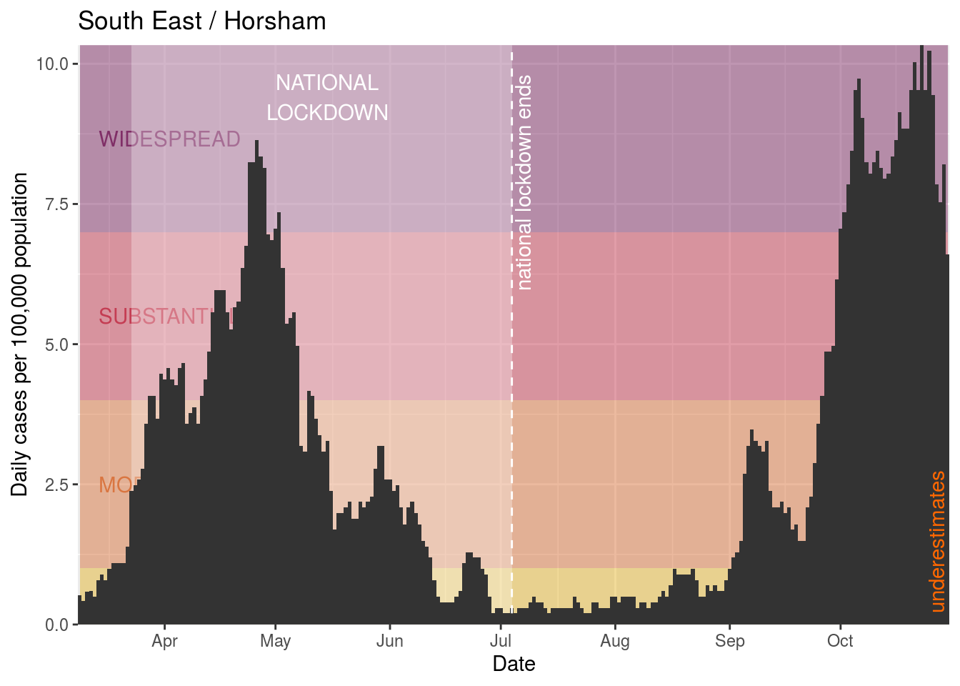
- Horsham
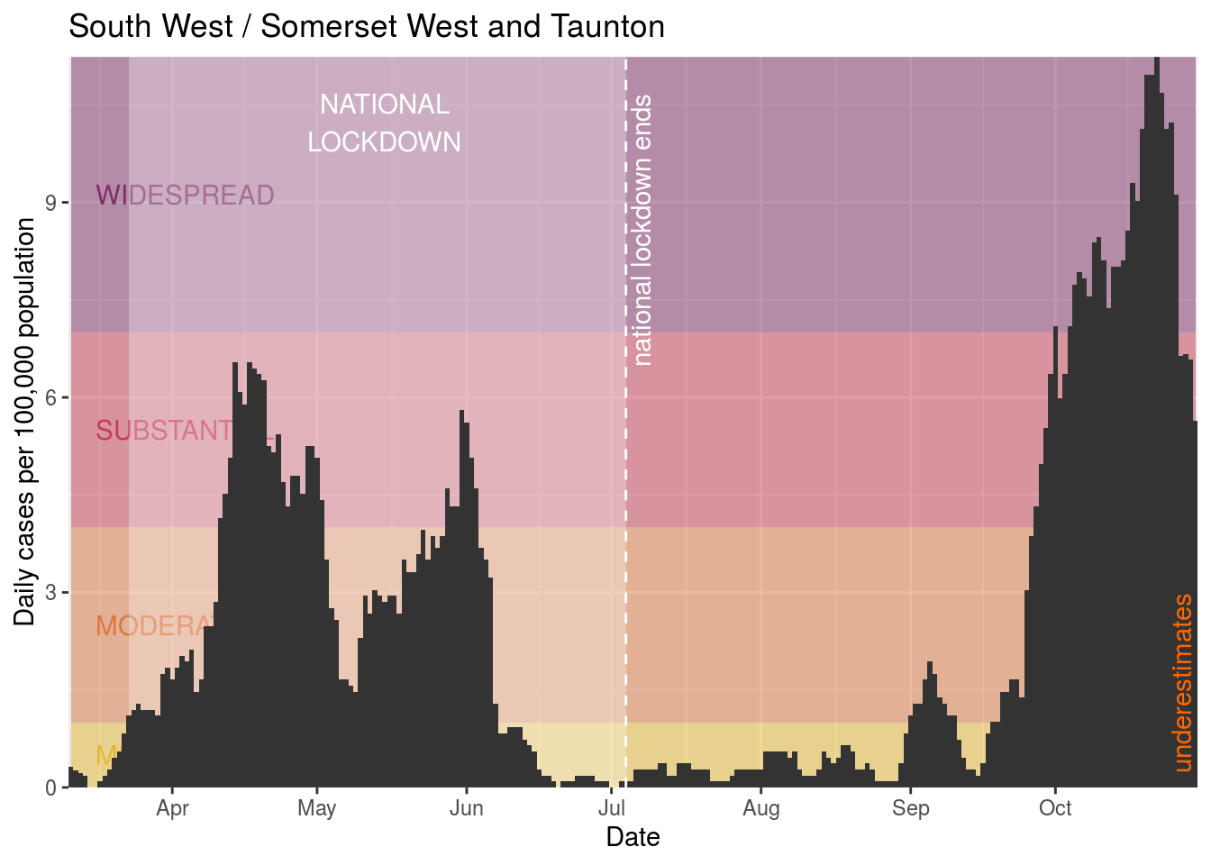
- Somerset West and Taunton
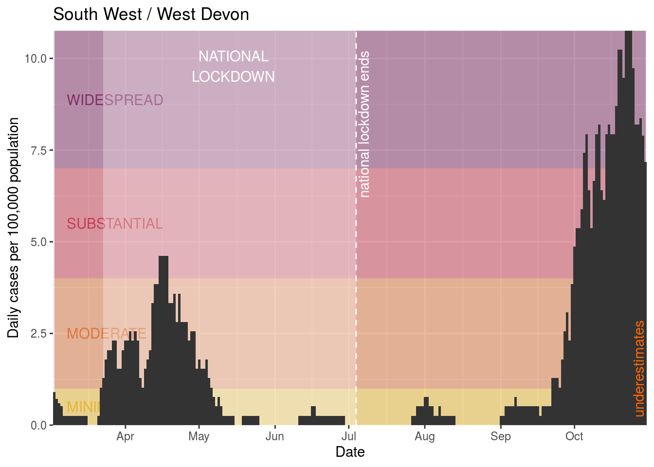
- West Devon
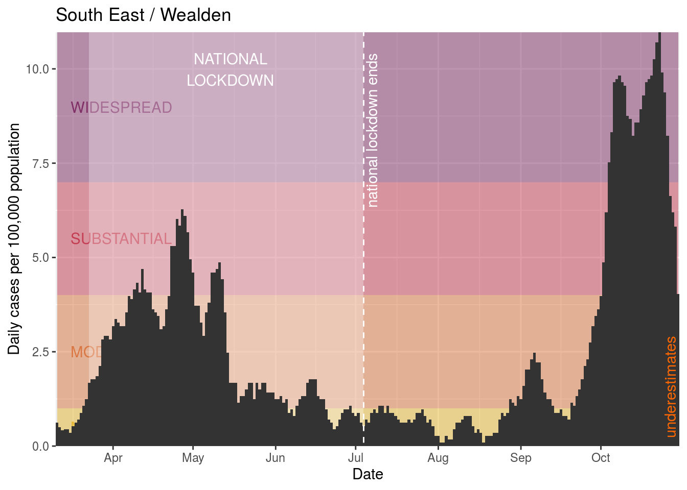
- Wealden
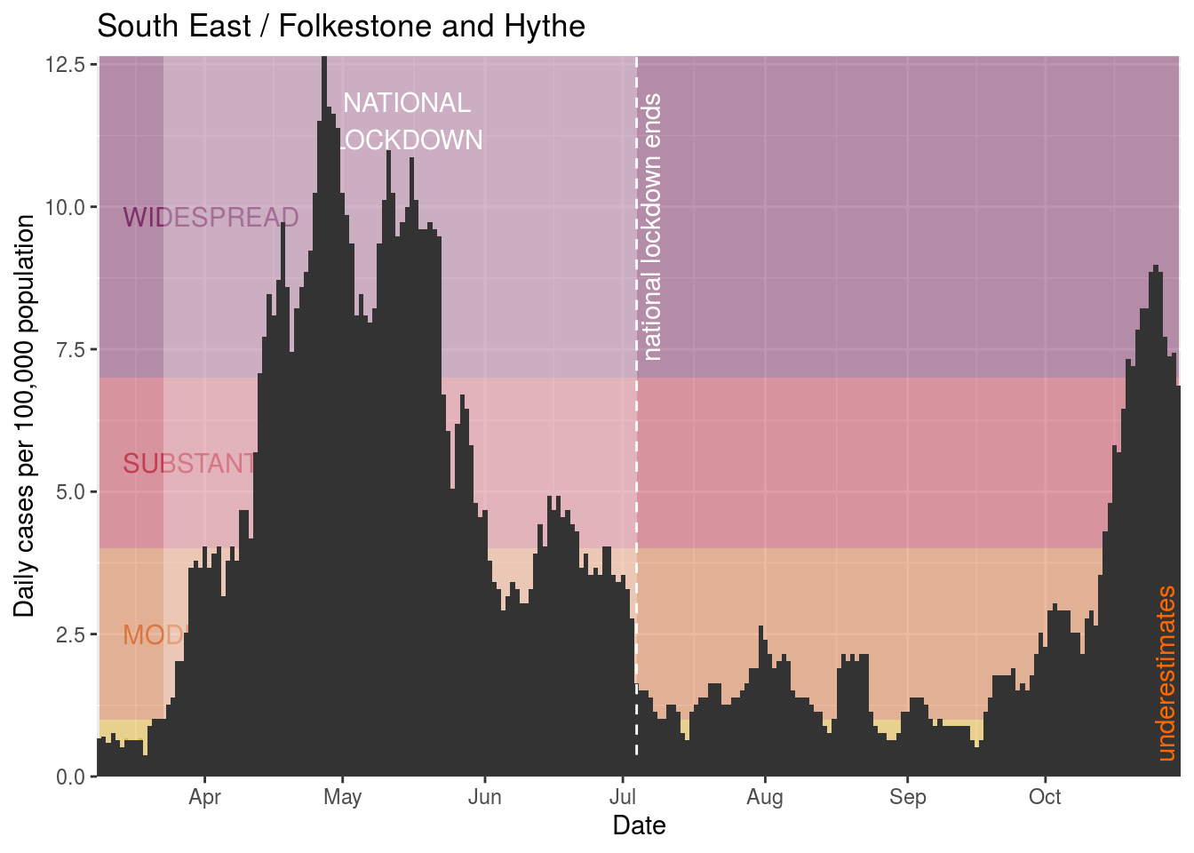
- Folkestone and Hythe
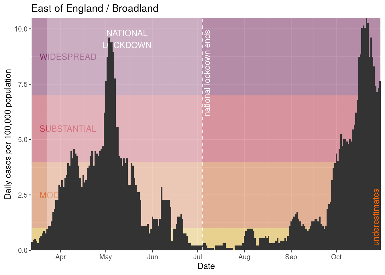
- Broadland
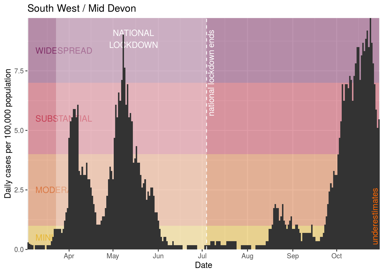
- Mid Devon
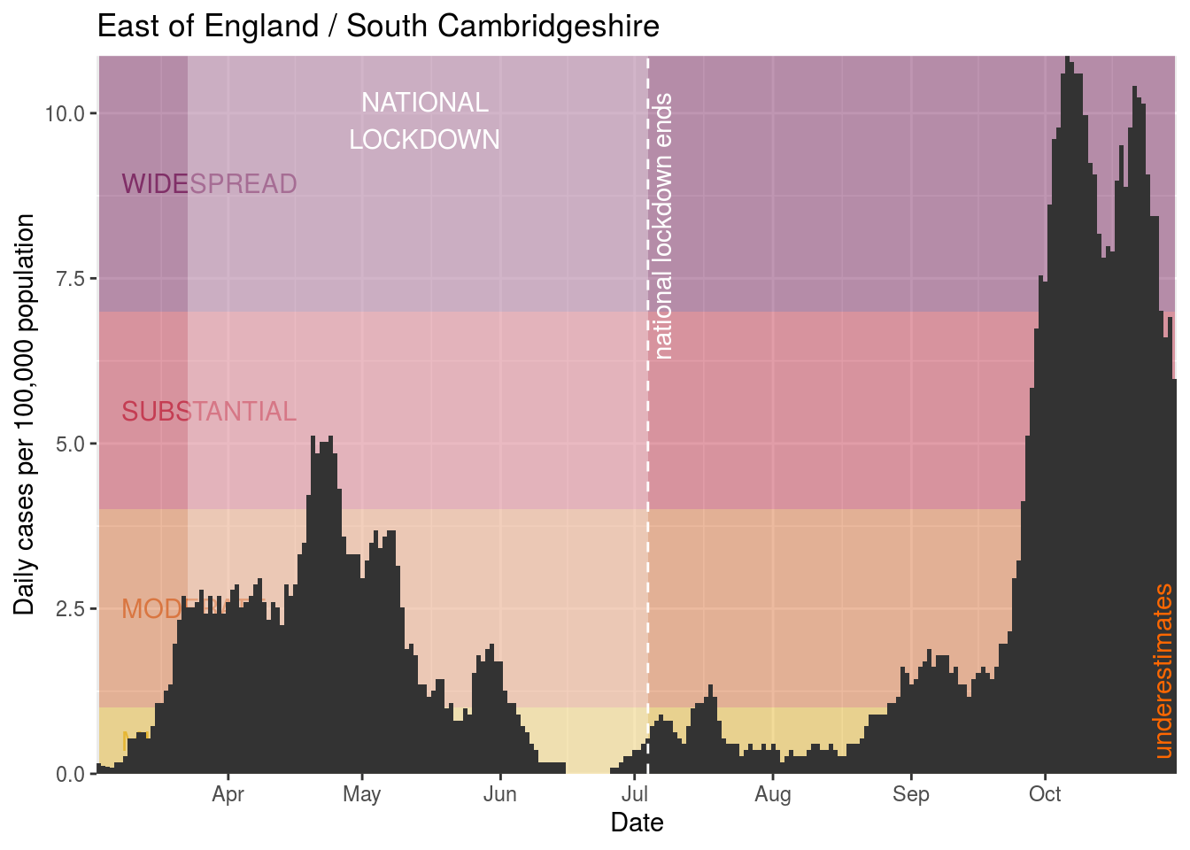
- South Cambridgeshire
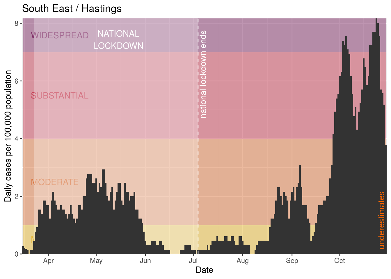
- Hastings
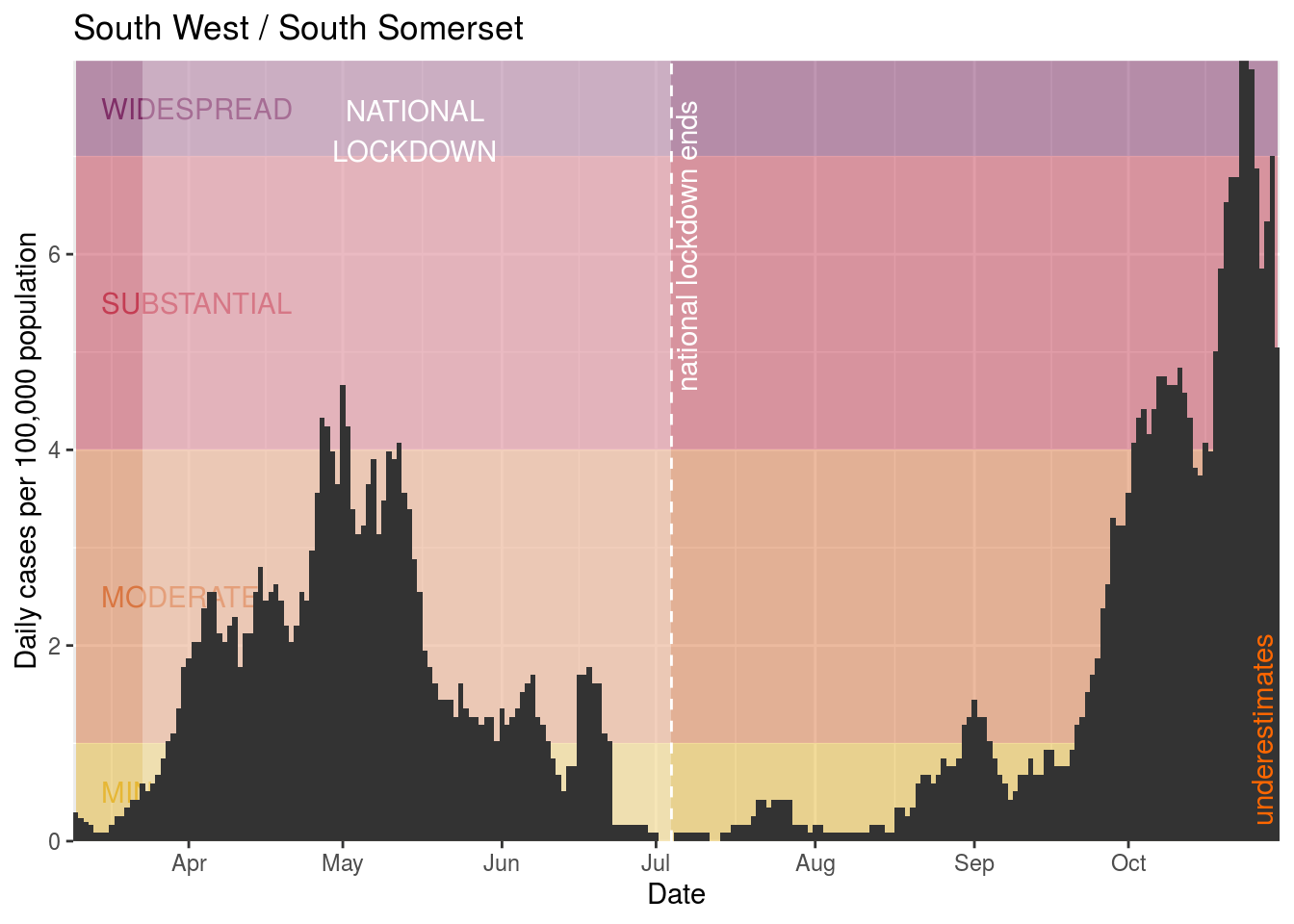
- South Somerset
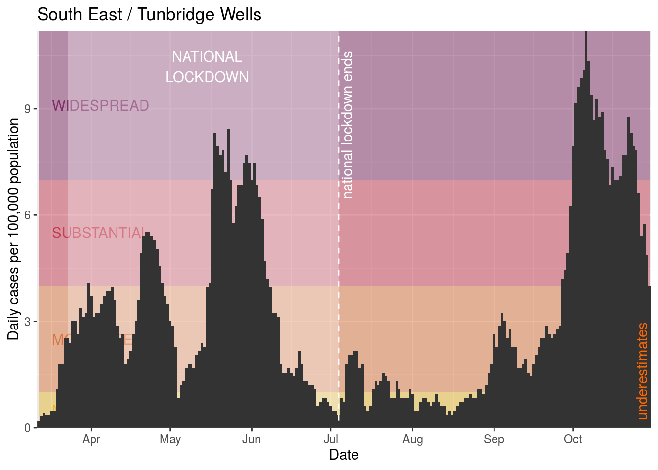
- Tunbridge Wells
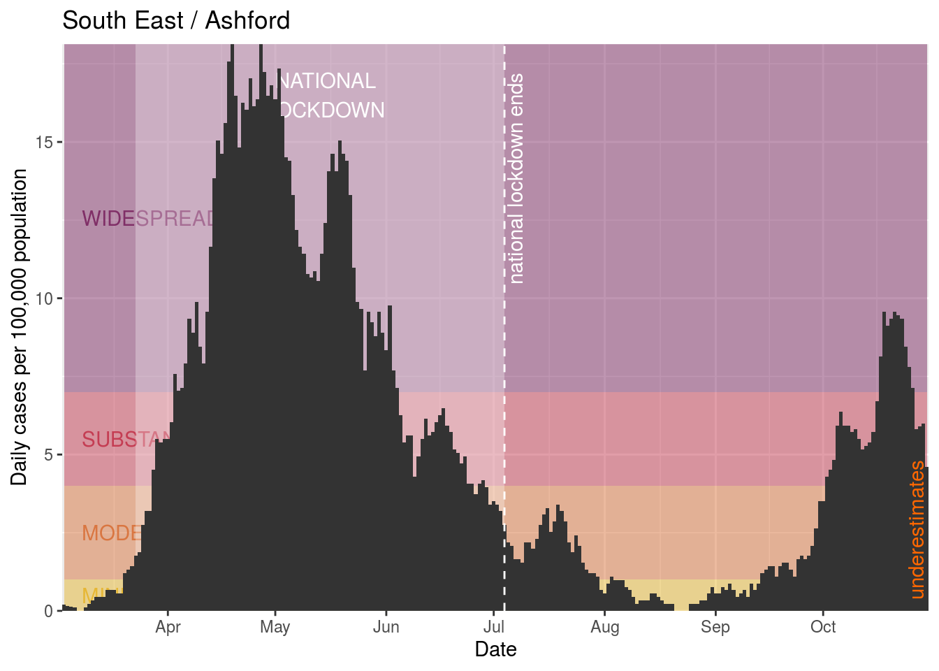
- Ashford
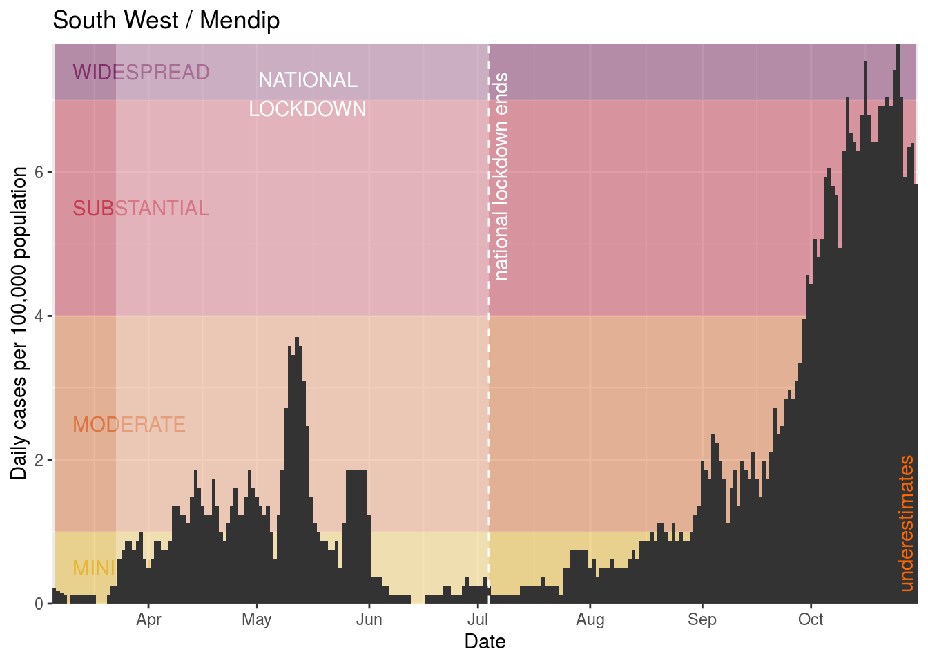
- Mendip
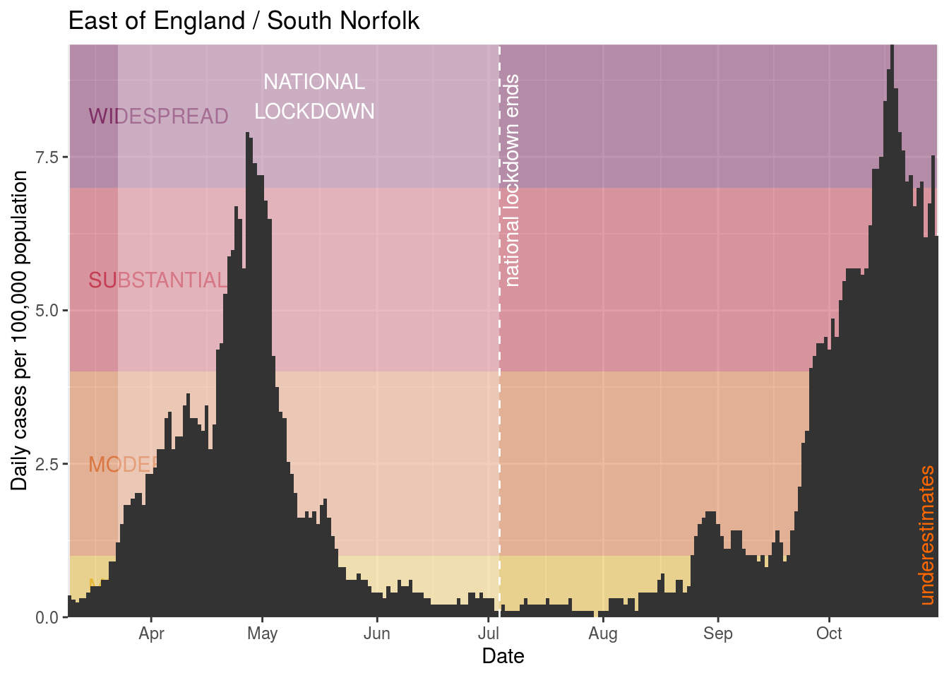
- South Norfolk
- Cornwall and Isles of Scilly
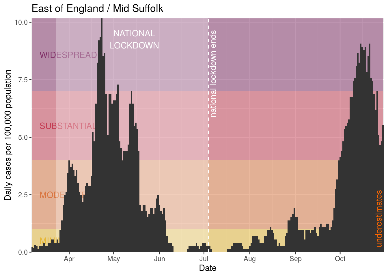
- Mid Suffolk
Now we’ll create charts for those places where there is widespread infection that do not currently have additional restrictions (some of which might be duplicates of the graphs above, because they previously did have local restrictions):
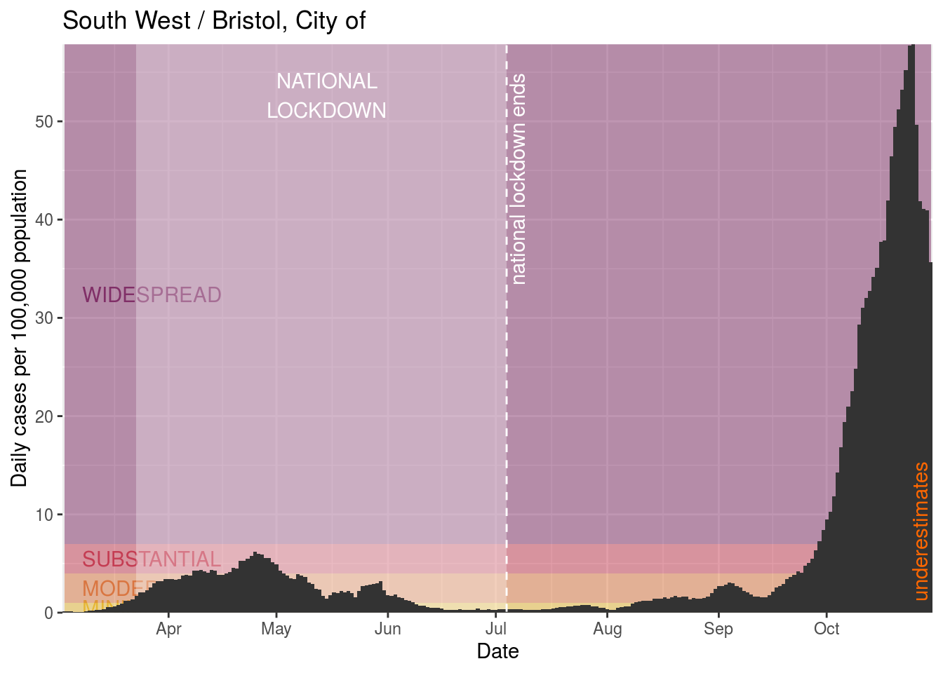
Bristol, City of
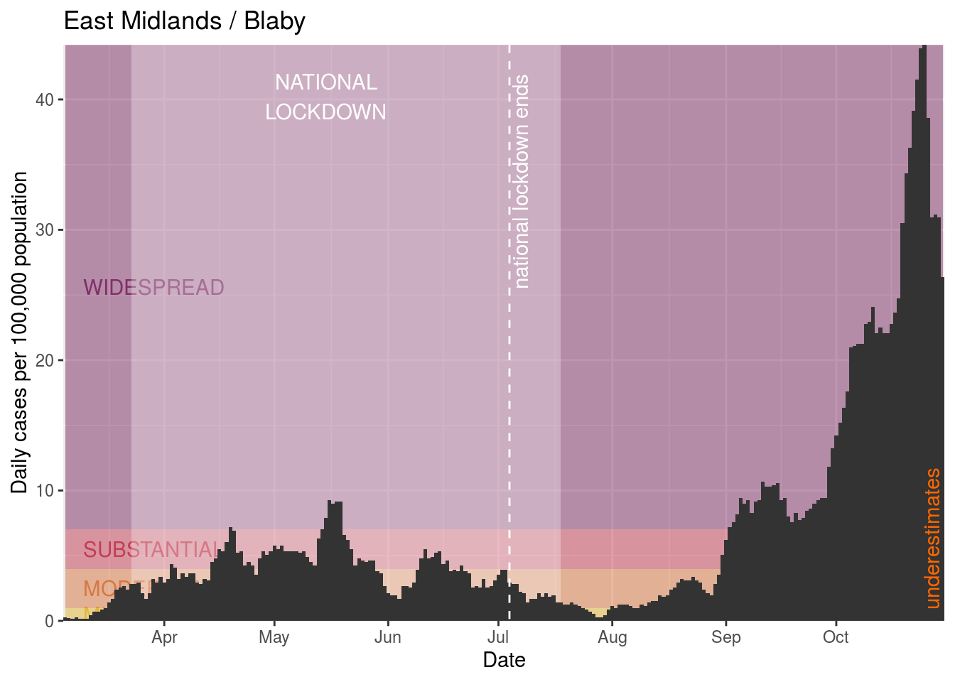
Blaby
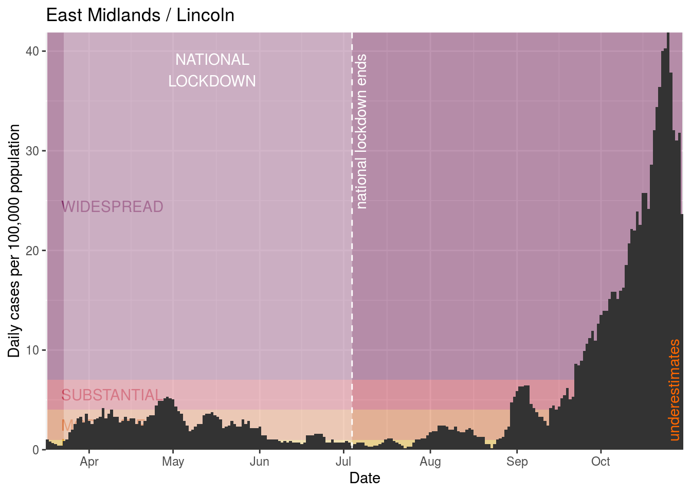
Lincoln
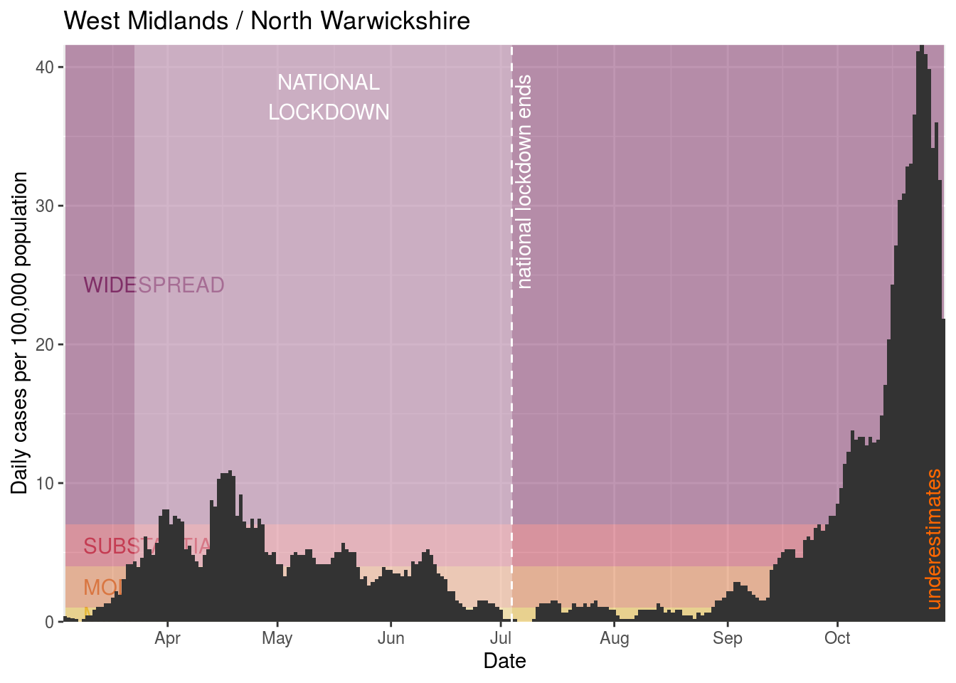
North Warwickshire
Harrogate
South Gloucestershire
Warwick
Bath and North East Somerset

Selby
Bournemouth, Christchurch and Poole
Portsmouth

North West Leicestershire
Nuneaton and Bedworth
East Lindsey
Breckland
Bromsgrove
Hinckley and Bosworth
Hambleton
Broxbourne
Craven
Swale
Harborough
Redditch
South Holland
Great Yarmouth
Cambridge
Hackney and City of London
Richmondshire
Northampton

North Somerset
Brighton and Hove
Shropshire
Worcester
Hertsmere
Eden
West Lindsey
Thanet
Southampton
Runnymede
Thurrock
Copeland
East Northamptonshire
Plymouth
Boston
Watford
Rugby
Mole Valley
Swindon
North Kesteven
Eastleigh
Torbay
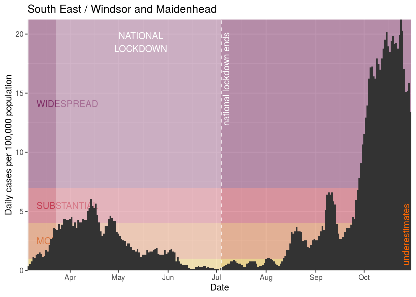
Windsor and Maidenhead
South Kesteven
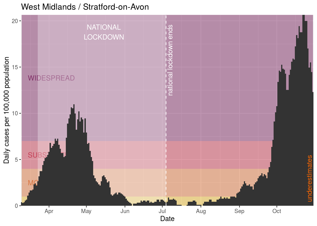
Stratford-on-Avon
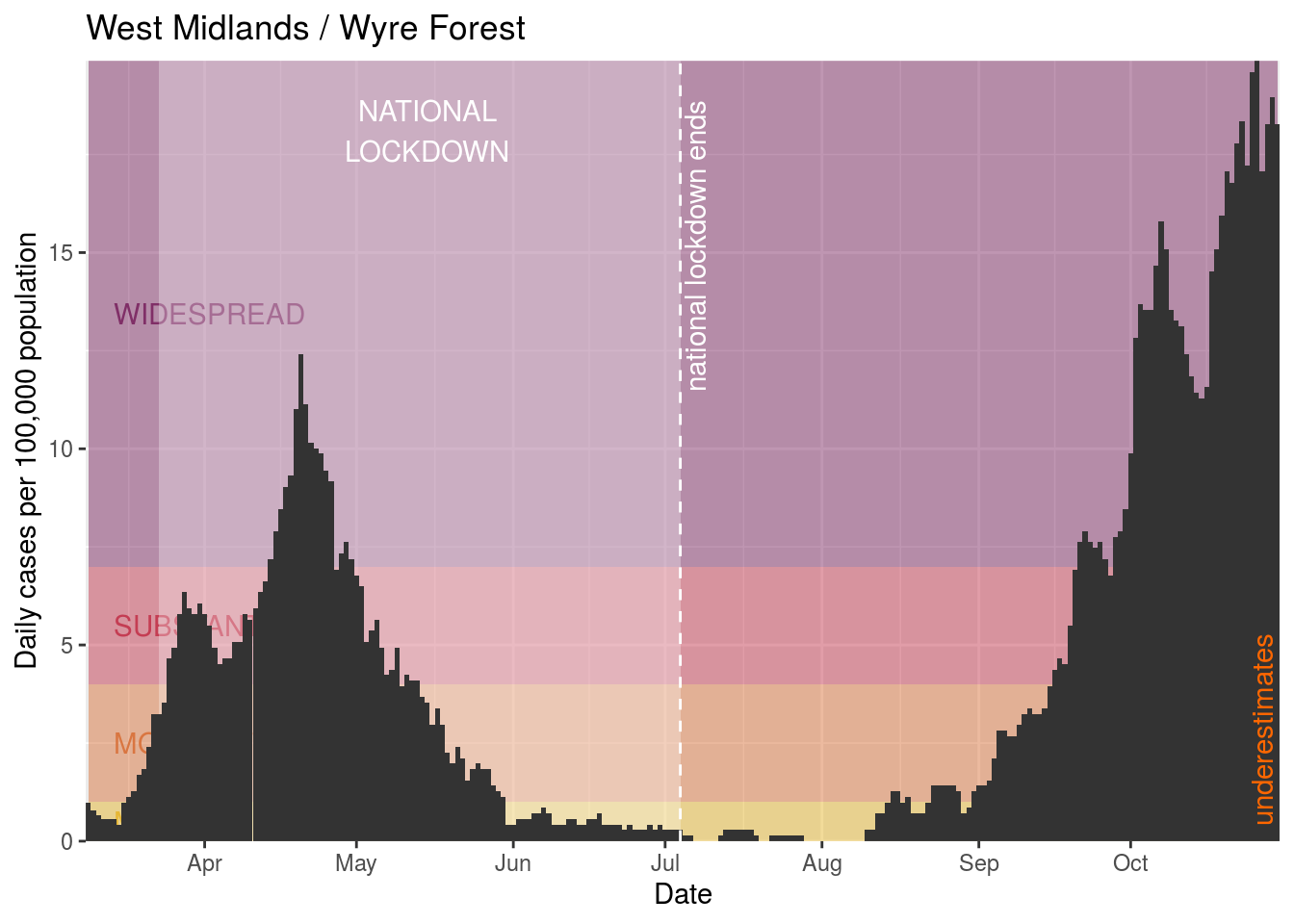
Wyre Forest
Scarborough
Wellingborough
Peterborough
Melton
Fareham
Cherwell
Winchester
Crawley
South Lakeland
Spelthorne
Exeter
Waverley
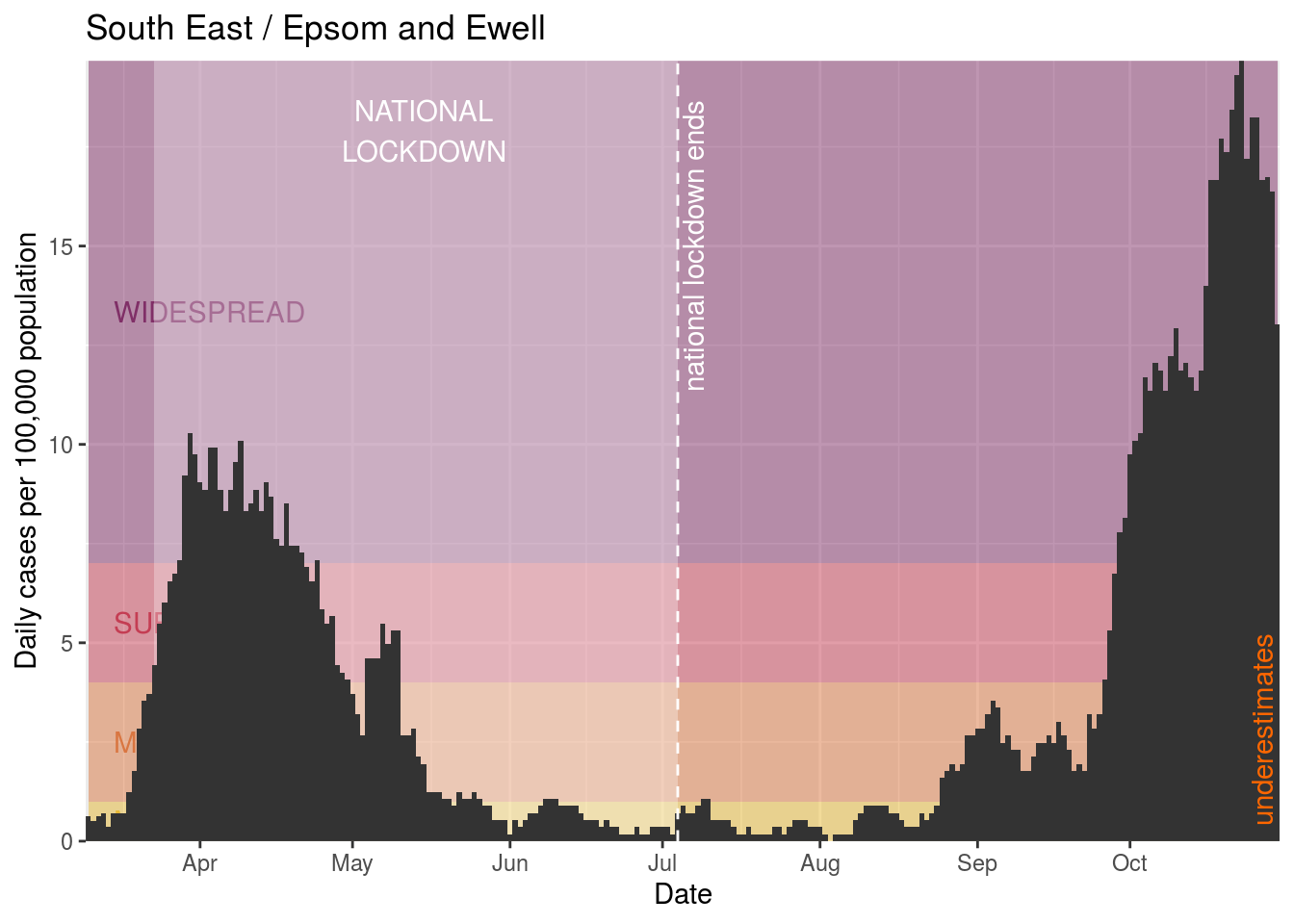
Epsom and Ewell
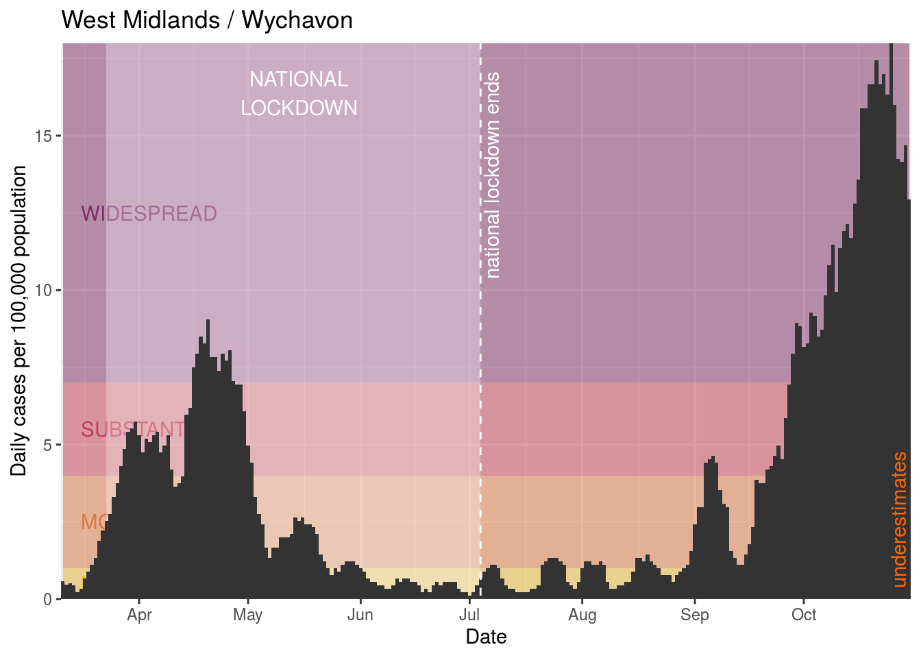
Wychavon
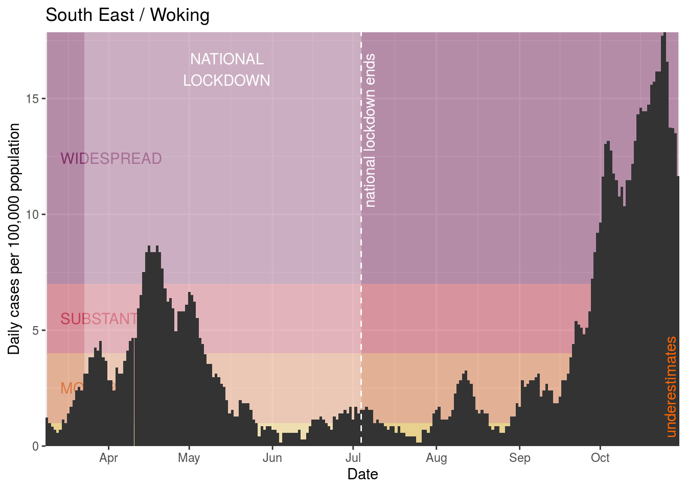
Woking
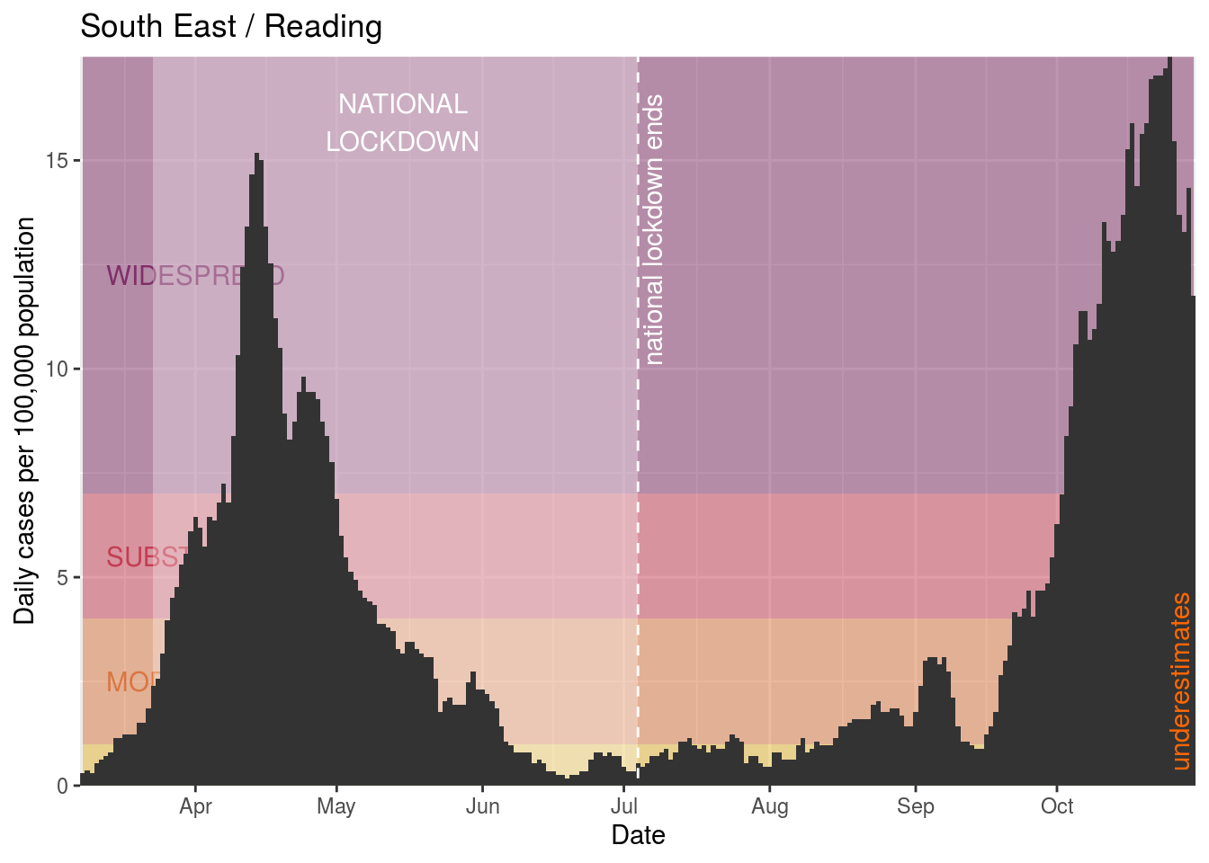
Reading
Rushmoor
Gosport
Malvern Hills
Chichester
Welwyn Hatfield
West Oxfordshire
Dartford
Sedgemoor
Guildford
Medway
Stevenage
South Northamptonshire
Milton Keynes
Allerdale
Three Rivers
Dorset
Norwich
Daventry
Havant
Test Valley
Gloucester
South Oxfordshire
Cotswold
Eastbourne
East Hertfordshire
Tandridge
Bedford
Ryedale
Reigate and Banstead
North Hertfordshire
Hart
East Devon
New Forest
Maidstone
Gravesham
Kettering
Dacorum
Stroud
Bracknell Forest
Wiltshire
King’s Lynn and West Norfolk
Cheltenham
Southend-on-Sea
Mid Sussex
West Berkshire
Babergh
Canterbury
Basingstoke and Deane
West Suffolk
Sevenoaks
Surrey Heath
South Hams
Ipswich
Forest of Dean
St Albans
Corby
Herefordshire, County of
Wokingham
Central Bedfordshire
Vale of White Horse
East Hampshire
Arun
Tonbridge and Malling
Lewes
Teignbridge
Rutland
Fenland
Dover
Worthing
North Devon
Adur
Tewkesbury
Horsham
Somerset West and Taunton
West Devon
Wealden
Folkestone and Hythe
Broadland
Mid Devon
South Cambridgeshire
Hastings
South Somerset
Tunbridge Wells
Ashford

Mendip
South Norfolk
Cornwall and Isles of Scilly

Mid Suffolk
Significant and increasing infection
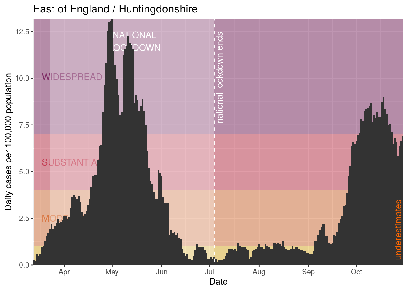
Finally, we’ll make a list of places where there’s been a significant infection (over 4 cases / day / 100,000 population) at some point over the last week and that are seeing increases in those rates.
- Huntingdonshire
Again we’ll create charts for those places that do not currently have additional restrictions:
Huntingdonshire
Identifying areas that are the least worrying
Finally, for comparison, let’s have a look at the ten places with the lowest current average daily rates.
- North Norfolk
- Rother
- Hastings
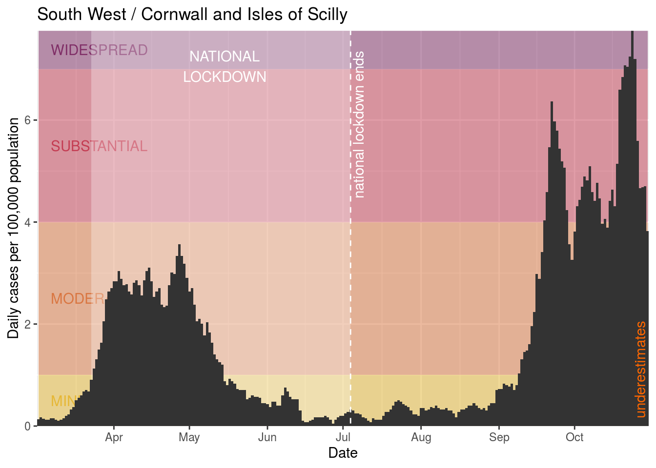
- Cornwall and Isles of Scilly
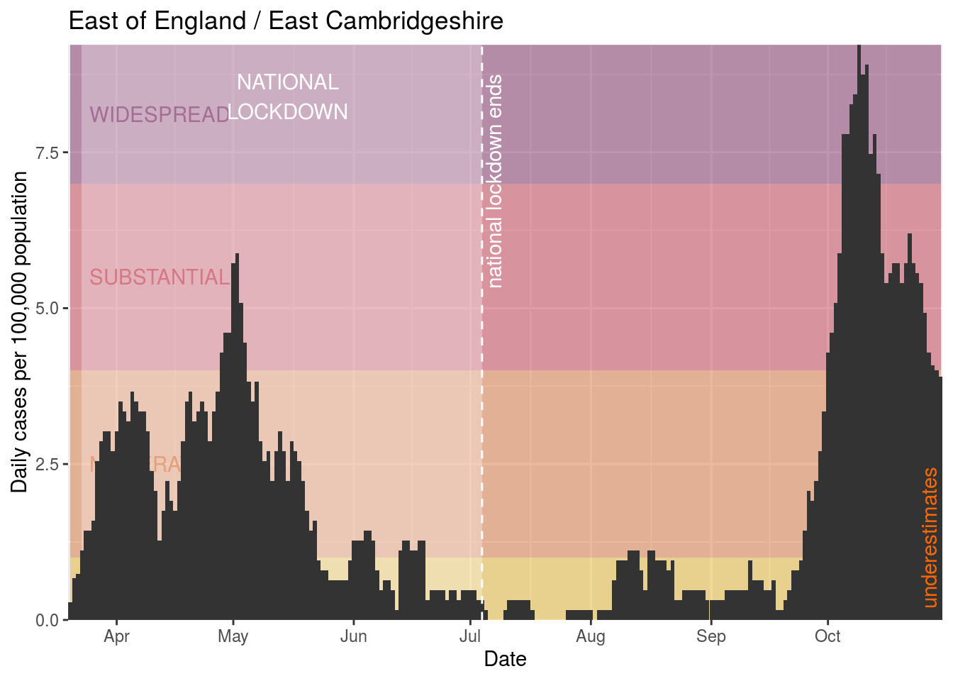
- East Cambridgeshire
- Tunbridge Wells
- Wealden
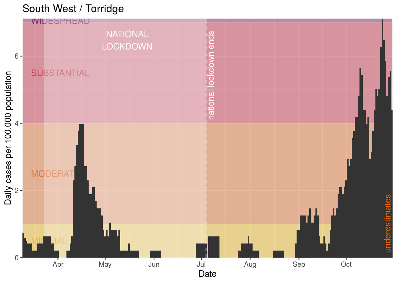
- Torridge
- Isle of Wight
- Ashford
North Norfolk
## Warning: Removed 1 rows containing missing values (geom_text).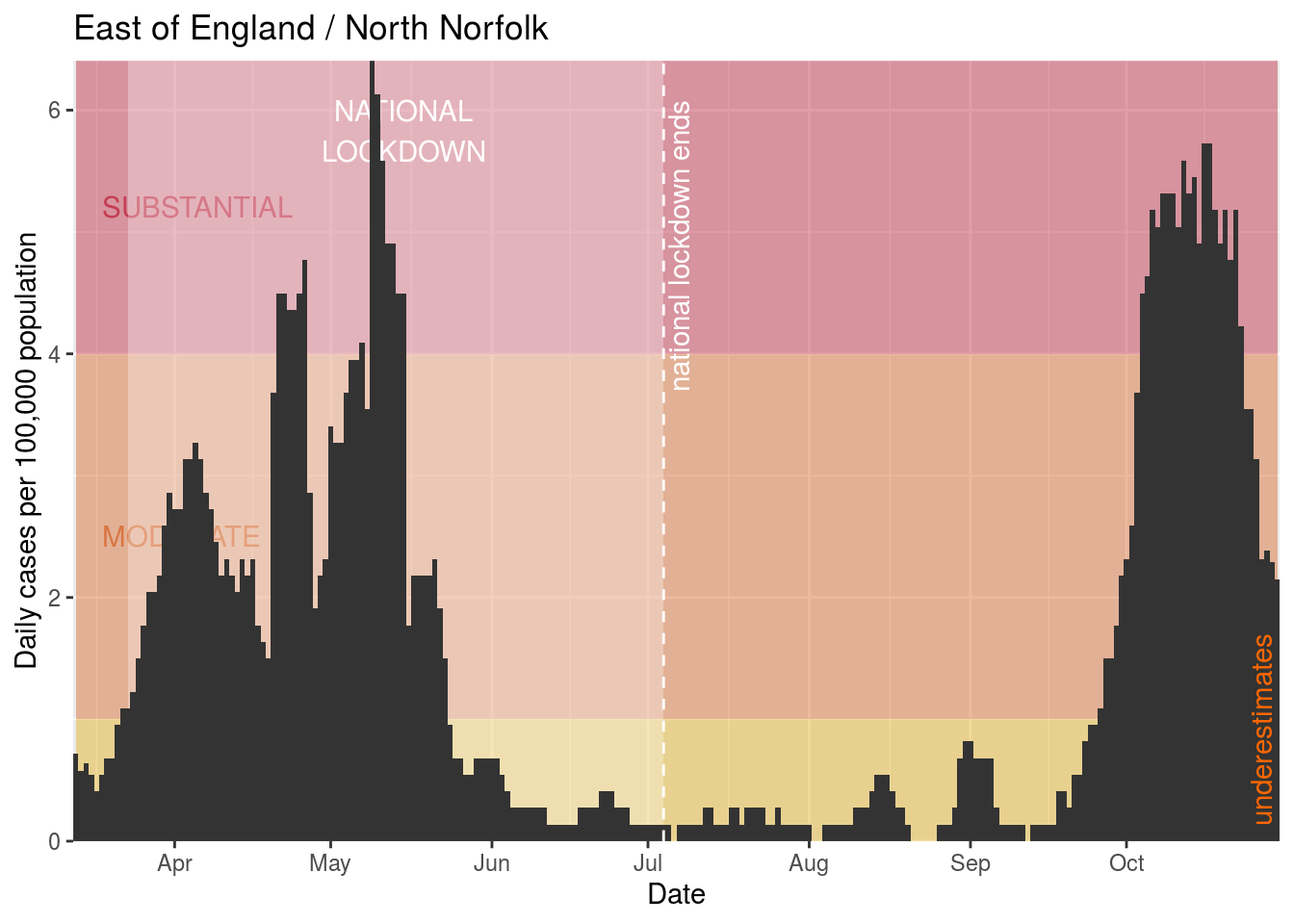
Rother
## Warning: Removed 1 rows containing missing values (geom_text).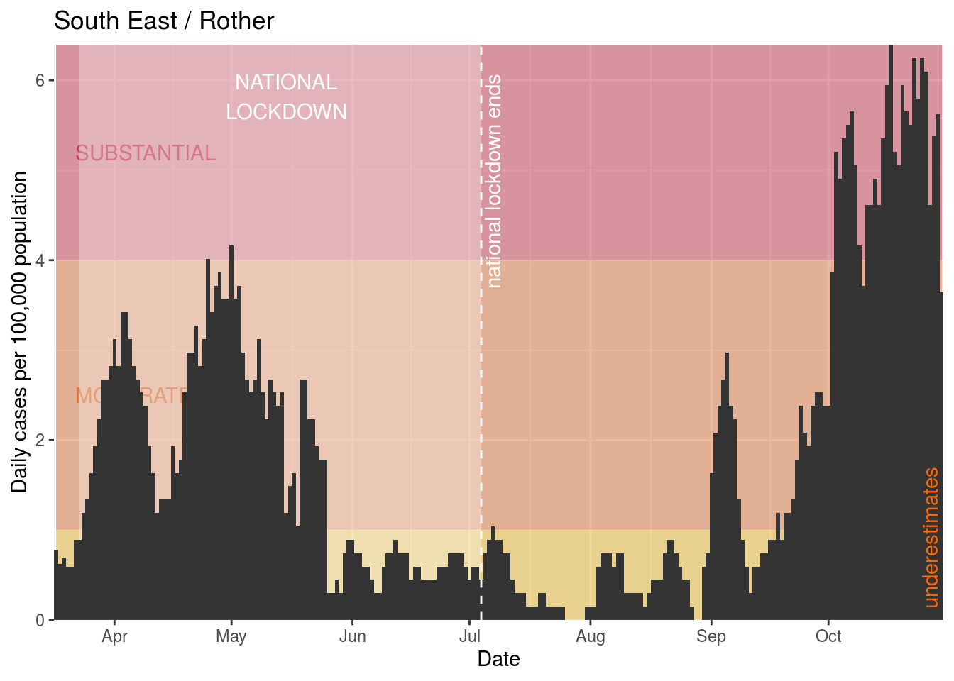
Hastings

Cornwall and Isles of Scilly
East Cambridgeshire
Tunbridge Wells

Wealden

Torridge
Isle of Wight
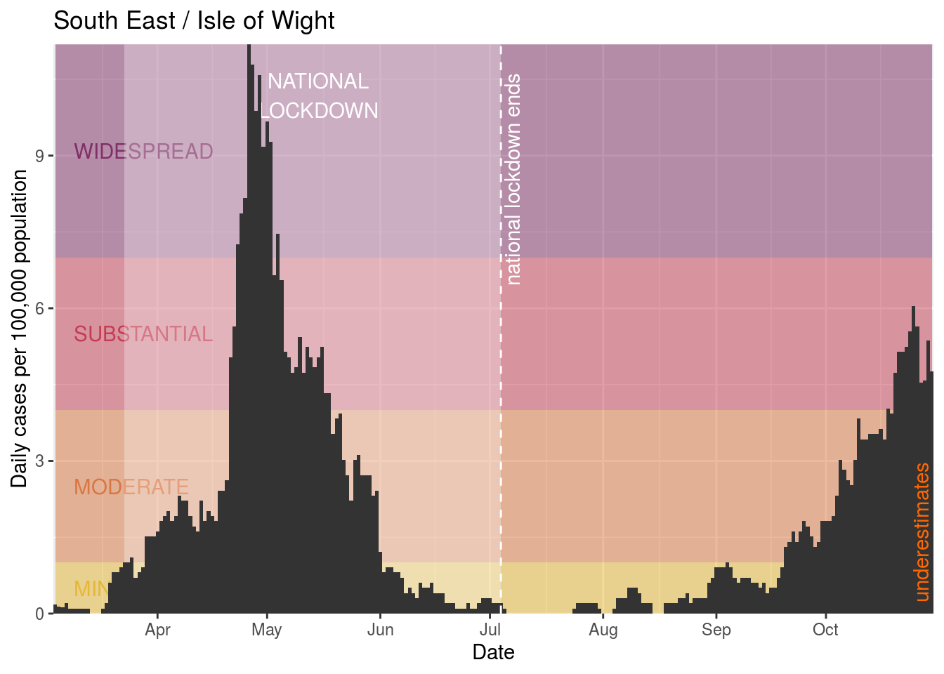
Ashford
Areas of interest
Just to highlight areas that were recently moved to Tier 3:
- Bolton
- Bury
- Manchester
- Oldham
- Rochdale
- Salford
- Stockport
- Tameside
- Trafford
- Wigan
- Barnsley
- Doncaster
- Rotherham
- Sheffield
Bolton

Bury

Manchester

Oldham
Rochdale

Salford
Stockport

Tameside
Trafford

Wigan

Barnsley
Doncaster

Rotherham

Sheffield
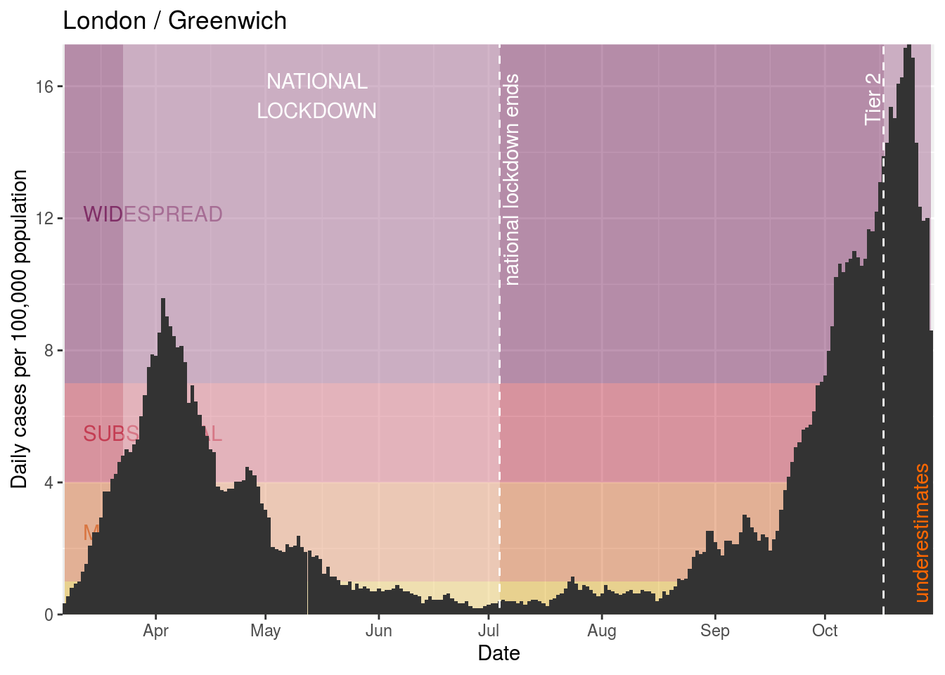
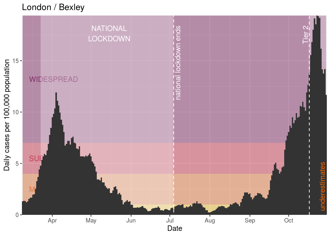
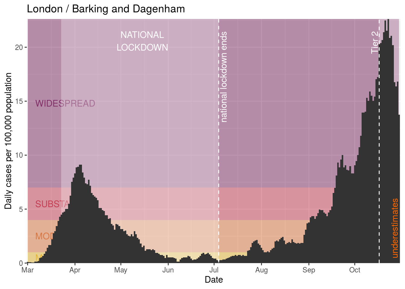
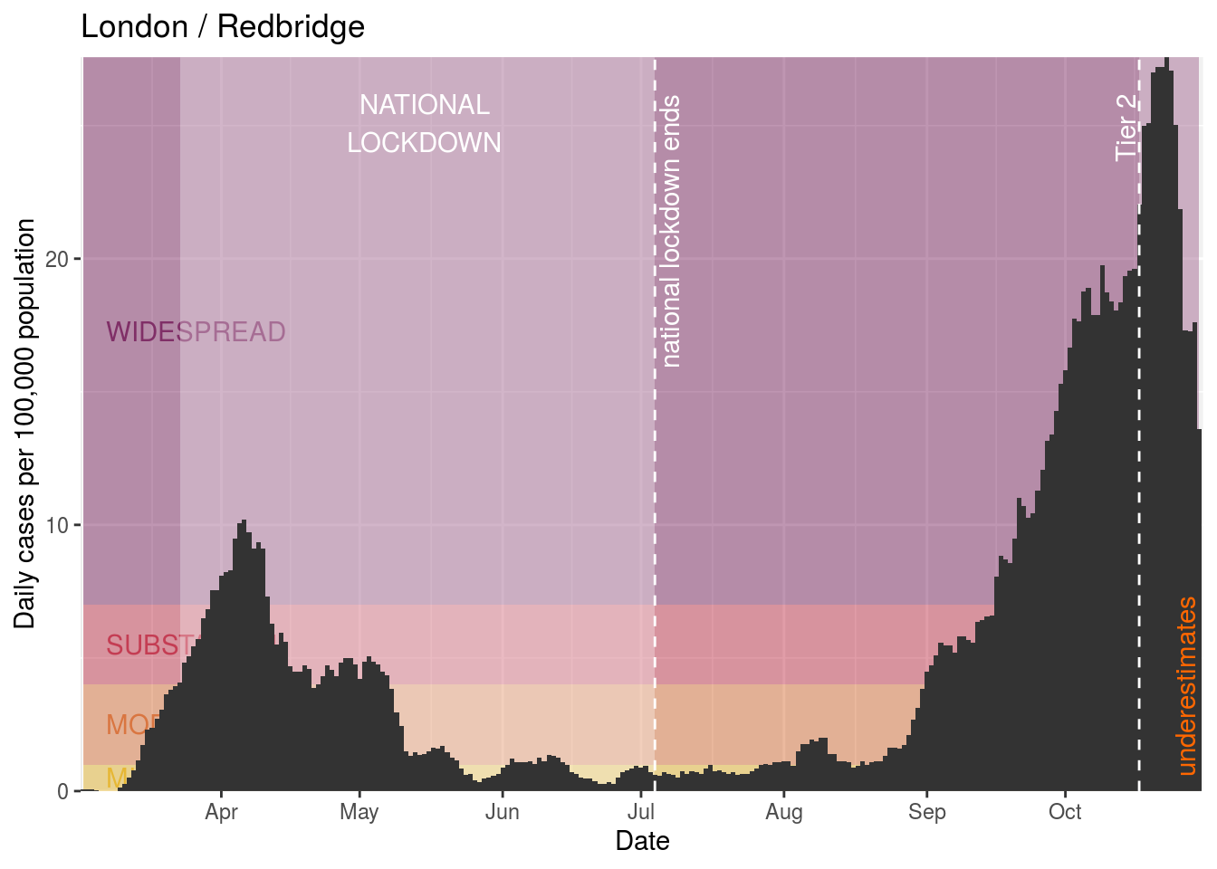
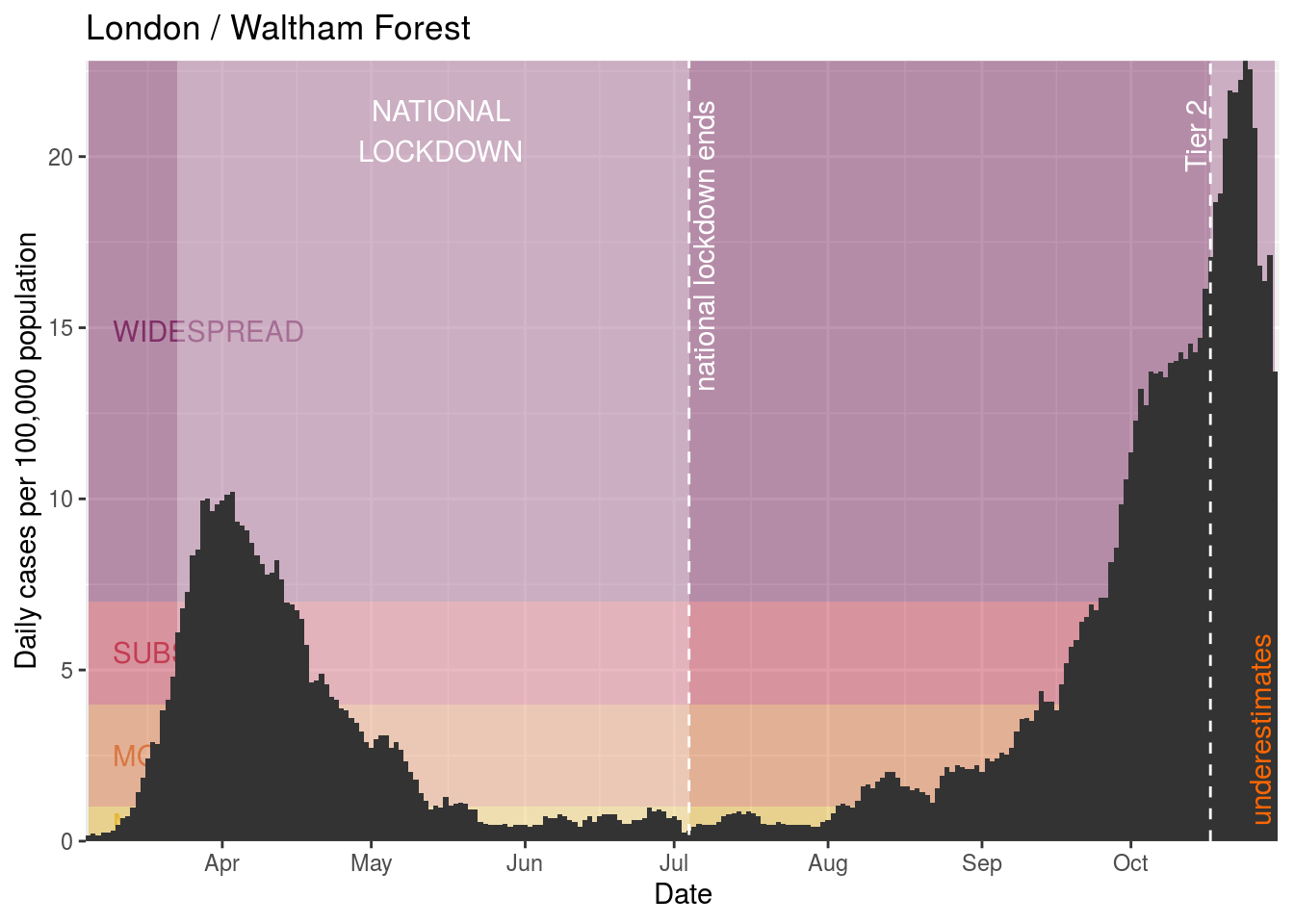
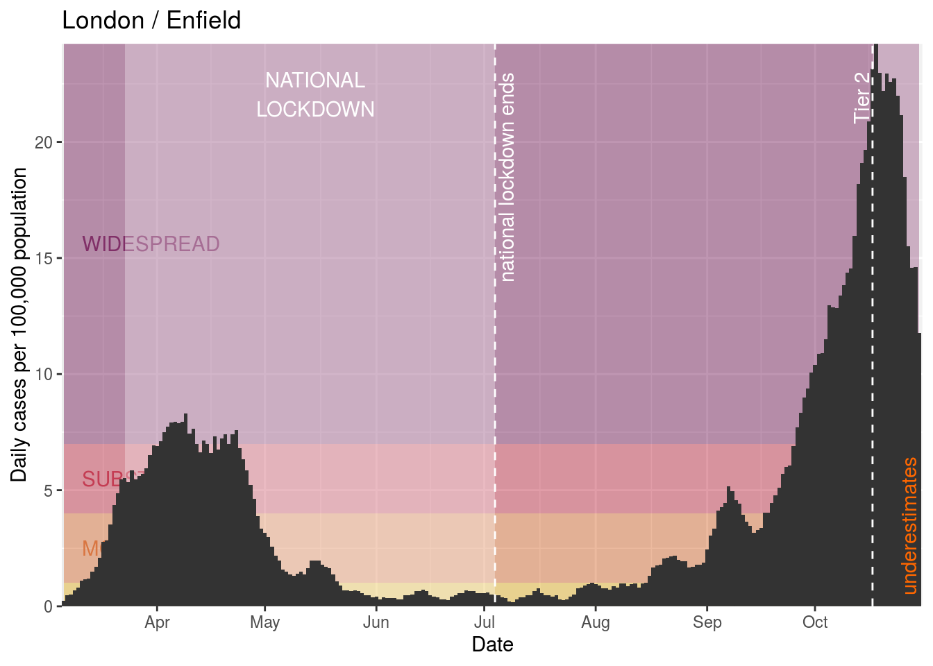
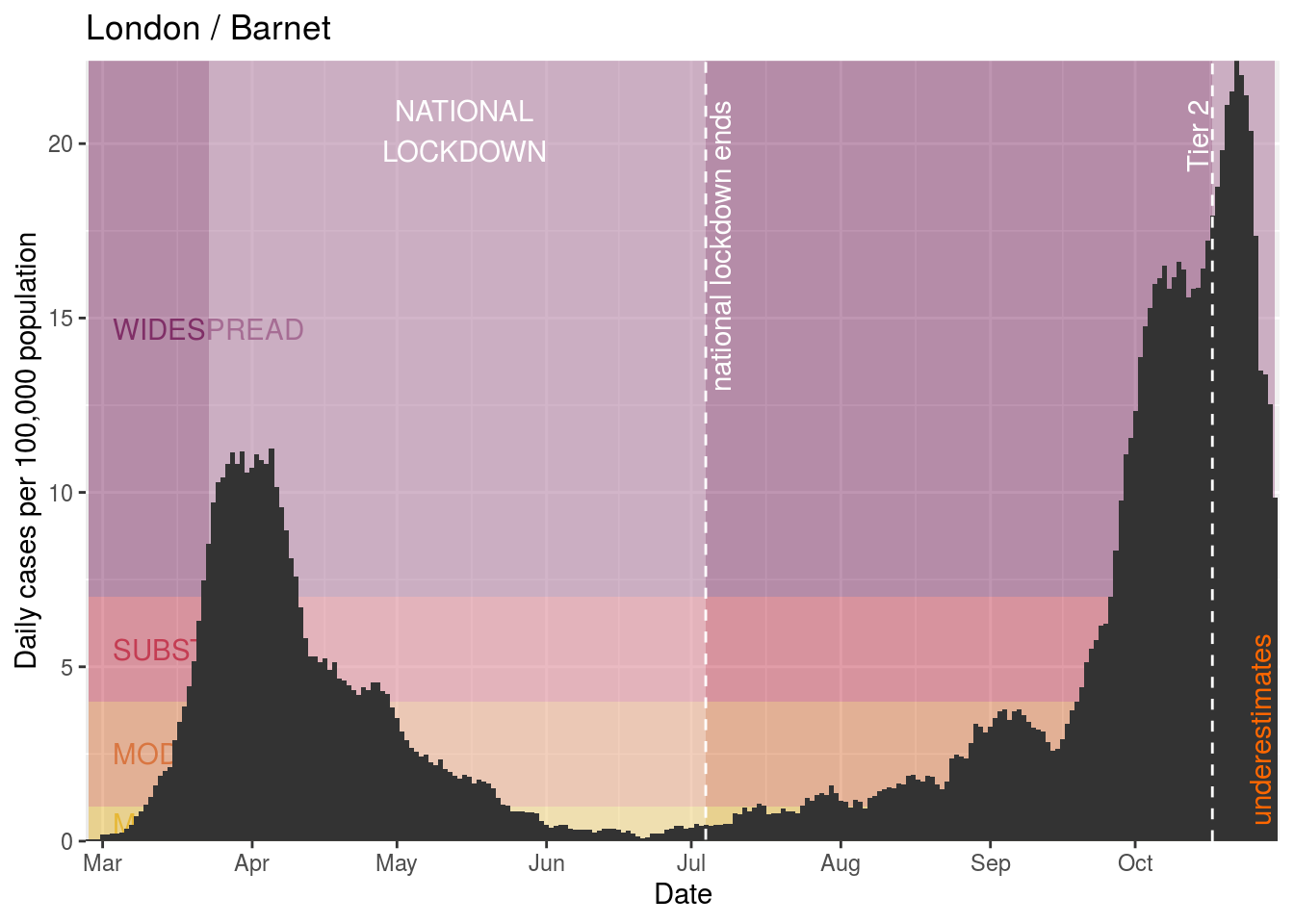
London
London is also in the news, so we’ll also look at London boroughs:
- Hackney and City of London
- Westminster
- Kensington and Chelsea
- Hammersmith and Fulham
- Wandsworth
- Lambeth
- Southwark
- Tower Hamlets
- Islington
- Camden
- Brent
- Ealing
- Hounslow
- Richmond upon Thames
- Kingston upon Thames
- Merton
- Sutton
- Croydon
- Bromley
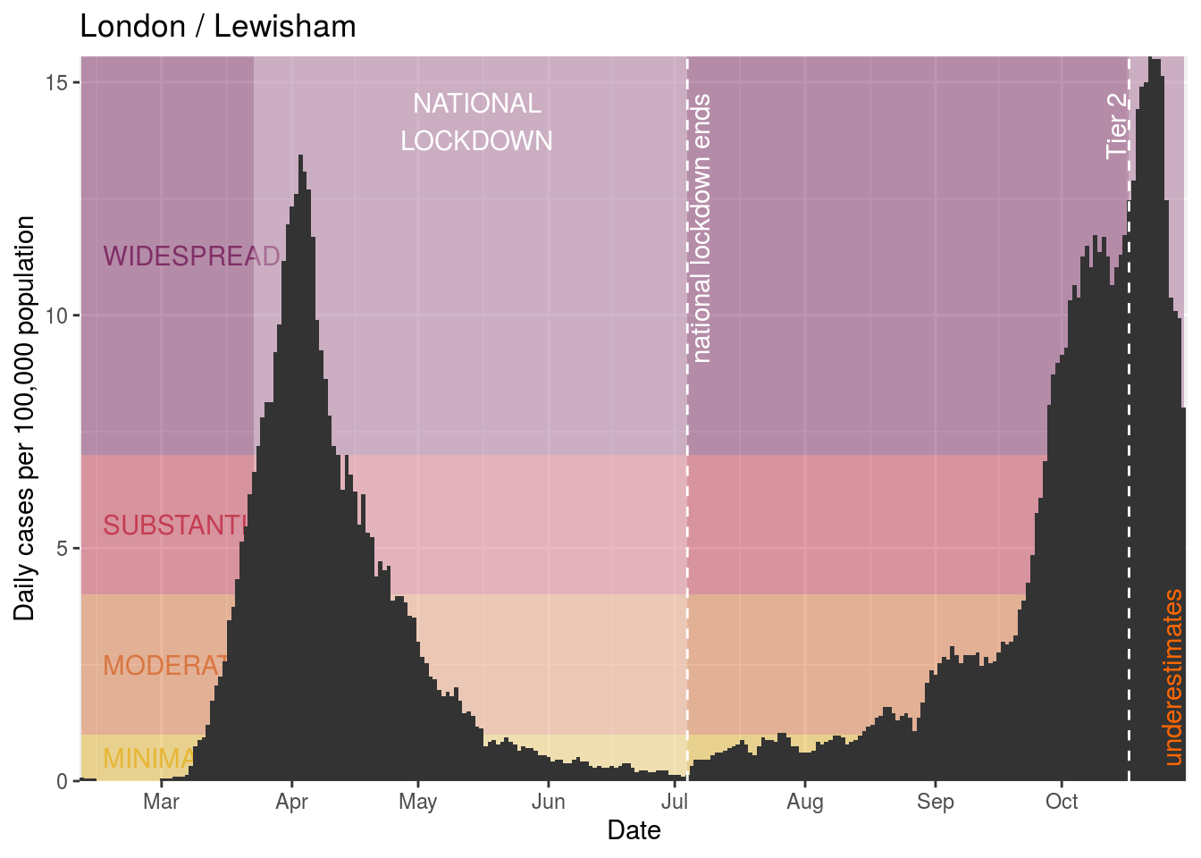
- Lewisham
- Greenwich
- Bexley
- Havering
- Barking and Dagenham
- Redbridge
- Newham
- Waltham Forest
- Haringey
- Enfield
- Barnet
- Harrow
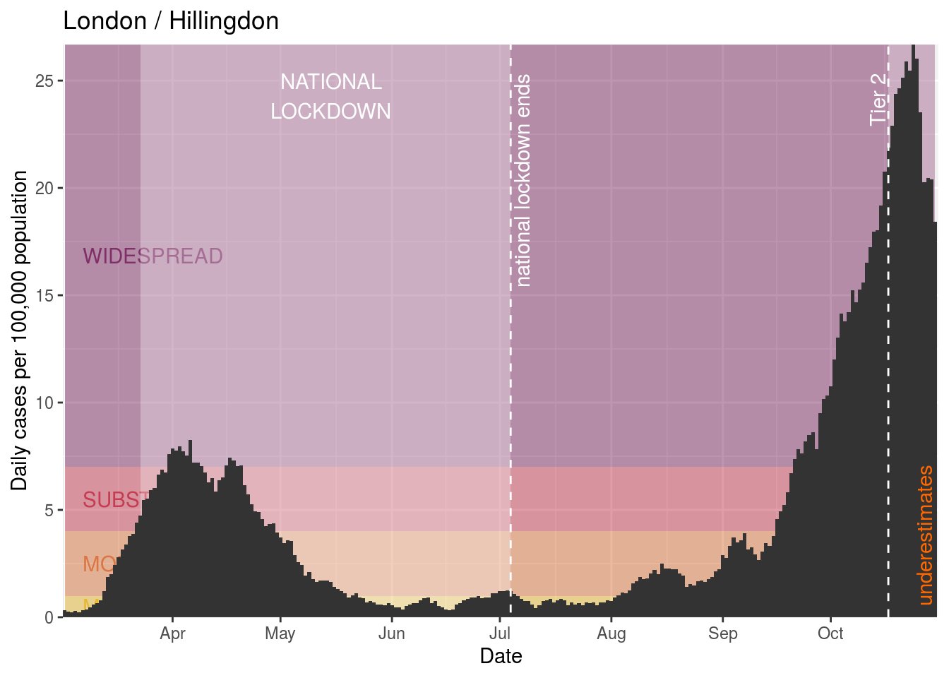
- Hillingdon
Hackney and City of London

Westminster
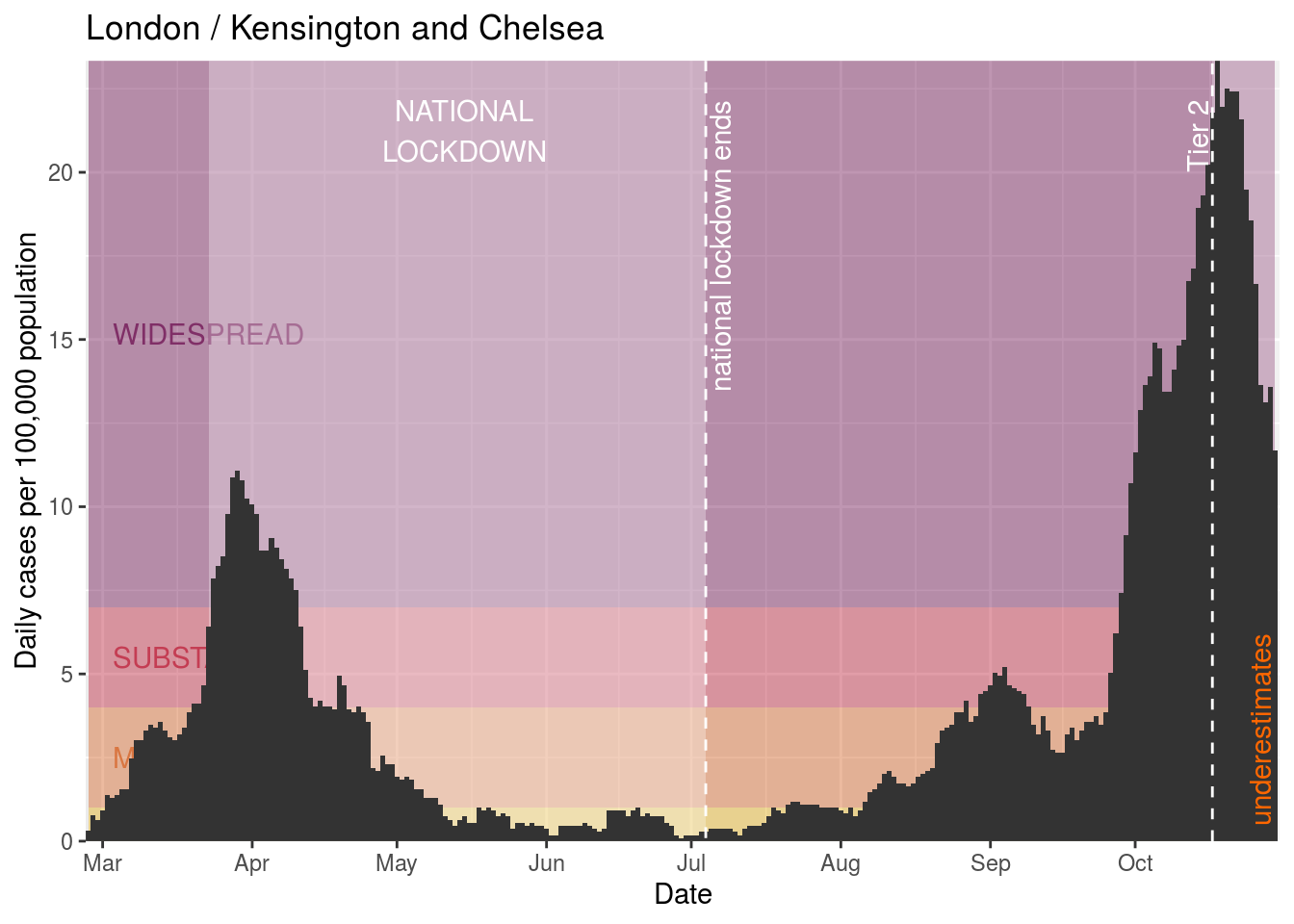
Kensington and Chelsea
Hammersmith and Fulham

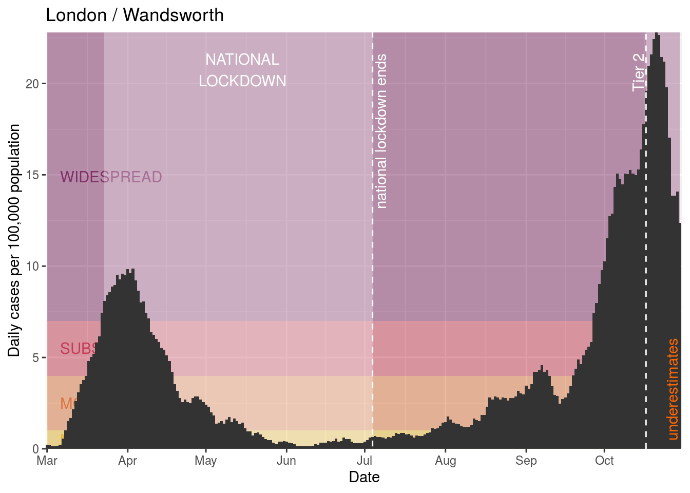
Wandsworth

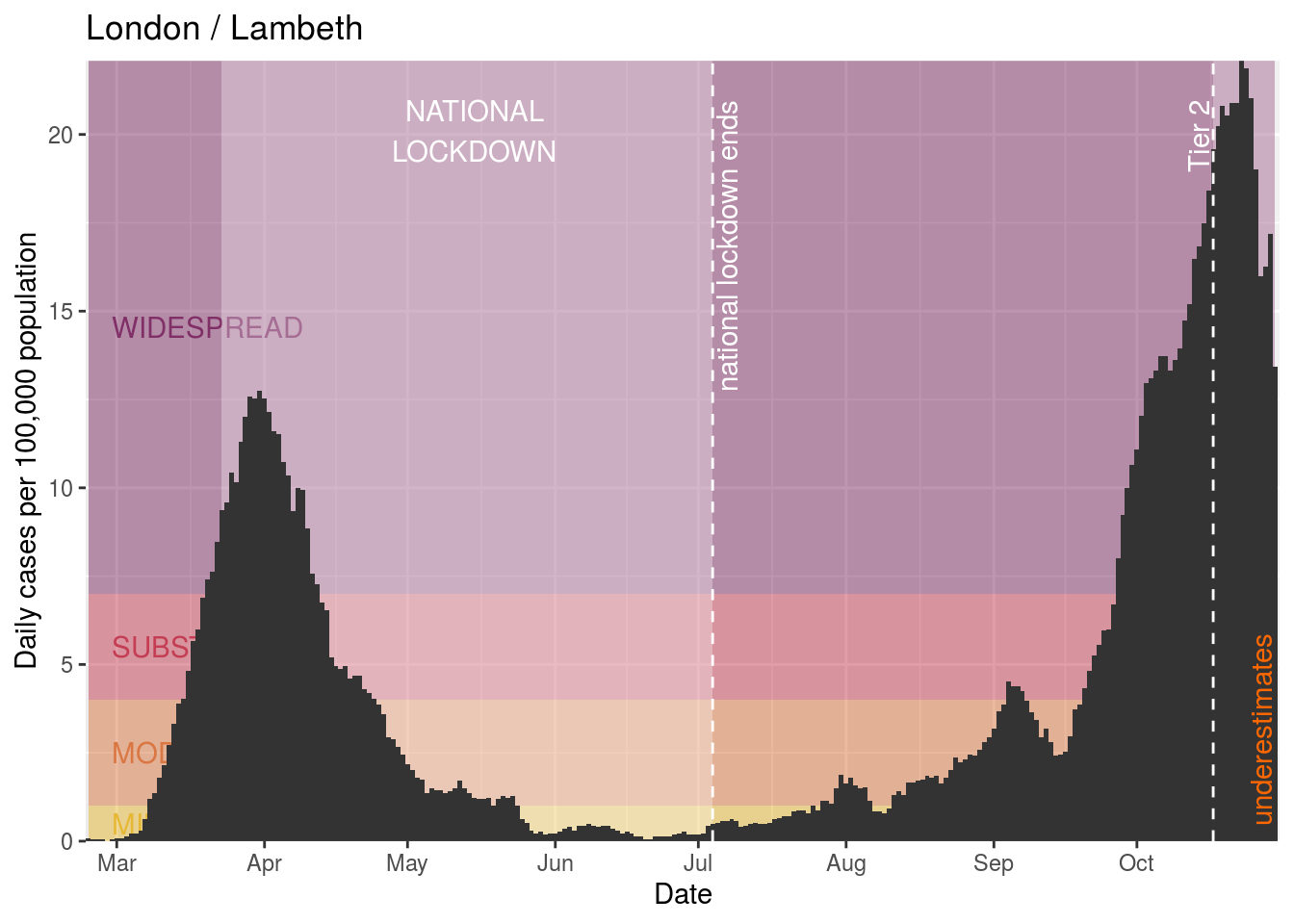
Lambeth
Southwark

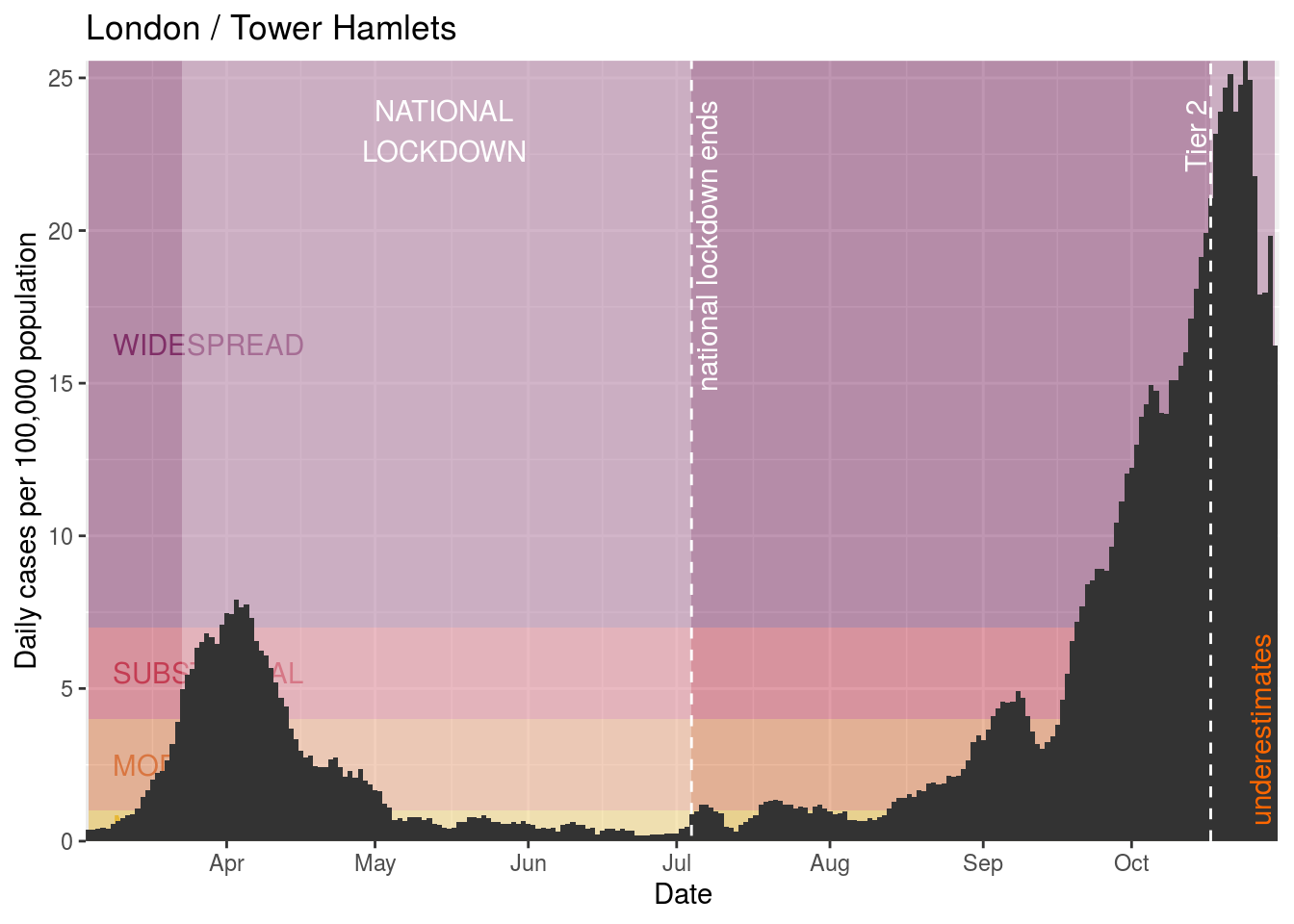
Tower Hamlets
Islington

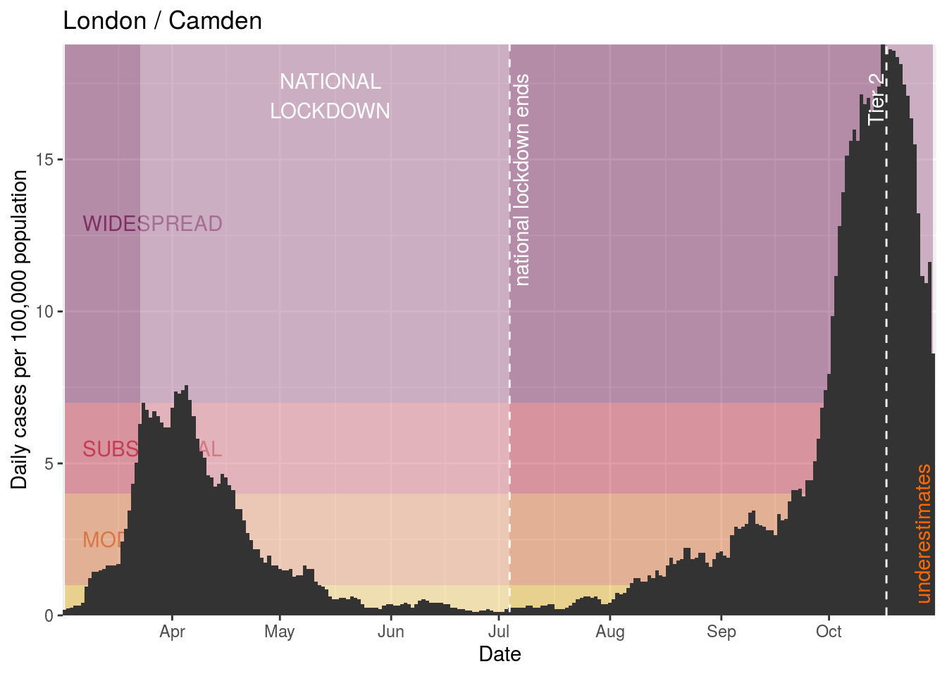
Camden
Brent

Ealing
Hounslow
Richmond upon Thames

Kingston upon Thames
Merton
Sutton

Croydon

Bromley

Lewisham

Greenwich
Bexley
Havering

Barking and Dagenham
Redbridge
Newham

Waltham Forest
Haringey

Enfield
Barnet
Harrow

Hillingdon